1EdTech QTI 3 Standardized Shared Vocabulary and CSS Classes
1EdTech QTI 3 Standardized Shared Vocabulary and CSS Classes
Spec Version 3.0
| Document Version: | 1.0 |
| Date Issued: | 18 December 2023 |
| Status: | This document is made available for adoption by the public community at large. |
| This version: | https://www.imsglobal.org/spec/qti/v3p0/guide/ |
IPR and Distribution Notice
Recipients of this document are requested to submit, with their comments, notification of any relevant patent claims or other intellectual property rights of which they may be aware that might be infringed by any implementation of the specification set forth in this document, and to provide supporting documentation.
1EdTech takes no position regarding the validity or scope of any intellectual property or other rights that might be claimed to pertain implementation or use of the technology described in this document or the extent to which any license under such rights might or might not be available; neither does it represent that it has made any effort to identify any such rights. Information on 1EdTech's procedures with respect to rights in 1EdTech specifications can be found at the 1EdTech Intellectual Property Rights webpage: http://www.imsglobal.org/ipr/imsipr_policyFinal.pdf .
The following participating organizations have made explicit license commitments to this specification:
| Org name | Date election made | Necessary claims | Type |
|---|---|---|---|
| HMH | September 16, 2019 | No | RF RAND (Required & Optional Elements) |
Use of this specification to develop products or services is governed by the license with 1EdTech found on the 1EdTech website: http://www.imsglobal.org/speclicense.html.
Permission is granted to all parties to use excerpts from this document as needed in producing requests for proposals.
The limited permissions granted above are perpetual and will not be revoked by 1EdTech or its successors or assigns.
THIS SPECIFICATION IS BEING OFFERED WITHOUT ANY WARRANTY WHATSOEVER, AND IN PARTICULAR, ANY WARRANTY OF NONINFRINGEMENT IS EXPRESSLY DISCLAIMED. ANY USE OF THIS SPECIFICATION SHALL BE MADE ENTIRELY AT THE IMPLEMENTER'S OWN RISK, AND NEITHER THE CONSORTIUM, NOR ANY OF ITS MEMBERS OR SUBMITTERS, SHALL HAVE ANY LIABILITY WHATSOEVER TO ANY IMPLEMENTER OR THIRD PARTY FOR ANY DAMAGES OF ANY NATURE WHATSOEVER, DIRECTLY OR INDIRECTLY, ARISING FROM THE USE OF THIS SPECIFICATION.
Public contributions, comments and questions can be posted here: http://www.imsglobal.org/forums/ims-glc-public-forums-and-resources .
© 2023 1EdTech™ Consortium, Inc. All Rights Reserved.
Trademark information: http://www.imsglobal.org/copyright.html
Abstract
This document details the use of QTI related classes and custom attributes. By using a shared vocabulary across implementers, the presentation and behavior of delivered assessments can be far more interoperabile. The shared CSS is provided as a convenient resource for implementers and is not intended to be strictly used as provided. The provided CSS does follow the intent of the class and attribute descriptions, as provided in the Shared CSS section.
1. SECTION 1: Shared Interaction Vocabulary
Shared Interaction Vocabulary and CSS Classes in QTI increases the visual presentation interoperability of QTI content across delivery platforms. It does not assume any particular CSS usage, though Section 2 of this document does provide possible stylesheet markup, as used by implementers of QTI. Some classes and data-attributes are required to be supported for certain QTI application certifications, which are listed in the acceptance criteria and certification checklists for specific capabilities of the application certifications.
1.1 GENERAL PURPOSE CLASSES
1.1.1 Accessibility Classes
1.1.1.1 Class = qti-keyword-emphasis
Some candidates might benefit from having key (cognitively important) words in the content brought to their attention, to help them better understand the meaning of the content. In QTI 3, you would use the QTI 3 specific class "qti-keyword-emphasis" on the element that you would like to have emphasis. The emphasis is intended to be limited to those candidates who have been assigned the keyword-emphasis support in their PNP.
Keyword Emphasis in a Candidate PNP
|
Keyword Emphasis in an qti-assessment-item
|
While there is no specific recommended approach as to how to emphasize words, the expectation is that the words within the "qti-keyword-emphasis" class would appear to be different, with greater emphasis than the surrounding text, and that the emphasis would only be presented to those candidates who are intended to see this extra emphasis for special words. For words intended to be emphasized for all candidates, use more traditional HTML techniques to indicate the emphasis (strong, em, etc.).
1.1.1.3 Data-attribute = data-qti-suppress-tts
To suppress text-to-speech (i.e., to hide content from assistive technology like screen readers) the accepted web practice and the QTI 3 recommended practice is to use the aria-hidden="true" attribute in the element you are trying to hide and prevent that content from being read aloud.
There are unique use cases in assessment contexts where you (at the direction of assessment programs) may wish to suppress text-to-speech for specific kinds of text-to-speech users, which AfA 3.0 refers to as the spoken support. In QTI 3, if you wish to suppress some content from being read aloud to candidates, use the special "data-qti-suppress-tts" attribute and use the standardized QTI 3 vocabulary (computer-read-aloud, screen-reader, all), which correlates to the spoken reading-type vocabulary.
Note that no existing screen readers natively support these attributes, and delivery engines will likely need to make specific delivery code modifications to enable this capability to work as intended. The QTI shared vocabulary is the interoperable method for expressing the concept of differentiated text-to-speech suppression.
Below is an example of using the text-to-speech (TTS) suppression attribute to suppress the labels being read aloud for a screen-reader candidate. The label information is only useful for candidates who can see where the text is associated with graphic. The computer-read-aloud candidate typically only has visible text read aloud to them, so we could suppress the read aloud of the long description.
|
1.1.1.4 Data-attribute = data-qti-aria-*
This custom attribute is a backup for instances where the QTI element does not support the use of ARIA attributes (but does support data-attributes), or where the QTI version may lag behind the W3C's updated versions of WAI-ARIA, or to implement proposed ARIA attributes for upcoming releases of WAI-ARIA.
To use this shared vocabulary, use the "data-qti-aria-" prefix, then add the new ARIA attribute name to the custom attribute. For example, "data-qti-aria-new-aria="somevalue".
1.1.1.5 Data-attribute = data-qti-a11y-content-role
This custom attribute is used to provide semantic indicators for accessibility specific content. Below are the shared vocabulary of this QTI-related custom element.
- screen-reader-orientation
Screen Reader User Orienting Information: This attribute value identifies objects that contain user guidance specific to users of screen readers, that identifies or describes information that a sighted test taker can glean from simply looking at the item, enabling users to more equitably orient to the task. - long-description
This attribute identifies objects that contain structured extended (or long) text description for images or other visual content. The objects with this attribute are referenced via aria-describedBy or data-qti-aria-details.
NOTE: There is existing shared-vocabulary for not visually displaying information that implies it is accessibility related information: class="qti-visually-hidden" — this of course only means that it is not on screen and the structure of the content is via HTML and/or ARIA information.
1.1.2 Inline Text
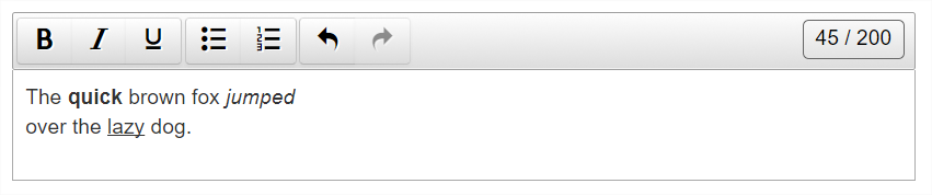
1.1.2.1 Class = qti-underline
| Semantics | Example CSS Definition |
|---|---|
| Underline an element |
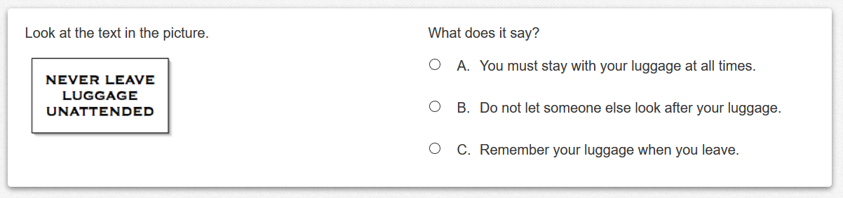
|
<p>Look at the <span class="qti-underline" >text</span> in the picture.</p> |
|
| Look at the text in the picture | |
1.1.2.2 Class = qti-italic
| Semantics | Example CSS Definition |
|---|---|
| Italicize an element |
|
<p>Look at the <span class="qti-italic" >text</span> in the picture.</p> |
|
| Look at the text in the picture | |
1.1.3 Layout
A common assessment presentation requirement is to arrange item stimuli, stems, and interactions into standard layouts which minimize scrolling and cognitive load while also supporting common user interface patterns about how content is displayed. Historically, this requirement has led authoring and delivery systems to implement such presentation layouts in ways that may impede interoperability. To address this common requirement, QTI 3 introduces shared "layout" CSS class names and definitions. By implementing these layout CSS class names and definitions, delivery and authoring platforms can achieve a wide range of flexible, responsive, standardized, interoperable item presentation user interfaces.
The QTI 3 shared Layout CSS class design and styles emulate well-known modern CSS presentation frameworks which define responsive layout grids in terms of "rows", each of which contains twelve "columns", each of which can be defined individually or grouped together to equal twelve total columns in each row.
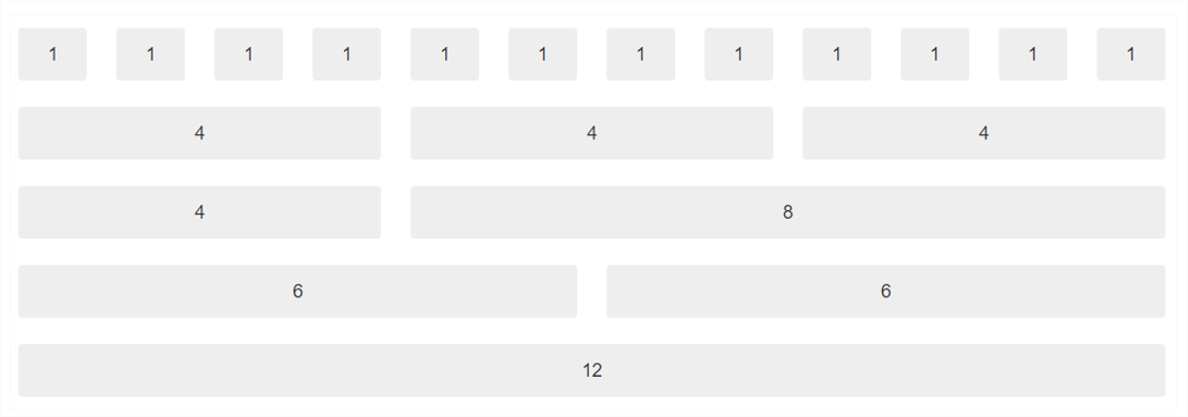
The first row above is divided into twelve individual columns. The second row contains twelve columns grouped into three four-column groupings. The third row contains twelve columns grouped into one four-column grouping, and one eight-column grouping. The fourth row contains twelve columns grouped into two six-column groupings. The fifth row contains one twelve-column grouping which encapsulates all of the columns in a single row.
Furthermore, rows and columns may be nested inside column groupings so long as the total number of nested columns equals the number of columns in the parent container column grouping.
Rows and column groupings are specified on <div> elements in the qti-item-body and are defined with the following class names:
1.1.3.1 Class = qti-layout-row
This class is used in conjunction with qti-layout-col-*.
1.1.3.2 Classes = qti-layout-col-*
* = 1 | 2 | 3 | 4 | 5 | 6 | 7 | 8 | 9 | 10 | 11 | 12
Example: Item Body with one layout row, and two six-column (qti-layout-col6) groupings
|
 |
Example: Item Body with two layout rows, each row with different column groupings
|
|
The first row contains column groupings of 8 and 4. A stimulus is placed into the eight-column grouping on the left. A hotspot interaction is placed into the four-column grouping to the right of the stimulus. The second row contains one twelve-column grouping spanning the entire width of the second row. A match interaction and stem are placed into the second row's twelve-column grouping. 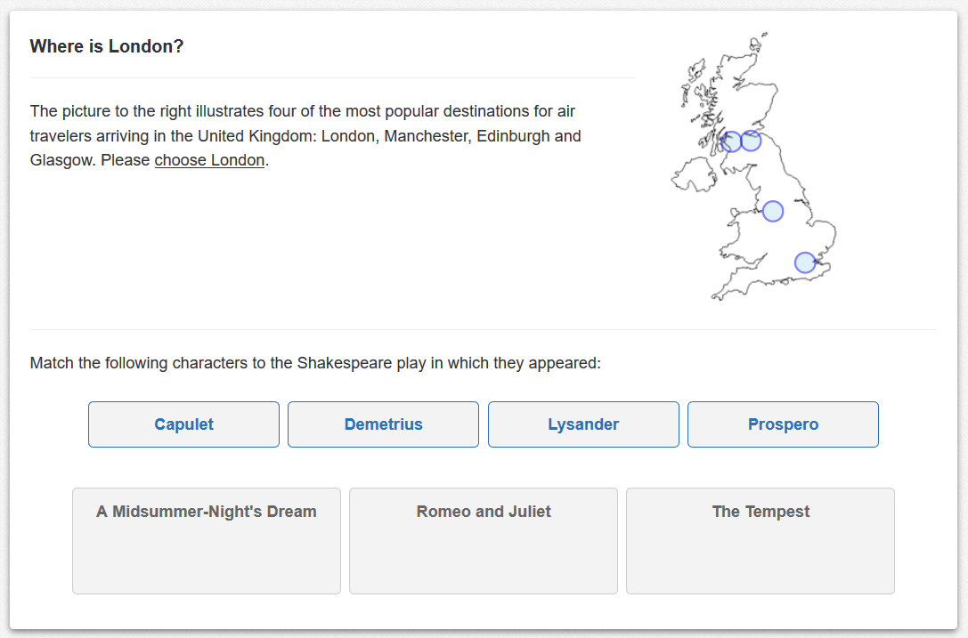 |
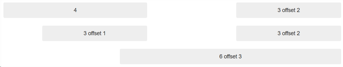
1.1.3.3 Classes = qti-layout-offset-*
* = 1 | 2 | 3 | 4 | 5 | 6 | 7 | 8 | 9 | 10 | 11
Column groupings within a row can be "offset" (from left to right) from the beginning of a row, or from a column grouping to the left. One row should never contain column groupings plus offsets that exceed twelve; i.e., the maximum number of columns in a row.
Column offset definitions can be visualized in the following diagram which contains three rows, each having twelve total columns. The first row contains a three-column grouping offset by two columns from a four-column grouping. The second row contains a three-column grouping offset by one column, plus a second three-column grouping offset by two columns.
 |
Example: Item Body with one layout row, and two three-column (qti-layout-col3) groupings, the first of which is offset by three columns
|
|
The item's stimulus is placed in the leftmost three-column grouping which is offset by three columns, while the interaction is placed in an adjacent three-column grouping. This creates the visual impression of a six-column grouping that is horizontally centered in a row. 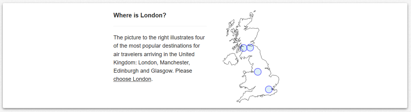 |
1.1.3.4 Class = qti-display-inline-block
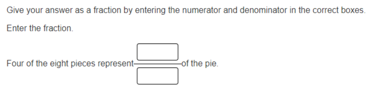
Some assessment platforms use a “Fraction” item-types. This is often implemented as two qti-text-entry-interactions in a table. To display this as an inline interaction with text on either side they set display:inline-block.
|
1.1.4 Alignment
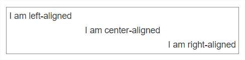
1.1.4.1 Classes = qti-align-left | -right | -center
| Semantics | Example CSS Definition |
|---|---|
| Horizontal alignment, left, center, and right. |
|
|
|
 |
|
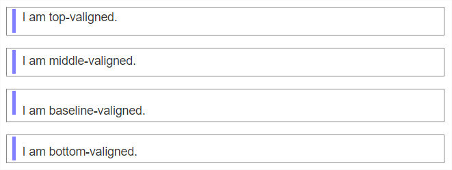
1.1.4.2 Classes = qti-valign-top | -middle | -baseline | -bottom
| Semantics | Example CSS Definition |
|---|---|
| Vertical alignment, top, middle, baseline, and bottom. |
|
|
|
 |
|
1.1.4.3 Class = qti-fullwidth
| Semantics | Example CSS Definition |
|---|---|
| Set the width of the element to 100% of the width of the element's container. |
|
|
|
| Note: Table border added for effect. Table expands to 100% width of its container. | |
1.1.4.4 Classes = qti-text-indent-1 | 2 | 3 | 4 | 5 | 6 | 7 | 8
A class to indicate an indent where the suffix of the class name has the number of rem (root-em) units to indent the block.
1.1.5 Vertical Writing
The following shared vocabulary is for the presentation of QTI 3 content containing vertical Chinese, Japanese, Korean, or Mongolian text.
1.1.5.1 Writing Mode
The writing-mode CSS property sets whether lines of text are laid out horizontally or vertically, as well as the direction in which blocks progress.
| Class | Purpose |
|---|---|
| .qti-writing-mode-vertical-rl | Set the writing-mode to vertical-rl. Typical for CJK vertical text. |
| .qti-writing-mode-vertical-lr | Set the writing-mode to vertical-lr. Typical for Mongolian vertical text. |
| .qti-writing-mode-vertical-tb | Set writing-mode to horizontal. This is the browser default. |
1.1.5.2 Float Classes
The float CSS property places an element on the left or right side of its container, allowing text and inline elements to wrap around it. The element is removed from the normal flow of the page, though still remaining a part of the flow.
| Class | Purpose |
|---|---|
| .qti-float-left | Float the element left. |
| .qti-float-right | Float the element right. |
| .qti-float-none | Remove a float. |
| .qti-float-clearfix::after | Clearfix Hack to apply to a container of floated content that overflows the container. |
| .qti-float-clear-left | |
| .qti-float-clear-right | |
| .qti-float-clear-both |
1.1.5.3 Text Orientation Classes
Explicitly set the rendering of Latin characters in vertical "writing mode".
| Class | Purpose |
|---|---|
| .qti-text-orientation-upright | By default, when writing mode is vertical, Latin characters are rendered sideways. To override this, set the text-orientation CSS property “upright”. |
| .qti-text-combine-upright-all | There are conditions in vertical writing where Latin characters are presented in a combined upright orientation; e.g., the “5012” and the “GI” characters.
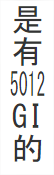 |
There are conditions in vertical writing where Latin characters are presented in a combined upright orientation; e.g., the “5012” and the “GI” characters. For this, use text-combine-upright: all.
1.1.6 Element Appearance
1.1.6.2 Class = qti-bordered & Class = qti-well
| Semantics | Example CSS Definition |
|---|---|
|
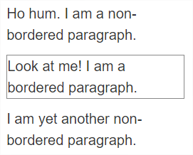
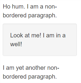
qti-bordered adds a visual border to an element. qti-well adds a "well" to an element. A "well" is a UI convention of adding visual importance to an element. Increased visual importance is usually achieved by adding both a border and background + foreground colors to the element. The background color should be chosen by the delivery platform so as not violate WCAG AA guidelines for foreground color textual contrast. |
|
|
|
  |
|
1.1.7 List Styles
1.1.7.1 Default Styling
ol
- First
- Second
- Third
- Fourth
- First
- Second
- Third
- Fourth
- First
- Second
- Third
- Fourth
ul
- First
- Second
- Third
- Fourth
- First
- Second
- Third
- Fourth
- First
- Second
- Third
- Fourth
1.1.7.2 .qti-list-style-type-none
ol
- First
- Second
- Third
- Fourth
- First
- Second
- Third
- Fourth
- First
- Second
- Third
- Fourth
ul
- First
- Second
- Third
- Fourth
- First
- Second
- Third
- Fourth
- First
- Second
- Third
- Fourth
1.1.7.3 .qti-list-style-type-arabic-indic
ol
- First
- Second
- Third
- Fourth
- First
- Second
- Third
- Fourth
- First
- Second
- Third
- Fourth
ul
- First
- Second
- Third
- Fourth
- First
- Second
- Third
- Fourth
- First
- Second
- Third
- Fourth
1.1.7.4 .qti-list-style-type-armenian
ol
- First
- Second
- Third
- Fourth
- First
- Second
- Third
- Fourth
- First
- Second
- Third
- Fourth
ul
- First
- Second
- Third
- Fourth
- First
- Second
- Third
- Fourth
- First
- Second
- Third
- Fourth
1.1.7.5 .qti-list-style-type-bengali
ol
- First
- Second
- Third
- Fourth
- First
- Second
- Third
- Fourth
- First
- Second
- Third
- Fourth
ul
- First
- Second
- Third
- Fourth
- First
- Second
- Third
- Fourth
- First
- Second
- Third
- Fourth
1.1.7.6 .qti-list-style-type-cambodian
ol
- First
- Second
- Third
- Fourth
- First
- Second
- Third
- Fourth
- First
- Second
- Third
- Fourth
ul
- First
- Second
- Third
- Fourth
- First
- Second
- Third
- Fourth
- First
- Second
- Third
- Fourth
1.1.7.7 .qti-list-style-type-circle
ol
- First
- Second
- Third
- Fourth
- First
- Second
- Third
- Fourth
- First
- Second
- Third
- Fourth
ul
- First
- Second
- Third
- Fourth
- First
- Second
- Third
- Fourth
- First
- Second
- Third
- Fourth
1.1.7.8 .qti-list-style-type-cjk-earthly-branch
ol
- First
- Second
- Third
- Fourth
- First
- Second
- Third
- Fourth
- First
- Second
- Third
- Fourth
ul
- First
- Second
- Third
- Fourth
- First
- Second
- Third
- Fourth
- First
- Second
- Third
- Fourth
1.1.7.9 .qti-list-style-type-cjk-heavenly-stem
ol
- First
- Second
- Third
- Fourth
- First
- Second
- Third
- Fourth
- First
- Second
- Third
- Fourth
ul
- First
- Second
- Third
- Fourth
- First
- Second
- Third
- Fourth
- First
- Second
- Third
- Fourth
1.1.7.10 .qti-list-style-type-cjk-ideographic
ol
- First
- Second
- Third
- Fourth
- First
- Second
- Third
- Fourth
- First
- Second
- Third
- Fourth
ul
- First
- Second
- Third
- Fourth
- First
- Second
- Third
- Fourth
- First
- Second
- Third
- Fourth
1.1.7.11 .qti-list-style-type-decimal
ol
- First
- Second
- Third
- Fourth
- First
- Second
- Third
- Fourth
- First
- Second
- Third
- Fourth
ul
- First
- Second
- Third
- Fourth
- First
- Second
- Third
- Fourth
- First
- Second
- Third
- Fourth
1.1.7.12 .qti-list-style-type-decimal-leading-zero
ol
- First
- Second
- Third
- Fourth
- First
- Second
- Third
- Fourth
- First
- Second
- Third
- Fourth
ul
- First
- Second
- Third
- Fourth
- First
- Second
- Third
- Fourth
- First
- Second
- Third
- Fourth
1.1.7.13 .qti-list-style-type-devanagari
ol
- First
- Second
- Third
- Fourth
- First
- Second
- Third
- Fourth
- First
- Second
- Third
- Fourth
ul
- First
- Second
- Third
- Fourth
- First
- Second
- Third
- Fourth
- First
- Second
- Third
- Fourth
1.1.7.14 .qti-list-style-type-disc
ol
- First
- Second
- Third
- Fourth
- First
- Second
- Third
- Fourth
- First
- Second
- Third
- Fourth
ul
- First
- Second
- Third
- Fourth
- First
- Second
- Third
- Fourth
- First
- Second
- Third
- Fourth
1.1.7.15 .qti-list-style-type-georgian
ol
- First
- Second
- Third
- Fourth
- First
- Second
- Third
- Fourth
- First
- Second
- Third
- Fourth
ul
- First
- Second
- Third
- Fourth
- First
- Second
- Third
- Fourth
- First
- Second
- Third
- Fourth
1.1.7.16 .qti-list-style-type-gujarati
ol
- First
- Second
- Third
- Fourth
- First
- Second
- Third
- Fourth
- First
- Second
- Third
- Fourth
ul
- First
- Second
- Third
- Fourth
- First
- Second
- Third
- Fourth
- First
- Second
- Third
- Fourth
1.1.7.17 .qti-list-style-type-gurmukhi
ol
- First
- Second
- Third
- Fourth
- First
- Second
- Third
- Fourth
- First
- Second
- Third
- Fourth
ul
- First
- Second
- Third
- Fourth
- First
- Second
- Third
- Fourth
- First
- Second
- Third
- Fourth
1.1.7.18 .qti-list-style-type-hebrew
ol
- First
- Second
- Third
- Fourth
- First
- Second
- Third
- Fourth
- First
- Second
- Third
- Fourth
ul
- First
- Second
- Third
- Fourth
- First
- Second
- Third
- Fourth
- First
- Second
- Third
- Fourth
1.1.7.19 .qti-list-style-type-hiragana
ol
- First
- Second
- Third
- Fourth
- First
- Second
- Third
- Fourth
- First
- Second
- Third
- Fourth
ul
- First
- Second
- Third
- Fourth
- First
- Second
- Third
- Fourth
- First
- Second
- Third
- Fourth
1.1.7.20 .qti-list-style-type-hiragana-iroha
ol
- First
- Second
- Third
- Fourth
- First
- Second
- Third
- Fourth
- First
- Second
- Third
- Fourth
ul
- First
- Second
- Third
- Fourth
- First
- Second
- Third
- Fourth
- First
- Second
- Third
- Fourth
1.1.7.21 .qti-list-style-type-kannada
ol
- First
- Second
- Third
- Fourth
- First
- Second
- Third
- Fourth
- First
- Second
- Third
- Fourth
ul
- First
- Second
- Third
- Fourth
- First
- Second
- Third
- Fourth
- First
- Second
- Third
- Fourth
1.1.7.22 .qti-list-style-type-katakana
ol
- First
- Second
- Third
- Fourth
- First
- Second
- Third
- Fourth
- First
- Second
- Third
- Fourth
ul
- First
- Second
- Third
- Fourth
- First
- Second
- Third
- Fourth
- First
- Second
- Third
- Fourth
1.1.7.23 .qti-list-style-type-katakana-iroha
ol
- First
- Second
- Third
- Fourth
- First
- Second
- Third
- Fourth
- First
- Second
- Third
- Fourth
ul
- First
- Second
- Third
- Fourth
- First
- Second
- Third
- Fourth
- First
- Second
- Third
- Fourth
1.1.7.24 .qti-list-style-type-khmer
ol
- First
- Second
- Third
- Fourth
- First
- Second
- Third
- Fourth
- First
- Second
- Third
- Fourth
ul
- First
- Second
- Third
- Fourth
- First
- Second
- Third
- Fourth
- First
- Second
- Third
- Fourth
1.1.7.25 .qti-list-style-type-korean-hangul-formal
ol
- First
- Second
- Third
- Fourth
- First
- Second
- Third
- Fourth
- First
- Second
- Third
- Fourth
ul
- First
- Second
- Third
- Fourth
- First
- Second
- Third
- Fourth
- First
- Second
- Third
- Fourth
1.1.7.26 .qti-list-style-type-korean-hanja-formal
ol
- First
- Second
- Third
- Fourth
- First
- Second
- Third
- Fourth
- First
- Second
- Third
- Fourth
ul
- First
- Second
- Third
- Fourth
- First
- Second
- Third
- Fourth
- First
- Second
- Third
- Fourth
1.1.7.27 .qti-list-style-type-korean-hanja-informal
ol
- First
- Second
- Third
- Fourth
- First
- Second
- Third
- Fourth
- First
- Second
- Third
- Fourth
ul
- First
- Second
- Third
- Fourth
- First
- Second
- Third
- Fourth
- First
- Second
- Third
- Fourth
1.1.7.28 .qti-list-style-type-lao
ol
- First
- Second
- Third
- Fourth
- First
- Second
- Third
- Fourth
- First
- Second
- Third
- Fourth
ul
- First
- Second
- Third
- Fourth
- First
- Second
- Third
- Fourth
- First
- Second
- Third
- Fourth
1.1.7.29 .qti-list-style-type-lower-alpha
ol
- First
- Second
- Third
- Fourth
- First
- Second
- Third
- Fourth
- First
- Second
- Third
- Fourth
ul
- First
- Second
- Third
- Fourth
- First
- Second
- Third
- Fourth
- First
- Second
- Third
- Fourth
1.1.7.30 .qti-list-style-type-lower-armenian
ol
- First
- Second
- Third
- Fourth
- First
- Second
- Third
- Fourth
- First
- Second
- Third
- Fourth
ul
- First
- Second
- Third
- Fourth
- First
- Second
- Third
- Fourth
- First
- Second
- Third
- Fourth
1.1.7.31 .qti-list-style-type-lower-greek
ol
- First
- Second
- Third
- Fourth
- First
- Second
- Third
- Fourth
- First
- Second
- Third
- Fourth
ul
- First
- Second
- Third
- Fourth
- First
- Second
- Third
- Fourth
- First
- Second
- Third
- Fourth
1.1.7.32 .qti-list-style-type-lower-latin
ol
- First
- Second
- Third
- Fourth
- First
- Second
- Third
- Fourth
- First
- Second
- Third
- Fourth
ul
- First
- Second
- Third
- Fourth
- First
- Second
- Third
- Fourth
- First
- Second
- Third
- Fourth
1.1.7.33 .qti-list-style-type-lower-roman
ol
- First
- Second
- Third
- Fourth
- First
- Second
- Third
- Fourth
- First
- Second
- Third
- Fourth
ul
- First
- Second
- Third
- Fourth
- First
- Second
- Third
- Fourth
- First
- Second
- Third
- Fourth
1.1.7.34 .qti-list-style-type-malayalam
ol
- First
- Second
- Third
- Fourth
- First
- Second
- Third
- Fourth
- First
- Second
- Third
- Fourth
ul
- First
- Second
- Third
- Fourth
- First
- Second
- Third
- Fourth
- First
- Second
- Third
- Fourth
1.1.7.35 .qti-list-style-type-mongolian
ol
- First
- Second
- Third
- Fourth
- First
- Second
- Third
- Fourth
- First
- Second
- Third
- Fourth
ul
- First
- Second
- Third
- Fourth
- First
- Second
- Third
- Fourth
- First
- Second
- Third
- Fourth
1.1.7.36 .qti-list-style-type-myanmar
ol
- First
- Second
- Third
- Fourth
- First
- Second
- Third
- Fourth
- First
- Second
- Third
- Fourth
ul
- First
- Second
- Third
- Fourth
- First
- Second
- Third
- Fourth
- First
- Second
- Third
- Fourth
1.1.7.37 .qti-list-style-type-oriya
ol
- First
- Second
- Third
- Fourth
- First
- Second
- Third
- Fourth
- First
- Second
- Third
- Fourth
ul
- First
- Second
- Third
- Fourth
- First
- Second
- Third
- Fourth
- First
- Second
- Third
- Fourth
1.1.7.38 .qti-list-style-type-persian
ol
- First
- Second
- Third
- Fourth
- First
- Second
- Third
- Fourth
- First
- Second
- Third
- Fourth
ul
- First
- Second
- Third
- Fourth
- First
- Second
- Third
- Fourth
- First
- Second
- Third
- Fourth
1.1.7.39 .qti-list-style-type-simp-chinese-formal
ol
- First
- Second
- Third
- Fourth
- First
- Second
- Third
- Fourth
- First
- Second
- Third
- Fourth
ul
- First
- Second
- Third
- Fourth
- First
- Second
- Third
- Fourth
- First
- Second
- Third
- Fourth
1.1.7.40 .qti-list-style-type-simp-chinese-informal
ol
- First
- Second
- Third
- Fourth
- First
- Second
- Third
- Fourth
- First
- Second
- Third
- Fourth
ul
- First
- Second
- Third
- Fourth
- First
- Second
- Third
- Fourth
- First
- Second
- Third
- Fourth
1.1.7.41 .qti-list-style-type-square
ol
- First
- Second
- Third
- Fourth
- First
- Second
- Third
- Fourth
- First
- Second
- Third
- Fourth
ul
- First
- Second
- Third
- Fourth
- First
- Second
- Third
- Fourth
- First
- Second
- Third
- Fourth
1.1.7.42 .qti-list-style-type-telugu
ol
- First
- Second
- Third
- Fourth
- First
- Second
- Third
- Fourth
- First
- Second
- Third
- Fourth
ul
- First
- Second
- Third
- Fourth
- First
- Second
- Third
- Fourth
- First
- Second
- Third
- Fourth
1.1.7.43 .qti-list-style-type-thai
ol
- First
- Second
- Third
- Fourth
- First
- Second
- Third
- Fourth
- First
- Second
- Third
- Fourth
ul
- First
- Second
- Third
- Fourth
- First
- Second
- Third
- Fourth
- First
- Second
- Third
- Fourth
1.1.7.44 .qti-list-style-type-tibetan
ol
- First
- Second
- Third
- Fourth
- First
- Second
- Third
- Fourth
- First
- Second
- Third
- Fourth
ul
- First
- Second
- Third
- Fourth
- First
- Second
- Third
- Fourth
- First
- Second
- Third
- Fourth
1.1.7.45 .qti-list-style-type-trad-chinese-formal
ol
- First
- Second
- Third
- Fourth
- First
- Second
- Third
- Fourth
- First
- Second
- Third
- Fourth
ul
- First
- Second
- Third
- Fourth
- First
- Second
- Third
- Fourth
- First
- Second
- Third
- Fourth
1.1.7.46 .qti-list-style-type-trad-chinese-informal
ol
- First
- Second
- Third
- Fourth
- First
- Second
- Third
- Fourth
- First
- Second
- Third
- Fourth
ul
- First
- Second
- Third
- Fourth
- First
- Second
- Third
- Fourth
- First
- Second
- Third
- Fourth
1.1.7.47 .qti-list-style-type-upper-alpha
ol
- First
- Second
- Third
- Fourth
- First
- Second
- Third
- Fourth
- First
- Second
- Third
- Fourth
ul
- First
- Second
- Third
- Fourth
- First
- Second
- Third
- Fourth
- First
- Second
- Third
- Fourth
1.1.7.48 .qti-list-style-type-upper-armenian
ol
- First
- Second
- Third
- Fourth
- First
- Second
- Third
- Fourth
- First
- Second
- Third
- Fourth
ul
- First
- Second
- Third
- Fourth
- First
- Second
- Third
- Fourth
- First
- Second
- Third
- Fourth
1.1.7.49 .qti-list-style-type-upper-latin
ol
- First
- Second
- Third
- Fourth
- First
- Second
- Third
- Fourth
- First
- Second
- Third
- Fourth
ul
- First
- Second
- Third
- Fourth
- First
- Second
- Third
- Fourth
- First
- Second
- Third
- Fourth
1.1.7.50 .qti-list-style-type-upper-roman
ol
- First
- Second
- Third
- Fourth
- First
- Second
- Third
- Fourth
- First
- Second
- Third
- Fourth
ul
- First
- Second
- Third
- Fourth
- First
- Second
- Third
- Fourth
- First
- Second
- Third
- Fourth
1.2 INTERACTION CLASSES
The following table summarizes the shared interaction vocabulary used in QTI.
Classes or attributes in italics are used in more than a single interaction type.
| Interaction | Classes | Custom Attributes |
|---|---|---|
| qti-choice-interaction |
qti-labels-none qti-labels-suffix-none qti-orientation-horizontal qti-input-control-hidden qti-choices-stacking-1 |
data-max-selections-message ="any text" data-min-selections-message ="any text" |
| qti-text-entry-interaction | qti-input-width-1 qti-input-width-2 qti-input-width-3 qti-input-width-4 qti-input-width-6 qti-input-width-10 qti-input-width-15 qti-input-width-20 qti-input-width-25 qti-input-width-30 qti-input-width-35 qti-input-width-40 qti-input-width-45 qti-input-width-50 qti-input-width-72 |
data-patternmask-message ="any text" |
| qti-extended-text-interaction |
qti-height-lines-3 qti-height-lines-6 qti-height-lines-15 qti-counter-up qti-counter-down |
data-patternmask-message ="any text" |
| qti-inline-choice-interaction | qti-input-width-1 qti-input-width-2 qti-input-width-3 qti-input-width-4 qti-input-width-6 qti-input-width-10 qti-input-width-15 qti-input-width-20 qti-input-width-25 qti-input-width-30 qti-input-width-35 qti-input-width-40 qti-input-width-45 qti-input-width-50 qti-input-width-72 |
data-prompt ="any text" |
| qti-match-interaction |
qti-match-tabular qti-header-hidden (only relevant when qti-match-tabular) qti-choices-top |
data-first-column-header = "any text" data-max-selections-message ="any text" data-min-selections-message ="any text" |
| qti-gap-match-interaction |
qti-gap-placement qti-choices-top qti-input-width-1 |
data-choices-container-width = " x" (pixels) data-max-selections-message ="any text" data-min-selections-message ="any text" |
| qti-graphic-gap-match-interaction |
qti-selections-light qti-selections-dark qti-unselected-hidden qti-choices-top |
data-choices-container-width ="x" (pixels) data-max-selections-message ="any text" data-min-selections-message ="any text" |
| qti-hottext-interaction |
qti-input-control-hidden qti-unselected-hidden |
data-max-selections-message ="any text" data-min-selections-message ="any text" |
| qti-hotspot-interaction |
qti-selections-light qti-selections-dark qti-unselected-hidden |
data-max-selections-message ="any text" data-min-selections-message ="any text" |
| qti-order-interaction |
qti-orientation-horizontal Level 3 Conformance(when implementing min/max) : qti-choices-top |
data-choices-container-width ="x" (pixels) Level 3 Conformance (when implementing min/max): data-max-selections-message ="any text" data-min-selections-message ="any text" |
| qti-media-interaction |
|
data-qti-media-player-controls ="x" values:
data-qti-media-player-pause-delay ="x" )seconds( data-qti-media-player-pause-duration ="x" )seconds( data-qti-media-player-pause-count ="x" )integer >0( |
1.2.1 Choice Interaction
1.2.1.1 Choice Label
For explicit choice labeling, use the class attribute as follows:
| Values | |
|---|---|
| qti-labels-none | No labels displayed. |
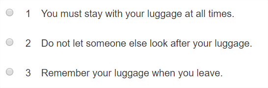
| qti-labels-decimal | Display numeric characters 1, 2, 3, … |
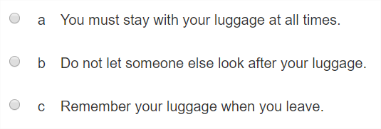
| qti-labels-lower-alpha | Display lowercase characters a, b, c, … |
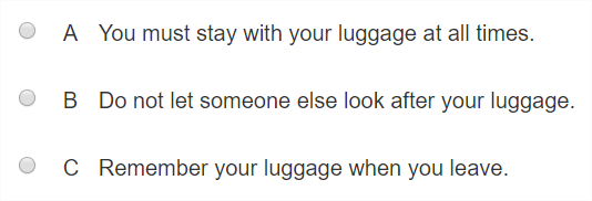
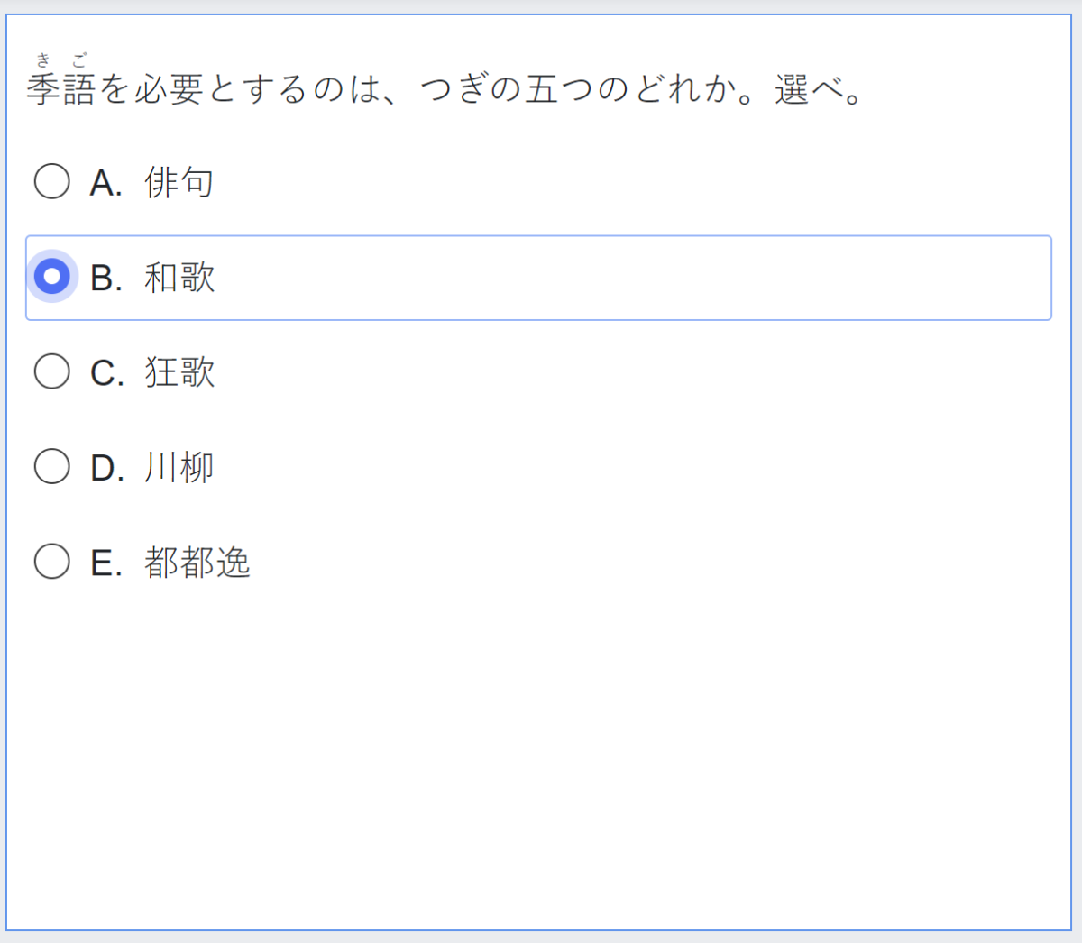
| qti-labels-upper-alpha | Display uppercase characters A, B, C, … |
In the absence of choice labeling, delivery systems should render platform defaults.
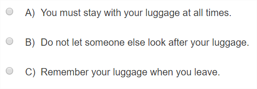
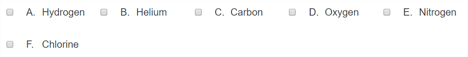
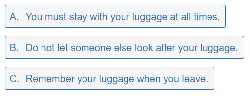
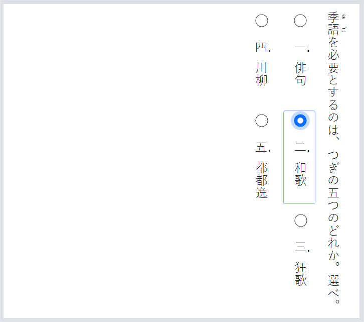
Example: Demonstrates class="qti-labels-none"
|
 |
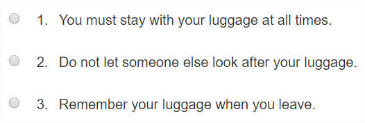
Example: Demonstrates class="qti-labels-decimal"
|
 |
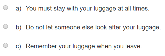
Example: Demonstrates class="qti-labels-lower-alpha"
|
 |
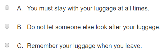
Example: Demonstrates class="qti-labels-upper-alpha"
|
 |
1.2.1.2 Choice Label Suffix
For explicit choice suffix labeling, use the class attribute as follows:
| Values | |
|---|---|
| qti-labels-suffix-none | No character is displayed after the choice label. |
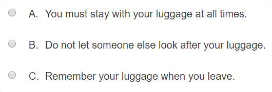
| qti-labels-suffix-period | A period "." character is displayed after the choice label. |
| qti-labels-suffix-parenthesis | A right parenthesis ")" character is displayed after the choice label. |
In the absence of choice suffix labeling, delivery systems should render platform defaults.
Example: Demonstrates class="qti-labels-suffix-none"
|
|
|
Example: Demonstrates class="qti-labels-suffix-period"
|
 |
Example: Demonstrates class="qti-labels-suffix-parenthesis"
|
 |
1.2.1.3 Combining Choice Label and Choice Label Suffix
It is possible to combine choice label and choice label suffix classes in order to make explicit the desired presentation of the label. In the absence of choice labeling and choice suffix labeling, delivery systems should render platform defaults.
Example: Demonstrates class="qti-labels-lower-alpha qti-labels-suffix-parenthesis"
|
 |
Example: Demonstrates class="qti-labels-decimal qti-labels-suffix-period"
|
 |
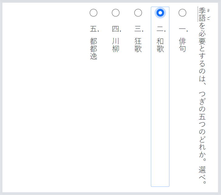
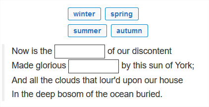
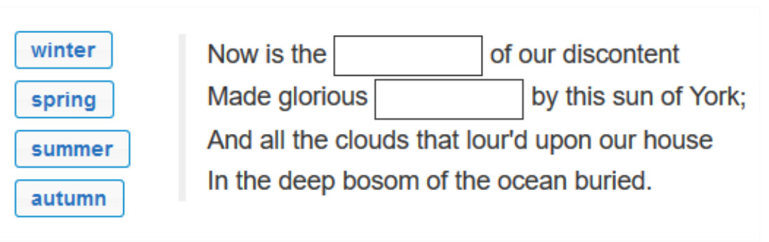
1.2.1.4 Choice Orientation
For explicit choice visual orientation, use the class attribute as follows:
| Values | |
|---|---|
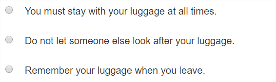
| qti-orientation-vertical | Choices are displayed from top to bottom, vertically. |
| qti-orientation-horizontal | Choices are displayed from left to right, horizontally. |
When displaying horizontally-oriented lists of choices, delivery systems are not expected to display more than five choices in any row.
Example: Demonstrates class="qti-orientation-vertical"
|
 |
Example: Demonstrates class="qti-orientation-horizontal"
|
 |
1.2.1.5 Choice Stacking
For explicit choice stacking, use the class attribute as follows:
| Values | |
|---|---|
| qti-choices-stacking-1 | Choices are stacked in 1 column. |
| qti-choices-stacking-2 | Choices are stacked in 2 columns. |
| qti-choices-stacking-3 | Choices are stacked in 3 columns. |
| qti-choices-stacking-4 | Choices are stacked in 4 columns. |
| qti-choices-stacking-5 | Choices are stacked in 5 columns. |
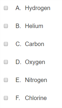
By default, with vertical orientation, default stacking = 1. With horizontal orientation, default stacking equals the number of choices; e.g., if there are 4 choices then default stacking is 4 when orientation is horizontal. Furthermore, when orientation is horizontal, no delivery system is expected to stack more than 5 choices in a single row. In the absence of an orientation class (horizontal or vertical), stacking is implicitly horizontal.
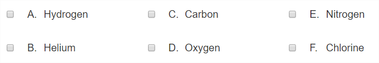
Example: Demonstrates class="qti-choices-stacking-1"
|
 |
Example: Demonstrates class="qti-choices-stacking-2"
|
 |
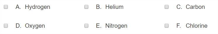
Example: Demonstrates class="qti-choices-stacking-3"
|
 |
Example: Demonstrates class="qti-choices-stacking-4"
|
 |
Example: Demonstrates class="qti-choices-stacking-5"
|
 |
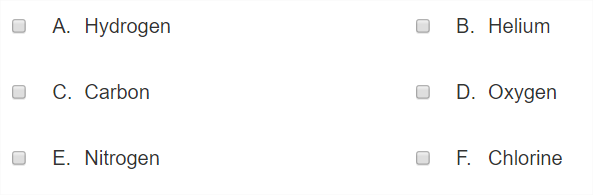
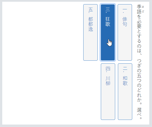
1.2.1.6 Combining Orientation and Choice Stacking
Combining an orientation class with a stacking class is used to explicitly set the visual order of the choices. Horizontal stacking must result in a "Z" order of the choices, while vertical stacking must result in a so-called, "Reverse N" visual order of the choices.
Please see the examples below.
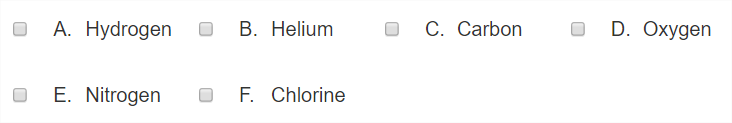
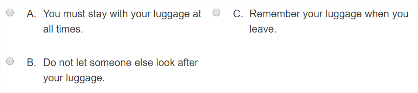
Example: Demonstrates class="qti-choices-stacking-3 qti-orientation-horizontal"
|
|
|
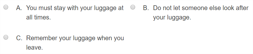
Example: Demonstrates class="qti-choices-stacking-3 qti-orientation-vertical"
|
 |
Example: Demonstrates class="qti-choices-stacking-2 qti-orientation-vertical"
|
 |
Example: Demonstrates class="qti-choices-stacking-2 qti-orientation-horizontal"
|
 |
1.2.1.7 Choice with No Input Control
To specify choice rendering with no input control (radio/checkbox), use the class attribute as follows:
| Values | |
|---|---|
| qti-input-control-hidden | Hide the input controls of the choices. |
When input controls are hidden, delivery systems should ensure that choice presentation follows WCAG 2.0 AA (or better) guidelines for text and images. Hidden in the context of input controls is intended to mean that the controls are only visually hidden – the controls MUST be available programmatically (available for assistive technology).
Example: Demonstrates class="qti-input-control-hidden"
|
 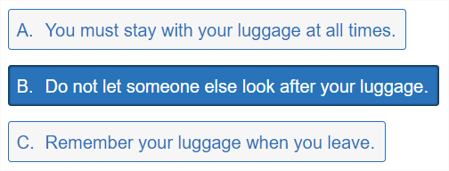 Note: The above two examples include choice labels (A., B., etc.). This is not a part of the expected rendering when qti-input-control-hidden is specified. Delivery platforms may choose a different labeling style except in the case where shared labeling vocabulary is specified. |
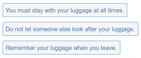
Example: Demonstrates class="qti-input-control-hidden qti-labels-none"
|
 |
1.2.1.8 Choice Interaction Custom max|min-choices Messages
To specify custom max-choices or min-choices messages, use a data- attribute as follows:
| Values | |
|---|---|
| data-max-selections-message | Custom message to be rendered by the delivery platform upon violation of the max-choices constraint. |
| data-min-selections-message | Custom message to be rendered by the delivery platform upon violation of the min-choices constraint. |
In the absence of such custom message overrides, delivery systems should render platform defaults.
1.2.1.9 Vertical Writing for Choice
The following is vocabulary to instrument delivery applications' rendering of interactions in the context of vertical writing content.
| Values | |
|---|---|
| qti-writing-orientation-vertical-rl | Display choices in a vertical orientation, from right to left, choice labels with upright orientation, and choice descriptions with writing mode vertical-rl |
The following example is a rendering with qti-writing-orientation-vertical-rl in qti-choice-interaction rendered with choices flowing from right to left, with labels rendered upright and horizontally, and with writing mode vertical-rl on the choice descriptions.
An example using qti-writing-orientation-vertical-rl, qti-choices-stacking-3, and qti-labels-cjk-ideographic:
| Values | |
|---|---|
| qti-writing-orientation-vertical-lr | Display choices in a vertical orientation, from left to right, choice labels with upright orientation, and choice descriptions with writing mode vertical-lr |
The above is typically used for rendering Mongolian content.
| Values | |
|---|---|
| qti-labels-cjk-ideographic | Display labels with list-style-type cjk-ideographic characters |
The following example renders cjk-ideographic labels rendered horizontally in an upright orientation:
The following example renders qti-input-control-hidden, qti-choices-stacking-2, and qti-labels-cjk-ideographic:
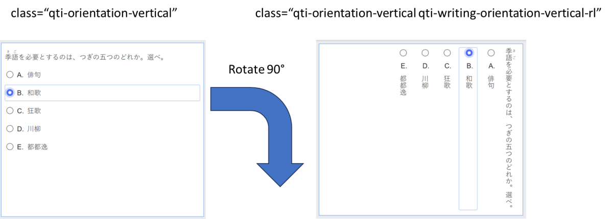
According to QTI best practices, a QtiChoiceInteraction has a default orientation of “vertical”. In other words, a vertically-oriented QtiChoiceInteraction, in the absence of a writing orientation class, should present the choices in order from top to bottom as in the following example:
However, when we add the qti-writing-orientation-vertical-rl class to the above interaction, we are effectively rotating the presentation 90 degrees clockwise and changing the choice labels' orientation to upright as demonstrated in the following diagram.
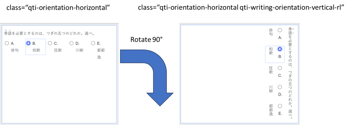
When a QtiChoiceInteraction has an explicit orientation of “horizontal”; e.g., class=”qti-orientation-horizontal” a delivery application is expected to present the choices in order “horizontally”, from left to right, as demonstrated in the following example:
And when we add the qti-writing-orientation-vertical-rl class to the above interaction, we are again effectively rotating the presentation 90 degrees clockwise and changing the choice labels' orientation to upright as demonstrated in the following diagram:
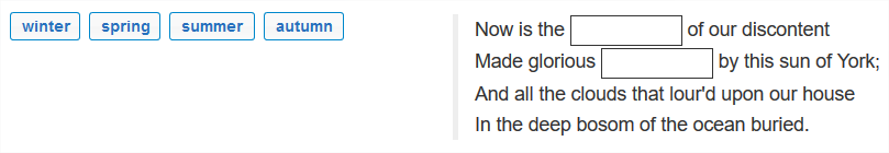
1.2.2 Text Entry Interaction
The bulk of the shared vocabulary for this interaction adds further definition to the presentation width of the input element by utilizing the class attribute.
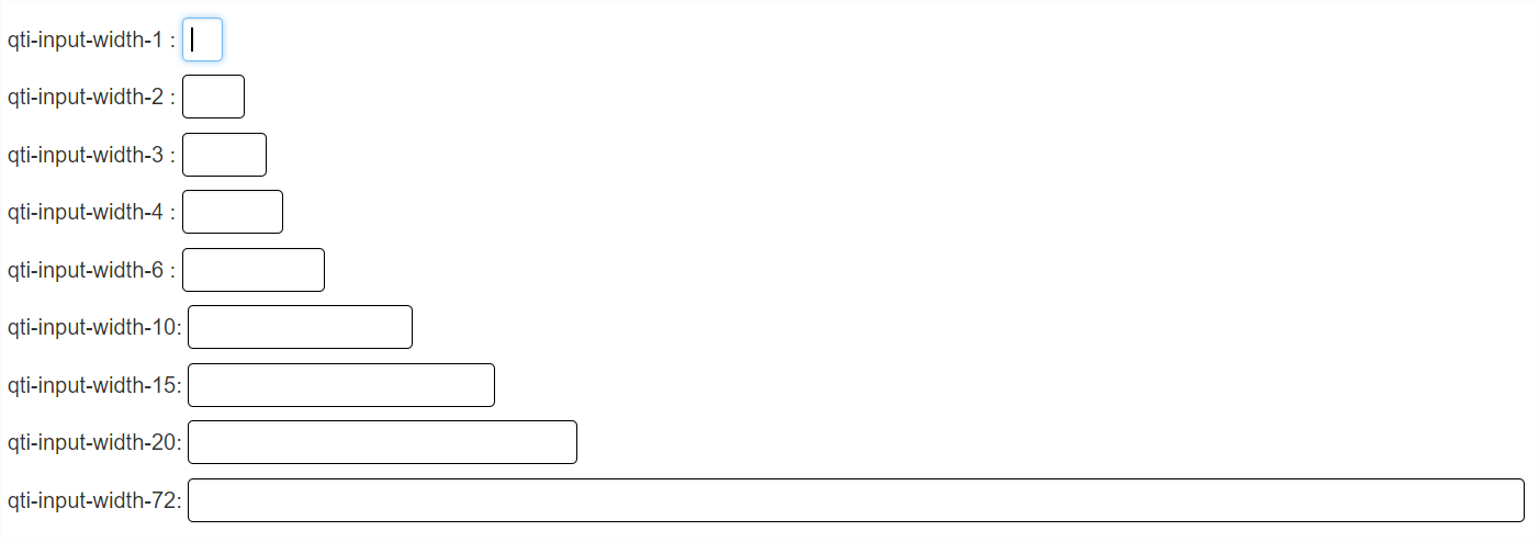
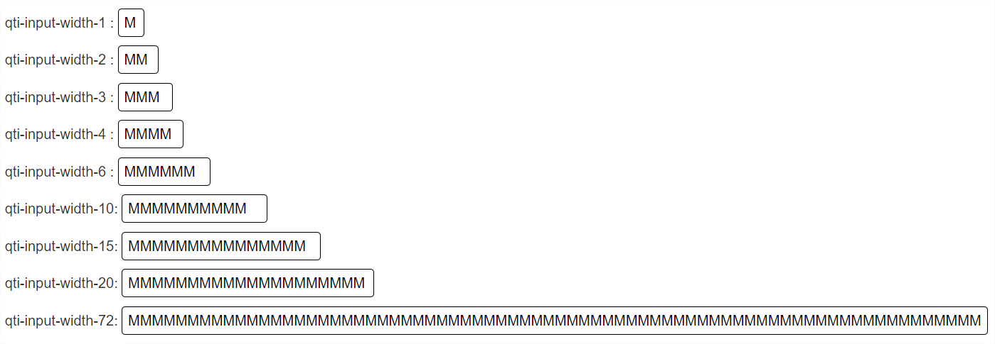
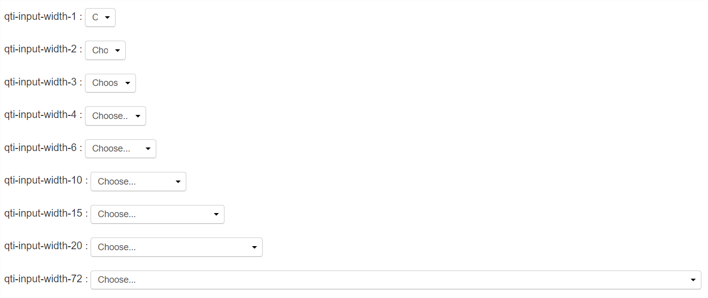
1.2.2.1 Input Width
For input element width definition, use the class attribute as follows:
| Values | |
|---|---|
| qti-input-width-1 | Input element width at least 1 character. |
| qti-input-width-2 | Input element width at least 2 characters. |
| qti-input-width-3 | Input element width at least 3 characters. |
| qti-input-width-4 | Input element width at least 4 characters. |
| qti-input-width-6 | Input element width at least 6 characters. |
| qti-input-width-10 | Input element width at least 10 characters. |
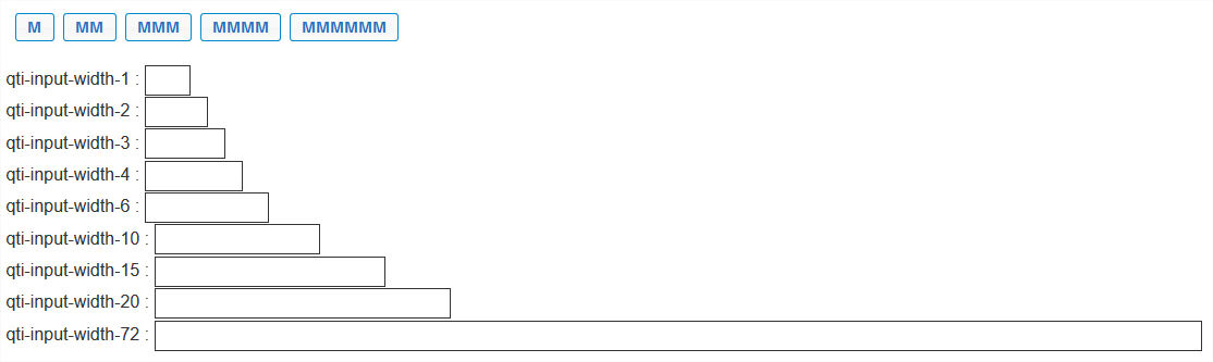
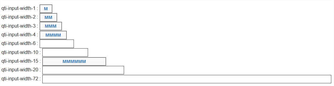
| qti-input-width-15 | Input element width at least 15 characters. |
| qti-input-width-20 | Input element width at least 20 characters. |
| qti-input-width-25 | Input element width at least 25 characters. |
| qti-input-width-30 | Input element width at least 30 characters. |
| qti-input-width-35 | Input element width at least 35 characters. |
| qti-input-width-45 | Input element width at least 45 characters. |
| qti-input-width-50 | Input element width at least 50 characters. |
| qti-input-width-72 | Input element width at least 72 characters. (Intended to be interpreted as the full width of a tablet.) |
The input element widths are intended to provide a general visual impression, and are not expected to exactly match the width of the designated characters. By default, in the absence of any shared vocabulary, the presentation width of the input element is left to the implementer.
Example: Demonstrates various "qti-input-width-1 | 2 | 3 | 4 | 6 | 10 | 15 | 20 | 72" classes (a subset of the classes detailed above).
|
  |
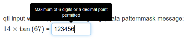
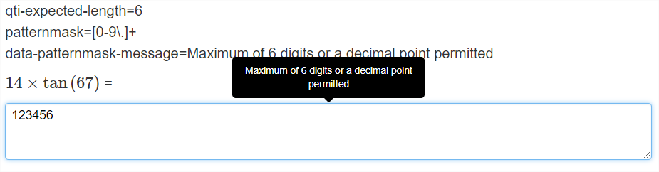
1.2.2.2 Custom Pattern Mask Message
To specify a custom pattern mask message, use a data- attribute as follows:
| Values | |
|---|---|
| data-patternmask-message | Custom message to be rendered by the delivery platform upon violation of the pattern mask constraints. |
Example: Demonstrates data-patternmask-message
|
 |
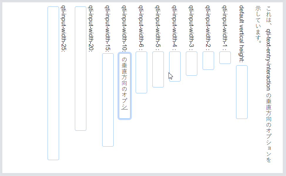
1.2.2.3 Vertical Writing for Text Entry
| Values | |
|---|---|
| qti-writing-orientation-vertical-rl | Display the interaction in a vertical orientation with writing mode vertical-rl (right-to-left) |
The following example shows a vertically-oriented qti-text-entry-interaction rendered inline with surrounding vertical text, and inner text is displayed with writing mode vertical-rl:
The following examples shows a Text Entry interaction with vertical orientation with various qti-input-width(s):
| Values | |
|---|---|
| qti-writing-orientation-vertical-lr | Display the interaction in a vertical orientation with writing mode vertical-lr (left-to-right) |
1.2.3 Extended Text Interaction
The shared vocabulary for the extended text interaction is intended to provide more precision when describing:
- Interaction height
- Character counter behavior
- Plain or Rich Text options
- A custom pattern-mask message
- Placeholder text
Responsive design implies that delivery systems should display an input area (typically, this will be a <textarea> or <div> html element) that has a width equal to 100% of the interaction's encapsulating container. Consequently, there is no shared vocabulary for overriding the width of this interaction.
1.2.3.1 Interaction Height
For input area height definition, use the class attribute as follows:
| Values | |
|---|---|
| qti-height-lines-3 | Input area is approximately 3 lines tall. |
| qti-height-lines-6 | Input area is approximately 6 lines tall. |
| qti-height-lines-15 | Input area is approximately 15 lines tall. |
The input element heights are intended to provide a general visual impression, and are not expected to exactly match the height of the designated lines. By default, in the absence of any shared vocabulary, the presentation height of the input element is left to the implementer.
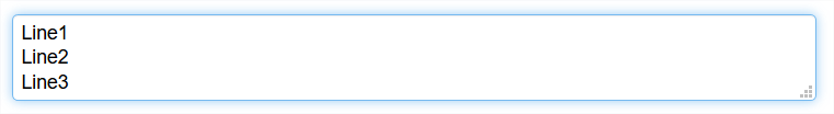
Example: Demonstrates format="plain" and class="qti-height-lines-3"
|
 |
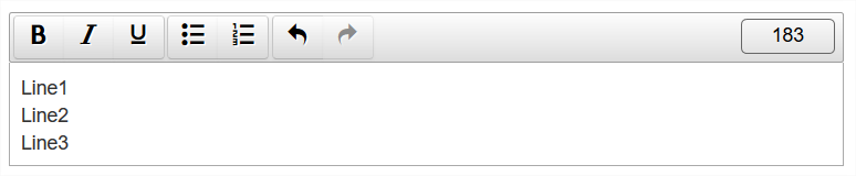
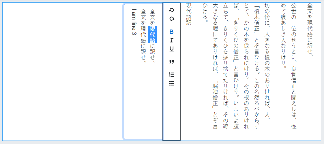
Example: Demonstrates format="xhtml" and class="qti-height-lines-3"
|
 |
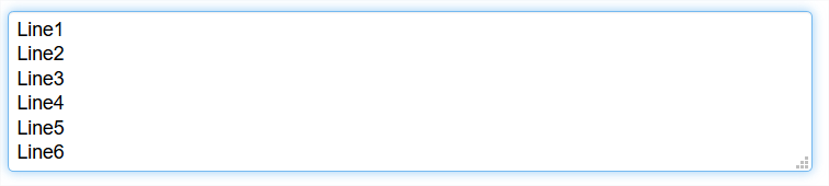
Example: Demonstrates format="plain" and class="qti-height-lines-6"
|
 |
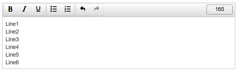
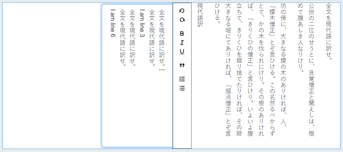
Example: Demonstrates format="xhtml" and class="qti-height-lines-6"
|
 |
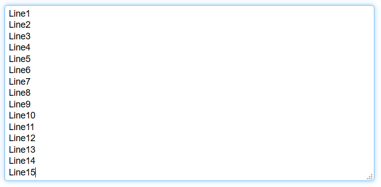
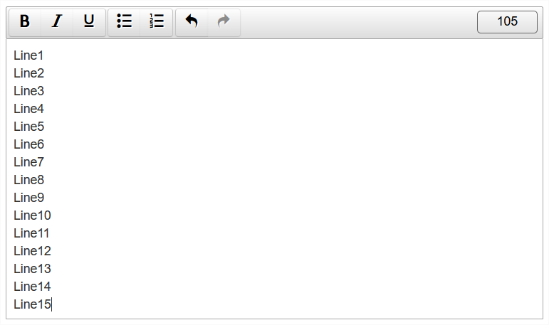
Example: Demonstrates format="plain" and class="qti-height-lines-15"
|
 |
Example: Demonstrates format="xhtml" and class="qti-height-lines-15"
|
 |
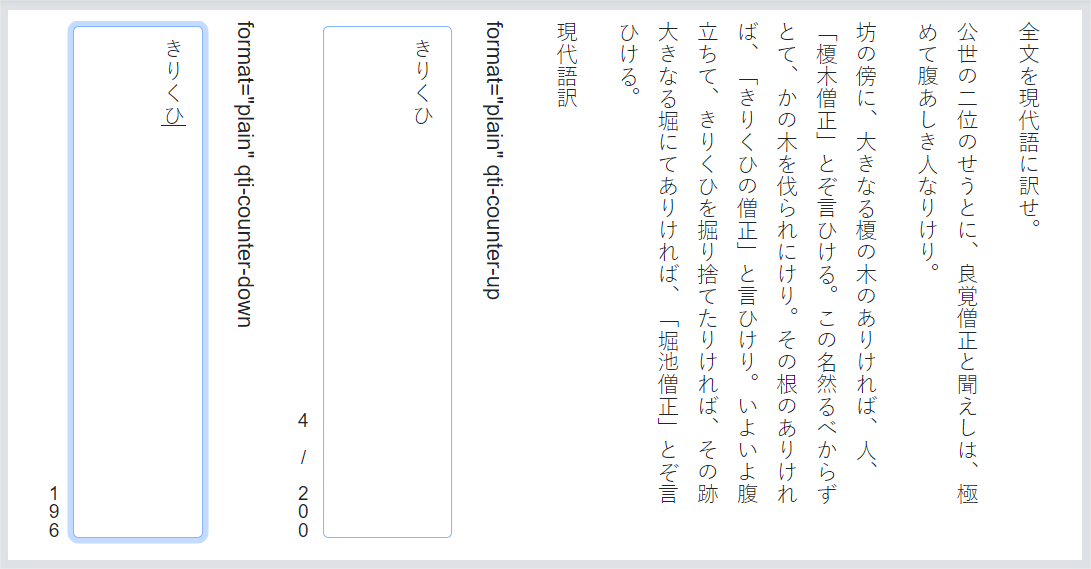
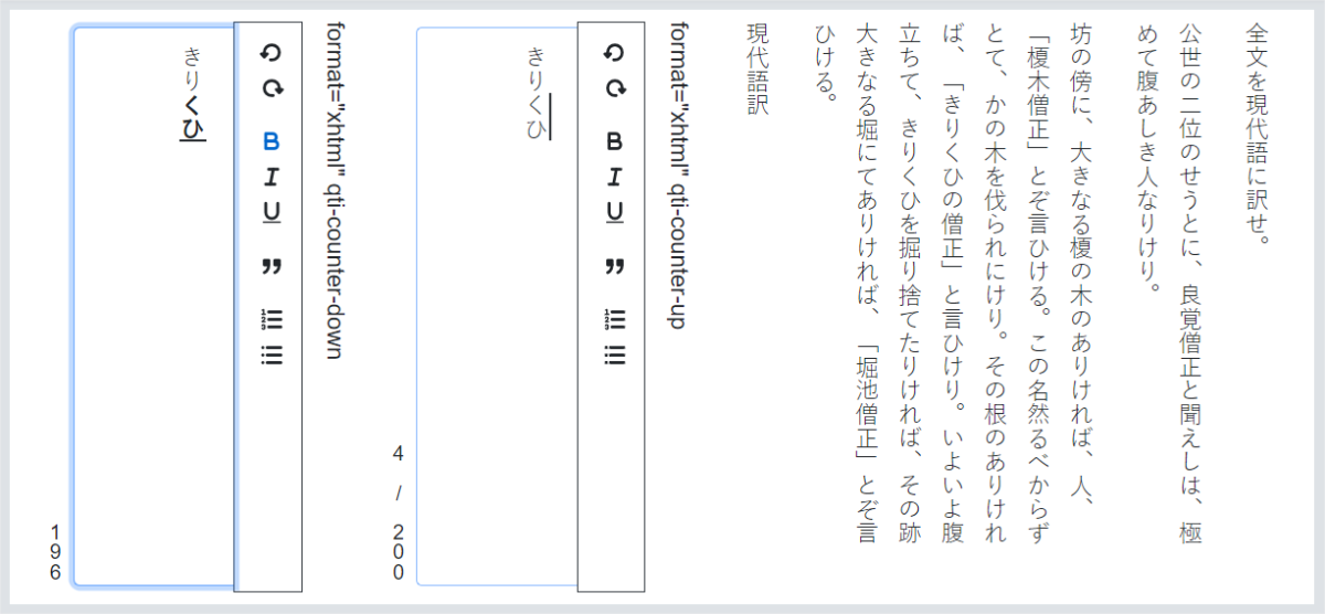
1.2.3.2 Character Counter Behavior
By default, a character counter is not displayed. For specifying character (not word) counter display and behavior, use the class attribute as follows:
| Values | |
|---|---|
| qti-counter-down | Display a character counter, starting at the value of the expected-length attribute and counting down to 0. |
| qti-counter-up | Display a character counter, starting at 0 and increasing to the value of the expected-length attribute. |
In the case where the format of the interaction is "xhtml", the delivery system is expected to count only the text of the markup elements. Example: <span>Hello</span> has 5 characters.
Example: Demonstrates qti-counter-down
|
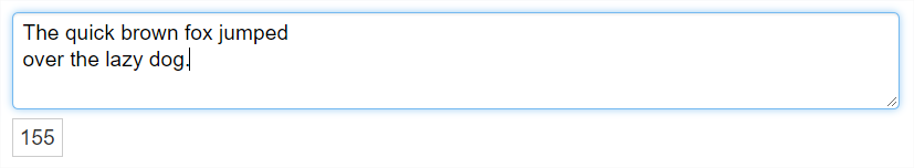 |
Example: Demonstrates qti-counter-up
|
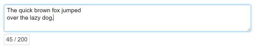 |
Example: Demonstrates qti-counter-up with format="xhtml"
|
 |
1.2.3.3 Custom Pattern Mask Message
To specify a custom pattern mask message, use a data- attribute as follows:
| Values | |
|---|---|
| data-patternmask-message | Custom message to be rendered by the delivery platform upon violation of the pattern mask constraints. |
Example: Demonstrates data-patternmask-message
|
 |
1.2.3.4 Vertical Text for Extended Text
| Values | |
|---|---|
| qti-writing-orientation-vertical-rl | Display the interaction in a vertical orientation with writing mode vertical-rl (right-to-left). |
The following example shows a vertically-oriented qti-extended-text-interaction, writing mode vertical right-to-left (qti-writing-orientation-vertical-rl), with format="plain":
An example of an extended text interaction in a vertical orientation, qti-writing-orientation-vertical-rl
→ qti-height-lines-3 and format="plain":
An example of an extended text interaction in a vertical orientation, qti-writing-orientation-vertical-rl
→ qti-height-lines-6 and format="plain":
An example of an extended text interaction in a vertical orientation, qti-writing-orientation-vertical-rl
→ qti-height-lines-15 and format="plain":
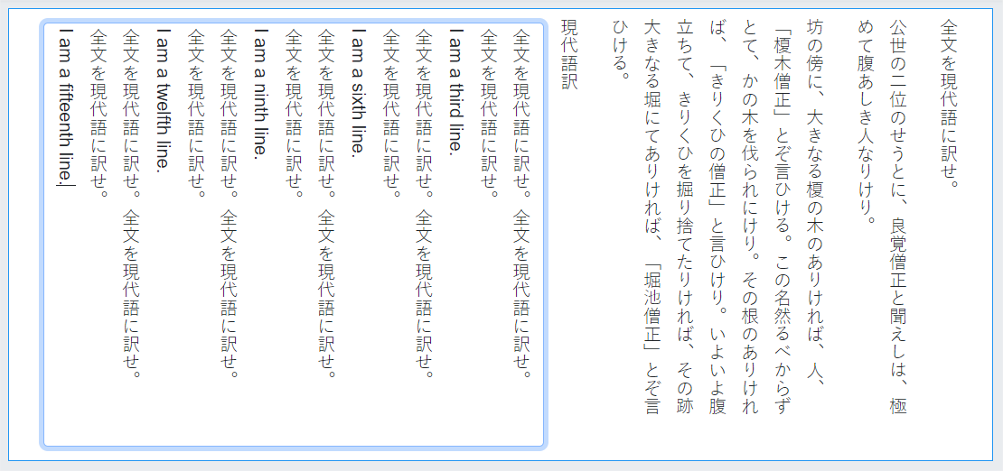
An example of an extended text interaction in a vertical orientation, qti-writing-orientation-vertical-rl
→ qti-height-lines-3, qti-counter-up|down, format="plain" with an expected-length="200":
The following examples use a format="xhtml" with various line heights (meaning line widths in the vertical context).
An example of an extended text interaction in a vertical orientation, qti-writing-orientation-vertical-rl
→ qti-height-lines-3 and format="xhtml":
An example of an extended text interaction in a vertical orientation, qti-writing-orientation-vertical-rl
→ qti-height-lines-6 and format="xhtml":
An example of an extended text interaction in a vertical orientation, qti-writing-orientation-vertical-rl
→ qti-height-lines-15 and format="xhtml":
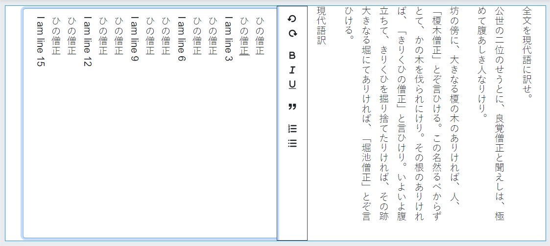
An example of an extended text interaction in a vertical orientation, qti-writing-orientation-vertical-rl
→ qti-height-lines-6, format="xhtml" with an expected-length="200", using qti-counter-up|down:
| Values | |
|---|---|
| qti-writing-orientation-vertical-lr | Display the interaction in a vertical orientation with writing mode vertical-lr (left-to-right). |
1.2.4 Gap Match Interaction
The shared vocabulary for the Gap Match Interaction is intended to provide more precision when describing:
- Positioning of the Gap Choices container with respect to the passage of text containing the Gaps.
- Gap Choices container width.
- Gap element widths.
- Custom max|min-associations message overrides.
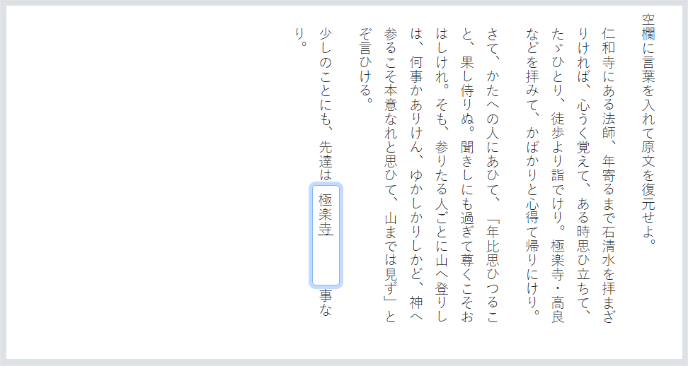
1.2.4.1 Gap Choices Container | Gap Positioning
For explicit gap choices container positioning with respect to the passage text containing the gaps, use the class attribute as follows:
| Values | |
|---|---|
| qti-choices-top | The gap choices container is displayed above the passage text. |
| qti-choices-bottom | The gap choices container is displayed below the passage text. |
| qti-choices-left | The gap choices container is displayed to the left of the passage text. |
| qti-choices-right | The gap choices container is displayed to the right of the passage text. |
The following examples demonstrate shared vocabulary describing the visual orientation of the gap match choices container with respect to the passage text containing the gaps.
Example: Demonstrates class="qti-choices-top"
|
 |
Example: Demonstrates class="qti-choices-bottom"
|
 |
Example: Demonstrates class="qti-choices-left"
|
 |
Example: Demonstrates class="qti-choices-right"
|
 |
1.2.4.2 Gap Choices Container Width
A common implementation of the gap match interaction is to place the gap choices in a so-called "gap choices container". If the gap choices are implemented with responsive design, then one can achieve a visual equivalent of gap choices stacking by manipulating the gap choices container width.
For specifying explicit gap choices container width, use a data- attribute as follows:
| Values | |
|---|---|
| data-choices-container-width | The gap choices container width in pixels. Example: data-choices-container-width="100" |
The assumption is that the container sizes would scale when content is magnified. There is likely to be a significant decrease in the ability for low-vision users to respond to the item who may magnify the content large enough to have portions of the container displayed off-screen.
Example: Demonstrates qti-choices-top and data-choices-container-width="200"
|
 |
Example: Demonstrates qti-choices-left and data-choices-container-width="100"
|
 |
1.2.4.3 Gap Element Input Width
For gap element width definition, use the class attribute as follows:
| Values | |
|---|---|
| qti-input-width-1 | Gap element width at least 1 character. |
| qti-input-width-2 | Gap element width at least 2 characters. |
| qti-input-width-3 | Gap element width at least 3 characters. |
| qti-input-width-4 | Gap element width at least 4 characters. |
| qti-input-width-6 | Gap element width at least 6 characters. |
| qti-input-width-10 | Gap element width at least 10 characters. |
| qti-input-width-15 | Gap element width at least 15 characters. |
| qti-input-width-20 | Gap element width at least 20 characters. |
| qti-input-width-25 | Input element width at least 25 characters. |
| qti-input-width-30 | Input element width at least 30 characters. |
| qti-input-width-35 | Input element width at least 35 characters. |
| qti-input-width-40 | Input element width at least 40 characters. |
| qti-input-width-45 | Input element width at least 45 characters. |
| qti-input-width-50 | Input element width at least 50 characters. |
| qti-input-width-72 |
Gap element width at least 72 characters. (Intended to be interpreted as the full width of a tablet.) |
The gap element widths are intended to provide a general visual impression. By default, in the absence of any shared vocabulary, the presentation width of a gap element is left to the implementer.
Note that the assumption is that input sizes scale with increased magnification of the content, though the input areas should never wrap to another line of text. Limits on scaling could be problematic for low-vision candidates, particularly at higher levels of magnification.
Example: Demonstrates all gap element "qti-input-widths-1 | 2 | 3 | 4 | 6 | 10 | 15 | 20 | 72" classes (a subset of the classes detailed above).
|
 |
1.2.4.4 Gap Match Custom max|min-associations Messages
To specify custom max-associations or min-associations messages, use a data- attribute as follows:
| Values | |
|---|---|
| data-max-selections-message | Custom message to be rendered by the delivery platform upon violation of the max-associations constraint. |
| data-min-selections-message | Custom message to be rendered by the delivery platform upon violation of the min-associations constraint. |
In the absence of such custom message overrides, delivery systems should render platform defaults.
1.2.5 Hotspot Interaction
The shared vocabulary for the Hotspot Interaction is intended to provide more precision when describing:
- Hotspot Selections theming.
- Custom max|min-choices message overrides.
1.2.5.1 Hotspot Selections Theming
For explicit hotspot selection theming, use the class attribute as follows:
| Values | |
|---|---|
| qti-selections-light | Delivery platform must implement hotspot selections in a color that the platform believes to be of suitable color contrast and opacity against a "dark" background image. |
| qti-selections-dark | Delivery platform must implement hotspot selections in a color that the platform believes to be of suitable color contrast and opacity against a "light" background image. |
| qti-unselected-hidden | Hotspot selections are visually hidden until focused or selected. |
When using qti-selections-dark and qti-selections-light classes, the intent is to increase the contrast between the selections and the background, to ensure candidates can clearly identify the selections. In the absence of such hotspot selection theming overrides, delivery systems should render platform defaults.
For qti-unselected-hidden, note that there is an obvious visual bias for these types of questions. In addition, the selection should only be visually-hidden. Selections should always be programmatically available (usable by keyboards and assistive technology) to candidates.
Example: Demonstrates Hotspot selections with class="qti-selections-light" and class="qti-selections-dark"
|
|
Expected Rendering: Hotspot selections are rendered with colors and opacities of the delivery platform's choosing. In the two hotspot interactions below, two of the four hotspots are selected, and two are unselected. All hotspots are visible, even in their unselected state, though this is left to the delivery platform. 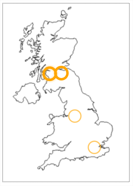 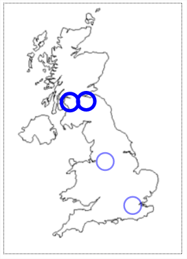 |
Example: Demonstrates Hotspot selections with class= " qti-selections-light " and class= " qti-selections-dark " , and " qti-unselected-hidden " in both.
|
|
Expected Rendering: Hotspots are rendered invisible in their unselected and unfocused state, with visible colors and opacities of the platform's choosing in their selected state. In the two hotspot interactions below, two of the four hotspots are selected (visible), and two are unselected and unfocused (invisible).  
|
1.2.5.2 Hotspot Interaction Custom max|min-choices Messages
To specify custom max-choices or min-choices messages, use a data- attribute as follows:
| Values | |
|---|---|
| data-max-selections-message | Custom message to be rendered by the delivery platform upon violation of the max-choices constraint. |
| data-min-selections-message | Custom message to be rendered by the delivery platform upon violation of the min-choices constraint. |
In the absence of such custom message overrides, delivery systems should render platform defaults.
1.2.6 Hot Text Interaction
The shared vocabulary for the Hot Text Interaction is intended to provide more precision when describing:
- Hiding the input control of the Hot Text choices.
- Custom max|min-choices message overrides.
1.2.6.1 Hot Text Choices with No Input Controls
To specify Hot Text choice rendering with no input control (radio/checkbox), use the class attribute as follows:
| Values | |
|---|---|
| qti-input-control-hidden | Hide the input controls of the Hot Text choices. |
When input controls are hidden, delivery systems should ensure that choice presentation follows WCAG 2.0 AA (or better) guidelines for text and images. By default, in the absence of any shared vocabulary, the presentation of input controls on the Hot Text elements is left to the delivery system.
Example: Demonstrates class="qti-input-control-hidden"
|
  |
1.2.6.2 Hot Text Interaction Custom max|min-choices Messages
To specify custom max-choices or min-choices messages, use a data- attribute as follows:
| Values | |
|---|---|
| data-max-selections-message | Custom message to be rendered by the delivery platform upon violation of the max-choices constraint. |
| data-min-selections-message | Custom message to be rendered by the delivery platform upon violation of the min-choices constraint. |
In the absence of such custom message overrides, delivery systems should render platform defaults.
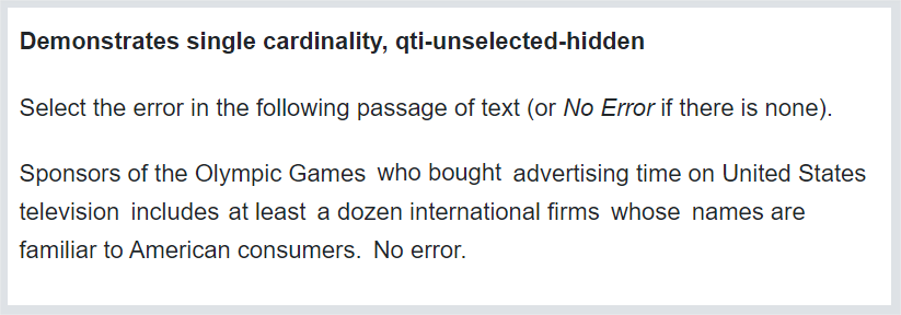
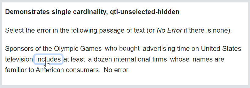
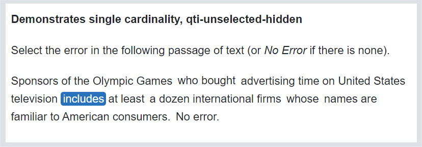
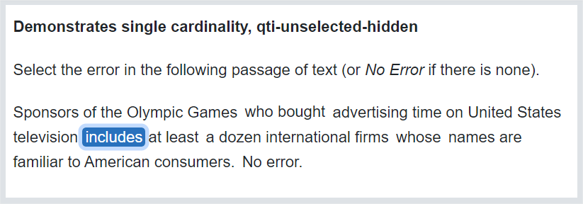
1.2.6.3 Hot text with no visual indication of the unselected choices
When you wish to have no visual indication of the hot text choices (no buttons, highlighting, or borders), use the qti-unselected-hidden class in the qti-hottext-interaction element.
The following visual examples are suggested renderings for the various states representing the choices without focus or selection, or with focus and/or selection. The exact rendering may vary across delivery applications.
Text where the available choices have no visual indication of the possible choices, and none of the possible choices have beeen selected or are in focus:
Text where one of the possible choices is in focus (via mouse hover or keyboard focus):
Text where one of the possible choices has been selected as the answer:
Text where one of the possible choices has been selected as the answer and still has programmatic focus (mouse hover or keyboard focus):
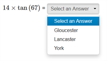
1.2.7 Inline Choice Interaction
The bulk of the shared vocabulary for this interaction adds further definition to the presentation width of the selection element by utilizing the class attribute.
1.2.7.1 Input Width
For selection element width definition, use the class attribute as follows:
| Values | |
|---|---|
| qti-input-width-1 | Selection element width at least 1 character. |
| qti-input-width-2 | Selection element width at least 2 characters. |
| qti-input-width-3 | Selection element width at least 3 characters. |
| qti-input-width-4 | Selection element width at least 4 characters. |
| qti-input-width-6 | Selection element width at least 6 characters. |
| qti-input-width-10 | Selection element width at least 10 characters. |
| qti-input-width-15 | Selection element width at least 15 characters. |
| qti-input-width-20 | Selection element width at least 20 characters. |
| qti-input-width-25 | Input element width at least 25 characters. |
| qti-input-width-30 | Input element width at least 30 characters. |
| qti-input-width-35 | Input element width at least 40 characters. |
| qti-input-width-45 | Input element width at least 45 characters. |
| qti-input-width-50 | Input element width at least 50 characters. |
| qti-input-width-72 | Selection element width at least 72 characters.(Intended to be interpreted as the full width of a tablet.) |
The selection element widths are intended to provide a general visual impression, and are not expected to exactly match the width of the designated characters. By default, in the absence of any shared vocabulary, the presentation width of the selection element is left to the implementer.
Example: Demonstrates various "qti-input-width-1 | 2 | 3 | 4 | 6 | 10 | 15 | 20 | 72" classes (a subset of the classes detailed above).
|
 |
1.2.7.2 Custom Prompt Messages
Delivery systems may display a word or a phrase - a so-called, "prompt" - inside the boundaries of the selection element when the element is in an unselected state. To specify custom text, use a data- attribute as follows:
| Values | |
|---|---|
| data-prompt | Custom text to be rendered by the delivery platform when the selection element is in an unselected state. |
In the absence of custom prompt overrides, delivery systems should render platform defaults.
Example: Demonstrates data-prompt
|
 |
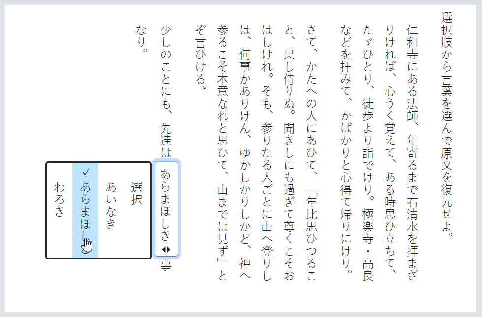
1.2.7.3 Vertical Text for Inline Choice
| Values | |
|---|---|
| qti-writing-orientation-vertical-rl | Display the interaction in a vertical orientation, with choices flowing from right to left and choices writing mode vertical-rl. |
The following example shows an inline interaction vertically-oriented qti-inline-choice-interaction rendered inline with surrounding vertical text, with choices flowing from right to left:
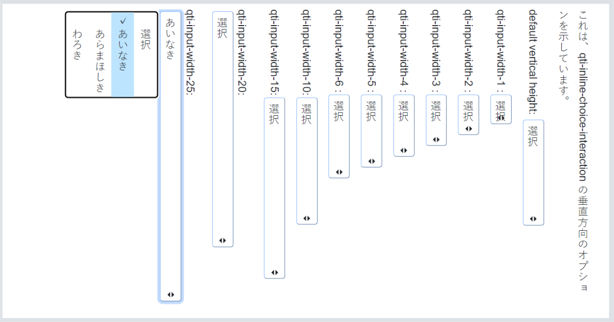
The example below shows an inline interaction vertically-oriented with various input widths for the choices:
1.2.8 Match Interaction
The shared vocabulary for the Match Interaction is intended to provide more precision when describing:
- Non-tabular Match Interaction positioning of the first Simple Match Set choices with respect to the second Simple Match Set choices.
- Tabular Match Interaction styling.
- Custom max|min-associations message overrides.
1.2.8.1 Non-Tabular Match Interaction Choice | Target Positioning
For explicit choice | target positioning, use the class attribute as follows:
| Values | |
|---|---|
| qti-choices-top | The first Simple Match Set choices are displayed above the second Simple Match Set choices. |
| qti-choices-bottom | The first Simple Match Set choices are displayed below the second Simple Match Set choices. |
| qti-choices-left | The first Simple Match Set choices are displayed to the left of the second Simple Match Set choices. |
| qti-choices-right | The first Simple Match Set choices are displayed to the right of the second Simple Match Set choices. |
Note about accessibility when using targeting position classes: there may be issues related to the order that choices and targets are presented to assistive technology candidates. If the candidate is known to be using assistive technology (screen readers), by default the choices should be presented first, followed by the targets second.
The following examples demonstrate shared vocabulary describing the visual orientation of the list of match choices; i.e., the choices of the first Simple Match Set, with respect to the list of match targets; i.e., the choices of the second Simple Match Set.
Example: Demonstrates class="qti-choices-top"
|
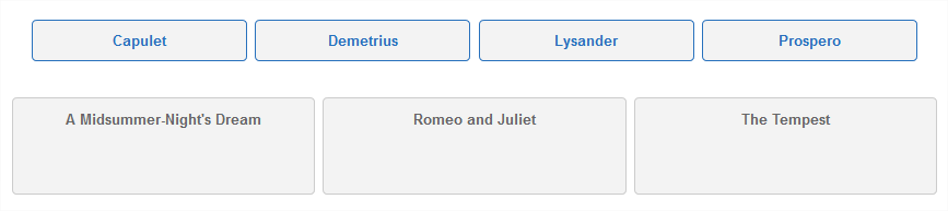 |
Example: Demonstrates class="qti-choices-bottom"
|
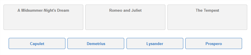 |
Example: Demonstrates class="qti-choices-left"
|
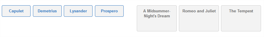 |
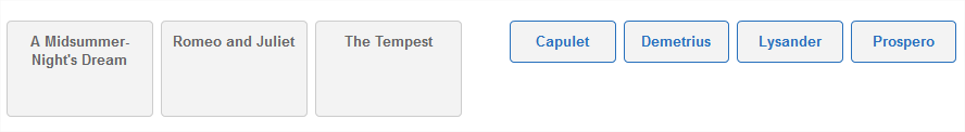
Example: Demonstrates class="qti-choices-right"
|
 |
1.2.8.2 Tabular Match Interactions
Delivery systems may implement Match Interaction's in a visual Tabular fashion. When they do so, the shared vocabulary is intended to provide visual styles and content to improve interoperability and visual consistency.
For explicit Tabular embodiments of Match Interactions, use the class attribute:
| Values | |
|---|---|
| qti-match-tabular | Render a visual table with the choices of the first Simple Match Set as the table row headers, and the choices of the second Simple Match Set as the table column headers. |
| qti-header-hidden | For certain presentations, it can be advantageous to hide the column headers. This class enables this presentation. Do not display the top row of the table where the column headers are displayed. |
Class qti-header-hidden, and data- attribute data-first-column-header (see below) are only relevant when qti-match-tabular is specified.
To specify the text of the top-left header cell of the table, use a data- attribute as follows:
| Values | |
|---|---|
| data-first-column-header | Custom text to be rendered in the top-left header cell of the table (headings must be visible). |
A note about accessibility when using qti-match-tabular: there are known issues for assistive technology users (screen readers in particular) when putting content into tables. There are sometimes differences between screen readers in the order that content is read out loud. Because the cells contain interactive controls, assistive technology needs to be able to provide navigation within the table (between the cells) as well as coordinating the match interaction. If any possible candidates may be using screen readers to respond to match interactions, using HTML tables may not be the best choice for presentation.
In addition, there is a likely negative impact to assistive technology candidates when using the qti-header-hidden, as the headers are used to orient assistive technology users.
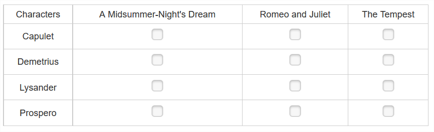
The following examples show expected rendering when class is qti-match-tabular.
Example: Demonstrates class="qti-match-tabular"
|
 |
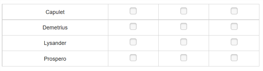
Example: Demonstrates class="qti-match-tabular qti-header-hidden"
|
 |
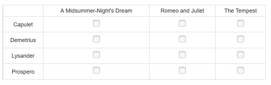
Example: Demonstrates class="qti-match-tabular" data-first-column-header="Characters"
|
 |
1.2.8.3 Match Custom max|min-associations Messages
To specify custom max-associations or min-associations messages, use a data- attribute as follows:
| Values | |
|---|---|
| data-max-selections-message | Custom message to be rendered by the delivery platform upon violation of the max-associations constraint. |
| data-min-selections-message | Custom message to be rendered by the delivery platform upon violation of the min-associations constraint. |
In the absence of such custom message overrides, delivery systems should render platform defaults.
1.2.9 Order Interaction
1.2.9.1 Order Target Labels
In certain rendering embodiments where the ordering choices are separated from an ordering target area, it may be desirable to specify labels for the order target elements. For explicit labeling of order target elements, use the same classes as for choice interaction; i.e., use the class attribute as follows:
| Values | |
|---|---|
| qti-labels-none | No labels displayed (default) |
| qti-labels-decimal | Display numeric characters 1, 2, 3, … |
| qti-labels-lower-alpha | Display lowercase characters a, b, c, … |
| qti-labels-upper-alpha | Display uppercase characters A, B, C, … |
In the absence of order target labeling, delivery systems should render platform defaults.
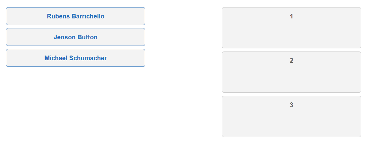
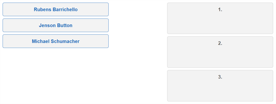
Example: Demonstrates qti-choices-top and qti-labels-none
|
 |
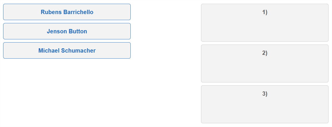
Example: Demonstrates qti-choices-top and qti-labels-decimal
|
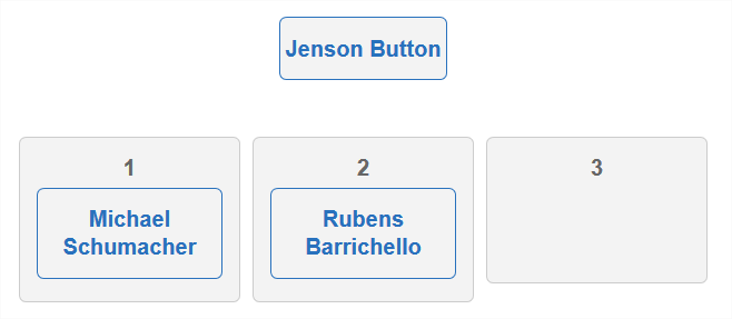 |
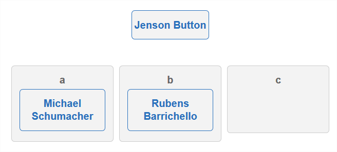
Example: Demonstrates qti-choices-top and qti-labels-lower-alpha
|
 |
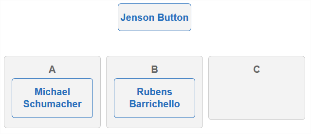
Example: Demonstrates qti-choices-top and qti-labels-upper-alpha
|
 |
1.2.9.2 Order Target Label Suffixes
For explicit suffix labeling of order target elements, use the same classes as for choice interaction; i.e., use the class attribute as follows:
| Values | |
|---|---|
| qti-labels-suffix-none | No character is displayed after the order target label. |
| qti-labels-suffix-period | A period "." character is displayed after the order target label. |
| qti-labels-suffix-parenthesis | A right parenthesis ")" character is displayed after the order target label. |
In the absence of order target suffix labeling, delivery systems should render platform defaults.
Example: Demonstrates qti-choices-left and qti-labels-decimal and qti-labels-suffix-none
|
 |
Example: Demonstrates qti-choices-left and qti-labels-decimal and qti-labels-suffix-period
|
 |
Example: Demonstrates qti-choices-left and qti-labels-decimal and qti-labels-suffix-parenthesis
|
 |
1.2.9.3 Ordering Choices | Order Target Container Positioning
For explicit ordering choice | order target container positioning, use the class attribute as follows:
| Values | |
|---|---|
| qti-choices-top | The choices container is displayed above the order target container |
| qti-choices-bottom | The choices container is displayed below the order target container |
| qti-choices-left | The choices container is displayed to the left of the order target container |
| qti-choices-right | The choices container is displayed to the right of the order target container |
In the absence of choices | order target container positioning, delivery systems should render platform defaults.
Example: Demonstrates class="qti-choices-top"
|
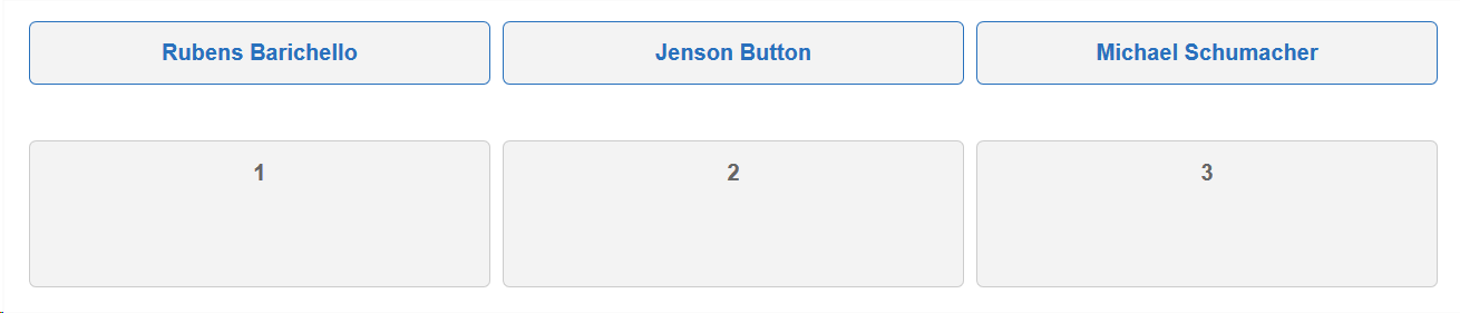 |
Example: Demonstrates class="qti-choices-bottom"
|
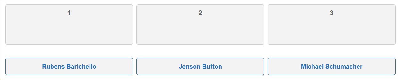 |
Example: Demonstrates class="qti-choices-left"
|
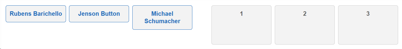 |
Example: Demonstrates class="qti-choices-right"
|
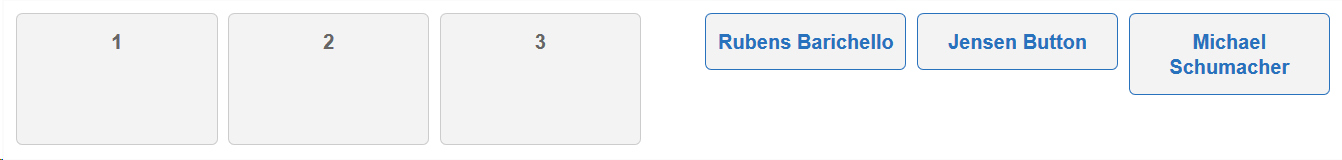 |
1.2.9.4 Ordering Choices Container Width
For specifying explicit ordering choices container width, use a data- attribute as follows:
| Values | |
|---|---|
| data-choices-container-width | The ordering choices container width in pixels. Example: data-choices-container-width="100" |
1.2.9.5 Ordering Custom max|min-selections Messages
To specify custom max-choices or min-choices messages, use a data- attribute as follows:
| Values | |
|---|---|
| data-max-selections-message | Custom message to be rendered by the delivery platform upon violation of the max-choices constraint. |
| data-min-selections-message | Custom message to be rendered by the delivery platform upon violation of the min-choices constraint. |
1.2.10 Graphic Gap Match Interaction
The shared vocabulary for the Graphic Gap Match Interaction is intended to provide more precision when describing:
- Positioning of the Gap Choices container with respect to the image containing the hotspots.
- Gap Choices container width.
- Associable Hotspot Selections theming.
- Custom max|min-associations message overrides.
1.2.10.1 Gap Choices Container | Image Positioning
For explicit gap choices container positioning with respect to the passage text containing the gaps, use the class attribute as follows:
| Values | |
|---|---|
| qti-choices-top | The gap choices container is displayed above the image. |
| qti-choices-bottom | The gap choices container is displayed below the image. |
| qti-choices-left | The gap choices container is displayed to the left of the image. |
| qti-choices-right | The gap choices container is displayed to the right of the image. |
The following examples demonstrate shared vocabulary describing the visual orientation of the gap choices container with respect to the image containing the hotspots.
Example: Demonstrates class="qti-choices-top"
|
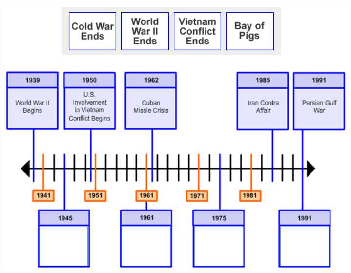 |
Example: Demonstrates class="qti-choices-bottom"
|
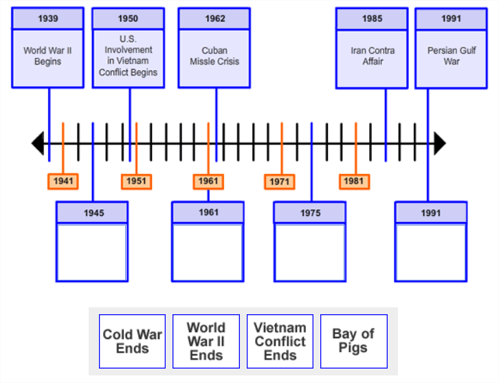 |
Example: Demonstrates class="qti-choices-left"
|
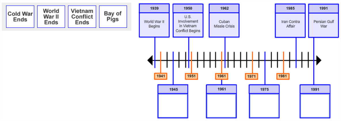 |
Example: Demonstrates class="qti-choices-right"
|
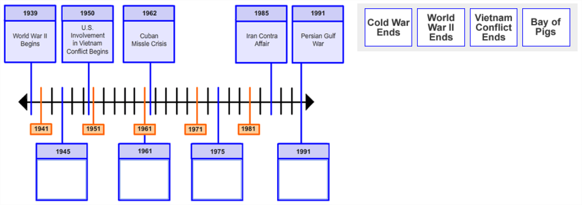 |
1.2.10.2 Choices Container Width
A common implementation of the graphic gap match interaction is to place the gap choices in a so-called, "gap choices container". One can achieve a visual equivalent of gap choices stacking by manipulating the gap choices container width.
For specifying explicit gap choices container width, use a data- attribute as follows:
| Values | |
|---|---|
| data-choices-container-width | The gap choices container width in pixels. Example: data-choices-container-width="100" |
Example: Demonstrates qti-choices-top and data-choices-container-width="188"
|
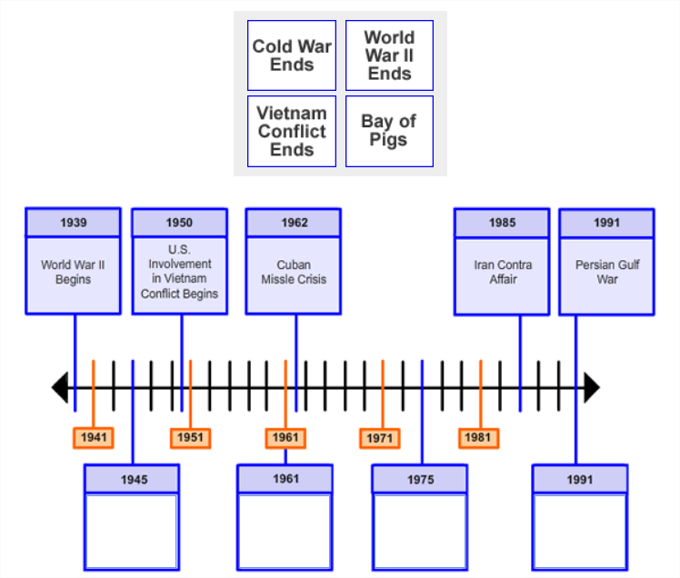 |
Example: Demonstrates qti-choices-left and data-choices-container-width="100"
|
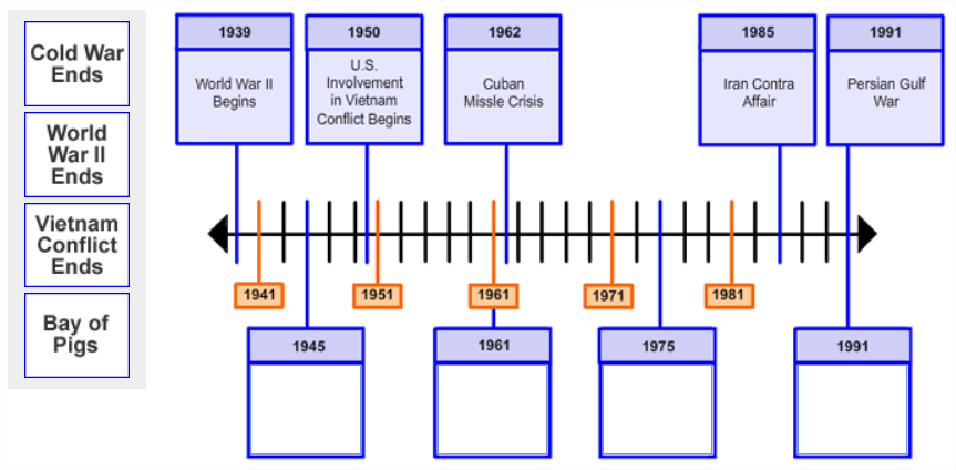 |
1.2.10.3 Graphic Gap Match Hotspot Selections Theming
For explicit associable hotspot selection theming, use the class attribute as follows:
| Values | |
|---|---|
| qti-selections-light | Delivery platform must implement associable hotspot selections in a color that the platform believes to be of suitable color contrast and opacity against a "dark" background image. |
| qti-selections-dark | Delivery platform must implement associable hotspot selections in a color that the platform believes to be of suitable color contrast and opacity against a "light" background image. |
| qti-unselected-hidden | Delivery platform must implement associable hotspot selections that are visually hidden (no visual border and no fill) unless a candidate is actively attempting to match gap choices with the selections. |
In the absence of such selections theming overrides, delivery systems should render platform defaults. When using qti-selections-dark and qti-selections-light classes, the intent is to increase the contrast between the selections and the background, to ensure candidates can clearly identify the selections.Use qti-selections-light to indicate that the selection lines and fills should be lighter than usual to accommodate for the background image. Use qti-selections-dark to indicate that the selection lines and fills should be darker than usual to accommodate for the background image.
For qti-unselected-hidden, note that there is an obvious visual bias for these types of questions. In addition, the selection should only be visually-hidden. If a candidate is known to have low-vision indications in their PNP, the class should be ignored, and the selection should NOT be visually hidden. Selections should always be programmatically available (usable by keyboards and assistive technology).
Example: Demonstrates Associable Hotspot selections with class="qti-selections-light"
|
 |
Example: Demonstrates Associable Hotspot selections with class="qti-selections-dark"
|
 |
1.2.10.4 Graphic Gap Match Custom max|min-associations Messages
To specify custom max-associations or min-associations messages, use a data- attribute as follows:
| Values | |
|---|---|
| data-max-selections-message | Custom message to be rendered by the delivery platform upon violation of the max-associations constraint. |
| data-min-selections-message | Custom message to be rendered by the delivery platform upon violation of the min-associations constraint. |
In the absence of such custom message overrides, delivery systems should render platform defaults.
1.2.11 Media Interaction
1.2.11.1 Data-attribute = data-qti-media-player-controls
By including the "controls" attribute in the HTML "video" element, you can indicate that video controls are to be displayed to the candidate, where the candidate would be provided with the default video controls. The data-qti-media-player-controls attribute can be used to indicate which specific controls you wish to display to the candidate.
The acceptable values for data-qti-media-player-controls:
- none
- default
- play
- rewind
- captions
- audioDescription
1.2.11.2 Data-attribute = qti-media-player-pause-delay
To indicate the length of pauses, use qti-media-player-pause-delay, where the value is the number of seconds of the delay before starting playback. This gives the ability to author a time in seconds to allow for a delay/pause in the start or resumption after a user-initiated pause of an audio file when a user presses the play button. This delay is needed so that any screen reader announcements have time to complete before the audio is heard, avoiding conflicting audio streams for the screen reader user.
1.2.11.3 Data-attribute = qti-media-player-pause-duration
For the duration of the pause, use qti-media-player-pause-duration, where the value is the number of seconds of the pause. This gives the ability to author a time in seconds to indicate the length of user-initiated pauses of audio that also has an interactive progress bar. Item authors/content specialists need to be able to indicate how long a pause should last so that it is appropriate for the content and the construct being measured.
1.2.11.4 Data-attribute = qti-media-player-pause-count
To indicate the number of times media can be paused during playback, use qti-media-player-pause-count where the value is an integer > 0 . Item authors and content specialists need to be able to indicate how many pauses are available to a user so that it is appropriate for the content and the construct being measured. Note that without this data and where the candidate is given controls, the candidate is presumed to have an unlimited number of pauses.
A. List of Contributors
The following individuals contributed to the development of this document:
| Name | Organization | Role |
|---|---|---|
| Arjan Aarnink | Cito | |
| Shiva Bojjawar | McGraw-Hill Education | |
| Paul Grudnitski | amp-up.io | Editor |
| Mark Hakkinen | ETS | Co-chair |
| Susan Haught | 1EdTech | |
| Thomas Hoffmann | 1EdTech | Editor |
| Mark Molenaar | Apenutmize | |
| Padraig O'hiceadha | Houghton Mifflin Harcourt | Co-chair |
| Mike Powell | Pearson | Co-chair |
| Julien Sebire | Open Assessment Technologies | |
| Colin Smythe | 1EdTech | Editor |
| Wyatt Vanderstucken | ETS |


