QTI v3 Best Practices and Implementation Guide
Question & Test Interoperability (QTI) 3.0 Best Practices and Implementation Guide

Spec Version 3.0.1
| Document Version: | 2.0 |
| Date Issued: | 1 October 2024 |
| Status: | This document is made available for adoption by the public community at large. |
| This version: | https://www.imsglobal.org/spec/qti/v3p0/impl/ |
IPR and Distribution Notice
Recipients of this document are requested to submit, with their comments, notification of any relevant patent claims or other intellectual property rights of which they may be aware that might be infringed by any implementation of the specification set forth in this document, and to provide supporting documentation.
1EdTech takes no position regarding the validity or scope of any intellectual property or other rights that might be claimed to pertain implementation or use of the technology described in this document or the extent to which any license under such rights might or might not be available; neither does it represent that it has made any effort to identify any such rights. Information on IMS's procedures with respect to rights in 1EdTech specifications can be found at the 1EdTech Intellectual Property Rights webpage: http://www.imsglobal.org/ipr/imsipr_policyFinal.pdf .
The following participating organizations have made explicit license commitments to this specification:
| Org name | Date election made | Necessary claims | Type |
|---|---|---|---|
| CITO | March 11, 2022 | No | RF RAND (Required & Optional Elements) |
| HMH | March 11, 2022 | No | RF RAND (Required & Optional Elements) |
Use of this specification to develop products or services is governed by the license with 1EdTech found on the 1EdTech website: http://www.imsglobal.org/speclicense.html.
Permission is granted to all parties to use excerpts from this document as needed in producing requests for proposals.
The limited permissions granted above are perpetual and will not be revoked by 1EdTech or its successors or assigns.
THIS SPECIFICATION IS BEING OFFERED WITHOUT ANY WARRANTY WHATSOEVER, AND IN PARTICULAR, ANY WARRANTY OF NONINFRINGEMENT IS EXPRESSLY DISCLAIMED. ANY USE OF THIS SPECIFICATION SHALL BE MADE ENTIRELY AT THE IMPLEMENTER'S OWN RISK, AND NEITHER THE CONSORTIUM, NOR ANY OF ITS MEMBERS OR SUBMITTERS, SHALL HAVE ANY LIABILITY WHATSOEVER TO ANY IMPLEMENTER OR THIRD PARTY FOR ANY DAMAGES OF ANY NATURE WHATSOEVER, DIRECTLY OR INDIRECTLY, ARISING FROM THE USE OF THIS SPECIFICATION.
Public contributions, comments and questions can be posted here: http://www.imsglobal.org/forums/ims-glc-public-forums-and-resources .
© 2024 1EdTech Consortium, Inc. All Rights Reserved.
Trademark information: http://www.imsglobal.org/copyright.html
Abstract
The 1EdTech Question and Test Interoperability® (QTI®) specification is a technical standard for digital interchange of assessment content (items and tests), assessment usage data and results reporting. Use of QTI 3.0 enables assessment materials to be exchanged digitally among a wide variety of products, such as item/test authoring products, item banks, and test delivery systems [QTI-OVIEW-30].
QTI 3.0 is based on the well established QTI standard that has been used internationally for two decades and IMS Accessible Portable Item Protocol® (APIP®). QTI 3.0 adds support of digital delivery options for a range of common accessibility needs and enables transform-free authoring to delivery workflow. Implementations of QTI 3.0 may require use of related standards, including the 1EdTech Content Packaging 1.0 specification, and the Personal Needs and PreferencesAll (PNP) 3.0 specification.
This document is the QTI 3.0 Best Practices and Implementation Guide (BPIG). The BPIG consists of six sections describing the various structures and features of QTI and how to best implement them in your assessment products.
1. Introduction
The main purpose of the Question and Test Interoperability® (QTI®) specification is to define an information model and associated binding that can be used to represent and exchange assessment content. While the QTI specification is the primary method of interoperability, QTI 3 introduces a greater amount of delivery interoperability through new formatting and behavioral expectations for interactions.
This document contains examples of QTI 3. Many of the examples are illustrated by screenshots or rendered views of the items, which are designed to illustrate how a system might implement the specification. This is a guide to best practices for QTI 3 implementation, and examples are for illustrative purposes.
Each section of this document introduces a new aspect or feature of the specification, starting with the simplest constructions and continuing to more intricate examples.
1.1 Scope and Context
The 1EdTech QTI work specifically relates to content providers (that is, question and test authors and publishers), developers of authoring and content management tools, assessment delivery systems and learning management systems. The data model for representing question-based content is suitable for targeting users in learning, education, and training across all age ranges and national contexts.
Common acronyms and terms with definitions related to assessment are included in the QTI Terms and Definitions document [QTI-TERM-30].
1.1.1 Relationship to 1EdTech Global Standards
QTI 3 brings together QTI 2.x and Accessible Portable Item Protocol® (APIP®) [APIP-IMPL-10] accessibility and accommodation features into a single assessment specification.
QTI 3 uses an 1EdTech Content Packaging [CP-12] specification profile to package and exchange assessment content.1EdTech Personal Needs and Preferences [AFA-30] specifications are used to support accessibility functionality.
The QTI 3 project group has also produced an assessment metric profile in connection to the 1EdTech Caliper Analytics® [CALIPER-11] specification.
The 1EdTech Competencies and Academic Standards Exchange® (CASE®) [CASE-10] specification is used to exchange information about learning and education competencies. CASE can also transmit information about rubrics, criteria for performance tasks, which may or may not be aligned to competencies. An example of CASE being used with a QTI package is included in BPIG section 6.
In QTI, Learning Tool Interoperability® (LTI®) [LTI-13] can be used to launch a specific interactive experience for candidates. However, externally launched tools may be blocked during assessment sessions depending on the security protocols of the assessment. The recommended practice is to use LTI only when standardized QTI approaches have been exhausted.
1.1.3 Interoperability in QTI 3
The QTI 3 standard is intended to foster interoperability of assessment-based content packages. The QTI 3 standard is comprised of a collection of specification documents designed to ensure that the exchangeable package of assessment content adheres to a rigorous set of file structure expectations. QTI 3 introduces new assessment, section, and item specifications as well as a new QTI 3 Content Package profile (based on the 1.2 version of the 1EdTech Content Package specification).
This revised item specification is enforced by a newer, more rigorous conformance process. User experience interoperability will enable content authors to produce questions and tests that render and behave consistently across systems implementing QTI 3. The resulting specification eases adoption by adding unambiguous content structural markup and accessibility information to QTI 3. The use of web-based markup (HTML5) describes assessment content and semantics, and CSS can describe how the content will be displayed to candidates, in terms of layout, colors, and animations. This helps eliminate rendering inconsistencies across platforms, and enable content authors to communicate specific formatting and rendering expectations for assessment delivery interfaces.
Delivery systems are expected to use the information supplied in the QTI 3 standardized exchange formats, but can elect to use proprietary or other delivery-focused formats during content rendering and data collection.
Within the content package exchange, there may be interoperability issues surrounding specific file formats (e.g., mime types) for some supporting media files or custom interaction code. The QTI 3 standard allows for the use of any media type at this time, so interoperability between vendors may require agreement on the provision of specific file formats. Likely areas where that would occur within the content are pre-recorded media files (audio or video-only, or audio with video) as part of an item stimulus or prompt, or as alternative or supplemental support content for specific support needs. The QTI 3 standard allows for the provision of multiple file formats, which could reduce run-time file-format incompatibility issues.
QTI 3 supports bi-directional text, Ruby Markup https://www.w3.org/International/articles/ruby/ , and vertical text (via CSS) to support internationalization.
Interoperability for QTI 3 is also supported by the use of an 1EdTech governed conformance and certification process, which employs 1EdTech provided online automated validation tools, and requires certified systems to demonstrate validation. The validation tools assist organizations by examining exchange files for structural consistency against the QTI 3 standard. (See the QTI 3 Conformance and Certification [QTI-CERT-30] documentation.)
1.1.4 Packaging
QTI uses the 1EdTech Content Packaging specification for organizing, describing, and exchanging assessment content. Section 6 of this document provides examples of IMS Content Packaging for metadata and variants.
1.1.5 Usage of Alternative XSDs
The physical exchange of QTI-based resources uses a zip file of the set of QTI-XML files, support asset files (e.g. images, video, etc) and a manifest file that defines and describes the relationships between the full set of files. This zip file is known as a QTI Package (this package is based upon the 1EdTech Common Cartridge 1.3 specification).
Validation of ALL of the QTI-XML resources is achieved using the primary ASI XSD ('imsqti_asiv3p0p1_v1p0.xsd'). The construction of the QTI Package requires that each QTI resource is supplied in its own XML file. Therefore, to enable validation of each type of QTI-XML resource we have supplied an XSD specific to that type. The list of XSDs and their intended validation usage is listed in the following Table.
| XSD Name | Validation Purpose |
|---|---|
| imsqti_asiv3p0p1_v1p0.xsd | Validation of all of the QTI-XML files. |
| imsqti_testv3p0p1_v1p0.xsd | Validation of the Test structure only. All of the used Sections must be accessed using the reference mechanism. |
| imsqti_sectionv3p0p1_v1p0.xsd | Validation of the Section structure only. All of the used Sections and/or Items must be accessed using the reference mechanism. |
| imsqti_itemv3p0p1_v1p0.xsd | Validation of the Item structure only. All of the used Stimuli must be accessed using the reference mechanism. |
| imsqti_stimulusv3p0p1_v1p0.xsd | Validation of the Stimulus structure only. |
| imsqti_outcomev3p0p1_v1p0.xsd | Validation of an Outcome Declaration only. Separate Outcome Declarations are used to align the corresponding learning standards through the QTI Package. |
| imsqti_responseprocessingv3p0p1_v1p0.xsd | Validation of a Response Processing structure. This enables reusability of a response processing algorithm. |
There is NO preferred validation method. Whichever approach is used the validations results are consistent. If any problems are encountered using the 1EdTech XSDs and/or validator then please use the 1EdTech Support Portal at: https://support.imsglobal.org/support/home .
1.1.6 Future Scope
The 1EdTech members contributing to the development of the QTI 3 specification regard this version 3 as a definitive set of features and functionality relating to Web and accessibility standards that should not require significant iterative updates or changes. Correction of errors is an expected part of any specification maintenance, but the QTI project group hopes version 3 meets market demands and will not require major additions or changes in scope.
1.2 Structure of this document
This Best Practices and Implementation Guide is organized to provide an introduction to implementing QTI, constructing a QTI 3 open standards-based solution, a description of the Item and Test models at the core of QTI content, how the content interacts with the Personal Needs and Preferences of students, and how packaging brings it all together. Example markup, screenshots of rendered QTI, and details about best practices in adopting the standard are provided in this best practices guide.
1.3 Conformance Statements
This document is an informative resource in the Document Set of the 1EdTech Question & Test Interoperability (QTI) v3.0 specification [QTI-OVIEW-30]. As such, it does not include any normative requirements. Occurrences in this document of terms such as MAY, MUST, MUST NOT, SHOULD or RECOMMENDED have no impact on the conformance criteria for implementors of this specification.2. Structure of QTI 3 Assessment Content
The purpose of this section is to give a broad overview of the structure and conventions used when constructing a QTI 3 solution. The specifics of the various QTI 3 features are enumerated in the sections that follow.
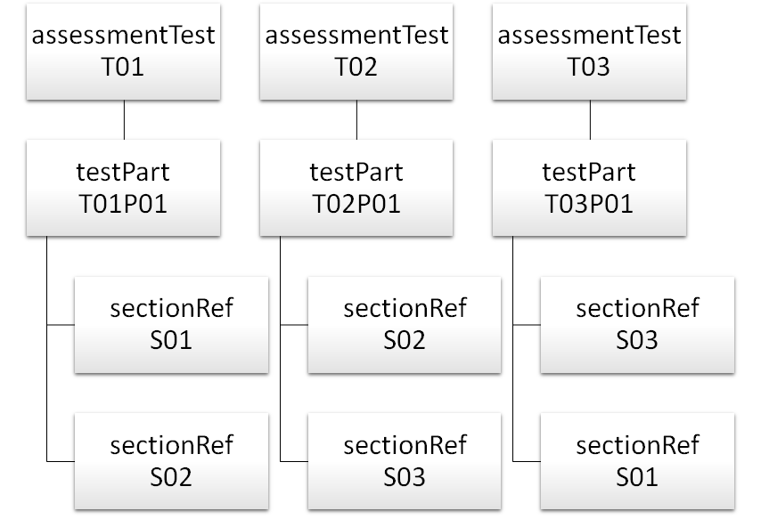
The exchange of QTI 3 content can vary significantly in scope, ranging from the exchange of a package containing a single assessment item to multiple tests with various subsections, thousands of assessment items, and shared stimulus content.
QTI 3 Assessment content is exchanged in a content package, using the standardized structure of the assessment structures, including tests, sections, test-parts, shared-stimulus, and items, as well as any of the content resources (like images and media), metadata, usagedata and stylesheet references. See Section 6 for more information on content packaging for QTI 3.
Given the complexity of assessment content, the QTI 3 standard allows for fairly simple interactions and content, as well as more complex interactions and assessment structures. The needs of the assessment program generally dictate which of the many QTI 3 features are used in the exchanged content. Conformance and certification for QTI 3 features is discussed in separate documentation, QTI 3 Conformance and Certification [QTI-CERT-30].
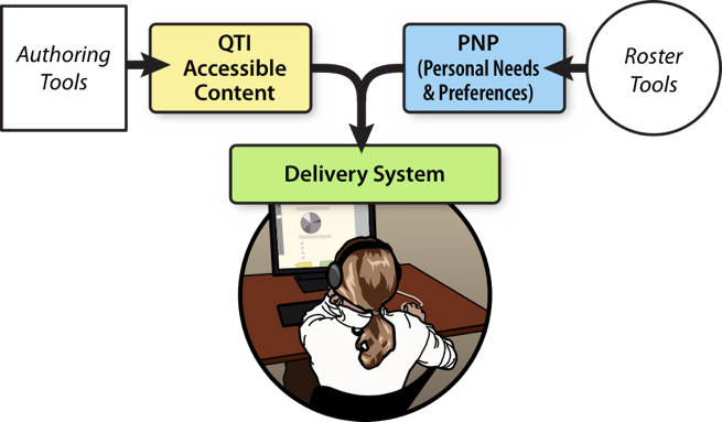
An assessment program can optionally create content that includes additional, dormant content that is selectively presented to candidates based on their user profile. In these cases, there is a dependency between the authoring systems creating the additional content, registration systems that allow for candidates to indicate their assessment needs and preferences, and the delivery system which uses the candidate profiles to present the dormant assessment content to specific candidates.
See Accessibility and Accommodations (Section 5) for more information on personalizing the assessment experience for candidates.
An QTI 3 assessment delivery system presents assessment content to candidates using QTI 3 for presentation of content, instructions for data collection, response processing, and scoring. There are many different ways to configure a delivery system, and QTI 3 does not dictate the architecture of these systems. The purpose of QTI 3 is to provide standardized content exchange and some basic user experience delivery expectations.
QTI 3 content is exchanged in standardized files using XML structure, where candidate-facing content is represented using a combination of HTML and XML (for the interactions). The content files may also contain template information, feedback content, or additional dormant content for specific candidates based on their Personal Needs and Preferences (PNP). QTI 3 content may reference external "web content" files, such as images, video, or audio files, which can be packaged with the QTI 3 content files to create a QTI 3 content package.
The test structures may include further information about the structure of test, including the order of possible parts, sections, and items, or even adaptive testing information, as well as outcomes processing information. The test structure may also include instructions or information which is intended to be delivered to the candidate. All tests must contain at least one test part, and all parts must contain at least one section. Sections can contain further sections, which is referred to as "nested sections" in QTI. Adaptive testing includes staged adaptive by using preconditions and branch-rules or by using an external (IRT-based) adaptive algorithm (newly introduced in QTI 3). See Section 4 for more information on the Test structure. See Section 4.3 and 4.4 for more specifics around test parts and sections.
Assessment items contain the bulk of the content that is presented to candidates, and it is the only structure which allows for candidates to respond to questions via interactions. The assessment items also contain the response processing and outcome variables which provide the correct (or partially correct) responses and how to score those responses. See Section 3 for a complete description of the assessment item structure.
Assessment items often relate to a common, shared stimulus. This shared stimulus is contained in a stimulus structure, and is referenced from an assessment item. See Section 3.7.7 for more specific information on Shared Stimulus content.
The sequence and structure of any valid QTI 3 file (tests, parts, sections, items, and stimulus) included in a content package is regulated by its associated XML Schema Definition (XSD). QTI 3 does leverage a number of W3C standards (HTML, MathML, CSS, SSML to name a few) which cannot be completely validated using the 1EdTech validators. When using these related standards, the expectation is that implementers will follow the best practices recommended for each of the standards.
The content package also provides the mechanism for resolving hrefs used in QTI content to the actual resources providing that content. In many cases the content package may resolve a href (e.g. "items/item1.xml") to a URL relative to the base href of the content package, but there are some advanced content packaging use cases which may resolve the href to a variant of the resource (e.g. a file with the item translated to a different language) or may indicate that the resource is not directly rendered by the delivery engine, but must instead be LTI launched. For more information on QTI content packages see Section 6.
2.1 Metadata
QTI 3 makes use of the following metadata standards: QTI, Learning Object Metadata (LOM), and curriculum standards.
2.1.1 QTI Metadata
This allows metadata specific to QTI 3 to be added to a QTI 3 item resource in the imsmanifest.xml file.
Full details of the QTI 3 metadata model can be found in the 1EdTech QTI Metadata Information Model and XSD Binding Version 3.0 document, but some of the defined metadata fields cover:
- the interaction types used in the item
- whether the item is a composite item
- whether the item is time dependant or not
- whether the item is adaptive or not
- whether the item will generate feedback or not, and if the feedback is adaptive
- whether the item makes a model solution available
- whether the item is a concrete instance or a template used to create a concrete instance
- how the item will be scored, by QTI response processing, by a human or by some form of external machine scoring
- some information on the tool used to author the item
2.1.2 LOM Metadata
Metadata following the 1EdTech QTI 3 profile of IEEE LOM can also be included, as well as the LOM metadata which can be applied to learning resources generally. This profile provides some rules on how to map QTI concepts to standard LOM fields. For example, that the test or item identifier should be present as an identifier in the LOM metadata. This profile also adds some additional QTI specific vocabularies as an extension to LOM. For example, it supports the Resource Discovery Network Resource Type Vocabulary (RDN/LTSN).
2.1.3 Curriculum Standards Metadata
This allows learning standards and 1EdTech CASE (Competencies and Academic Standards Exchange) identifiers to be associated with a test or item. See the example in section 6.4 on support for CASE in QTI.
2.2 Markup Languages
2.2.1 XML
The QTI Information Model [QTI-INFO-30] is defined as an eXtensible Markup Language (XML) instance and bound by a set of XML Schema Definition (XSD) files. XML is a W3C Recommendation designed to store and transport data and provides the flexibility and extensibility necessary for QTI assessment content or data to be easily organized and exchanged.
2.2.2 HTML5
Beginning in version 2.2, QTI added a select group of HTML5 elements to the standard. These elements were primarily chosen to increase the accessibility of the assessment content. QTI 3 continues to use a subset of the the complete HTML5 specification to maintain the interoperability of the content being exchanged.
In QTI 3, there is an increased emphasis on the use of HTML5 markup. While the class attribute has been available in previous versions, the use of specific QTI standardized presentation classes was developed to increase rendering interoperability. This new approach uses classes where appropriate: for specifying styling information (presentation). An enumerated, shared interaction vocabulary and shared CSS classes (prefixed by the qti- prefix) will be maintained outside of the QTI specification (schema) to improve interoperability of styling information.
The use of these QTI-specific classes and attributes is generally described in the interactions or features for which they are intended. A full list of all standardized QTI vocabulary is included in Appendix B, and the complete documentation and example CSS is found in the QTI 3 Standardized Shared Vocabulary and CSS Classes document.
If a particular presentation style or behavior does not exist in the shared interaction vocabulary or shared CSS classes while authoring assessment content, custom classes can be used.
For specifying behavior (semantics) outside of the existing QTI attributes, custom data attributes ( data-) should be used. In case a certain data- attribute is used frequently, and becomes a best practice, it is a candidate for promotion to a built-in attribute, part of the QTI schema.
The new standardized QTI presentation classes and attributes use a "qti" prefix in their naming in the hope of preventing class naming conflicts. For all standardized QTI presentation classes, the names begin with "qti-"; for example "qti-labels-decimal" (used for interaction choices). For standardized custom attributes related to presentation, the attribute names begin with "data-qti-"; for example "data-qti-max-selections-message."
Note that in XML, attributes MUST contain a value to be valid. HTML allows for some boolean attributes to leave out the values, for example <video controls> to indicate the video should include controls. The QTI 3 XML validator would flag this markup as invalid. In QTI 3, you should use a "true" value for HTML boolean attributes except in the following cases:
- For the audio and video elements in QTI 3 markup, the "controls" attribute MUST include a value for the attribute to be valid XML. As per the HTML 5 specification, the way to exclude controls is to explicitly not include the attribute in the audio or video element. In QTI 3, valid values to include controls are "controls" (as per the HTML specification) or "true" (the more traditional boolean value for XML). So
<video>would mean the controls are not provided to the candidate (as in the example below), and<video controls="controls">would indicate the candidate should be provided with media controls. - For the "default" attribute, use
default="default"(though "true" is also valid).
2.2.3 CSS3
QTI 3 does allow for the inclusion of Cascading Style Sheets (CSS) version 3 in content files to transfer the preferred rendering and behavior for test presentation. However, given the complexities of cascading styles, features such as @import and image references, and their possible conflict with delivery system default styles, the automatic acceptance of stylesheets is not required by certified QTI systems. Some assessment programs may, at their own discretion, create and demand support for their own stylesheets as part of the agreed upon scope of work for a particular contract or program.
Associating a stylesheet with an item, a test, a section, a rubric block, template block, feedback structure, or stimulus to control appearance involves using the QTI stylesheet element within the content structure.
There are specific sequential places within a given QTI XML file that can reference stylesheets, and some substructures within the XML files can also reference stylesheets. In each instance, multiple stylesheets can be listed, with the expectation that the styles "cascade" – where stylesheets listed after other stylesheets override previous stylesheets. However, there are instances where stylesheet references are made within nested nodes of the content, and the stylesheet within these nested nodes are meant to be scoped to that node only, and not intended to apply to any other content. For example, assessment items can contain references to stimulus, where the stimulus has a reference to a stylesheet. In this case, the stylesheet within the stimulus is intended only for that stimulus, and not applied to the item content. Similarly, if a stylesheet reference is made from within a rubric block within the qti-item-body node, the stylesheet for the rubric block is scoped only to that specific rubric block, and not for any other rubric blocks within that item, or the item content itself.
Adding a reference to a stylesheet is done by referencing the stylesheet from your file, as shown in the example below.
<qti-stylesheet href="style/custom/your-styles.css" type="text/css" />Disclaimer: some systems will reject custom CSS as part of item content to maintain overall visual consistency. Only use custom CSS on the item-level as a last resort.
QTI 3 has adopted the Shared Interaction Vocabulary and classes approach to improve the interoperability for the presentation of assessment content. Use the QTI 3 Standardized CSS Shared Vocabulary and CSS Classes document to reference the shared interaction vocabulary for visual consistency. The use of these QTI-specific classes and data attributes is generally described in the interactions or features for which they are intended.
QTI 3 does not support the use of CSS 3 Speech.
For CSS introduced by item authors or QTI authoring systems via the stylesheet element, a qti-portable-custom-interaction would be able to dynamically insert CSS at run time into the HTML markup associated with the interaction. It is recommended that any such CSS generated be scoped to the interaction.
2.2.4 MathML
QTI 3 permits the use of MathML version 3 directly within the portions of the XML files that use HTML5 markup.
The simple example below illustrates the inclusion of a mathematical expression marked up with MathML into an item.
|
1EdTech hosts schemas from external namespaces for efficient validation. Note that within this Guide, schema locations and namespaces may not be included in the examples here for ease of reading.
2.2.5 Other Specialized Markup Languages
Specialized markup languages such as Chemical Markup Language (CML) exist for many domains that have a need for computer aided assessment. For that reason, integrating such markup languages with QTI is desirable. Other markup languages include MathML, SVG, and SSML.
A markup language that is widely supported by browsers is Scalable Vector Graphics [SVG]. While direct markup is not supported in the QTI 3 qti-item-body structure at this time, it is easy to include via HTML's 'img' or 'object' tag. Domain specific languages such as CML can often be rendered as SVG, thus providing a convenient way to integrate material with QTI 3.
At present, QTI's qti-printed-variable can be used within MathML and HTML.
A feature that is under consideration for future inclusion is the use of SVG and other languages via HTML 5's 'embed' tag [html5]. The use of this tag is not currently supported either within or outside HTML's 'object' tag.
2.2.6 SSML & PLS
There are two different methods for providing pronunciation information in assessment content that could be consumed by Text-to-Speech (TTS) software (and by extension Screen Reader software) in QTI 3. They are:
- PLS
- SSML
See Section 5 for examples that use SSML & PLS pronunciation.
2.3 QTI 3 Conventions
2.3.1 Use of data- attributes
The custom data-* attribute extends QTI 3.0 to support additional features. When defining a custom attribute, the best practice is to utilize clear naming conventions that describe what the attribute does in order to support interoperability. Documentation for your items should also include detailed information about intended use of custom attributes. Below is an example item with documentation on how each custom attribute is intended to be used.
Example of possible use cases:
In this example qti-hottext element:
|
The data-group-name allows for radio button group assignment.
The data-deselection-allowed sets whether or not students can deselect that option.
The data-dont-word-wrap defines if that option is allowed to wrap onto a new line.
2.3.2 Markup Styles and Conventions
QTI 3 introduces a limited number of shared CSS style names and conventions for use by authoring and delivery systems. See the QTI 3 Standardized Shared Vocabulary and CSS Classes for complete documentation.
By implementing these shared styles and conventions, QTI 3 authoring and delivery platforms can safely import/export – or render – items while preserving certain presentation characteristics without using custom stylesheet injection. Note that all of the shared styles are prefaced by the "qti-" string so as to avoid collisions with a delivery platform's existing CSS.
2.3.3 Use of id and identifier in QTI Content
One attribute, "identifier", is about QTI and it has specific rules regarding format and the QTI information model. On the other hand, "id" is an HTML/XML attribute, and it has different formatting rules, as well as the expectation that an element's id must be unique within the document or else the DOM is considered broken.
2.4 The Accessibility Approach of QTI 3
QTI 3 has several methods for achieving accessibility, primarily through the use of W3C web accessibility standards (including selected HTML5 elements, WAI-ARIA 1.0, SSML 1.1, and PLS 1.0), and the use of a QTI 3 feature called "catalog" referencing.
Valid QTI 3 content many contain web accessibility markup, including Accessible Rich Internet Applications [wai-aria] 1.0 and Speech Synthesis Mark-up Language [speech-synthesis11] 1.1 in the text-based HTML content. QTI also allows for some additional HTML5 tags in the HTML markup, to aid in the structural intent of the content to aid Assistive Technology test takers. Content instances may also reference Pronunciation Lexicon Standard [pronunciation-lexicon] files to instruct Text-to-Speech Synthesis engines on pronunciation, emphasis, and timing.
In addition to promoting the use of international internet accessibility markup, QTI 3 has additional supports that may assist candidates in accessing assessment content, or receiving special assessment accommodations. The specific needs of candidates can be provided to delivery systems using the data provided in a candidate's Personal Needs & Preferences (PNP) file (see Section 5). Alternate or additional content can be authored and exchanged in QTI 3 files which is intended to be provided to candidates who specifically request this alternate or additional content (see Section 5).
2.4.1 Use of W3C Standards in QTI
Assessment delivery systems that use web delivery platforms can be made accessible to Assistive Technology audiences by using standardized accessible web markup. QTI v3 supports and encourages the use of W3C standards, including HTML5, WCAG 2.0, WAI-ARIA 1.0, SSML 1.1, MathML 3, CML, CSS3 (except CSS3 Speech), and PLS. The proper use of these standards will greatly increase the accessibility of the assessment content exchanged in a QTI 3 content package. For guidance around the proper use of the W3C standards for accessibility, use the extensive online W3C documentation .
While W3C recommended techniques are continuously being modified, the exchange of QTI 3 content may have more restricted markup, using fixed released versions and accepted best practices for content transfer. However, delivery systems may choose to adopt newer techniques for the candidate-facing code during presentation (a live assessment session). The methods that are most likely to give candidates access to content, and the ability to respond to interactions, are encouraged to be implemented as soon as they are available and robust enough to be practically implemented.
2.4.2 Candidate Profiles
QTI 3 is capable of using candidate profiles to offer assessment presentation modifications for specific candidates. QTI 3 uses the Personal Needs and Preferences 3.0 standard [AFA-30] for the exchange of candidate profiles, also known as Personal Needs & Preferences (PNP) profiles. The vocabulary used in Personal Needs and Preferences 3.0 is closely aligned with the predefined supports that can be provided in QTI 3 content.
Through the use of a candidate PNP, a delivery system can provide additional assessment tools for candidates, modify the assessment session parameters (e.g., time limits), or inform test proctors of any special needs of the candidate. Additionally, the assessment content can contain content alternatives or supplemental content that can be activated based on the specific support needs of the candidate.
A description of all the QTI 3 predefined supports can be found in Section 5 of this guide.
2.4.3 Using Catalogs to Store Support-Specific Content
QTI 3 uses a feature called "catalogs" to provide additional content for specific supports which can be activated for specific users, either based on their candidate PNP information or through other test administrative controls. Within an item, any element within the qti-item-body (including the qti-item-body element itself) can point to a referenced container called a "catalog" that contains one or more snippets of content that support the referencing content.
A general description of how to reference and use catalogs can be found in Section 3.7.10, and examples for each feature of the QTI 3 profile of the Personal Needs & Preferences 3.0 supports can be found in Section 5.
2.4.4 Special Assessment Accessibility Markup in QTI
QTI versions 2.2 and 3.0 allow the use of specific markup that indicates assessment related accessibility. These specific classes are listed and discussed in Section 1.1.1 of the QTI 3 Standardized Shared Interaction Vocabulary and CSS Classes. They include:
- Keyword emphasis (these can vary across delivery applications)
- Visually hidden content
- Content that should be presented visually but NOT read aloud by Text-to-Speech engines
- A fail-safe custom attribute for the inclusion of ARIA tags on all QTI elements
- Accessibility role indicators
See Section 5.1.7 for guidance on the use of heading structures in QTI 3.
2.5 Use of Portable Custom Interactions (PCI)
QTI defines a rich set of interaction types but it is not possible for QTI to fully define all interaction types which may be required by educational organizations, particularly with growth in the use of technology enhanced items.
QTI 2 offered an extension mechanism, customInteraction, which allowed interaction content not defined in the QTI Assessment Test, Section and Item specifications to be included in a QTI assessment item, but such items are not in general inter-operable.
To address this interoperability gap, a best practice, known as the Portable Custom Interaction (PCI), was established for QTI 2, which standardizes the contents of a custom interaction element so that it can be utilized by any assessment engine which implements the Portable Content Interaction Best Practice.
In QTI 3 this has been superseded by the introduction of a new interaction type, qti-portable-custom-interaction which makes an enhanced version of this best practice part of the QTI specification. For more information see Section 3.2.23 and Section 3.7.12.
2.6 Results and Metrics: Caliper Assessment Metric Profile
In addition to using the Response Processing Templates in Section 3.4 to score items, there is now a QTI 3.0 Assessment Profile for Caliper Analytics® in development. Adopting this profile allows use of the IMS learning Sensor API™to define basic learning events and to standardize and simplify the gathering of learning metrics across learning environments. Using Caliper to capture student activity during an assessment will allow for metrics that are unavailable from a simple score on each item. For more details on Caliper Analytics [CALIPER-11] please review the latest specification.
Review the Results Reporting Specification [QTI-RR-30] for more information.
2.7 Internationalization
2.7.1 BI-directional Text and Content
Item authors might want to specify the base directionality of their item contents. This is done by the 'dir' attribute, enabling text and content bi-directionality (BIDI). Although the [UNICODE] specification supports directionality of characters, the 'dir' attribute enables item authors to specify the direction of texts but also other kinds of contents, such as tables or interactions. The Content Model described by QTI 3.0 Information Model obey to bidirectional algorithm, inheritance of text direction information, and direction of embedded text specified by the [html40] and [html5] specifications.
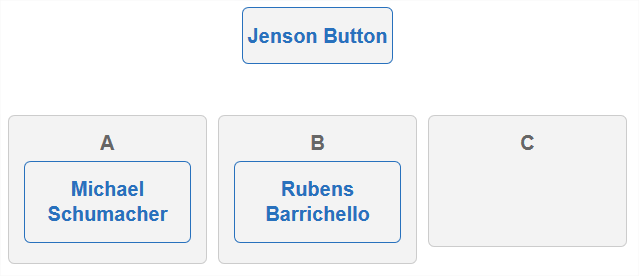
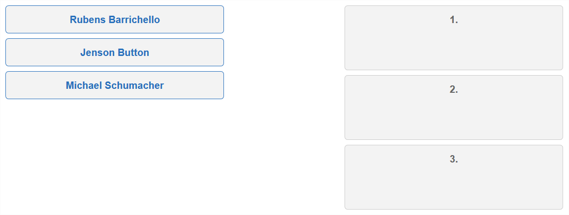
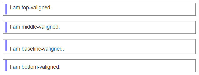
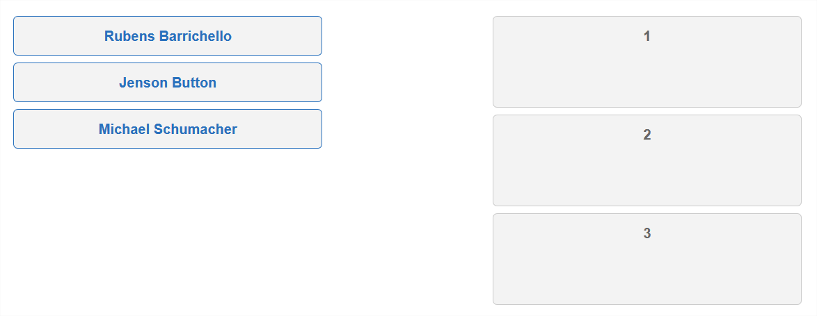
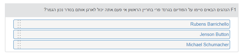
The following example is an Hebrew version of the Composition of Water item. An enclosing div' has a 'dir' attribute with a value of "rtl" (Right to Left). As a result, the 'rtl' directionality is in effect (by inheritance) for all nested block elements. The ChoiceInteraction and its content must be then displayed from right to left as well.
|
|
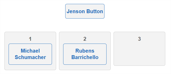
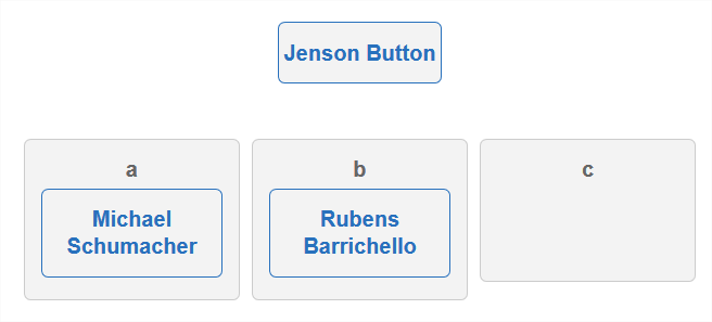
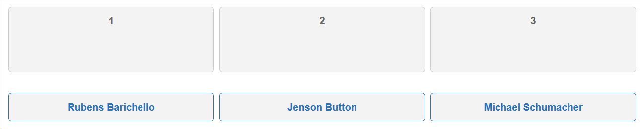
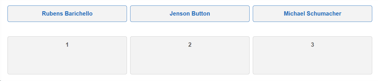
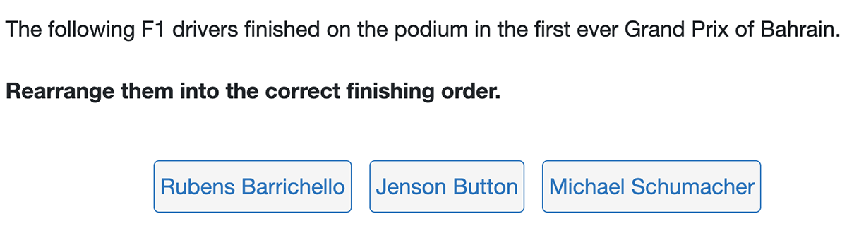
The next example describes the use of the bdo class to turn off the bidirectional algorithm for given text portions ("F1", "Rubens Barrichello", "Jenson Button", "Michael Schumacher").
|
|
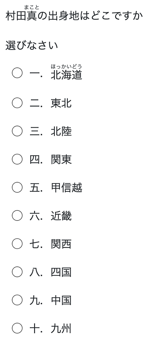
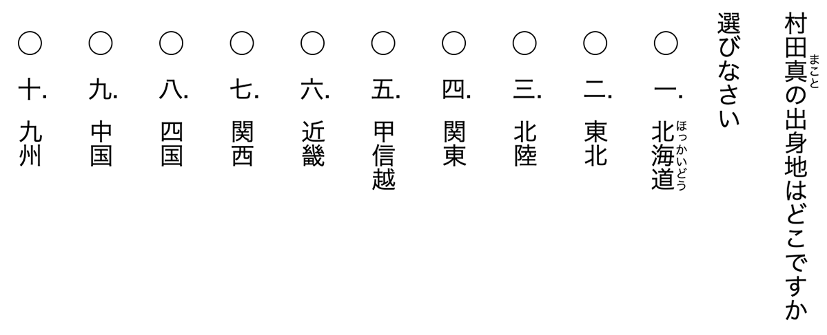
2.7.2 Ruby Markup
QTI 3.0 includes Ruby Markup support. Its intent is to provide a way to render small annotations rendered alongside base text. As explained in depth by the W3C Ruby Markup and Styling article, "Ruby is used in East Asian countries to describe characters that readers might not be familiar with, or describe the meaning of ideographic characters". [ruby] Markup in QTI 3.0 adheres to the description of W3C in [html5].
The item example below makes use of the ruby, rb and rt classes to annotate base text in paragraphs and choices. It uses the default Choice Interaction rendering of horizontally presented text from left-to-right.
|
|
In this next ruby example, the standardized shared interaction vocabulary is used to show the text vertically from right to left. Go to the QTI 3 Standardized Shared Vocabulary and CSS Classes document for additional vertical text options.
|
|
3. Item Structure
Items are the essential building blocks of an assessment and make up the bulk of the test material. Items contain the assessment stimuli and prompts (the questions), and also the response areas (the interactions) and scoring instructions.
In order for organizations to exchange the assessment items, the item files may also need to contain a variety of data elements that support the item content. These data elements are briefly explained in this subsection, and with greater details throughout Section 3 of this implementation guide. An assessment item encompasses the information that is presented to a candidate and information about how to score the item. Scoring takes place when candidate responses are transformed into outcomes by response processing rules.
3.1 The qti-assessment-item Element
The qti-assessment-item element contains all the other QTI 3 item structures, and the opening qti-assessment-item element contains the following attributes (* denotes the attribute is required):
- All namespace declarations, including schema locations*
- identifier*
- title*
- label
- language (xml:lang)
- tool name (tool-name)
- tool version (tool-version)
- adaptive item indicator (adaptive)
- time dependent (time-dependent) item indicator*
The qti-assessment-item node must contain an "identifier" attribute with a non-null string to identify the item. It is used to identify the item as a unique entity within the context of the exchange of assessment content, so organizations may wish to add organizational prefixes to their identifier information to ensure uniqueness among multiple vendors.
The "title" is an additional required attribute, which generally contains a more human readable string of text that describes the item. It is often presented to authors and reviewers, sometimes to candidates.
You can optionally add a "label" as an attribute, in whatever way is meaningful as an organizational label for the item(s). The 'label' attribute is typically used to identify, or label, workflow or process aspects of the Item. Typically the value in 'label' is used to support various tools.
The "xml:lang" attribute is optional, though it should be included as a best practice, as the language is a primary accessibility support for web-based documents.
Both the "tool-name" and "tool-version" are optional elements, which usually indicate the tool name and version that generated the item.
The "adaptive" attribute is also optional, and the default value is false, where only boolean values (true/false) are permitted. By not including the adaptive attribute, the item will NOT be considered adaptive (changing to the responses of the candidate). The adaptive attribute is not related to adaptive assessments, where the sequence of the item within the context of an assessment is non-linear. See Section 3.7.2 for more information on item adaptivity.
The "time-dependent" attribute is a required attribute, where boolean values (true/false) are permitted. A time dependent item (time-dependent="true") is one in which time; i.e., the amount of time a candidate is provided by a delivery system to enter a response, is important for the psychometric properties - the calibration - of the item. Along with response evaluation, this attribute can also be used in conjunction with other Test attributes by delivery systems to enforce candidate attempt duration limits.
3.1.1 Structures within the qti-assessment-item Node
The QTI-specific XML structures are described in the QTI 3Item XSD. The QTI 3 Item XSD can be found at https://purl.imsglobal.org/spec/qti/v3p0/schema/xsd/imsqti_itemv3p0p1_v1p0.xsd , which is a subset of the full QTI 3 XSD found at https://purl.imsglobal.org/spec/qti/v3p0/schema/xsd/imsqti_asiv3p0p1_v1p0.xsd. The namespace is http://www.imsglobal.org/xsd/imsqtiasi_v3p0
An item typically includes the following information:
- Scoring data
- The item content presented to the candidate, which itself contains:
- Any directions/instructions
- Any stimuli or references to stimuli
- The prompt(s)
- The interaction(s)
- Feedback for the candidate
- Supplemental content or references to supplemental content
- Content displayed, voiced, or printed, contingent on the candidate's Personal Needs and Preferences (PNP)
The above information is stored in specific QTI 3structures, and must be supplied in the sequence listed below :
- qti-context-declaration
- qti-response-declaration
- qti-outcome-declaration
- qti-template-declaration
- qti-template-processing
- qti-assessment-stimulus-ref
- qti-companion-materials-info
- qti-response-processing
- qti-modal-feedback
The inclusion or exclusion of the above structures depends on the complexity of the item, and on the needs of the assessment program using the assessment content.
Scoring an item can be quite complex, and the information used to provide the response information and the score(s)received (the outcome(s)) are possible using a combination of the following structures:
- qit-context-declaration
- qti-response-declaration
- qti-outcome-declaration
- qti-response-processing
Content (and content presentation data) to be presented to the candidate is supplied or referenced in a combination of these structures:
- qti-assessment-stimulus-ref
- qti-companion-materials-info
- qti-stylesheet
- qti-item-body
Content presented to candidates using variables use these structures:
- qti-template-declaration
- qti-template-processing
- qti-catalog-info
- qti-modal-feedback
A brief introduction to the AssessmentItem structures is provided below.
3.1.1.1 Context Declaration
The qti-context-declaration nodes are used to make "contextual" variable declarations that are global in scope to an item. When evaluating TemplateProcessing and ResponseProcessing instructions in an AssessmentItem, having contextual information available in the information model can improve the effectiveness, efficiency, and personalization of TemplateProcessing and ResponseProcessing instructions. Contextual information can include candidate information, test information, and system (or environmental) information. Context declarations are also permitted in tests. See Section 3.7.11 for a longer description of context declarations.
3.1.1.2 Response Declaration
Response variables are declared using qti-response-declaration nodes. Interactions in the itemBody must be bound to one of these declared variables . The response declaration supplies the values for the scoring of the item. It may indicate what the correct response is, or the partially correct response(s). The base-type and cardinality defined for a response variable must match the types and cardinality required by the interactions bound to that response variable.
3.1.1.3 Outcome Declaration
Outcome variables are declared using qti-outcome-declaration nodes. The outcome variables represent the score that the candidate can receive for responding to, or not responding to, the item. The outcomes variables values are set either from a default given in the outcome declaration itself or by a ResponseRule during ResponseProcessing. See Section 3.5 for a longer description of outcome declarations.
3.1.1.4 Template Declaration
Use qti-template-declaration nodes to declare item variables that are to be used specifically for the purposes of cloning items. Template variables can have their value set only during TemplateProcessing. Template declarations are referred to within the qti-item-body in order to individualize the clone and possibly also within the ResponseProcessing rules if the cloning process affects the way the item is scored. See Section 3.7.4 for a longer description of using templates in items.
3.1.1.5 Template Processing
Use the qti-template-processing node for template processing. Template processing consists of one or more TemplateRules that are followed by a cloning engine or delivery system in order to assign values to the template variables. Template processing is identical in form to ResponseProcessing except that the purpose is to assign values to template variables, not outcome variables. See Section 3.7.4 for a description on using template processing in items.
Reference to a Shared Stimulus
The qti-assessment-stimulus-ref element can be used to associate one or more external; i.e., external to the qti-assessment-item XML, stimulus blocks with a particular item. A common use case is to author and package a stimulus such as a passage, which can then be shared among multiple items. See Section 3.7.7 for more specifics on how to link items to a shared stimulus.
3.1.1.6 Companion Materials
The qti-companion-materials-info node is used to indicate if the item should be presented to candidates with other kinds of (built-in) assessment tools or materials (companion materials), including: calculators, protractors, rulers, digital materials, or physical materials. See Section 3.7.8 for a longer description of including companion materials in items.
3.1.1.7 Stylesheets
The qti-stylesheet nodes are used to associate external stylesheets for the item. QTI 3 supports CSS 2.1 and CSS 3.0 stylesheets (excluding speech). Any number of stylesheets can be included in an item. See Section 3.6 for examples of how to include stylesheets in items.
For conformance purposes, the use of stylesheets may be ignored by delivery systems, where support for stylesheets is not required for QTI applications.
For interoperability and implementation purposes, QTI shared interaction vocabulary and CSS classes take precedence over CSS stylesheets. See the QTI 3 Standardized Shared Vocabulary and CSS Classes document for full details.
3.1.1.8 The Item Body
The qti-item-body node contains the text, graphics, media objects and interactions that describe the item's content and information about how it is structured. Only one qti-item-body node is allowed within an item. The qti-item-body is presented to candidates by combining the qti-item-body content with stylesheet information, either explicitly or implicitly using the default style rules of the delivery or authoring system. The ItemBody contains formatted, structured HTML content (see @@@ Section 2.3), as well as any prompt content (optionally contained within the qti-prompt nodes) and any interactions.
Composite items are items that contain more than one interaction within the ItemBody. Composite items may contain multiple instances of the same type of interaction or have a mixture of interaction types within the ItemBody. See Section 3.2 for documentation for specific QTI interactions, and Section 3.3 for the use of composite items. Note that while the qti-item-body node may contain multiple interactions, any interaction MUST NOT be nested or contained within other interactions. Items with nested interactions are not considered compliant to the QTI standard regardless of whether they pass validation or not.
Because ItemBody content is expected to be presented to candidates with a wide variance of perceptual, cognitive processing, physical capabilities, etc.; assessment content should be made as accessible as possible to the widest range of candidates. Guidance on how to provide accessible content is sprinkled throughout this implementation guide, but is certainly not the definitive nor complete documentation on providing accessible content to people. Implementers should stay current in methods and approaches that help increase access to assessment content for all users.
The ItemBody content must be presented to the candidate during an active assessment session. In the assessment session, the candidate must be able to interact with each of the presented interactions and therefore set or update the values of the associated response variables.
The ItemBody may be presented to the candidate when the item session is in the closed or review state. In these states, although the candidate's responses should be presented, the interactions must be disabled so as to prevent the candidate from setting or updating the values of the associated response variables.
The ItemBody may be presented to the candidate in the solution state, in which case the correct values of the response variables must be presented and the associated interactions disabled.
Adaptive items are a feature that allows an item to be scored adaptively over a sequence of attempts. This allows the candidate to alter their answer following feedback or to be posed additional questions based on their current answer.
The ItemBody may also contain rubric blocks (qti-rubric-block), which is content that may be presented to one of the possible audiences for the content, including the author, candidate, proctor, scorer, testConstructor, or tutor. This content would only be shown to the specified audience when the role of that audience is specifically known the system presenting the item. See Section 3.7.5 for more information on using rubric blocks in an assessmentItem.
3.1.1.9 Catalog Resources
The qti-catalog-info node holds one or more catalogs. The ItemBody content references specific catalogs within the qti-catalog-info node. Catalogs hold and reference item content that is presented to candidates based on their candidate profile (PNP) requirements. See Section 5 for a longer description of using catalogs to store support-specific content. In addition to Section 5, there is an annotated item in Section 3.8.1 that includes the use of catalogs for encoding Glossaries and Keyword Translations.
3.1.1.10 Response Processing
Use the qti-response-processing node for response processing – the process by which a delivery engine assigns outcomes (the scores) based on the candidate's responses. Response processing can be achieved using either a response processing template (a reference to a common processing pattern), or by using customized response processing. See Section 3.4.2 for information on using response processing templates, and Section 3.7.1 for information on customized response processing.
3.1.1.11 Modal and Test Feedback
The qti-modal-feedback node is used to provide item-level feedback, which is presented to the candidate directly following response processing. See Section 3.7.3 for more information on providing feedback to candidates. Similarly, qti-test-feedback provides a method to display feedback at the Assessment Test or Test Part level and can be presented either during the test or test part after each instance of outcome processing, or at the conclusion of the test or test part.
3.2 Interaction Types
All QTI v2.2 interaction types are included in QTI 3. However, the interaction elements have been renamed to reflect a web component-friendly syntax which will enable QTI processors to render ItemBody interaction content - should they choose to do so – with web components, and without having to apply further interaction transformations.
The QTI 3 interaction web components-friendly vocabulary introduces the "qti-" prefix on every QTI element. Furthermore, camelcase elements and attributes are replaced with all-lowercase elements/attributes with hyphen separators. See the example below of a choice interaction with the QTI 3 web components-friendly vocabulary.
Example: qti-choice-interaction
|
In another example (a hotspot interaction), note how the img element is considered an HTML element - and therefore not prefixed by "qti-" - even though it is a sub-element of an interaction.
Example: qti-hotspot-interaction
|
QTI 3 includes the following standardized interactions:
- Choice (qti-choice-interaction): presents a set of choices to the candidate. The candidate's task is to select one or more of the choices, up to a maximum number of choices allowed. (See Section 3.2.2 )
- Text Entry (qti-text-entry-interaction): an inline interaction that accepts text from the candidate. (See Section 3.2.3 )
- Extended Text(qti-extended-text-interaction): a block interaction that allows the candidate to enter an extended amount of text.
- Gap Match (qti-gap-match-interaction): a block interaction that contains a number of gaps that the candidate can fill from an associated set of choices.
- Hot Spot(qti-hotspot-interaction): a graphical interaction with a corresponding set of choices that are defined as areas of the graphic image. The candidate's task is to select one or more of the areas (hotspots).
- Hot Text (qti-hot-text-interaction): presents a set of choices to the candidate represented as selectable runs of text embedded within a surrounding context, such as a passage of text.
- Inline Choice (qti-inline-choice-interaction): an inline interaction that presents the user with a set of choices, each of which is an answer option (usually text). The candidate's task is to select one of the choices.
- Match (qti-match-interaction): a block interaction that presents candidates with two sets of choices and allows them to create associations between pairs of choices in the two sets, but not between pairs of choices in the same set.
- Order (qti-order-interaction): the candidate's task is to reorder the choices, the order in which the choices are displayed initially is significant.
- Graphic Order(qti-graphic-order-interaction): A graphic order interaction is a graphic interaction with a corresponding set of hotspot choices that are defined as areas of the graphic image. The candidate's task is to impose an ordering on the areas (hotspots).
- Associate (qti-associate-interaction): a block interaction that presents candidates with a number of choices and allows them to create associations between them.
- Graphic Associate (qti-graphic-associate-interaction): a graphic interaction with a corresponding set of choices that are defined as areas of the graphic image. The candidate's task is to associate the areas (hotspots) with each other.
- Graphic Gap Match (qti-graphic-gap-match-interaction): a graphical interaction with a set of gaps that are defined as areas (hotspots) of the graphic image and an additional set of gap choices that are defined outside the image. The candidate must associate the gap choices with the gaps in the image and be able to review the image with the gaps filled in context, as indicated by their choices.
- Media (qti-media-interaction): allows more control over the way the candidate interacts with a time-based media object and allows the number of times the media object was experienced to be reported in the value of the associated response variable.
- Position Object (qti-position-object-interaction): consists of a single image which must be positioned on another graphic image (the stage) by the candidate.
- Select Point (qti-select-point-interaction): a graphic interaction in which the candidate's task is to select one or more points.
- Slider (qti-slider-interaction): presents the candidate with a control for selecting a numerical value between a lower and upper bound.
- Upload(qti-upload-interaction): allows the candidate to upload a pre-prepared file representing their response.
- Drawing(qti-drawing-interaction): allows the candidate to use drawing tools provided by the delivery system to modify a given graphical image (the canvas). The result is a file in the same format as the original image.
- Custom(qti-custom-interaction) and Portable Custom (qti-portable-custom-interaction): allow the item author to present an interaction with a custom user interface and behavior, supported by, respectively, delivery engine-specific or author-provided code. Portable Custom Interactions (PCIs) allow the Javascript code implementing the interaction to be made available to delivery systems, with a standard Javascript interface, offering the potential for making PCIs more interoperable and portable between conforming delivery engines.
- End Attempt (qti-end-attempt-interaction): is a special interaction which immediately ends the current attempt on an assessment item. It may be used, for example, to allow the candidate to request a hint or model solution, or in an adaptive item to let the candidate display feedback or to move to the next in a series of interactions in the item.
Each of the interactions described in the following sections can contain sub-elements and attributes. For full descriptions of these features, see the QTI 3 Information Model document.
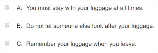
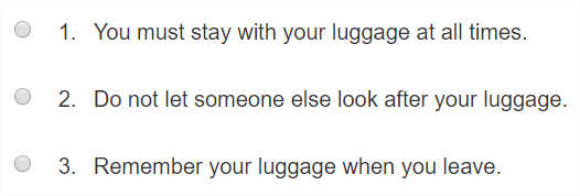
3.2.2 Choice Interaction
The ChoiceInteraction.Type (qti-choice-interaction) interaction presents a collection of choices to the candidate. The candidate's task is to select one or more of the choices, up to a maximum of max-choices. The interaction is always initialized with no choices selected.
The ChoiceInteraction.Type must be bound to a response variable with a base-type of identifier and single or multiple cardinality.
In a choice interaction, it is considered best practice to use the shared interaction vocabulary related to the layout of choices instead of using the optional orientation attribute. If both the shared interaction vocabulary classes and the orientation attribute are used, the shared interaction vocabulary classes take precedence over the orientation attribute value (including the default value of "vertical").
ChoiceInteraction Attributes (element: qti-choice-interaction)
| Name | Usage | Value(s) | Default |
|---|---|---|---|
| max-choices | optional | Non-negative integer | 1 |
| min-choices | optional | Non-negative integer | 0 (unlimited) |
| orientation* | optional | Vocabulary:• horizontal• vertical | vertical |
| shuffle | optional | boolean | false |
* Deprecated in favor of the shared interaction vocabulary.
The choice interaction is made up of choices, which use the qti-simple-choice element (SimpleChoice.Type) to present an ordered list of choices to the candidate.
As noted in the table above, the "shuffle" attribute is optional and defaults to false. However, if the shuffle attribute is set to "true", and the delivery engine supports the discretionary "shuffle" feature, the presentation system must randomize the order in which the choices are originally listed in the Assessment Item XML, subject to the value of the fixed attribute of each choice. If fixed is "true" for a choice then the position of this choice within the interaction must not be changed by the presentation system even if the immediately enclosing interaction supports the shuffling of choices. If no value is specified then the choice is free to be shuffled.
SimpleChoice (element: qti-simple-choice) Attributes
| Name | Usage | Value(s) | Default |
|---|---|---|---|
| identifier | required | Identifier | |
| template-identifier | optional | Identifier | |
| show-hide | optional | Vocabulary:• show• hide | show |
| fixed | optional | boolean | false |
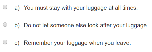
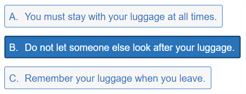
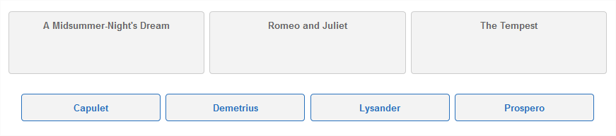
Here is an example of a choice interaction that allows the candidate to pick one choice (sometimes called single selection choice).
|
|
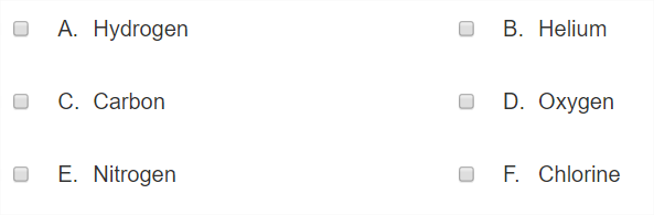
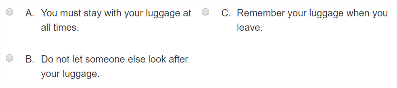
Below is an example of a choice interaction that allows the candidate to select multiple response options to respond to the prompt.
Example: qti-choice-interaction (multiple cardinality)
|
|
|
|
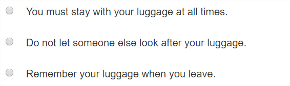
By default, in the absence of any shared interaction vocabulary, the presentation of each choice control, label, label suffix, and description, is left to the implementer, with the only requirement that the choices are displayed in a single column, vertically oriented.
The qti-choice-interaction has a considerable amount of its shared interaction vocabulary dedicated to the presentation/layout of the interaction's associated qti-simple-choices. Each qti-simple-choice consists of a collection of elements, displayed from left to right, defined as follows:
- A "control"; e.g., either a radio button or checkbox control, and
- A "label"; e.g., often an alphanumeric character such as, "A", "B", "1", "2", etc.
- A "label suffix"; e.g., a "." or ")" character after the label, and
- A "description"; e.g., the HTML content contained by a qti-simple-choice element
Go to the 1EdTech QTI 3 Standardized Shared and CSS Classes section on Choice Interaction classes for full details.
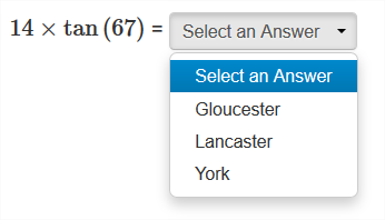
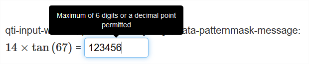
3.2.3 Text Entry Interaction
A Text Entry Interaction is an inline interaction that obtains a simple piece of text from the candidate. Like qti-inline-choice-interaction, the delivery engine must allow the candidate to review their choice within the context of the surrounding text.
The TextEntryInteraction.Type (qti-text-entry-interaction) must be bound to a response variable with single or record cardinality only. If the response variable has single cardinality the base-type must be one of string, integer or float; if it has record cardinality the permitted fields are 'stringValue', 'floatValue', etc.
TextEntryInteraction Attributes (element: qti-text-entry-interaction)
| Name | Usage | Value(s) | Default |
|---|---|---|---|
| response-identifier | required | Identifier | |
| base | optional | xs:int | Default is 10. |
| string-identifier | optional | Identifier of a qti-response-declaration with base-type=string | |
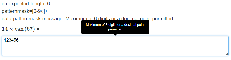
| expected-length | optional | Non-negative integer | |
| pattern-mask | optional | string | |
| placeholder-text | optional | string | |
| format | optional | Normalized string |
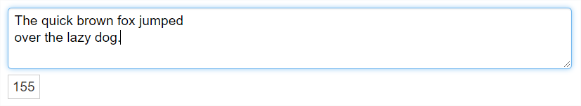
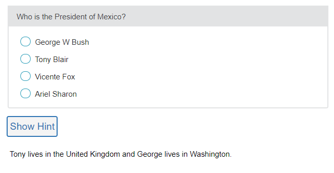
Below is an example of a Text Entry Interaction:
|
Which might look something like this when presented to candidates:

The scoring for this item could have just matched the correct response (in the response declaration) but actually uses a mapping to enable partial credit for an improperly capitalized city name (spelled without a capital letter, or all caps, or other capitilization error). When mapping strings the mapping, by default, is NOT case sensitive. This example also illustrates the use of the mapping when the response only has single cardinality.
The bulk of the shared interaction vocabulary for the Text Entry interaction adds further definition to the presentation width of the input element by utilizing the class attribute. Go to the 1EdTech QTI 3 Standardized Shared and CSS Classes section on Text Entry Interaction classes for full details.
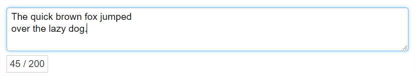
3.2.4 Extended Text Interaction
If an extended written response is required from the candidate then the Extended Text Interaction (qti-extended-text-interaction) is appropriate. An extended text interaction is a block Interaction that allows the candidate to enter an extended amount of text.
ExtendedTextInteraction Attributes (element: qti-extended-text-interaction)
| Name | Usage | Value(s) | Default |
|---|---|---|---|
| base | optional | xs:int | 10 |
| string-identifier | optional | Identifier of a response variable with base-type=string | |
| expected-length | optional | Non-negative integer | |
| pattern-mask | optional | xs:string | |
| placeholder-text | optional | xs:string | |
| max-strings | optional | Non-negative integer | |
| min-strings | optional | Non-negative integer | 0 (unlimited) |
| expected-lines | optional | Non-negative integer | |
| format | optional | Vocabulary: • plain • preformatted • xhtml |
plain |
The qti-extended-text-interaction must be bound to a response variable of single, multiple, ordered or record cardinality. If the response variable has record cardinality the fields in the record must be 'stringValue', 'floatValue', etc. Otherwise it must have a base-type of string, integer or float. When bound to response variable with single cardinality a single string of text is required from the candidate. When bound to a response variable with multiple or ordered cardinality several separate text strings may be required.
The extended text interaction allows a candidate to supply a text string for a response. A basic example of the markup is shown below.
|
The cardinality of "single" in the qti-response-processing element means that a single string of text is used in the response, though it may include multiple words or paragraphs within that string.
The example does not include a response processing node, as automated scoring of extended text responses is beyond the scope of the QTI specification.
The shared interaction vocabulary for the extended text interaction is intended to provide more precision when describing:
- Interaction height
- Character counter behavior
- Plain or Rich Text options
- A custom pattern-mask message
- Placeholder text
Responsive design implies that delivery systems should display an input area (typically, this will be a <textarea> or <div> html element) that has a width equal to 100% of the interaction's encapsulating container. Consequently, there is no shared interaction vocabulary for overriding the width of this interaction.
Go to the 1EdTech QTI 3 Standardized Shared Vocabulary and CSS document for details related to the Extended Text Interaction.
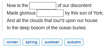
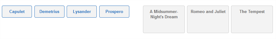
3.2.5 Gap Match Interaction
A gap match interaction is a block Interaction that contains a number of gaps that the candidate can fill from an associated set of choices. The candidate must be able to review the content with the gaps filled in context, as indicated by their choices.
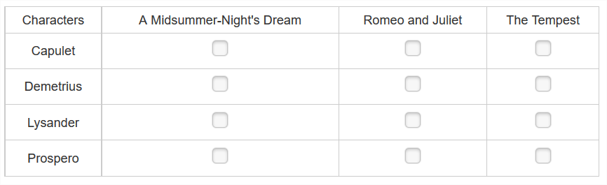
The GapMatchInteraction.Type (qti-gap-match-interaction) is similar to Match Interaction (qti-match-interaction) except that the choices in the second set are gaps (qti-gap) in a given passage of text and the task involves selecting choices from the first set and using them to fill the gaps. The same attributes are involved in controlling which, and how many, pairings are allowed, though there is no match-max attribute for the gaps because they can only ever have one associated choice. The scoring is again done with a mapping.
GapMatchInteration Attributes (element: qti-gap-match-interaction)
| Name | Usage | Value(s) | Default |
|---|---|---|---|
| max-associations | optional | Non-negative number | 1 |
| min-associations | optional | Non-negative number | |
| shuffle | optional | boolean | false |
Sub-elements include qti-gap-text (GapText.Type) and qti-gap-img (GapImg.Type).
GapText Attributes (element: qti-gap-text)
| Name | Usage | Value(s) | Default |
|---|---|---|---|
| identifier | required | Identifier | |
| template-identifier | optional | Identifier of a template variable used to control the visibility of the qti-gap-text | |
| show-hide | optional | Vocabulary:• show• hide | show |
| match-group | optional | IdentifierList | |
| match-max | required | Non-negative integer | |
| match-min | optional | Non-negative integer | 0 (unlimited) |
The qti-gap-img contains a single HTML object element.
GapImg Attributes (element: qti-gap-img)
| Name | Usage | Value(s) | Default |
|---|---|---|---|
| identifier | required | Identifier | |
| template-identifier | optional | Identifier of a template variable used to control the visibility of the qti-gap-img | |
| show-hide | optional | Vocabulary:• show• hide | show |
| match-group | optional | IdentifierList | |
| match-max | required | Non-negative integer, 0 means unlimited | |
| match-min | optional | Non-negative integer <= match-max | 0 |
| object-label | optional | string | |
| top | optional | empty | |
| left | optional | empty |
Additional formatting may be applied within the qti-gap-text element allowing for a greater variation.' Allowed formats include:
'br', 'img', 'xi:include', 'm:math', 'object', 'qti-printed-variable', 'a', 'abbr', 'acronym', 'b', 'big', 'cite', 'code', 'dfn', 'em', 'qti-feedback-inline', 'i', 'kbd', 'q', 'samp', 'small', 'span', 'strong', 'sub', 'sup', 'tt', 'var', 'qti-template-inline', 'bdi', 'bdo', 'label', 'ruby', 'ssml11:*'.
The qti-gap-match-interaction must be bound to a response variable with base-type directedPair and either single or multiple cardinality, depending on the number of gaps. The choices represent the source of the pairing and gaps the targets. Each gap can have at most one choice associated with it. The maximum occurrence of the choices is controlled by the match-max attribute of qti-gap-text or qti-gap-img.
The following is an example of a gap match interaction:
|
|
|
|
The shared interaction vocabulary for the Gap Match Interaction is intended to provide more precision when describing:
- Positioning of the Gap Choices container with respect to the passage of text containing the Gaps.
- Gap Choices container width.
- Gap element widths.
- Custom max|min-associations message overrides.
The full list of the Gap Match Interaction shared interaction vocabulary is enumerated in the 1EdTech QTI 3 Standardized Shared Vocabulary and CSS document.
3.2.6 Hotspot Interaction
A HotspotInteraction.Type (qti-hotspot-interaction) is a graphical interaction with a corresponding set of choices that are defined as areas of the graphic image. The candidate's task is to select one or more of the areas (hotspots).
The hotspot interaction should only be used when the spatial relationship of the choices with respect to each other (as represented by the graphic image) is important to the needs of the item. Otherwise, Choice Interaction should be used instead with separate material for each option.
The delivery engine must clearly indicate selected hotspots when such hotspots are selected. If the shared interaction vocabulary class qti-unselected-hidden is present, the delivery engine must hide the hotspots in their unselected and unfocused state. If the qti-unselected-hidden is not present, indicating hotspots in their unselected and unfocused state is left to the delivery engine.
HotspotInteraction Attributes (element: qti-hotspot-interaction)
| Name | Usage | Value(s) | Default |
|---|---|---|---|
| max-choices | optional | Non-negative number | 1 |
| min-choices | optional | Non-negative number | 0 (unlimited) |
The sub-element sequence for the qti-hotspot-interaction:
- either img, picture, or object (must have only 1, note that the use of object is deprecated in QTI 3)
- qti-hotspot-choice (at least 1)
HotspotChoice Attributes (element: qti-hotspot-choice)
| Name | Usage | Value(s) | Default |
|---|---|---|---|
| identifier | required | Identifier | |
| template-identifier | optional | Identifier of a template variable used to control the visibility of the qti-hotspot-choice | |
| show-hide | optional | Vocabulary:• show• hide | show |
| shape | required | Vocabulary:• circle• default• ellipse• poly• rect | |
| coords | required | Coords.Type | |
| hotspot-label | optional | string |
The hotspot interaction must be bound to a response variable with a base-type of identifier and single or multiple cardinality.
The shared interaction vocabulary for the Hotspot Interaction is intended to provide more precision when describing:
- Hotspot Selections theming.
- Custom max|min-choices message overrides.
All information related to the Hotspot Interaction shared interaction vocabulary is enumerated in the 1EdTech QTI 3 Standardized Shared Vocabulary and CSS document.
|
|
3.2.7 Hot Text Interaction
The HotTextInteraction.Type (qti-hottext-interaction) presents a set of choices to the candidate represented as selectable runs of text embedded within a surrounding context, such as a simple passage of text. Like Choice Interaction, the candidate's task is to select one or more of the choices, up to a maximum of max-choices.
The interaction is initialized from the qti-default-value of the associated response variable, a NULL value indicating that no choices are selected (the usual case).
HotTextInteraction Attributes (element: qti-hottext-interaction)
| Name | Usage | Value(s) | Default |
|---|---|---|---|
| min-choices | optional | Non-negative integer | 0 (unlimited) |
| max-choices | optional | Non-negative integer | 1 |
The qti-hottext-interaction must be bound to a response variable with a base-type of identifier and single or multiple cardinality.
|
|
The above example demonstrates an interaction with a single selection. For multiple selections, the response processing cardinality would be "multiple" and you may choose to limit the number of selections using the max-choices attribute in the qti-hottext-interaction element (or set to "0" for unlimited/all selections).
The shared interaction vocabulary for the Hot Text Interaction is intended to provide more precision when describing:
- Hiding the input control of the Hot Text choices.
- Custom max|min-choices message overrides.
All information related to the Hot Text Interaction shared interaction vocabulary is enumerated in the 1EdTech QTI 3 Standardized Shared Vocabulary and CSS document.
3.2.8 Inline Choice
The InlineChoiceInteraction.Type (qti-inline-choice-interaction) is an inline interaction to display a set of simple text choices in context in a surrounding text, which may be subject to variable value substitution with qti-printed-variable.
InlineChoiceInteraction Attributes (element: qti-inline-choice-interaction)
| Name | Usage | Value(s) | Default |
|---|---|---|---|
| identifier | required | Identifier | |
| required | optional | boolean | false If true then a choice must be selected by the candidate in order to form a valid response to the interaction. |
| shuffle | optional | boolean | false |
The sub-element seCoolquence of qti-inline-choice-interaction is:
- qti-label (maximum of 1)
- qti-inline-choice (at least 1)
InlineChoice Attributes (element: qti-inline-choice)
| Name | Usage | Value(s) | Default |
|---|---|---|---|
| identifier | required | Identifier | |
| template-identifier | optional | Identifier of a template variable used to control the visibility of the choice | |
| show-hide | optional | Vocabulary:• show• hide | show |
| fixed | optional | boolean | false |
When rendering an inline choice interaction, the common implementation is an embodiment of a <select> html form element or a combo box form control.
Below is an example of an inline choice interaction that allows the candidate to select one answer option to respond to the prompt.
Example: qti-inline-choice-interaction
|
|
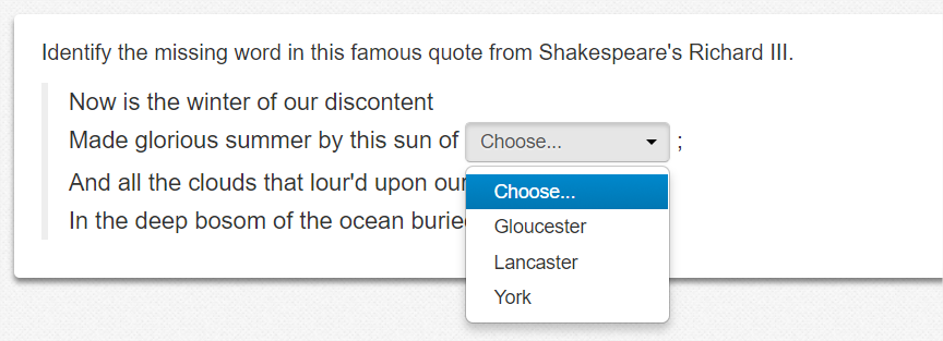
|
|
The bulk of the shared interaction vocabulary for this interaction adds further definition to the presentation width of the selection element by utilizing the class attribute.
Go to the QTI 3 Standardized Shared Vocabulary and CSS section on Inline Choice for full details.
3.2.9 Match Interaction
A MatchInteraction.Type (qti-match-interaction) is a blockInteraction that presents candidates with two sets of choices and allows them to create associations between pairs of choices in the two sets, but not between pairs of choices in the same set. Further restrictions can still be placed on the allowable associations using the match-max characteristic of the choices.
The sub-element within qti-match-interaction is qti-simple-match-set. MatchInteration Attributes (element: qti-match-interaction)
| Name | Usage | Value(s) | Default |
|---|---|---|---|
| max-associations | optional | Non-negative number | 1 |
| min-associations | optional | Non-negative number | |
| shuffle | optional | boolean | false |
The sub-element of qti-match-interaction is qti-simple-match-set (SimpleMatchSet.Type). The qti-simple-match-set has an optional "id" attribute which contains a UniqueIdentifier.Type. The qti-simple-match-set contains an ordered set of choices using qti-simple-associable-choice (SimpleAssociableChoice.Type) elements.
SimpleAssociableChoice Attributes (element: qti-simple-associable-choice)
| Name | Usage | Value(s) | Default |
|---|---|---|---|
| identifier | required | Identifier | |
| template-identifier | optional | Identifier | |
| show-hide | optional | Vocabulary:• show• hide | show |
| match-group | optional | IdentifierList | |
| match-max | required | Non-negative integer | |
| match-min | optional | Non-negative integer | 0 (unlimited) |
| fixed | optional | boolean | false |
The match interaction must be bound to a response variable with base-type directedPair and either single or multiple cardinality.
In the match interaction example below, the candidate's response is declared to have directedPair because the task involves pairing up choices from a source set into a target set. In this case characters from plays with the names of the plays from which they are drawn. Notice that match-max on the characters (the first set of associable choices) is "1" because each character can be in only one play but it is "4" on the plays (the second set of associable choices) because each play could contain all the characters. For example, Demetrius and Lysander were both in A Midsummer-Night's Dream, so in the correct response that play has two associations. In the mapping used for response processing these two associations have been awarded only a half a mark each.
|
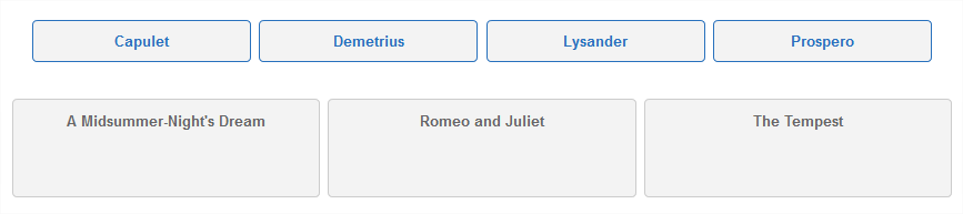
|
The shared interaction vocabulary for the Match Interaction is intended to provide more precision when describing:
- Non-tabular Match Interaction positioning of the first Simple Match Set choices with respect to the second Simple Match Set choices.
- Tabular Match Interaction styling.
- Custom max|min-associations message overrides.
Go to the QTI 3 Standardized Shared Vocabulary and CSS section on Match Interaction for full details.
3.2.10 Order
In an OrderInteraction.Type (qti-order-interaction) the candidate's task is to reorder the choices, the order in which the choices are displayed initially is significant. By default the candidate's task is to order all of the choices but a subset of the choices can be requested using the max-choices and min-choices attributes. When specified the candidate must first select a (sub)set of the choices and then impose an ordering on them.
OrderInteraction Attributes (element: qti-order-interaction)
| Name | Usage | Value(s) | Default |
|---|---|---|---|
| min-choices | optional | Non-negative number | |
| max-choices | optional | Non-negative number | |
| orientation | optional | Vocabulary:• horizontal• vertical | |
| shuffle | optional | false |
The sub-element of qti-order-interaction is qti-simple-choice (SimpleChoice.Type) where there must be at least one qti-simple-choice in the interaction to be valid, and at least 2 choices to be useful as an order interaction.
SimpleChoice (element: qti-simple-choice) Attributes
| Name | Usage | Value(s) | Default |
|---|---|---|---|
| identifier | required | Identifier | |
| template-identifier | optional | Identifier | |
| show-hide | optional | Vocabulary:• show• hide | show |
| fixed | optional | boolean | false |
This example below illustrates the Order Interaction. The candidate's response is declared to have ordered and the correct value is therefore composed of an ordered list of value. The question uses the standard response processing template Match Correct to score 1 for a completely correct answer and 0 otherwise.
|
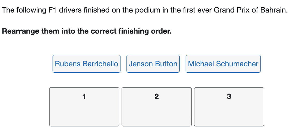 |
The shared interaction vocabulary for the Order Interaction is intended to provide more precision when describing:
- Target Labels
- Target Label Suffixes
- Choices | Targets Container Positioning
- Choices Container Widths
- Custom max|min -associations Messages
Go to the QTI 3 Standardized Shared Vocabulary and CSS section on Order Interaction for full details.
3.2.11 Graphic Order Interaction
A GraphicOrderInteraction.Type (qti-associate-interaction) is a graphic interaction with a corresponding set of choices that are defined as areas of the graphic image. The candidate's task is to impose an ordering on the areas (hotspots). The order hotspot interaction should only be used when the spatial relationship of the choices with respect to each other (as represented by the graphic image) is important to the needs of the item.
Otherwise, Order interaction should be used instead with separate material for each option. The delivery engine must clearly indicate all defined area(s) of the image.
Graphic Order Interaction Attributes (element: qti-graphic-order-interaction)
| Name | Usage | Value(s) | Default |
|---|---|---|---|
| max-choices | optional | Non-negative number | If unspecified, all of the choices may be ordered. |
| min-choices | optional | Non-negative number | If unspecified, all of the choices must be ordered and max-choices is ignored. |
The sub-element sequence for the qti-graphic-order-interaction:
- either img, picture, or object (must have only 1, object is deprecated)
- qti-hotspot-choice (at least 1)
HotspotChoice Attributes (element: qti-hotspot-choice)
| Name | Usage | Value(s) | Default |
|---|---|---|---|
| identifier | required | Identifier | |
| template-identifier | optional | Identifier of a template variable used to control the visibility of the qti-hotspot-choice | |
| show-hide | optional | Vocabulary:• show• hide | show |
| shape | required | Vocabulary:• circle• default• ellipse• poly• rect | |
| coords | required | Coords.Type | |
| hotspot-label | optional | string |
The graphic order interaction must be bound to a response variable with a base-type of identifier and ordered cardinality.
Example: Demonstrates qti-graphic-order-interaction
|
|
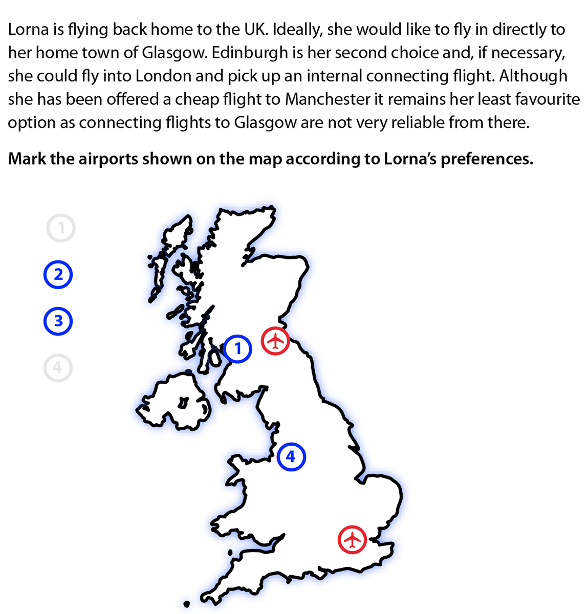
|
|
3.2.12 Associate Interaction
An AssociateInteraction.Type (qti-associate-interaction) is a block interaction that presents candidates with a number of choices and allows them to create associations between them.
AssociateInteraction Attributes (element: qti-associate-interaction)
| Name | Usage | Value(s) | Default |
|---|---|---|---|
| max-associations | optional | Non-negative number | 1 |
| min-associations | optional | Non-negative number | 0 (unlimited) |
| shuffle | optional | boolean | false |
The sub-element of qti-associate-interaction is qti-simple-associable-choice, where there must be at least one qti-simple-associable-choice.
SimpleAssociableChoice Attributes (element: qti-simple-associable-choice)
| Name | Usage | Value(s) | Default |
|---|---|---|---|
| identifier | required | Identifier | |
| template-identifier | optional | Identifier | |
| show-hide | optional | Vocabulary:• show• hide | show |
| match-max | required | Non-negative integer | |
| match-min | optional | Non-negative integer | 0 (unlimited) |
| fixed | optional | boolean |
The qti-associate-interaction must be bound to a response variable with base-type pair and either single or multiple cardinality.
Example: Demonstrates qti-associate-interaction allowing for 3 pairings
|
|
3.2.13 Graphic Associate Interaction
A GraphicAssociateInteraction.Type (qti-graphic-associate-interaction) is a graphic interaction with a corresponding set of choices that are defined as areas of the graphic image. The candidate's task is to associate the areas (hotspots) with each other. The graphic associate interaction should only be used when the graphical relationship of the choices with respect to each other (as represented by the graphic image) is important to the needs of the item. Otherwise, an Associate Interaction should be used instead with separate material for each option. The delivery engine must clearly indicate all defined area(s) of the image.
AssociateInteraction Attributes (element: qti-associate-interaction)
| Name | Usage | Value(s) | Default |
|---|---|---|---|
| max-associations | optional | Non-negative number | 1 |
| min-associations | optional | Non-negative number |
The sub-element sequence:
- img, picture, or object (limited to a single occurrence, object is deprecated)
- qti-associable-hotspot (at least 1)
AssociableHotspot Attributes (element: qti-associable-hotspot)
| Name | Usage | Value(s) | Default |
|---|---|---|---|
| identifier | required | Identifier | |
| template-identifier | optional | Identifier | |
| show-hide | optional | Vocabulary:• show• hide | show |
| match-group | optional | IdentifierList | |
| shape | required | Vocabulary:• circle• default• ellipse• poly• rect | |
| coords | required | Coords.Type | |
| hotspot-label | optional | string | |
| match-max | required | Non-negative integer | |
| match-min | optional | Non-negative integer | 0 (unlimited) |
The qti-graphic-associate-interaction must be bound to a response variable with base-type pair and either single or multiple cardinality.
Example: Demonstrates qti-graphic-associate-interaction
|
|
|
|
|
|
Alternatively, you may wish to use the picture element to reference the source for the more highly compressed WebP version and with a PNG alternative within the img element for browsers that do not support WebP.
Example: Demonstrates qti-graphic-associate-interaction with picture element
|
3.2.14 Graphic Gap Match Interaction
A GraphicGapMatchInteraction.Type (qti-graphic-gap-match-interaction) is a graphical interaction with a set of gaps that are defined as areas (hotspots) of the graphic image and an additional set of gap choices that are defined outside the image. The candidate must associate the gap choices with the gaps in the image and be able to review the image with the gaps filled in context, as indicated by their choices.
Care should be taken when designing these interactions to ensure that the gaps in the image are a suitable size to receive the required gap choices. It must be clear to the candidate which hotspot each choice has been associated with. When associated, choices must appear wholly inside the gaps if at all possible and, where overlaps are required, should not hide each other completely. If the candidate indicates the association by positioning the choice over the gap (e.g. drag and drop) the system should 'snap' it to the nearest position that satisfies these requirements.
GraphicGapMatchInteraction Attributes (element: qti-graphic-gap-match-interaction)
| Name | Usage | Value(s) | Default |
|---|---|---|---|
| max-associations | optional | Non-negative number | 1 |
| min-associations | optional | Non-negative number |
The sequence of elements within the qti-graphic-gap-match-interaction is:
- qti-prompt
- either img, picture, or object (deprecated)
- qti-gap-text
- qti-gap-img
- qti-associable-hotspot
GapText Attributes (element: qti-gap-text)
| Name | Usage | Value(s) | Default |
|---|---|---|---|
| identifier | required | Identifier | |
| template-identifier | optional | Identifier | |
| show-hide | optional | Vocabulary:• show• hide | show |
| match-group | optional | IdentifierList | |
| match-max | required | Non-negative integer | |
| match-min | optional | Non-negative integer | 0 (unlimited) |
GapImg Attributes (element: qti-gap-img)
| Name | Usage | Value(s) | Default |
|---|---|---|---|
| identifier | required | Identifier | |
| template-identifier | optional | Identifier | |
| show-hide | optional | Vocabulary:• show• hide | show |
| match-group | optional | IdentifierList | |
| match-max | required | Non-negative integer | |
| match-min | optional | Non-negative integer | 0 (unlimited) |
| object-label | optional | string | |
| top | optional | empty | |
| left | optional | empty |
AssociableHotspot Attributes (element: qti-associable-hotspot)
| Name | Usage | Value(s) | Default |
|---|---|---|---|
| identifier | required | Identifier | |
| template-identifier | optional | Identifier | |
| show-hide | optional | Vocabulary:• show• hide | show |
| match-group | optional | IdentifierList | |
| shape | required | Vocabulary:• circle• default• ellipse• poly• rect | |
| coords | required | Coords.Type | |
| hotspot-label | optional | string | |
| match-max | required | Non-negative integer | |
| match-min | optional | Non-negative integer | 0 (unlimited) |
The graphic-gap-match-interaction must be bound to a response variable with base-type directedPair and multiple cardinality. The choices represent the source of the pairing and the gaps in the image (the hotspots) the targets. Unlike the simple GapMatchInteraction, each gap can have several choices associated with it if desired, furthermore, the same choice may be associated with an qti-associable-hotspot multiple times, in which case the corresponding directed pair appears multiple times in the value of the response variable.
|
|
The shared interaction vocabulary for the Graphic Gap Match Interaction is intended to provide more precision when describing:
- Positioning of the Gap Choices container with respect to the image containing the hotspots.
- Gap Choices container width.
- Associable Hotspot Selections theming.
- Custom max|min-associations message overrides.
Go to the QTI 3 Standardized Shared Vocabulary and CSS section on Graphic Gap Match Interaction for full details.
3.2.15 Media
The MediaInteraction.Type (qti-media-interaction) enables measurement of the number of times the media object was experienced. This quantity is reported in the value of the interaction's response variable.
MediaInteraction Attributes (element: qti-media-interaction)
| Name | Usage | Value(s) | Default |
|---|---|---|---|
| autostart | required | boolean | Note: Accessibility guidelines suggest that candidates should initiate any media instead of automatically playing the media, therefore the value should be "false". |
| min-plays | optional | Non-negative integer | 0 (unlimited) |
| max-plays | optional | Non-negative integer | 0 (unlimited) |
| loop | optional | boolean | false |
| coords | optional | Coords.Type |
The sub-elements include:
- audio
- video
- object (deprecated)
The qti-media-interaction must be bound to a response variable of base-type integer and single cardinality.
Note that for the audio and video elements in QTI 3 markup, the "controls" attribute MUST include a value for the attribute to be valid XML. As per the HTML 5 specification, the way to exclude controls is to explicitly not include the attribute in the audio or video element. In QTI 3, valid values to include controls are "controls" (as per the HTML specification) or "true" (the more traditional boolean value for XML). So <video> would mean the controls are not provided to the candidate (as in the example below), and <video controls="controls"> would indicate the candidate should be provided with media controls.
Example: Demonstrates qti-media-interaction
|
|

|
|
3.2.16 Position Object Interaction
The PositionObjectInteraction.Type (qti-position-object-interaction) consists of a single image which must be positioned on another graphic image (the stage) by the candidate. Like Select Point Interaction, the associated response may have a qti-area-mapping that scores the response on the basis of comparing it against predefined areas but the delivery engine must not indicate these areas of the stage. Only the actual position(s) selected by the candidate shall be indicated.
PositionObjectInteraction Attributes (element: qti-position-object-interaction)
| Name | Usage | Value(s) | Default |
|---|---|---|---|
| center-point | optional | IntegerList | |
| min-choices | optional | Non-negative number | |
| max-choices | optional | Non-negative number | 1 |
The sub-element for the qti-position-object-interaction is either the HTML "img" or "picture" element. The object element is deprecated in QTI 3.
The qti-position-object-interaction must be bound to a response variable with a base-type of point and single or multiple cardinality. The point records the coordinates, with respect to the stage, of the centre point of the image being positioned.
Position Object Interaction, has a required parent, the qti-position-object-stage, which is a graphic image (represented as an "object"), on top of which the Position Object Interaction image is to be positioned. A single qti-position-object-stage may have several Position Object Interactions as child elements, representing several objects to be positioned on the same "stage".
Example: Demonstrates qti-position-object-interaction
|
|
|
|
3.2.17 Select Point Interaction
The SelectPointInteraction.Type (qti-select-point-interaction) is a graphic interaction. The candidate's task is to select one or more points. The associated response may have an qti-area-mapping that scores the response on the basis of comparing it against predefined areas but the delivery engine must not indicate these areas of the image. Only the actual point(s) selected by the candidate shall be indicated.
SelectPointInteraction Attributes (element: qti-select-point-interaction)
| Name | Usage | Value(s) | Default |
|---|---|---|---|
| min-choices | optional | Non-negative number | 0 |
| max-choices | optional | Non-negative number | 0 (unlimited) |
The sub-element for the qti-select-point-interaction is either the HTML "img" or "picture" element. The object element is deprecated in QTI 3.
The select point interaction must be bound to a response variable with a base-type of point and single or multiple cardinality.
|

|
3.2.18 Slider Interaction
The SliderInteraction.Type (qti-slider-interaction) presents the candidate with a control for selecting a numerical value between a lower and upper bound. It must be bound to a response variable with single cardinality with a base-type of either integer or float.
Note that a slider interaction does not have a default or initial position except where specified by a default value for the associated response variable. The currently selected value, if any, must be clearly indicated to the candidate.
Because a slider interaction does not have a default or initial position, except where specified by a default value for the associated response variable, it is difficult to distinguish between an intentional response that corresponds to the slider's initial position and a NULL response. As a workaround, slider interaction items have to either a) not count NULL responses (i.e. count all responses as intentional) or b) include a 'skip' button and count its activation combined with a response variable that is equal to the slider's initial position as a NULL response.
There are six attributes for the qti-slider-interaction where the lower-bound and upper-bound are required attributes:
Slider Interaction Attributes (element: qti-slider-interaction)
| Name | Usage | Value(s) | Default |
|---|---|---|---|
| lower-bound | required | NonNegativeDouble | |
| upper-bound | required | NonNegativeDouble | |
| step | optional | NonNegativeDouble | 1.0 |
| step-label | optional | boolean | false |
| orientation | optional | Vocabulary;
|
|
| reverse | optional |
Example: Demonstrates qti-slider-interaction
|
|
3.2.19 Upload
The UploadInteraction.Type (qti-upload-interaction) allows the candidate to upload a pre-prepared file representing their response.
The qti-upload-interaction must be bound to a response variable with base-type file and single cardinality.
UploadInteraction Attributes (element: qti-upload-interaction)
| Name | Usage | Value(s) | Default |
|---|---|---|---|
| class | optional | xs:string | |
| response-identifier | mandatory | identifier |
Example: Demonstrates qti-upload-interaction
|
|
A chocolate factory produces several types of chocolate, some of which have nut centres. The chocolates are mixed together and are randomly packed into cartons of ten. Build a spreadsheet to simulate 50 cartons of chocolates when each carton contains 10 chocolates, and when one-seventh of the chocolates have nut centres. Your spreadsheet should include 50 rows representing the 50 cartons, each row containing 10 columns to represent the chocolates. 
|
3.2.20 Drawing Interaction
The DrawingInteraction.Type (qti-drawing-interaction) allows the candidate to use a set of drawing tools to modify a given graphical image (the canvas). It must be bound to a response variable with base type file and single cardinality.
DrawingInteraction Attributes (element: qti-drawing-interaction)
| Name | Usage | Value(s) | Default |
|---|---|---|---|
| class | optional | xs:string | |
| response-identifier | mandatory | identifier |
The sub-element of the qti-drawing-interaction are the HTML elements img, picture, or object. The image specified within one of the aforementioned elements acts as the canvas on which the drawing takes place. It is best practice to use the img or picture elements for this interaction. If using the deprecated object element it MUST be of an image type, as specified by the type attribute.
Example: Demonstrates qti-drawing-interaction
|
|
3.2.21 End Attempt Interaction
End Attempt Interaction is a special interaction which immediately ends the current attempt on an assessment item. It may be used, for example, to allow the candidate to request a hint or model solution, or in an adaptive item to let the candidate display feedback or to move to the next in a series of interactions in the item.
EndAttemptInteraction Attributes (element: qti-end-attempt-interaction)
| Name | Usage | Value(s) | Default |
|---|---|---|---|
| title | mandatory | xs:string | |
| count-attempt | optional | xs:boolean |
Example: Demonstrates qti-end-attempt-interaction with a Hint
|
|
|
|
3.2.22 Custom Interaction
The CustomInteraction.Type (qti-custom-interaction) is a deprecated feature in QTI 3. It is recommended to use Portable Custom Interaction (next section) in place of the custom interaction. The Custom Interaction provides an opportunity for delivery platform-specific extensibility of this specification to include support for interactions not currently built into the QTI specification. This can be used, for example, to develop technology-enhanced items.
As the user interface and behavior of a qti-custom-interaction are custom, there is no predefined shared interaction vocabulary for qti-custom-interaction. However if a qti-custom-interaction implements a feature or behavior in a way which is consistent with how that has been defined for the pre-defined interaction types then it may use qti- prefixed class names to indicate it supports a behaviour consistent with the use of that shared interaction vocabulary elsewhere in this specification; e.g., a qti-custom-interaction which supports text entry by the candidate may support the qti-input-width set of classes to control the visible width allocated to display of the candidate's input.
CustomInteraction Attributes (element: qti-custom-interaction)
| Name | Usage | Value(s) | Default |
|---|---|---|---|
| class | optional | xs:string | |
| response-identifier | mandatory | identifier |
Example: Demonstrates qti-custom-interaction
|
|
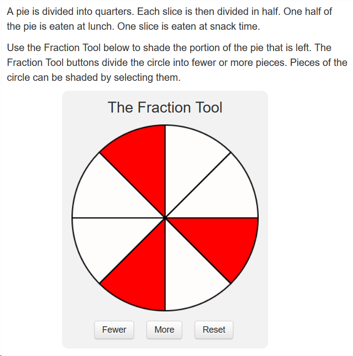
|
|
3.2.23 Portable Custom Interaction (PCI)
The PortableCustomInteraction.Type (qti-portable-custom-interaction) allows an item author with the support of a PCI module developer the ability to render an interaction with a custom user interface and behaviors by providing custom Javascript code supporting the interaction. This can be used, for example, to develop technology-enhanced items.
The Javascript code which implements a PCI may be included with the item in the content package or may reside elsewhere on the network. It will be loaded dynamically by the delivery engine when the item containing the PCI is presented. These Javascript modules must be AMD (Asynchronous Module Definition) modules, and must conform to the PCI API, detailed later in this document. The markup of a PCI may include any HTML5, MathML, and SSML elements supported elsewhere in QTI. In addition, a PCI may contain feedback, template, and printed variable elements. Finally, a special templateelement may be included. This may be used only in a PCI and is a container for any valid XML markup.
As the user interface and behavior of a PCI are custom, there is no predefined shared interaction vocabulary for PCIs. However if a PCI implements a feature or behavior in a way which is consistent with how that has been defined for the pre-defined interaction types then it MAY use qti- prefixed CSS class names to indicate it supports a behaviour consistent with the use of that shared interaction vocabulary elsewhere in this specification; e.g. a PCI which supports text entry by the candidate may support the qti-input-width set of classes to control the visible width allocated to display of the candidate's input.
PCI allows for referencing a stylesheet using the qti-stylesheet element, where the stylesheet is specific to the code referenced within the PCI. PCI also allows for the inclusion of catalog information that is specific to the PCI. PCI is the only interaction that allows for these elements within the interaction. All other interactions would use the item level stylesheet reference and the item level catalog node.
There is a detailed example of a PCI in Section 3.7.12 . Consequently, example definitions and expected renderings are not provided here.
3.3 Composite Items
Composite items are items that contain more than one interaction. Composite items may contain multiple instances of the same type of interaction or have a mixture of interaction types.
While a QTI item may contain multiple interactions, an interaction MUST NOT be nested or contained within any other interaction. Items with nested interactions are not considered compliant to the QTI standard regardless of whether they pass validation or not.
Example: Demonstrates composite item with two Inline Choice interactions and oneText Entry interaction, Response Processing with partial scoring
|
|
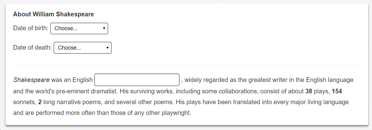
|
|
3.4 Response Processing
Item response processing occurs after the candidate has completed an attempt on an item. The purpose of response processing is to compute the value of the item's outcome variables. The most common application is to compute the candidate's score on the item, but in more advanced items, response processing may be used to show or hide feedback or interaction choices, and for other purposes.
3.4.1 Response Processing Rules
Response processing consists of a sequence of rules that are carried out, in order, by the response processor. A ResponseCondition rule is a special type of rule which contains sub-sequences of rules divided into responseIf , responseElseIf and responseElse sections. The response processor evaluates the expressions in the responseIf and responseElseIf elements to determine which sub-sequence to follow. In this example, the responseIf section is followed only if the variable with identifier RESPONSE matches the correct response declared for it. The responseElseIf section is followed if RESPONSE matches the response explicitly given (which places the correct driver 1st but confuses the other two). Finally, the responseElse section is followed if neither of the previous two apply. The responseElse section has no corresponding expression of course. The qti-set-outcome-value element is just a ResponseRule that tells the processor to set the value of the specified outcome variable to the value of the expression it contains.
The qti-variable , qti-correct and qti-base-value elements are examples of simple expressions. In other words, expressions that are indivisible. In contrast, the qti-match and qti-ordered elements are examples of operators. Operators are expressions that combine other expressions to form new values. For example, match is used to form a boolean depending on whether or not two expressions have matching values.
3.4.2 Fixed and General Response Processing
There are two forms of response processing:
- Fixed Template Response Processing
- General Response Processing.
In "fixed template" response processing, the processing to be done is identified by a "template name". There are three standard template names, and a delivery engine may define additional template names. For simple scenarios, the "match_correct" and "map_response" standard templates may be used because this maximizes interoperability. All conformant delivery systems are required to provide response processing as defined by these two templates, while there is no assurance that a template other than these two will be supported, or that general response processing will be supported.
The three standard "fixed" response processing templates are:
| Template Name | Description | Location |
| match_correct | https://purl.imsglobal.org/spec/qti/v3p0/rptemplates/match_correct.xml | |
| map_response | https://purl.imsglobal.org/spec/qti/v3p0/rptemplates/map_response.xml | |
| map_response_point | https://purl.imsglobal.org/spec/qti/v3p0/rptemplates/map_response_point.xml |
For "general" response processing, QTI defines an XML-based Domain Specific Language (DSL) with a large number of commands and operators for computing and setting template and outcome variables. General response processing is necessary for more complex items, such as items generated from templates, adaptive items involving feedback, and composite items.
The same Domain Specific Language is also used for Outcome Processing, Template Defaults, Constraints, and Processing, and for evaluating Preconditions and Branch Rules.
3.4.3 Partial Scoring
Please see section 3.3 Composite Items for an example of response processing that implements partial scoring.
3.4.4 Conformance
It is possible to define the effect of the standard templates using the "general" response processing DSL, but it is not required that a QTI 3 Entry-level delivery system implement the standard templates through support of the DSL. A "built-in" implementation of the standard templates is sufficient for conformance in a QTI 3 Entry-level delivery system.
At the QTI 3 Core-level of conformance, a delivery system is required to support enough of the response processing DSL to be able to load and execute at least the "match_correct" and "map_response" standard templates, as well as other templates or inline response processing blocks using the same subset of the Domain Specific Language as these two standard templates. For convenience and performance, a QTI 3 Core-level delivery system may still also use the "built-in" approach for some of the templates which it supports, in addition to supporting the response processing language.
3.4.5 External Scoring
In some cases, response processing is undertaken by external systems or human scorers. This is typically the case for items asking candidates to write an essay. However, it might be important for external systems or human scorers to know which outcome value has to be set to derive an appropriate score.
External Scoring Example
|
This example describes an item with a single qti-extended-text-interactionasking the candidate to write an essay. As the item does not contain qti-response-processing, the SCORE qti-outcome-declaration has its external-scored attribute value set to "human". This makes QTI compliant systems aware that the final value of SCORE has to be set by a human scorer after the Item Session has closed.
3.5 Outcomes
Outcome variables are declared by outcome declarations. Their value is set either from a default given in the declaration itself or by a responseRule during responseProcessing.
Items that declare a numeric outcome variable representing the candidate's overall performance on the item should use the "SCORE" built-in outcome variable. SCORE must have a base-type of float.
Items that declare a maximum score (in multiple response choice interactions, for example) should do so by declaring the built-in variable named "MAXSCORE". MAXSCORE must have a base-type of float.
Items or tests that want to make the fact that the candidate scored above a predefined threshold available as a variable should use the built-in "PASSED' outcome variable. PASSED must have a base-type of boolean.
At runtime, outcome variables are instantiated as part of an item session. Their values may be initialized with a default value and/or set during response processing. If no default value is given in the declaration then the outcome variable is initialized to NULL unless the outcome is of a numeric type (integer or float) in which case it is initialized to 0.
For non-adaptive Items; i.e., items that do not use template processing to compute default values, the values of the outcome variables are reset to their default values prior to each invocation of response processing. For adaptive Items, the outcome variables retain the values that were assigned to them during the previous invocation of response processing. For more information, see section 3.4.2 Fixed and General Response Processing .
There is one built-in outcome variable, "completionStatus", that is declared implicitly and must not appear in an outcomeDeclaration. Delivery Engines must maintain the value of the built-in outcome variable completionStatus, a single identifier. It starts with the reserved value "not_attempted". At the start of the first attempt it changes to the reserved value "unknown". It remains with this value for the duration of the item session unless set to a different value by a setOutcomeValue rule in responseProcessing. There are four permitted values:
- 'completed' - the candidate has experienced enough of the item to consider it completed;
- 'incomplete' - the candidate has not experienced enough of the item to consider it completed;
- 'not_attempted' - the candidate is considered to have not used the item in any significant way;
- 'unknown' - no assertion on the state of completion can be made.
Any one of these values may be set during response processing. If an Adaptive Item sets completionStatus to completed then the session must be placed into the closed state, however an item session is not required to wait for the completed signal before terminating, it may terminate in response to a direct request from the candidate, through running out of time or through some other exceptional circumstance. Adaptive Items must maintain a suitable value and should set completionStatus to "completed" to indicate when the cycle of interaction, response processing and feedback must stop. Non-adaptive Items are not required to set a value for completionStatus, but they may do so. Delivery Engines are encouraged to use the value of completionStatus when communicating externally.
OutcomeDeclaration Attributes (element: qti-outcome-declaration)
| Name | Usage | Value(s) | Default |
|---|---|---|---|
| identifier | required | Identifier | |
| base-type | required | Normalized string
|
|
| cardinality | required | Normalized string
|
|
| view | optional | Normalized string
|
The intended audience for an outcome variable can be set with the view attribute. If no view is specified the outcome is treated as relevant to all views. Complex items, such as adaptive items or complex templates, may declare outcomes that are of no interest to the candidate at all, but are merely used to hold intermediate values or other information useful during the item or test session. Such variables should be declared with a view of author (for item outcomes) or testConstructor (for test outcomes). Systems may exclude outcomes from result reports on the basis of their declared view if appropriate. Where more than one class of user should be able to view an outcome variable the view attribute should contain a comma delimited list. |
| interpretation | optional | string | A human interpretation of the variable's value. |
| long-interpretation | optional | uri | An optional link to an extended interpretation of the outcome variable's value. Declared outcomes with numeric types should indicate their range of possible values using normal-maximum and normal-minimum, especially if this range differs from [0,1]. Declared outcomes with numeric types should indicate their range of possible values using normal-maximum and normal-minimum, especially if this range differs from [0,1]. |
| normal-maximum | optional | float | The normal-maximum attribute optionally defines the maximum magnitude of numeric outcome variables, it must be a positive value. If given, the outcome's value can be divided by normal-maximum and then truncated (if necessary) to obtain a normalized score in the range [-1.0,1.0]. normal-maximum has no effect on response processing or the values that the outcome variable itself can take. |
| normal-minimum | optional | float | The normal-minimum attribute optionally defines the minimum value of numeric outcome variables, it may be negative. |
| mastery-value | optional | float | The mastery-value attribute optionally defines a value for numeric outcome variables above which the aspect being measured is considered to have been mastered by the candidate. |
3.6 Stylesheets
QTI 3 introduces an extensive shared interaction vocabulary for improving item interaction rendering interoperability. To further improve item rendering interoperability, QTI 3 also introduces a limited number of shared CSS style names and conventions for use by authoring and delivery systems. In the QTI 3 Standardized Shared Vocabulary and CSS Classes document, the shared vocabulary are defined (with examples) and sample CSS code is provided. In addition to interaction specific vocabulary, the document includes:
- Accessibility Classes
- The standardized markup for inline text
- Content layout (rows, columns, offsets, etc.)
- Alignment markup
- Vertical Writing
- Markup for visually hiding elements
- List Styles
By implementing these shared styles and conventions, QTI 3 authoring and delivery platforms can safely import/export – or render – items while preserving certain presentation characteristics without using custom stylesheet injection. Note that all of the shared styles are prefaced by the "qti-" string so as to avoid collisions with a delivery platform's existing CSS.
Reference implementations of each CSS class – and further examples – can be found in the IMS GitHub QTI 3 repository. Over time, it is expected that additional shared CSS style names and definitions will be added to this repository.
3.6.1 Custom Styles
For QTI 3, the best practice is to avoid using custom styles, and instead use the Shared CSS Vocabulary as described above. By using the Shared CSS style names, Test Delivery Systems can optimize the rendering experience for accessibility and for design responsiveness.
However, as a last resort, custom stylesheets may be injected into an item and other QTI content, such as tests, stimuli, and feedback, rubric, and template blocks, using the qti-stylesheet element:
|
As in earlier versions of QTI, it is not required for conformance for delivery systems to support the qti-stylesheet element -- a further reason why stylesheet injection is likely not to be interoperable. Notwithstanding these issues, if your implementation will be using stylesheets, QTI 3 recommends the use of CSS 3 stylesheets. For more information on CSS 3 stylesheets, see the W3C documentation at https://www.w3schools.com/css/default.asp .
The best practice convention in QTI 3 is that stylesheets referenced within an AssssmentItem file apply to the item itself, and are not assumed to apply to associated content such as stimulus ( qti-assessment-stimulus) or rubric blocks ( qti-rubric-block), both of which can have their own associated stylesheets. An item's stylesheets are assumed to apply to content within qti-item-body, qti-catalog-info, as well as to any content generated from the use of feedback or templates. Any included content using XInclude that is placed within the qti-item-body, qti-catalog-info, and qti-modal-feedback, or qti-template-block generated content is also assumed to be covered by the stylesheet reference made within an item.
It is the responsibility of an item author to limit the scope of an injected stylesheet to the content with which it is associated. Because of the way CSS scoping is defined, this is admittedly difficult. The following describes some approaches to limiting CSS scope:
- Use class naming conventions. Use a naming convention for CSS classes which includes a prefix with an item vendor-specific code, and which is likely to make custom class names globally unique.
- Avoid bare element or attribute selectors. Avoid CSS style rules which apply broadly, such as those using "bare" element or attribute selectors. Such rules are very likely to have a wider impact than intended. Do not write rules like "div {color: red}". There are bound to be many other div'sin the document, not all of which should be red. Instead, write ".vendorprefix-red { color: red }", and add the "vendorprefix-red" class to elements in the content which should be red. Further note: at all costs, avoid specifying any colors in custom style definitions as these are practically guaranteed to result in an accessibility problem for the delivery platform.
- Do not assume defaults are in effect. Do not assume that CSS properties will have their default values. If it is important for an element to have the default CSS property values, you should set the properties explicitly to the default values.
- Use id attributes and descendent selectors. QTI 3 allows the use of the id attribute on HTML5 elements. It may be helpful to assign an id to a higher level element within the HTML content you are styling, such as a div,and write style rules against that id, possibly combined with descendant selectors. Choose ids that are likely to be globally unique so that other stylesheets in the environment don't affect your content, and vice-versa.
- Do not assume order.Do not assume an injected stylesheet will be first or last, or in any particular position relative to other stylesheets in the delivery environment. That is, if item 1 injects stylesheet A, and the next item, item 2, injects stylesheet B, a delivery engine is free to insert the two stylesheets in any order, and an author cannot rely on stylesheet B being after stylesheet A. Even worse, stylesheet C, from somewhere else entirely, may land in between the two. In short, it is not really possible to rely on the CSS cascade between stylesheets, because the ultimate ordering of the stylesheets is not defined.
- Be aware of delivery system artifacts. You may observe that the HTML generated by the delivery system for QTI content includes HTML elements which were not in the original content. This is because delivery engines commonly transform QTI content such as interactions, interaction components (e.g. qti-prompt, or qti-simple-choice), the qti-item-body, catalog cards, rubrics, feedback blocks, etc, into standard HTML elements, and these will end up as the parents, children, or siblings of the HTML elements placed in the item directly. It is unwise to style these system-generated elements or to rely on the generated structure in CSS style rules, because another delivery system, or even another version of the same delivery system, will generate a different structure. Be aware when writing style rules that delivery system artifacts may appear "out of nowhere" and "get in the way" of sibling selectors, child selectors, adjacency selectors, first- and last-child pseudo-selectors, and the like.
- Do not depend on the stylesheet. To be interoperable, QTI content should fall back to a functional and accessible presentation even if the stylesheet is not injected. When injecting a stylesheet, authors should still rely on the shared interaction vocabulary and shared CSS classes for most of the styling and reserve the additional rules in the stylesheet for styling which cannot be achieved through shared interaction vocabulary and shared CSS classes. An author should ensure that the content is acceptable using only shared interaction vocabulary and shared CSS classes, and be prepared for a stylesheet not to be injected at all.
Here is an example item, generated by a fictional vendor Quizzco, with some of these best practices applied:
Item with External Stylesheet Example
|
External Stylesheet Example: Quizzco-Custom-Styles.css
|
3.7 Advanced Item Structures
3.7.1 Customized Response Processing
The qti-custom-operator extension mechanism allows the inclusion of custom, non-QTI response evaluation rules. In general, such APIs are likely to be particular to a specific software library or programming language. For that reason, it is difficult to predict what form such custom operators will take, and, by extension, how to generalise functions or syntax between different custom operators.
By way of illustration, the following fragment illustrates the use of the Maxima engine as a response processing library via the qti-custom-operator element.
|
In this case, a qti-custom-operator is used as a very slim container for what is effectively a complete script in Maxima's language. A QTI processor designed to work with this qti-custom-operator could pass the script verbatim to Maxima, and use its response to set the 'oDummy' outcome value.
3.7.2 Adaptive Items
Adaptive items are a feature that allows an item to be scored adaptively over a sequence of attempts. This allows the candidate to alter their answer following feedback or to be posed additional questions based on their current answer. Response processing works differently for adaptive items. Normally (for non-adaptive items) each attempt is independent and the outcome variables are set to their default values each time response processing is carried out. For adaptive items, the outcome variables retain their values across multiple attempts and are only updated by subsequent response processing. This difference is indicated by the value of the adaptive attribute of the Assessment Item. Adaptive items must of course provide feedback to the candidate in order to allow them to adjust their response(s).
In the following example, the feedback is used to contain a solution which is displayed when the candidate clicks the "Show Solution" button.
|
A randomized version of the item above is shown below. The randomization does not affect the display of the solution in this example.
|
Adaptive Example 4 – Using qti-template-block and qti-template-inline inside qti-feedback-block to adjust content:
The qti-feedback-block element can contain subsidiary feedback elements, "template" elements and interactions alongside any of the HTML elements. In this question, the values of template variables are calculated within the templateProcessing element, and the solution is different depending on the value of the variable iA; if iA=90, the right angle in the triangle makes the question easier.
The method for displaying the solution is as in the previous example; here we concentrate on the template elements within the SOLUTION feedbackBlock.
|
Adaptive Example 5 – Using qti-feedback-block to change the appearance of a question
|
In this example, the "feedback" forms part of the question. In adaptive questions, feedbackBlock and feedbackInline elements can contain interactions:
Monty Hall (Take 1)
Section 3.8.3 - Annotated Item Examples - Monty Hall (Take 1)
This example takes a famous mathematical problem and presents it to the user as a game. The qti-feedback-block element, in association with a number of outcome variables is used to control the flow of the story, from the opening gambit through to whether or not you have won a prize. When the story concludes you are asked about the strategy you adopted. Notice that the scoring for the question is based on the actual strategy you took (one mark) and your answer to the final question (two marks). If you choose a bad strategy initially you are always punished by losing the game. If you feel that this is cheating take a look at a more realistic version of the same question which combines adaptivity with the powerful feature of item templates: Monty Hall (Take 2).
Items with Hints
See the example in the End Attempt Interaction section, where the item is extended to provide both feedback and the option of requesting a hint. The qti-end-attempt-interaction controls the value of the response variable HINTREQUEST - which is true if the attempt ended with a request for a hint and false otherwise.
3.7.3 Feedback
Feedback consists of material presented to the candidate conditionally, based on the values of outcome variables, allowing an item to be reconfigured as a result of Response Processing . In other words, feedback is controlled by the values of outcome variables. There are several types of feedback material:
- Feedback blocks ( qti-feedback-block) are shown to the candidate based on the value of an outcome variable. Each feedback block is associated with an outcome variable and an identifier. If the outcome variable has that identifier as its value, then the feedback block is shown or hidden, as determined by the value of the show-hide attribute. Feedback blocks may contain almost any valid qti-item-body content, including interactions and other feedback blocks. Feedback blocks may be used inside many interaction components, such as choices, and within HTML5 elements, such as div. After each attempt, following a round of response and outcome processing, the delivery engine re-computes the visibility of feedback blocks based on possibly new values of the controlling outcome variables. By default, the changed state of feedback content is only shown during subsequent attempts on, or review of, an item.
- Inline feedback ( qti-feedback-inline) is similar to block feedback, but may only be used in "inline" contexts. Inline feedback elements may only contain inline HTML5 content, such as span, and inline QTI interactions, such as qti-inline-choice-interaction, or qti-text-entry-interaction.
- Modal feedback ( qti-modal-feedback) is item content which is shown to (or hidden from) the candidate based on the value of outcome variables, and whose display can be changed by response processing. Those display changes become visible before any subsequent attempt or review of the item. As with feedback blocks, the value of a controlling outcome variable is used in conjunction with the show-hide and identifier attributes to determine whether or not the feedback is presented. Unlike feedback blocks and inline feedback, the modal feedback element cannot contain any interactions, and may not be used inside an item body. Because modal feedback is not part of the item body, it may be displayed "modally" -- for example, as a pop-up "dialog box" which appears after response and outcome processing and which must be dismissed by the candidate after it is read. However, how modal feedback is displayed is left to the delivery platform, and an implementation may simply display modal feedback in-line in the item, similar to other forms of feedback.
- Test feedback ( qti-test-feedback) is allowed within qti-assessment-test and qti-test-part, and is otherwise very similar to modal feedback. Test feedback may be configured to be shown during the test or test part ( access="during"), or only when the candidate reaches the end of the test or test part ( access="atEnd").
Using qti-modal-feedback
In this example, a straightforward multi-choice question declares an additional outcome variable called FEEDBACK which is used to control the visibility of just qti-modal-feedback.
|
Inline Feedback using qti-feedback-inline
In this example, the feedback appears within the question, right beside the text of the selected option. The content of qti-feedback-inline is restricted to material which can be displayed "inline", i.e. without moving to a new block or paragraph, so it behaves like the HTML "span" element.
|
3.7.4 Item Templates
Item Templates are items which function as templates that can be used for generating large numbers of related items. The generated items are often called "cloned items". Item templates can be used by special-purpose software, a so-called "cloning engine" to produce many clones of the template.
Where Delivery Engines support Template Processing, an Item Template can also be included directly in an assessment. At delivery time, the delivery engine will run the Template Processing in the item, giving the item's template variables values, and possibly computing new correct responses based upon the template variable values, effectively creating a single clone of the item template dynamically. In combination with the QTI selection element with the attribute with-replacement="true", a single Item Template in an assessment may be instantiated multiple times, and appear to the candidate as a different item each time, as a result of the Template Processing in the Item being run in each separate instance.
Each item cloned from an Item Template is identical except for the value, qti-default-value, and qti-correct-response value of the template, response, and outcome variables of the item, as assigned by the Template Processing.
An Assessment Item is therefore an Item Template if it contains a set of Template Processing rules for assigning values to the item variables. An Item Template will typically also have Template Declarations for template variables, although this is not mandatory. The state of the template, outcome, and response variables post-Template Processing is what distinguishes one clone of an item from another.
A cloning engine that creates cloned items must assign a different identifier to each clone and record the values of the template variables used to create it. A report of an item session with such a clone can then be transformed into an equivalent report for the original item template by substituting the item template'sidentifier for the cloned item's identifier and adding the values of the template variables to the report.
Item templating features may be used in combination with QTI adaptive and feedback features to provide items with varying paths through multiple interactions.
The main QTI features which support Item Templates include:
- Template Variables. Similar to response, outcome, and context variables, template variables are defined by the qti-template-declarationelement. The default values of template variables can be set in the declaration or by qti-template-defaultelements. The values may subsequently be changed via Template Processing.
- Template Variable Defaults (qti-template-default). While the default value of a template variable can be set using the qti-default-valueelement within the qti-template-declaration, in the same manner as with response and outcome declarations, the qti-template-default element may also be used to set the default value within an Assessment Item Reference at the Assessment Section level. This allows the default values of template variables, as specified within the item, to be overridden when an item is incorporated by reference into a particular assessment. The template default value can be given as an expression in the Template Processing domain-specific language.
- Template Content(qti-template-block and qti-template-inline). Conceptually similar to feedback blocks and inline feedback, template blocks and inline templates represent content which is shown to, or hidden from, the candidate based on the identifier and show-hide attributes of the template blocks and inline templates. Many of the interaction types also have subcomponents, such as hotspots or choices, which can be conditionally displayed (or hidden), using the same show-hide mechanism as template blocks and inline templates. This makes it possible, for example, to turn the choices in a Choice Interaction on or off via template variables.
- Template Variable Expansion. Printed variables (qti-printed-variable) may be used to display template variable values, just as they may be used with outcome and context variables. In addition, if a template variable has the math-variable="true" attribute, MathML mi and mo variables will be replaced with the value of the corresponding template variable. Similarly, if a template variable has the param-variable="true" attribute, param element values will be replaced with the corresponding template variables.
- Template Processing (qti-template-processing). Similar to response and outcome processing, template processing may be defined within an item to compute and set the values of template, response, and outcome variables. The delivery system will run the template processing rules immediately before the first attempt on an item, just prior to its initial presentation to the candidate. Following template processing and still before the initial presentation of the item, the delivery system will then determine the visibility of template blocks and inline templates, and do variable expansion on printed variables, MathML and param elements based on template variables.
- Template Constraints (qti-template-constraint). A template constraint is a processing rule available only in Template Processing. It terminates Template Processing and re-runs it from the beginning if the condition specified in the template constraint is not satisfied. This can be used, for example, to iterate the Template Processing with different randomly-generated values until a predetermined condition is satisfied.
The following examples demonstrate a variety of templating features.
Using Template Variables
This example contains a simpleqti-text-entry-interaction(TextEntryInteraction.Type) but the question (and the correct answer) varies for each item session. In addition to the usual RESPONSE and SCORE variables a number of template variables are declared. Their values are set by a set of TemplateProcessing rules. Template processing is very similar to response processing. The same condition model and expression language are used. The difference is that TemplateRules set the values of template variables and not outcome variables. Notice that the declaration of RESPONSE does not declare a value for the CorrectResponse because the answer varies depending on which values are chosen for A and B. Instead, a special rule is used, qti-set-correct-response in the template processing section.
The display of aqti-text-entry-interaction response can be formatted through the use of a format attribute using # for optional digits. For example, comma separators and a leading 0 for decimal entries can be displayed if format="#,##0.#". A response 12345678 would display as 12,345,678, but would be captured as entered - "12345678". A response .12345 would be captured as entered, but would display as 0.12345. A response 1.2345 would display and be captured as entered, 1.2345. See https://code.google.com/p/javascript-number-formatter/ for the basis of this feature.
The qti-random-integer element represents a simple expression that selects a random integer from a specified range. The qti-random element represents an operator that selects a random value from a container.
The qti-item-body displays the values of the template variables using the qti-printed-variable element.
|
Using a Template to Change an Image
Sometimes it is desirable to vary some aspect of an item that cannot be represented directly by the value of a template variable. For example, in "Mick's Travels", the qti-item-body contains an illustration that needs to be varied according to the value chosen for a template variable. To achieve this, three qti-template-inline elements are used, each one enclosing a different img element. This element (along with the similar qti-template-block ) has attributes for controlling its visibility with template variables in the same way as outcome variables are used to control the visibility of feedback.
|
Item Templates Combined with Adaptive Items
In Monty Hall (Take 1) we cheated by fixing the game so that the wrong strategy always lost the candidate the prize (and the first mark). In Monty Hall (Take 2) we present a more realistic version of the game using an item template. The same outcome variables are defined to control the story and the feedback given but this time a qti-template-declaration is used to declare the variable PRIZEDOOR. The qti-template-processing rules are then used to preselect the winning door at random making the game more realistic. The qti-response-processing rules are a little more complicated as the value of PRIZEDOOR must be checked (a) to ensure that Monty doesn't open the prize winning door after the candidate's first choice and (b) to see if the candidate has actually won the "fantastic prize".
In this example, using the correct strategy will still lose the candidate the prize 1/3 of the time (though they always get the mark). Do you think that the outcome of the game will affect the response to the final strategy question?
|
Modal Feedback with Math Markup Language
This example makes extensive use of templates to test knowledge of calculus. It has modal feedback and includes some mathML.
|
Numeric Operators in Response Processing
An example that uses templates extensively testing statistic funtions, and uses many common numeric operators in the response processing. It has modal feedback and includes some mathML.
|
Using Template Constraint to Determine Variables at Runtime
This is another numeric example that makes use of templates, but is notable for its use of templateConstraint to determine variables at runtime.
|
3.7.5 Rubric Blocks
The qti-rubric-block element is the container for the rubric block content, which can be placed anywhere within the qti-item-body node of an AssessmentItem. A rubric block identifies part of the content that represents instructions to one or more of the actors that view the item.
Although rubric blocks are defined as simple blocks they must not contain interactions. The visibility of nested qti-rubric-blocks is determined by the outermost element. In other words, if an element is determined to be hidden then all of its content is hidden including conditionally visible elements for which the conditions are satisfied and that therefore would otherwise be visible.
If you use a stylesheet within a rubric block, the stylesheet is scoped only to that specific rubric block, and should not be used for other content within an AssessmentItem or any other rubric block. The stylesheet within the rubric block would also apply to any catalog content, if it were placed in that same rubric block. The assumption is that the rubric block also inherits from the AssessmentItem, and the rubric block stylesheet is intended to add styles or override AssessmentItem styles.
The qti-rubric-block element has two attributes, "use" and "view".
Rubric Block Attributes (element: qti-rubric-block)
| Name | Usage | Value(s) | Default |
|---|---|---|---|
| use | required | Vocabulary:
|
No default |
| view | required | Vocabulary:
|
No default |
The content within the qti-rubric-block should only be presented to the specified actors when the role of the actor is known. For example, in a testing session, a candidate would not have any content in the qti-rubric-block where the view="scorer" as the content is intended for the scorer, not the candidate.
In addition to the use and view attributes, QTI 3 introduces a limited set of shared classes which are used to clarify the presentation expectations for the rubric block. The classes include:
- qti-rubric-discretionary-placement : to indicate that the delivery/presentation system should provide the content to the intended view actors, but they are not necessarily placed inline with the content. The rubric block content can be displayed somewhere within the delivery platform's interface.
- qti-rubric-inline : to indicate that the delivery/presentation system should provide content to the intended view actors in the order they appear within the AssessmentItem file. For example, if a rubric block showing scoring information for scorer is placed after an interaction, the scoring information should be visually placed after the interaction is presented for any scorer.
The content of the rubric block is stored within the qti-content-body node, and contain the QTI 3 limited HTML set. It cannot contain any QTI interactions.
Rubric blocks can also optionally include a qti-catalog-info node to store catalogs that support the rubric block content.
An example of using multiple rubric blocks for different views and uses is shown below. Note that the use of the shared classes is optional, but included in the example to demonstrate good practice.
Rubric Block in an AssessmentItem
|
3.7.6 Printed Variable, MathML Variable, and Param Expansion.
Printed variable (qti-printed-variable) elements may be used to insert the values of template or outcome variables into test- and item-level content, such as within feedback, template, and rubric blocks, within most HTML5 elements, and within such interaction components as prompts and choices. This is useful in generating item content from templates, for customizing feedback and messages, and for similar use cases.
The format attribute of the qti-printed-variable element can be used to control the formatting of the printed variable. Appendix A of Section 2 of this document gives a list of possible formatting options.
A delivery system which supports printed variables updates them in all content currently displayed to users immediately after response processing and outcome processing are completed. Similar to printed variables, the values of template variables with math-variable="true" are substituted into < mi> and < ci> elements within MathML blocks, and template variables with param-variable="true" are substituted into object param elements
3.7.8 Companion Materials
Companion materials are described within the <qti-companion-materials-info> node, and include assessment materials that are required to be available to test takers while answering a specific item. Materials may include interactive tools, like calculators or rulers. The specific materials tags, and their best practice usage are described below.
3.7.8.1 Calculators
All calculators would have access to all number digits, decimal key, equals button, and Clear button. Spoken (read aloud) capability should be something that is configurable to either allow, or not allow, during testing. Additionally, some programs allow for reading the numbers or functions as you use them, but do not allow reading the number as a whole. This is usually for Math-related content. The four possible calculators that can be specified are Basic, Standard, Scientific, and Graphing. Descriptions of each are included below.
Basic Calculator:In the <qti-calculator-type> tag, use the "Basic" vocabulary. The best practice assumed functions: Add, Subtract, Multiply, Divide.
Example usage:
|
Standard Calculator:In the <qti-calculator-type> tag, use the "Standard" vocabulary. The best practice assumed functions: all basic calculator functions, Square root (√), Percentage (%) , Plus/Minus (a.k.a. Sign Change), Memory Functions.
Scientific Calculator:In the <qti-calculator-type> tag, use the "Scientific" vocabulary. The functions may include, but are not limited to: ALL standard calculator functions, a p key, square ( x2) , cube (x3), x to the y (xy), cube root , xth root , logarithm keys, log, ln, base 10, base e,Trigonometry function keys with an INVERSE key for the inverse functions, sin, cos, tan, hsin (hyperbolic sin), hcos, (hyperbolic cos), htan (hyperbolic tan), DEG, RAD, GRAD conversion, a capacity to work in both degree and radian mode, a reciprocal key (1/ x) – calculate the inverse of the displayed value, permutation and/or combination keys ( nP r , nC r), parentheses keys, metric conversion, permutation and combination keys, nPr, cPr, x!
Graphing Calculator:In the <qti-calculator-type> tag, use the "Graphing" vocabulary. A Graphing calculator includes many of the same functions of a scientific calculator, plus the ability to display equations graphically.
3.7.8.2 Rule
Allows for the presentation of a measuring device for use on the computer with the supplied content. Use the qti-description tag for text description, as a human readable description of the functionality/capability of the rule. Provide the system of measurement using the rule system (which provides for choosing between metric (SI) and US measurement systems), then set the minimum length of the rule, the minor increment of the rule, and the major increment of the rule using the unit type (related to the rule measurement system).
Example usage:
|
3.7.8.3 Protractor
The test taker will be supplied with an on-screen protractor while responding to the item. A human readable description can be included in the description tag. Provide the measurement system using the increment tag, which lets you provide a value for either the metric (radians) or US (degrees) systems of angular measurement.
Example usage:
|
3.7.8.4 Digital Materials
These are content or reference materials that relate to the item content. The materials can include some level of interactivity, but no QTI interactions. Examples could be a map, a table of information, a sheet of math formulas, an interactive periodic table of elements, or even graphic creation tools. Use the <qti-digital-material> tag and provide a link to the material by use of the qti-file-href tag.
An optional label and icon representing the digital material's resource may be provided which the delivery system may use if it wants to provide a link to the resource, or a button to launch the resource.
A MIME type may also be provided (via the attribute mime-type) which may allow the delivery engine to optimize the delivery of the resource.
Example usage:
|
Digital Materials are intended to be presented to candidates during an assessment session. However, these materials are meant to assist, remind, guide, or in the case of a formative assessment, may even instruct the candidate. The candidate's interaction with these materials is not a requirement to responding to any assessment items, and no there are no scoring implications for the use of the materials by candidates.
The reference to the materials from within the item is often done to indicate that the particular reference materials are associated with the item, and that the candidate should have access to the materials while the assessment item is presented to the candidate. Because there is no indication as to how the materials are to be presented to candidates, the delivery system has discretion over the manner of presentation. Assessment programs often provide direction as to their expectations around the presentation of reference materials for candidates.
If candidates are required to access the materials to answer questions (like a reading passage), use the assessment stimulus structures (see Section 3.7.7 ) instead of digital materials. 3.7.8.5 Physical Materials
These are external materials needed to work with, or respond with, when the test taker responds to the item. Use the <qti-physical-material> tag, then describe the materials using text.
Example usage:
|
3.7.9 HTML5 Accessibility Structures
Within an QTI 3 item, content presented to candidates is largely authored using HTML in the itemBody, qti-catalog-info, and qti-modal-feedback nodes. Any prompts or interactions within the itemBody use QTI 3 specific elements, which are commonly converted to HTML elements at the time of delivery to the candidate. While authoring QTI 3 content, and transforming any markup code to delivery code, it is important to ensure that the content is presentable to as wide an audience as possible. In addition to making content more accessible to all candidates, using accepted web-delivery standards provides access to candidates using assistive technology (AT).
Many of the recommendations around the techniques that provide accessibility to candidates come from the World Wide Web Consortium's (W3C) Web Content Accessibility Guidelines (WCAG) 2.1. Implementers are encouraged to use WCAG to provide guidance on making their assessments accessible. The practices recommended below and throughout this document are certainly not definitive, exhaustive, or complete. However, using the native HTML structures will reduce the amount of special accessibility markup required for assessment delivery.
Using semantically-rich markup aids AT because the content structure and meaning can be programmatically determined. The WCAG 2.1 documentation defines "programmatically determined" as:
determined by software from author-supplied data provided in a way that different user agents, including assistive technologies, can extract and present this information to users in different modalities.
There are several HTML elements that are also useful for accessibility that can be used within an item, or an assessment interface. The elements: h1, h2, h3, h4, h5, h6, figure, main, nav, aside, ul (unordered list), ol (ordered list), table, footer, audio, video, p (paragraph) – all provide semantic meaning to the content within the element, and that meaning is used by assistive technology to be conveyed to the user, as well as providing navigational assistance. Implementers are encouraged to take advantage of native HTML elements to aid in providing meaningful, understandable content to candidates.
3.7.9.1 Use of Headings and Labels
By using descriptive headings and labels in assessment items (and assessment interfaces), the assessment experience for all candidates, including Assistive Technology (AT) users, is substantially improved. WCAG success criteria cover many of the aspects of using headings and labels in web content. The success criteria for headings and labels include:
- 2.4.6 Headings and Labels
- 2.4.10 Section Headings
- 3.2.4 Consistent Identification
- 3.3.2 Labels and Instructions
- 4.1.2 Name, Role, Value
In addition to headings providing useful descriptions of the content that follows, they can provide structure to the content and allow AT users to navigate through and around the content using keyboard shortcuts. This allows the AT users to skim, read, and focus their attention on the specific portions of the content that are important to them, without the need of rereading unimportant information, and freeing them from a content-linear user experience.
Heading levels should maintain their hierarchical order, as computer programs would assume that heading levels with lower numbers are not within heading sections with higher numbers.
Having labels for interactive components allows assistive technology users (particularly screen reader users) to understand the purpose of the interactive component, as well as identifying the current object why the computer device has in focus. The use of WAI-ARIA to provide state information (or for labelling custom created web components) is also extremely helpful for AT users, and is discussed in more detail in Section 2.4.1, as well as within many of the item examples (particularly the transformation to delivery examples).
3.7.9.2 Alt Text and Long Descriptions
Images (pictures, illustrations, graphs, charts, icons, etc.) intended to provide meaningful content (non-decorative images) should include a short description of the image. The length of the description can vary from a few words to a couple of sentences. If the description needs to exceed two or three sentences, or the description would benefit from text formatting (use of lists, data tables, mathematical notation, etc.), consider making a shorter description that identifies the image, then add a long description for the image.
For assessments, the amount of information, and the specific information provided, is particularly important. In some cases, over describing the image can be a hindrance to understanding the image, or may add unintended distractions for the candidate, so authors should include only the amount of information that is important to the task, and for which a sighted candidate might need to consider when responding to the item.
Decorative images should include the empty alt text string (alt=""), as this coding convention is used by AT to skip even mentioning the image in any way. In some cases, assessments (particularly for younger candidates) include images to increase the engagement of the assessment, though the image is not critical to answer the question. Authors will need to judge whether adding simple descriptions like "Picture of a duck" is useful for the candidate. In many cases, treating these engagement images as "decorative" may be appropriate.
If the image has a caption which is intended for all candidates (regardless of accessibility requirements), consider using the HTML5 <figure> element which allows for a caption by using the <figcaption> element. The <figure> element can also be useful when displaying a series of images together. When providing multiple images within a figure, the <figcaption> can be used to describe the grouping of images collectively. If you use a caption for an image, you should also include at least a short identifying description in the alt text for any images within the figure.
For more complicated images, the simple description provided in the alt text string may be inadequate to describe all the information within the image, and writing a long string of text describing the image can be difficult to navigate for AT users. In these cases, it is recommended that a long description of the image be provided for candidates who could benefit from them.
See Section 5.2.1.1 for additional information on alternative text, and Section 5.2.1.2 for examples of long descriptions.
3.7.9.3 Audio and Video Tracks
The QTI 3 standard allows the use of the HTML5 elements audio and video. These are useful not only because they provide semantic meaning for the media object, but because they allow the use of tracks, which are used to include alternative representations of the auditory and visual aspects of the media.
To provide captions for a video object, use the "captions" vocabulary in the "kind" attribute in the track element, as shown in the code snippet below:
|
The above example refers to a WebVTT file for the captions. Most browsers have media players that automatically display a Closed Caption (CC) icon in the controls bar if you supply a captions track, but check your particular delivery implementation to ensure that candidates can access the track. The media players then synchronize the captions information supplied in the WebVTT file with the video playback.
Some video files include the captions in the video file itself.
While you can provide multiple languages as subtitles for videos, this is typically not done for assessment content, as the captions provided are expected to be in the language of the assessment content, and if the content is also provided in a different language, that content is provided in a completely different Assessment Item (QTI 3 refers to these as item "variants").
There is a notable exception, where some assessments provide "stacked" translations, where the content switches back and forth between two languages by providing a chunk of content in one language (like a paragraph of text), then following that chunk with the second language translation. For stacked translated content, it would make sense to include multiple languages, as well as providing the language in the "srclang" attribute using a valid [BCP 47] language tag, as well as using the "label" attribute of the track (label="English") to identify the captions for the different language versions. Typically, those language labels appear in a list when the user selects the Closed Caption (CC) icon.
QTI 3 allows for the Media Fragments URI 1.0 notation (l ink to W3C documentation ) as recommended by the W3C as of 25 September, 2012. For example, if you wanted to play only the first 20 seconds of a video file, you add the media fragment notation to the end of the src URI, as shown in the example below:
|
3.7.10 PNP Activated Content and the Use of Catalogs for Resource Storage
Within an QTI 3 Item, you can provide support-specific content through the use of catalog resources. Catalog content in a QTI 3 Item is considered "dormant" because it is only presented to candidates if their PNP information or their program's business rules indicate that the delivery system should provide them with the support-specific content within the catalog.
It should be noted that general accessibility information should NOT be supplied within catalogs, but rather should be included as content readily available to all users using accepted web-based accessibility markup practices. General accessibility information would include things like alt text for images, captions for videos with audio, roles for sections of content, headings, labels, and text descriptions for non-text content.
An item can contain none, one, or many catalogs, all contained within the qti-catalog-info node within an AssessmentItem file, inserted after the qti-item-body content.
A single catalog can contain one or many supports, which are enumerated using "cards" within the qti-catalog node. The "support" attribute of the card describes which support is contained within the card. Each catalog must only contain one of any of the particular supports. For example, you cannot have a catalog with 2 cards with a support="additional-directions". If the support is intended to match the predefined supports (see Section 3.7.10.1) of the Personal Needs and Preferences 3.0, the support name in the support attribute will exactly match the support name of the PNP. If the support is not intended to match the predefined supports, then the support name is considered "custom" and should follow the custom support conventions (see Section 3.7.10.3).
If you need to further differentiate between candidates based on their PNP needs and preferences, cards can contain one or more qti-card-entry nodes, where the specific differentiated metadata is provided as an attribute for each qti-card-entry. A common differentiating characteristic is the language of the content for each qti-card-entry.
A qti-card or qti-card-entry may contain a single qti-html-content node, or any number of qti-file-href nodes, which reference files outside the item instance. A qti-card or qti-card-entry must contain at least some content: either qti-html-content or a qti-file-href reference.
The qti-html-content node can contain any of the QTI 3 permitted HTML elements, or plain text. The qti-html-content node cannot contain any QTI 3-specific elements, including any interactions.
The qti-file-href nodes reference one or more external files that are intended to be delivered for the specific support as listed in the support attribute for the card or card-entry. When referencing multiple files intended to provide the same support, use the mime-type attribute to differentiate between the file types, where the delivery system determines which file type is most appropriate to deliver in any specific context. The multiplicity of files is not intended to provide files for different user-based needs or preferences (as derived from the candidate's PNP). If different content is needed for user-based needs, the differences should be expressed in the attributes of a multiplicity of card-entry instances for that support.
However the content with the qti-card or qti-card-entry is provided, the delivery expectation is that the content for any specific support should only be provided when requested. A request can come from either a candidate's needs and preferences (their PNP), or from an administrative request for all or some portion of the candidate pool; e.g., a testing program could decide that ALL candidates should receive the glossary-on-screen support, regardless of any specific requests from a candidate's PNP. If no request for any particular support-specific content is made, that content should remain dormant; i.e., not presented to the candidate.
3.7.10.1 The Predefined Personal Needs and Preferences® 3.0 Supports Permitted in QTI 3 Item Content
The QTI 3 profile of Personal Needs and Preferences 3.0 is a subset of the full set of supports that are defined in Personal Needs and Preferences 3.0. Additionally, only certain supports of the QTI 3 profile are allowed in the support attribute of cards, hereafter referred to as the predefined supports. For many of the supports it is not necessary to provide additional or alternative content in order to provide a candidate with the support. Examples include supports like breaks for candidates during testing, or providing a computer linereader tool. The presentation/delivery system can provide these supports without the need of authored information within the item. These supports are therefore not needed in the context of authored content.
The predefined supports can be named in the support attribute without the use of custom support extension. The IMS QTI 3 validator will check and allow the use of the predefined supports.
The full list of predefined supports that can be authored in assessment content includes:
- additional-directions
- audio-description
- braille
- glossary-on-screen
- high-contrast
- keyboard-directions
- keyword-translation
- linguistic-guidance
- long-description
- sign-language
- simplified-language-portions
- simplified-graphics
- spoken
- tactile
- transcript
3.7.10.2 How to Reference Catalog Content
Catalogs can be referenced from the qti-item-body element, from any element within the qti-item-body node, and within any element within a qti qti-catalog → qti-card → qti-html-content node.
A reference is made to the catalog using the attribute "data-catalog-idref" from within an element in the qti-item-body - or on the qti-item-body element itself - where the value of the attribute is the id of the catalog you are referencing. A catalog MUST contain a unique id in the qti-catalog element's start tag. In the simple item example below, notice the reference (data-catalog-idref="catalog1") to the qti-catalog on line 0019, where the data-catalog-idref value matches the id in the qti-catalog element found on line 0029.
Note that the catalog is placed within the qti-catalog-info node (starting on line 0028), and the qti-card supports the "linguistic-guidance" feature (line 0029), as described within the support attribute of the qti-card.
Example: Referencing Catalog Content
|
A catalog can be referenced from more than one originating source. For example, if there is additional content in the above example that also used the word "accurate", you would point to the same catalog from all the instances of the word accurate within the text.
Catalogs can contain more than one support, as shown in the slightly more complex example below, where the catalog has support for both keyword-translation and linguistic guidance.
The example also shows how a support with other user-based needs (as provided in the candidate's PNP) uses multiple qti-card-entry nodes where the attributes differentiate between which content is to be presented to the candidate. In this example, the keyword-translations are provided in multiple languages (the languages are specified using [BCP 47] language tags), and the expectation is only the language requested by the candidate in their PNP will be presented to them.
Example: Catalog with Multiple Supports
|
While an item may not contain any catalogs, it might also contain multiple catalogs that support any number of pieces of content within the item. In the example below, the sign-language support uses two different catalogs to allow the stem and the response options to have their own associations to portions of the sign language video file.
Example: Multiple Catalogs within a Single Item
|
In addition to the primary qti-catalog-info node of an assessment item, catalog content can be placed within the various structures that go inside assessment items (i.e., rubric blocks, feedback structures, template structures).
As a best practice, the scope of the catalog should be limited to the container that holds (or could hold) a qti-catalog-info node. For example, a rubric block within an assessment item's qti-item-body node should reference catalogs within that rubric block. It should not jump out of the rubric block and reference catalogs from the item's primary qti-catalog-info node or other rubric blocks. Conversely, item content outside the rubric block should never access catalogs inside the rubric block's qti-catalog-info node. An example of the proper referencing is shown below.
Example: Catalogs Across Content Nodes
|
For interoperability purposes, catalog ids within assessment content files (items, sections, stimulus, parts/tests) MUST be unique. Be aware that there may be referenced/included/nested content (like a shared stimulus or rubric blocks) that may also include catalogs and could be on the same delivery presentation screen for candidates. It is the expectation that Authoring systems ensure there are no catalog naming conflicts across structures when exported.
3.7.10.3 Custom Supports
Cards within a catalog can also contain custom content – content for supports other than the predefined supports allowed in QTI 3 (see Section 3.7.10.1 for the list).
To include your custom content, use the prefix "ext:" in the name of the support attribute on the card. As a best practice, your custom name should include the name of the organization implementing the custom support, in order to avoid namespace collisions with other organizations that may create similar custom supports. In the example below, the fictional organization "KXZ Testing" will include "kxztesting" in the custom support name (line 0012), which follows the lowercase & hyphen naming convention used throughout QTI 3 and Personal Needs and Preferences® 3.0. The IMS QTI 3 validator will allow any alphabetical characters (a-z, A-Z, 0-9) (plus dash and underscore) following the extension prefix. It will not check for any spelling consistencies for custom-created support names.
Example: Labelling Custom Support Content
|
If the custom support is intended to be delivered for specific candidates based on their PNP information, the PNP should also use the Personal Needs and Preferences 3.0 extension mechanism, using the same name of the custom support used in the content. (See Section 5.4)
3.7.11 Context Declarations
When evaluating Template Processing and Response Processing instructions in an Assessment Item, having contextual information available in the information model can improve the effectiveness and efficiency of such Template Processing and Response Processing instructions. For example, Template Processing and Response Processing instructions with easy access to a candidate's PNP "context" can yield richer, more effective, presentation and outcomes. In another example, enabling an evaluation system to pass system or environmental "context" into an Assessment Item – or an Assessment Test – using common information model conventions can add richness to item evaluation and improve interoperability.
The built-in QTI_CONTEXT record variable can be visualized with the following qti-field-identifier structure when declared in a QTI3 Assessment Item:
The key elements to qti-context-declaration are:
- A variable declaration which declares a variable with global scope. Such a globally scoped variable can be accessed within <qti-template-processing>, <qti-response-processing>, and <qti-outcome-processing> instructions. This approach uses the element qti-context-declaration.
A <qti-context-declaration> has all of the typical attributes; e.g., cardinality, identifier, and base-type.
- A built-in <qti-context-declaration> for a variable named "QTI_CONTEXT", with cardinality of record. The following is an explicit (though unnecessary) <qti-context-declaration> of QTI_CONTEXT:
<qti-context-declaration cardinality="record" identifier="QTI_CONTEXT" />
"QTI_CONTEXT" is the name used in order to avoid collisions with other variables that might already be declared in existing items.
- Systems that support context declarations are required to support three field definitions within the QTI_CONTEXT record:
- candidateIdentifier: a string used to map to a candidate object. A practical application of this would be to encode a user or session ID which could then be used as the key to additional user/candidate information
- testIdentifier: a string used to map to a test object. A practical application of this would be to encode an <qti-assessment-test> identifier which could then be used as the key to additional "test" contextual information.
- environmentIdentifier: a string used to map to an environment runtime in which template processing or response processing is being evaluated. A practical application of this would be to encode a "program" identifier which could then be used as the key to additional system-level properties.
|
A system supporting context declarations must implement the candidateIdentifier, testIdentifier, and environmentIdentifier fields of the QTI_CONTEXT record.
Note: A common expected usage of QTI_CONTEXT is to enable more interoperable methods of retrieving a candidate's PNP information. For example, PNP information can be located by using the candidateIdentifier field as a key, alone, or in conjunction with the testIdentifier field.
In the next example, different programs use one item to capture and evaluate essays. However, each program has chosen to implement different partial scoring ratios. An environmentIdentifier is passed into an item using the QTI_CONTEXT environmentIdentifier field (lines 39–41). This value (either "1" or "2" in this example) is then used with a <qti-match-table> (lines 12–15) to find the partial scaling factor for a program.
|
3.7.12 Portable Custom Interactions (PCIs)
As discussed in Section 3.2.23 , PCIs can be used to build interoperable interactions with custom user interface and behaviour.
The functionality of a PCI is implemented by an AMD module written in Javascript, which may load any other AMD modules upon which it depends.
PCIs are introduced into an item by the use of a qti-portable-custom-interaction element. As with the predefined interaction types, PCIs are bound to a response variable via the response-identifier attribute.
As two different qti-portable-custom-interaction elements could represent two very different custom interaction types, a PCI MUST have an attribute (custom-interaction-type-identifier) to identify the actual interaction type represented by this PCI. To prevent name collisions between the values used by different implementers it is RECOMMENDED that a Federated Content URN [rfc4198] be used for the value of the custom-interaction-type-identifier attribute.
Any custom attributes provided by the item author through the use of data- attributes on the qti-portable-custom-interaction element MUST be passed as properties by the delivery engine to the PCI module on initialization.
The item author MAY pass the values of template variables defined in the item to the PCI module via qti-template-variable child elements.
The item author MAY pass HTML markup to the PCI module to customize the user interface of the PCI via a qti-interaction-markup child element. It is the responsibility of the PCI module to decide what use (if any) it will make of this markup. The markup allowed would be similar to that allowed by a qti-rubric-block, so it could for example include qti-printed-variable or inline feedback elements. One difference with qti-rubric-block is that the qti-interaction-markup element MAY contain a templateelement which in turn may contain any HTML5 markup.
3.7.12.1PCI AMD Default Module Resolution
As the delivery engine must dynamically load the AMD module which implements the PCI module and any AMD module that it depends on, it needs to know how to resolve references to AMD module names to loadable Javascript files.
PCI supports loading AMD modules from global URLs (e.g. CDN (content delivery network) hosted Javascript files) and also from QTI content package relative files. As a QTI content package may be deployed in more than one context (e.g. it may be used in a normal web browser with access to external CDN hosted files or it may be used in a high stakes secure browser context where access is permitted only to files included in the QTI content package) PCI allows both a primary location (typically used to reference CDN hosted files) and a fallback location (typically referencing content package provided files) to be used when specifying AMD module locations.
The first mechanism supported for AMD module resolution is to provide a module resolution configuration file called "module_resolution.js" in the QTI content package which defines the item in a directory called "modules".
This file defines the primary location of each named AMD module.
This MUST be supported by delivery engines. While it is expected that this will be the most common way to resolve the AMD modules used by PCIs its use by content authors and QTI content packages is RECOMMENDED, but not mandatory.
3.7.12.2 PCI AMD Module Resolution File Format
This config file is a JSON document like the following example:
{
    "waitSeconds": 15,   "paths": {
    "module1": "https://example.com/js/modules/graph1.01/graph",
    "module2": "https://foobar.com/foo/bar1.2/foo"  }}
The "waitSeconds" property defines how long the delivery engine should wait for each Javascript file to load before timing out. A setting of 0 indicates that no timeout should be used (however this may prevent a fallback configuration from being used). If "waitSeconds" is not specified then a default of 7 seconds should be assumed.
The paths object provides a collection of AMD module name to URL mappings. The path supplied should not contain a file extension.
If the location starts with a protocol (e.g. https://) then the module should be fetched from that location. Otherwise it should be assumed to be a QTI content package relative path.
A delivery engine MAY ignore any package relative locations which are not defined in the manifest of the QTI content package.
A delivery engine MAY apply security rules to the URLs from which it will load Javascript files.
In the example above if an AMD require call was made for "module1" the delivery engine would first read the module resolution configuration from "<content package base href>/modules/module_resolution.js" and then load the Javascript for the module from https://example.com/js/modules/graph1.01/graph.js
3.7.12.3 PCI AMD Default Fallback Module Resolution
The second module resolution mechanism is to provide a module resolution configuration file called "fallback_module_resolution.js" in the QTI content package which defines the item in a directory called "modules".
This MUST be supported by delivery engines, but its use in QTI content packages is optional. For any modules where the primary location is not a package relative path it is RECOMMENDED that a fallback location is configured which uses a package relative path.
The file format and processing rules are the same as defined in section 3.7.12.2 above, but the locations provided are those to be used if a timeout or a fatal error (such as a 403 error) is encountered when attempting to load the module from the primary location.
3.7.12.4 Associating a PCI module to the interaction
To associate a PCI module with a qti-portable-custom-interaction (PCI), either the "module" attribute or a qti-interaction-modules element MUST be present. The value of the "module" attribute (or the qti-interaction-modules element) MUST be the name of an AMD module defined in the module resolution configuration.
If we take the example of a simple PCI which implements a custom Likert Scale interaction where the QTI content package included a module resolution configuration in "modules/module_resolution.js" with the contents: {
    "paths": {
  "exampleLikertScale": "modules/likert",
  "handlebars": "modules/lib/handlebars.min"    }}
Then the item author can use:
|
When this item is rendered by the delivery engine it will read the "module" attribute's value ("exampleLikertScale") and after looking this module name up in "modules/module_resolution.js" will attempt to dynamically load "modules/likert.js" from the QTI content package. If the AMD module in likert.js required a module called "handlebars", then the location for that will be resolved in the same way and the delivery engine will attempt to dynamically load "modules/lib/handlebars.min.js" from the QTI content package.
The item author MAY also override the default location for the primary resolution config files by adding a qti-interaction-modules child element with a "primary-configuration" attribute to set the location for the primary module resolution configuration and MAY set the fallback module resolution configuration location by setting a "fallback-configuration" attribute. This MUST be supported by the delivery engine, however the delivery engine MAY refuse to load relative paths which are not defined in the content package's manifest, and MAY apply security rules to the URLs it will load Javascript from.
The item author MAY further customize the module loading for an interaction by specifying the primary and fallback locations to use for an individual module by adding one or more qti-interaction-module child elements to the qti-interaction-modules element. This MUST be supported by the delivery engine.
For example, there may be no default module resolution configuration files in the content package, but there may be a module resolution file called e.g. modules/maths_config.js with the contents: { "waitSeconds": 10, "paths": { "exampleLikertScale": "modules/likert", "exampleGraphing": "modules/graphing", "handlebars": "modules/lib/handlebarsv101.min" }}
Assuming that both PCI modules require a module called "handlebars" but require different versions of the handlebars module, the item author may wish to override the module version in the item definition, e.g.
|
3.7.12.5 Example PCI lifecycle
Depending on the item definition, on the set of features implemented by the delivery engine, and on the portable custom interaction, there are many possible PCI lifecycles.
The first example flow is of a non-adaptive, non-composite item containing a portable custom interaction. Here the candidate navigates away from the item while it is unsubmitted, and then later returns to complete the item and submit it. The delivery engine stores the state of the item it retrieves from the PCI object in the item session and when the candidate returns to the item it passes that stored state back to the custom interaction instance.
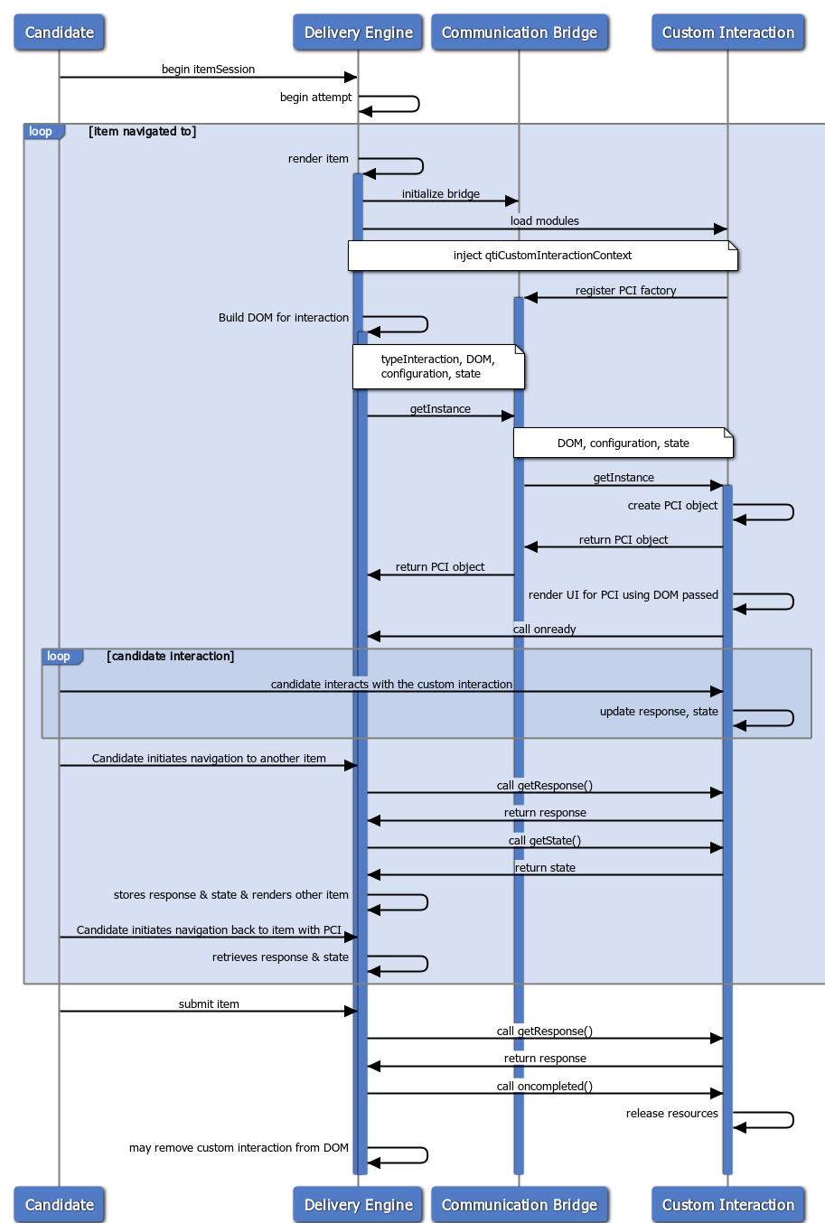
In this second example a more complex flow is shown where a candidate may interact with an adaptive composite item which may contain more than one portable custom interaction and a qti-end-attempt-interaction across multiple attempts where the candidate uses the endAttemptInteraction to end each attempt and a button in the delivery engine to ‘submit' the item, the item response processing then closes the item.
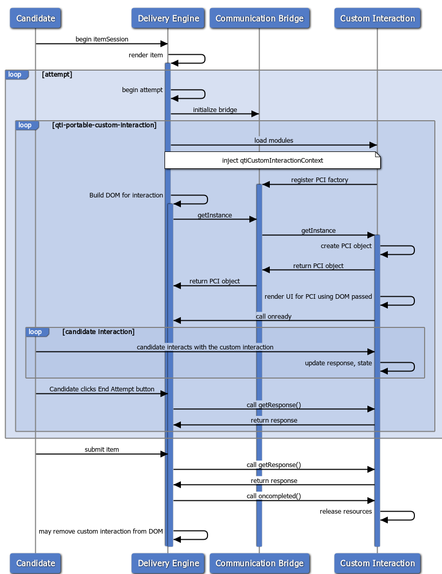
3.7.12.6 PCI API
Any Javascript loaded as part of or to support a PCI MUST be written to run inside a strict Javascript execution context (e.g. it must expect that the delivery engine has called "use strict" before any of its modules are loaded) [STRICT]. It is recommended that all PCI modules also call "use strict".
3.7.7 PCI Communication Bridge Methods
The delivery engine supports portable custom interactions by injecting a Javascript object which supports the PCI Communication Bridge contract into the loaded PCI module via AMD. This object allows PCIs to register themselves and exchange state and configuration settings with the delivery engine. The delivery engine will provide this via a standard AMD definition of 'qtiCustomInteractionContext' which the portable custom interaction can require in its AMD module.As an alternate method of discovering the qtiCustomInteractionContext object, the delivery engine MUST also assign it to the global window object before the PCI is loaded.
When a delivery engine is rendering an item which contains one or more portable custom interaction instances, it needs a way to obtain the factory interface needed to create new PCI objects to implement the portable custom interaction instances in the item. The key which links the two is that each qti-portable-custom-interaction element has a custom-interaction-type-identifier attribute which is a string that uniquely identifies the factory that will be used to create PCI objects of the type needed by that qti-portable-custom-interaction instance. That instance also identifies the module(s) which are required to be loaded for that PCI.
As these modules are loaded they must ensure that one will call the registermethod of the bridge object to register the factory for that PCI with the Communication Bridge under a key which is the typeIdentifier of the PCI module.
The delivery engine can then later call the getInstance method of the Communication bridge to cause it to render itself to the DOM element passed in the call. The delivery engine will also pass the value of the custom-interaction-type-identifier attribute of the qti-portable-custom-interaction it is rendering as the first parameter of the call, and the Communication Bridge will then look up the factory the PCI registered with that typeIdentifier and then call getInstance on that factory, proxying on the other parameters provided. The getInstance call returns a reference to the object thus created.
The qti-interaction-markup element of the PCI may contain HTML which in turn may contain QTI elements such as qti-variable etc. It is the responsibility of the delivery engine to resolve those elements. As this HTML is passed to the PCI when getInstance is called, the PCI can then choose to modify that HTML as it sees fit. Consequently, the delivery engine should resolve these elements before generating the HTML in the DOM element passed to the PCI, and whenever the rendering of that HTML might change; e.g., after response or outcome processing where response and outcome variables used in that HTML might change, the delivery engine should update the HTML and call getInstance on the PCI again to pass it the updated HTML.
The register method will be called once per PCI type, in each AMD loading context where the PCI module is loaded. How an implementation defines AMD loading contexts is beyond the scope of this document. For example, there may be only one loading context for an entire assessment, or loading contexts for each item, or for each portable custom interaction instance, depending on the implementation.
If a delivery engine supports composite interactions the qtiCustomInteractionContext getInstance method may be called multiple times to construct more than one PCI in the Assessment Item.
Before unloading a PCI, if the PCI object provides an oncompleted callback function the delivery engine MUST call it to allow the PCI to release any global resources it allocated (e.g. global event listeners).
| PCI Communication Bridge (qtiCustomInteractionContext) Required Methods | |||
|---|---|---|---|
| register(customInteraction) After the PCI module loads it uses this method to register its customInteraction factory object which provides a factory method used to create PCI instances |
|||
| getInstance(typeIdentifier, dom, configuration, state) | The typeIdentifier argument should be the value of the typeIdentifier property of the customInteraction factory object passed in a previous call to the registermethod. It should also match the value of the custom-interaction-type-identifieron the qti-portable-custom-interaction element.The other arguments of this call are the same as the arguments of the getInstancemethod of the registered custom interaction for the PCI and are documented in the next section.Returns the object created. | ||
3.7.12.7.1 PCI API - PCI Module Factory
| PCI Communication Bridge - PCI Factory | |||
|---|---|---|---|
| getInstance(dom, configuration, state) This is the registered PCI module factory method for constructing a new instance of the custom interaction with the supplied configuration and state. The domparameter is required. It is a reference to the DOM element where the delivery engine has transformed and injected the qti-interaction-markup child of the qti-portable-custom-interaction into the HTML DOM. The state parameter is optional. It can be passed to recreate a previous interaction state of the item. The value of state, if provided, should have been previously returned by the same interaction type. It returns the object created. The object passed as the required configurationparameter should contain the following properties: |
|||
| properties | An object containing all of the key/value pairs from the data- attributes set on the qti-portable-custom-interaction.The naming rules applied by HTML5 for element.dataset should be followed here. For example, the data- is removed and hyphenated names have the hyphens stripped and are camelCased. Also, data-max-choices-message="Too Many" would become properties: { maxChoicesMessage: "Too Many" } | ||
| templateVariables | An object containing all of the template variables referenced (via qti-template-variable elements) in the qti-portable-custom-interaction and their current values.The values of variables MUST follow the structure defined in Appendix C. | ||
| contextVariables | An object containing all of the context variables referenced (via qti-context-variable elements) in the qti-portable-custom-interaction and their current values. The values of variables MUST follow the structure defined in Appendix C. | ||
| boundTo | The value of the response variable of this qti-portable-custom-interaction.The values of variables MUST follow the structure defined in Appendix C | ||
| responseIdentifier | The interaction's response identifier; e.g., "RESPONSE". Useful for logging and events. This should not be relied on to be unique for the web-page the interaction is rendered on ( e.g. multiple items may be rendered on the same web page). | ||
| onready | Callback method for the PCI instance to call when it is fully constructed and ready for interaction.The signature of this callback function is documented in the next Section. | ||
| ondone | OPTIONAL. Callback method which MAY be called by the PCI module if the candidate indicates that they have finished interacting with the item; e.g., by clicking on a button rendered by the PCI. The custom interaction can identify that the item state should change; e.g. the attempt should be ended, or that a model solution be shown to the candidate.The signature of this callback function is documented in the next Section. | ||
| status | OPTIONAL. Specify the item status (as per Section 4.1 of the QTI 3 Information Model). If not specified it should default to "interacting". The values of status which may be passed to a PCI are:
|
||
3.7.12.7.2 PCI Communication Bridge API - Delivery Engine Callbacks
When the delivery calls getInstance, the configurationobject contains one required and one optional callback, onreadyand ondone, respectively. The PCI instance is responsible for calling these callback functions on the events described below.
These two callbacks are defined below:
| onready | ||
|---|---|---|
| This callback MUST be called by the custom interaction instance once it has finished initialization and is ready for the candidate to interact with. When onready is called, the following two parameters below MUST be provided. |
||
| interaction | The custom interaction instance (as created by a call to getInstance) | |
| state | The current internal state of the custom interaction instance. This should be treated as an opaque string by the delivery engine. It can be passed back by the delivery engine in a getInstance call to recreate the PCI in the same state. | |
| ondone | ||
|---|---|---|
| This callback MAY be called by the custom interaction instance if the candidate indicates that they have finished interacting with the item (e.g. by clicking on a button rendered by the PCI). For example, it might be used to request that the item be closed, or that the item transition to "solution" state. When ondone is called, the first three parameters below MUST be provided. |
||
| interaction | The custom interaction instance (as created by a call to getInstance) | |
| response | The response variable to which this qti-portable-custom-interaction is bound and its value. The values of variables MUST follow the structure defined in Appendix C. | |
| state | The current internal state of the custom interaction instance. This should be treated as an opaque string by the delivery engine. It can be passed back by the delivery engine to the PCI module in a getInstance call to recreate the PCI in the same state. |
|
| status | OPTIONAL. Requests that the delivery engine transition the item to the specified state. If not specified, it should default to "interacting". For example, if a value of "closed" is provided that would indicate that the item state should be set as closed, which would also end the attempt. The delivery engine is not required to transition the item state as requested. The values of status that a delivery engine should expect a PCI to send are:
|
|
3.7.19.3 PCI API - PCI Object
The PCI module getInstancefactory method returns an instance of the portable custom interaction. Each instance will correspond to one occurrence of qti-portable-custom-interaction in an assessment item. PCI objects have the following properties and methods.
| PCI Instance | |
|---|---|
| getResponse() This method may be called zero or more times. The type of the response data must correspond with the base-type and cardinality defined in the QTI response declaration of the response variable the qti-portable-custom-interaction is bound to (via the response-identifier attribute). The value returned must follow the format defined in Appendix C. If the user has not yet interacted with the interaction, or if the response is not valid for any reason, then getResponse should return undefined. |
|
| getState() This method can be used to retrieve the current state of the custom interaction instance. This can be later used to re-initialize the PCI to that state. This may, for example, be used by delivery engines when a student navigates away from the current item to another item and later returns to resume their interaction with the item. This should be treated as an opaque string by the delivery engine. |
|
| oncompletedOPTIONAL. The custom object instance MAY implement an oncompleted callback function. If a function has been assigned to the oncompleted property of the PCI object, then this callback function MUST be called by the delivery engine before unloading the PCI module, or before removing markup associated with the PCI from the DOM. | |
| typeIdentifier This should have the same value as the custom-interaction-type-identifier attribute in the qti-portable-custom-interaction element. |
|
| checkValidity() OPTIONAL. Check whether the candidate's interaction with the PCI satisfies any validity constraints defined for this PCI instance; i.e., is the interaction's response valid? If the validity constraints are not met, the PCI MUST fire a cancelable invalid event at elements containing invalid input, and then return false. If the validity constraints are met, the PCI MUST return true. If this PCI has no validity constraints, or the PCI can not yet validate the candidate's input, the PCI MUST return undefined. |
|
| reportValidity() OPTIONAL. Behave exactly as checkValidity(), except if false is returned the PCI SHOULD also report validation problems identified to the candidate. |
|
| setCustomValidity() OPTIONAL. Set the custom validity message for the PCI to the specified message. Use the empty string to indicate that the element does not have a custom validity error. |
|
| getCustomValidity() OPTIONAL. Return the custom validity message for the PCI. Use the empty string to indicate that the element does not have a custom validity error. |
The custom interaction instance is responsible for calling the callback functions set by the delivery engine in the getInstance call via the onready and/or ondone properties of the configuration. See Section 3.7.12.9 for the expected signature of these functions, and for information on when in the interaction life cycle the custom interaction instance should call these callback functions.
3.7.19.4 PCI Communication Bridge API - PCI callback
The custom interaction instance returned by the PCI module MAY implement an "oncompleted" callback which MUST be called by the delivery engine before unloading the PCI module or removing markup associated with the PCI from the DOM.
| oncompleted() | |
|---|---|
| oncompletedhas no parameters. If provided, this callback MUST be called by the delivery engine before unloading the PCI module or removing markup associated with the PCI from the DOM. This is to allow the custom interaction instance to release any allocated resources; e.g., unbind global event listeners etc., or remove markup, which might not be deallocated or removed automatically by removing the DOM element associated with the PCI. Typically, the delivery engine will call getResponseand getStatebefore calling oncompleted. |
3.7.19.5 Notifying Changes to the Delivery Engine
When the value of a PCI changes (e.g. the value which would be returned by getResponse() changes) a PCI MUST send a qti-interaction-changed event by firing a custom event to the DOM element passed to getInstance. The PCI can determine when it considers the response value to have changed. For example, a PCI does not have to send a qti-interaction-changed event on every keypress or mouse click - unless of course the designer of the PCI explicitly , it does not have to e.g. send an event on every keypress. When sent, the custom event MUST be set to bubble and be cancellable. The custom event MUST be initialized with the following data ( which will appear as a 'detail' object on the event ).
| qti-interaction-changed | |||
|---|---|---|---|
| interaction | The PCI object MUST provide itself. It is recommended that the bridge/delivery engine always use this value to resolve which qti-portable-custom-interaction the change relates to. | ||
| responseIdentifier | The PCI MUST provide the value of responseIdentifier provided in the getInstance call. This value should not be relied on to be a unique identifier on the web page. | ||
| valid | The PCI SHOULD provide a boolean which provides the value that a call to checkValidity() would return; i.e., whether or not the PCI's response meets the PCI's validity constraints. | ||
| value | The PCI SHOULD provide the value that a call to getResponse() would return. | ||
3.7.19.6 Configuration of a PCI
Configuration of portable custom interactions may utilize data- attributes of the qti-portable-custom-interaction. The configuration data is passed to the PCI module via a call to getInstance.
QTI template variables may also be utilized to provide configuration data to custom interactions by template variable binding. The delivery system must read the mapping and provide configuration data before interaction initialization. QTI template variables are transcribed into JSON data by the delivery system using the JSON binding defined in Appendix C.
PCI module developers should consider that a PCI module may be used in a composite item when deciding how to bind template variables to a PCI as template variables are defined at the level of the item. For template variables which the PCI module expects to be given a unique value for each interaction in the item the PCI module author should consider approaches to providing the item author flexibility over how the template variables can be named so that they can be unique to the instance but still recognized by the PCI module.
Some techniques which the PCI module author might consider applying are
- Allowing a suffix to be applied to the template variable name; e.g., where a template variable is used to provide a range on a number line and which will be mapped to an internal variable called rangethen any template variable starting with ‘range'which the item author has bound to the PCI instance via a qti-template-variable element would be mapped to the internal variable ‘range',so the item author could use any of the following template variable names, range, rangeOne, rangeTwo, rangeline1.
- Allow a suffix to be applied as above but require the item author to provide the value of the suffix as a documented data attribute on the qti-portable-custom-interaction element; e.g.,using data-instance-id=" One" might then cause the PCI module to expect the template variable to be named " rangeOne". This suffix might apply to multiple template variables used by the PCI module.
- Allow the item author to override a default expectation for the template variable name via a data attribute on the qti-portable-custom-interaction element; e.g., data-range-variable-name=" rangeOne" would cause the PCI Module to map a template variable called " rangeOne" rather than defaulting to mapping a template variable called " range" to an internal variable " range".
Where the values of the template variables are not expected to be unique to an instance, PCI module authors should consider selecting template variables which are not likely to be the same as the names required by other PCI modules which might be used in the same item, e.g. by using a vendor prefix.
The JSON data is passed into the custom interaction object on creation via the getInstance method. The example item in Section 3.8.2 below binds two template variables (X and Y) to this interaction, so that the value of these two variables will be passed by the delivery engine into the configuration in the templateVariables property when the custom interaction object is created.
3.8 Annotated Item Examples
3.8.1 Example 1 - Implementing Shared Vocabulary, ARIA, and Catalogs with Glossary and Keyword Translation
This example demonstrates a variety of techniques involving QTI3 shared CSS vocabulary, shared interaction vocabulary, use of aria for users of assistive technology, and Catalogs for encoding glossaries, keyword translations, and computer read aloud.
|
|
|
|
3.8.1.3 Use of WAI-ARIA
The item's author also endeavored to make this item a fairer geometry measurement for both sighted candidates and for candidates with visual impairments who use certain forms of assistive technology (AT) such as screen readers. This was accomplished by adorning various parts of the item's content with aria.
On lines 18 and 19, the image uses an "alt" attribute to tell AT that the image is indeed the "survey map" to be examined, but goes further by linking the detailed description of the image with an "aria-describedby" attribute. By using so-called "down-arrow" navigation, a candidate can easily manipulate the screen reader to scan the content linked by the id of the element specified by the value of the describedby - in this case "imgdesc1"on line 21.
Furthermore, as is common with mathematics, aria is used in several places of the describedby element to get the AT to properly voice the mathematical symbols (lines 22, 24-25, 28-31).
In order to properly voice the math on lines 42-44, the author also specifies an "alttext" attribute on the MathML. Delivery systems MUST convert MathML alttext attributes to aria-label attributes. Otherwise, most AT will not properly voice the math.
3.8.1.4 Use of Catalogs (Glossary, Keyword Translation, and Computer-Read-Aloud)
In this item, the author uses catalogs for three different purposes: Glossary, Keyword Translations, and Computer-Read-Aloud.On line 16, the word "Examine" is wrapped in a span element with data-catalog-idref="cat01", which links the contents of the span ("Examine") with the qti-catalog id="cat01" on line 58.
On lines 59–63, there is a qti-card element with support="glossary-on-screen", and containing a glossary definition for the word "Examine".On line 65, there is a qti-card element with support="keyword-translation", which typically contains a list of qti-card-entry's, each of which contains a valid [BCP 47] language tag. In this item's case, the author only encodes a translation for Spanish ([BCP 47] "es") on lines 65–69.
As mentioned previously, there exists a qti-visually-hidden detailed description of the survey diagram on lines 21-33. To prevent the delivery system's computer-read-aloud technology (which is primarily used as a literacy support) from voicing the description of the diagram that is provided to AT users, a catalog (data-catalog-idref="cat02") is linked on line 21. Then, on lines 73-78, there is a catalog override for what the delivery system's computer-read-aloud technology should voice, which, in this case, should be nothing because we don't want to create a literacy aid to content that we can't see! Consequently, there exists what amounts to empty white space for this qti-card-entry (lines 74-77). This effectively "hides" the visually-hidden content from the delivery system's computer-read-aloud technology while still retaining content visibility for assistive technology.
3.8.2 Example 2 - Implementing a PCI
In formative assessment, it can be useful to provide rapid feedback to the student when they are testing their own comprehension of a topic. A useful interaction type to support this is a Tap To Reveal/Click to Reveal interaction, where a prompt is displayed with one or more images displayed which are initially masked and revealed when the student clicks on them. There is no built-in interaction in QTI for this. And while this result could be achieved in QTI using an adaptive item with custom response processing and feedback blocks, this approach is quite cumbersome to author.
However, this is quite easy to implement as a portable custom interaction.
3.8.2.1 Interaction Authoring
As the item author may want to use images as part of the prompt the PCI module designer has decided to use a CSS class called "tap" to indicate which images the student may interact with. The module designer has also provided the item author with a few mechanisms to customize the PCI.
- Two CSS classes can be used with the interaction:
- "hmh-tap-border-rounded" can be applied to the interaction to add a rounded border to the entire interaction
- "hmh-tap-image" can be defined to style the tap and reveal images
- Two data- attributes can be used
- data-tap-message can be used to set the message which will be voiced by a screen user when a masked image is presented.
- data-toggle can be used to customize the behavior of the interaction, if set to true a click will toggle the masking of the image on and off.
This interaction is similar to a qti-media-interaction as it is not typically scored, it reports the number of images which were revealed to the student to the associated response variable.
Now let's see how an item author may use this interaction in a formative assessment item which allows the student to test their knowledge of measuring the pH of solution.
|
The response variable RESPONSE will then be updated to the value "1".
The item author added the figure and figcaption elements to clearly associate the image labels with the images, which should help screen readers when voicing the interaction. Even though the item author added alt attributes to the three img elements, when a screen reader voices the interaction it should announce the contents of the ‘data-tap-message' attribute instead of the author assigned alt text.
Now, when a screen reader voices the Vinegar image in the interaction it should announce the author assigned alt text.
In the item above the interaction doesn't include a qti-interaction-modules element so the QTI package will need to provide a PCI module resolution configuration file call module_resolution.js in the QTI package in the directory "modules". The item author needs to ensure that there is an entry in that module resolution config for the PCI module identifier they provide as the value of the "module" attribute (in line 20 above) and that the value they provide for the custom-interaction-type-identifier attribute (in line 21 above) is the value which the PCI module will return as it's type-identifier property.
This PCI module requires that any image which the item author wants masked initially be tagged with a class of "tap" (see lines 40, 47 and 55). A data-tap-message attribute is added (in line 23) to customize the message to the item topic, and also a data-toggle attribute is added to allow the candidate to toggle the image visibility.
The author wants the interaction outlined so they apply the CSS class "html-tap-border-rounded". And as this PCI will apply that border to the elements tagged with the class "border", they add that class in line 27. The HTML which should be displayed to the student is then added in lines 27 through 60.
3.8.2.2 PCI Module Development
To simplify deployment, the PCI developer would like to create a single Javascript file to implement the functionality of the PCI. This must be an AMD module and it must implement all the required methods of the API defined in Section 3.7.12.10 .
The file tap.js below is developed which will be added to the "modules" directory in QTI packages which use this interaction. An entry will be added to the modules/module_resolution.js" file in the package in order to resolve "tap" to "modules/tap".
|
The PCI module must set strict mode (line 1) and must be an AMD module, so define is called (line 6) with a declared dependency on the communication bridge ("qtiCustomInteractionContext") and an object is defined starting on line 7 which contains all the mandatory methods and properties and which is returned as the value of the function (line 211), this will become the value returned as the value of a require call for the PCI module.
The PCI registers itself with the communication bridge (line 230).
It defines some internal properties (lines 11 to 21) and then defines the required typeIdentifier property which it will return. This value needs to be communicated to item authors as they will need to use this as the value of the custom-interaction-type-identifier attribute in the qti-portable-custom-interaction element in their item.
It then defines the mandatory getInstance method (lines 39-91), which is one of the most important methods in the PCI API as it creates the Javascript object which will be used by the delivery engine/communication bridge to communicate with this interaction instance. It would typically also perform any dynamic HTML generation or modification required to deliver the user experience of this PCI.
In this method it generates a unique id for this instance of the interaction which it adds to the DOM element provided by the delivery engine for this PCI and then calls another method (lines 40-43, the method _addCSS and the stylesheet property it uses in lines 137-169) to dynamically insert the CSS for this interaction, scoped to the element with that unique id. While this should prevent any CSS styles defined by this PCI module from affecting any HTML in the rest of the page it does not prevent CSS styles defined outside the interaction, e.g. by the item author and included via a stylesheet element, or more commonly by the delivery engine (especially rules not scoped to a class, like div { .. } or * { .. } ).
PCI module authors should also consider during development that CSS rules from the delivery engine the PCI module is being tested with may be affecting how the HTML displayed by their PCI module appears, and that when their PCI is used with another delivery engine it may not render as they expect without those rules. It would be good practice for a PCI developer to ensure that the PCI relies solely on user agent CSS rules.
It would also be good practice for delivery engines to limit the effect of CSS rules they define having an unwanted impact on 3rd party PCI modules by scoping all CSS rules to vendor or qti prefixed CSS classes, or use the style isolation provided by Shadow DOM, or render each PCI in it's own iframe.
It stores the configuration passed and then takes the properties passed in that configuration (which were set by the item author as data- attributes), adds any default values desired for unset properties and stores then in the object (line 45 and the method _extend() in lines 173-182).
If the delivery engine/communication bridge has passed back a state previously returned by this interaction this is then stored as an object. The ‘state of revelation' of each image and the number of times images have been revealed is maintained.
Now it looks at the HTML provided by the item author and finds all images which were tagged with the class "tap" (line 50). For each image it finds the current dimensions of the image and sets them as width and height attributes (before it replaces the image with the mask image which may be a different size) and then stores the URL of the current image and the author provided alt tag in data attributes and then replaces them with the URL of the mask image and the ‘tap to reveal' alt message (lines 51 to 72). It also reflects the saved state of which images have been revealed to the DOM.
To make the interaction keyboard navigable it then wraps the image with a button element, and as it knows that the contents of this element may change adds ARIA attributes to tell screen readers to watch for changes to the element (lines 74-75). Event listeners are attached to these button elements (lines 78-79). As a button element is focusable the user can navigate to where the image is rendered (via tab or screen reader commands) and activate the reveal action either by pressing return or by clicking on the image.
To avoid needing to include a separate image file to be used as the mask image, a data url is used (where the image contents are included in the url), which is included in the source above (line 192, note the data url is truncated for readability).
The interaction is now rendered as desired with all of the author supplied images masked and is ready for the student to interact with, so if an onready callback was set this is now called with the current PCI object and it's state object (lines 87-89).
The next mandatory method, getResponse, is then implemented. This will be called by the delivery engine/communication bridge when it needs to discover what value should be set for the bound QTI response variable. As this interaction reports the number of times an image was revealed, the value of numReveals (which is held as part of the internal state of the PCI) is returned in the format defined in Appendix D (lines 97-103).
The following mandatory method, getState (lines 110-112), returns the state to the delivery engine (e.g. if the user navigates away from the item the delivery engine should store the state returned by the PCI and supply that state back to the PCI in a call to getInstance if the user navigates back to the item again), lines 53-55.
It then defines the onclick event handler which implements the behaviour of this PCI (lines 118-124) and the method swap it calls (lines 126-137). This finds the image the user has selected and then sets the image url and alt attributes to those stored as data- attributes on the image and if the interaction is set to toggle (data-toggle='true') stores the current values back as data-attributes. On 1st click this will reveal the author supplied image and restore the author supplied alt tag which should then be voiced by a screen reader. Finally it updates the count of the number of times images have been revealed (line 121).
3.8.3 Example 3 - Implementing an Adaptive Item - Monty Hall (Take 1)
This example takes a famous mathematical problem and presents it to the user as a game. The qti-feedback-block element, in association with a number of outcome variables is used to control the flow of the story, from the opening gambit through to whether or not you have won a prize. When the story concludes you are asked about the strategy you adopted. Notice that the scoring for the question is based on the actual strategy you took (one mark) and your answer to the final question (two marks). If you choose a bad strategy initially you are always punished by losing the game. If you feel that this is cheating take a look at a more realistic version of the same question which combines adaptivity with the powerful feature of item templates: Monty Hall (Take 2).
|
MONTY HALL (TAKE 1) - First Attempt
")
MONTY HALL (TAKE 1) - Second Attempt
")
MONTY HALL (TAKE 1) - Third Attempt
")
MONTY HALL (TAKE 1) - Final Feedback
")
In the previous example, the default method of ending an attempt was used to progress through the item, however, sometimes it is desirable to provide alternative ways for the candidate to end an attempt. The most common requirement is the option of requesting a hint instead of submitting a final answer. QTI provides a flexible way to accommodate these alternative paths through the special purpose qti-end-attempt-interaction .
4. Tests
A test is represented by the AssessmentTest class. A test is a group of items with an associated set of rules that determine which of the items the candidate sees, in what order, and in what way the candidate interacts with them. The rules describe the valid paths through the test, when responses are submitted for response processing and when (if at all) feedback is to be given.
There are two constructs that are used to group together Items: TestParts and Sections. A TestPart is used to divide a Test into parts that would normally be undertaken in separate test sessions. Whereas, a Section establishes groups of Items that have some common pedagogic testing objective. Sections are used to collect together Items which will then be presented to the candidate. The order of presentation can be controlled using (external adaptive) selection and ordering algorithms. A Test must have at least one TestPart. A TestPart must have at least one Section. A Section may contain child (nested) Sections. A Section must contain at least one other Section or Item. The set of classes that realise the core test structures are:
- AssessmentTest
- TestPart
- AssessmentSection
- AssessmentSectionRef
- AssessmentItemRef
Any Test, Section and/or Item or combination is exchanged as a '.zip' file. The format of this file is based upon the IMS Content Packaging v1.2 specification [CP-12]. See the QTI ASI v3.0 XSD Binding specification [QTI-BIND-30] for further details on how content packaging is used.
4.2 The Structure of a Test
For each test session, items and sub-sections are selected and arranged into order according to rules defined in the containing section. This process of selection and ordering defines a basic structure for each part of the test on a per-session basis. The paths that a candidate may take through this structure are then controlled by the mode settings for the test part and possibly by further preconditions or BranchRules evaluated during the test session itself. The figure below illustrates part of a test and the way the items are structured into sections and sub-sections.

The next figure illustrates a specific instance of the same test part after the application of selection and ordering rules. A rule in section S01 selects just one of S01A and S01B, a rule in S02 shuffles the order of the items contained by it and, finally, rules in S03 select 2 out of the 3 items it contains and shuffles the result.

The classes that support selection and ordering are:
4.3 Time Limits
In the context of a specific AssessmentTest an item, or group of items, may be subject to a time constraint. This specification supports both minimum and maximum time constraints. The controlled time for a single item is simply the duration of the item session as defined by the built in response variable "duration". For AssessmentSections, TestParts and whole AssessmentTests the time limits relate to the durations of all the item sessions plus any other time spent navigating that part of the test. In other words, the time includes time spent in states where no item is being interacted with, such as dedicated navigation screens.
The allow-late-submission attribute regulates whether a candidate's response that is beyond the max-time should still be accepted.
Minimum times are applicable to AssessmentSections and AssessmentItems only when linear navigation mode is in effect.
Delivery Engines are required to track and report the time spent on each test part when time limits are in force. If no time limit is in force for a given test part or section then the time spent may be tracked and reported but it is not required. Similarly, if no time limit is in force for an item that is not a Time Dependent Item then the time spent may be reported but is not required either.
The time spent on the test is recorded as if it were a built-in response variable called duration declared at the test-level and of base-type duration and single cardinality. Similarly, time spent on test parts or sections are treated as built-in response variables declared within each respective scope. The values of these durations can be referred to during outcome processing by using the variable name duration prefixed with the identifier of the part or section followed by the period character. See the variable expression for further information.
On the item level, the "time-dependent" attribute can be used to express that the duration (time spent) on an item is taken into account for scoring purposes, e.g. fewer points awarded if more time is spent answering the item. Based on this attribute, a test delivery engine should provide a clue to the student that this is the case. This may be, but is not required to be, combined with time limits defined on the (item-in) test-level.
4.4 Sections
An assessment section groups together individual item references and/or sub-sections. A section can be composed of any hierarchy/combination of items and sections. A section can only reference an item using an qti-assessment-item-ref object but it may contain or reference other sections. The grouping of the sections/items depends upon the nature of the parent section i.e. each section can be used for different grouping criteria e.g. organizational, pedagogic, etc.
4.4.1 SectionRefs
QTI 2.2 introduced the concept of SectionRefs, allowing re-use of sections across multiple AssessmentTests. This can be useful in designing parallel test forms with overlap:

In this example, there are three separate test forms (T01, T02, T03), each containing two references to (externally defined) sections (S01, S02, S03). It’s a very basic linked design, with all tests overlapping 50%.
4.4.2 Item Session Control
When items are referenced as part of a test, the test may impose constraints on how many attempts, and which states are allowed. These constraints can be specified for individual items, for whole sections or for an entire TestPart. By default, a setting at TestPart level affects all items in that part unless the setting is overridden at the AssessmentSection level or ultimately at the individual AssessmentItemRef. The defaults for an ItemSessionControl are used only in the absence of any applicable constraint.
4.4.2.1 Max Attempts (max-attempts)
For non-adaptive items, max-attempts controls the maximum number of attempts allowed in the given test context. Normally this is 1 as the scoring rules for non-adaptive items are the same for each attempt. A value of 0 indicates no limit. If it is unspecified it is treated as 1 for non-adaptive items. For adaptive items, the value of max-attempts is ignored as the number of attempts is limited by the value of the completionStatus built-in outcome variable. A value of max-attempts greater than 1, by definition, indicates that any applicable feedback must be shown. This applies to both Modal Feedback and Integrated Feedback where applicable. However, once the maximum number of allowed attempts have been used (or for adaptive items, completionStatus has been set to completed) whether or not feedback is shown is controlled by the show-feedback constraint.
4.4.2.2 Show Feedback (show-feedback)
This constraint affects the visibility of feedback after the end of the last attempt. If it is 'false' then feedback is not shown. This includes both Modal Feedback and Integrated Feedback even if the candidate has access to the review state. The default is 'false'.
4.4.2.3 Show Solution (show-solution)
This constraint controls whether or not the system may provide the candidate with a way of entering the solution state. The default is 'false'.
4.4.2.4 Allow Comment (allow-comment)
Some delivery systems support the capture of candidate comments. The comment is not part of the assessed responses but provides feedback from the candidate to the other actors in the assessment process. This constraint controls whether or not the candidate is allowed to provide a comment on the item during the session. Comments are captured as part of the ItemResult in the Results Reporting schema.
4.4.2.5 Allow Review (allow-review)
This constraint also applies only after the end of the last attempt. If set to 'true' the item session is allowed to enter the review state during which the candidate can review the ItemBody along with the responses they gave, but cannot update or resubmit them. If set to 'false' the candidate can not review the ItemBody or their responses once they have submitted their last attempt. The default is 'true'. If the review state is allowed, but feedback is not, delivery systems must take extra care not to show integrated feedback that resulted from the last attempt as part of the review process. Feedback can however take the form of hiding material that was previously visible as well as the more usual form of showing material that was previously hidden. To resolve this ambiguity, for non-adaptive items the absence of feedback is defined to be the version of the ItemBody displayed to the candidate at the start of each attempt. In other words, with the visibility of any integrated feedback determined by the default values of the outcome variables and not the values of the outcome variables updated by the invocation of response processing. For Adaptive Items the situation is complicated by the iterative nature of response processing which makes it hard to identify the appropriate state in which to place the item for review. To avoid requiring delivery engines to cache the values of the outcome variables the setting of show-feedback should be ignored for adaptive items when allow-review is 'true'. When in the review state, the final values of the outcome variables should be used to determine the visibility of integrated feedback.
4.4.2.6 Allow Skipping (allow-skipping)
An item is defined to be skipped if the candidate has not provided any response. In other words, all response variables are submitted with their default value or are NULL. This definition is consistent with the qti-number-responded operator available in OutcomeProcessing. If 'false', candidates are not allowed to skip the item, or in other words, they are not allowed to submit the item until they have provided a non-default value for at least one of the response variables. By definition, an item with no response variables cannot be skipped. The value of this attribute is only applicable when the item is in a TestPart with individual submission mode. Note that if allow-skipping is 'true' delivery engines must ensure that the candidate can choose to submit no response, for example, through the provision of a "skip" button.
4.4.2.7 Validate Responses (validate-responses)
This attribute controls the behavior of delivery engines when the candidate submits an invalid response. An invalid response is defined to be a response which does not satisfy the constraints imposed by the interaction with which it is associated (see interaction for more information). When validate-responses is turned on (true) then the candidates are not allowed to submit the item until they have provided valid responses for all interactions. When turned off (false) invalid responses may be accepted by the system. The value of this attribute is only applicable when the item is in a TestPart with individual submission mode (see Navigation and Submission).
4.5 Item Sequencing
Within a section, the test constructor may use the qti-selectionand qti-ordering elements to control which sub-sections or items of a section are selected for presentation to the candidate, and to control the order in which the elements will be presented.
As the candidate works through a test part or section, and the delivery system must repeatedly determine the next item to be presented to the candidate, qti-pre-conditionand qti-branch-ruleelements may alter the sequence determined by qti-selectionand qti-ordering.
qti-pre-conditiondefines preconditions for an item, section, or test part and the item is skipped if the preconditions are not met.
qti-branch-ruledefines conditions for branching to a test part, section, or item, out of the normal sequence, after a test part, section, or item has been completed and outcome and response processing have run. Preconditions and branch rules are specified using the same domain specific language as is used for template, response, and outcome processing.
While selection, ordering, preconditions and branch rules allow a type of sequencing which might be referred to as "conditional" or "multi-stage" adaptive testing, true item-by-item computer adaptive testing (CAT) would be very cumbersome, if not impossible, to implement with only these features. And even if something like CAT could be achieved with them, it would likely not be portable if it involved interfacing to an external CAT engine.
Accordingly, QTI 3.0 introduces the qti-adaptive-selectionelement, which allows a section to be defined as "adaptive" and bound to an external sequencing or CAT (Computer Adaptive Testing) engine. In such a section, the external CAT engine is invoked to control all aspects of selection and sequencing of items within a section, on an item-by-item basis, based on the candidate’s preferences, estimated ability, responses to previous items in the assessment, and any other information deemed relevant by the CAT engine.
Combined with the new IMS Computer Adaptive Testing 1.0 API specification [CAT-10], which defines the RESTful service provided by external CAT engines, qti-adaptive-selectionmakes Computer Adaptive Testing possible with QTI 3.0.
4.5.1 Selection
The qti-selectionelement specifies how many of the subsections and items of a section are to be selected. It has two standard attributes, selectand with-replacement.
The select attribute, which gives a numeric value, defines how many of the subsections and items in the section should be selected. A value of 0 is allowed, though of limited application. Unless with-replacement is true, it is an error to specify more subsections and items to be selected than exist in the section. When selecting "n" items and subsections, each subsection counts as one. For example, a section with two items and one subsection and select="2" might end up with either item and the subsection, or both items. Items in subsections are not considered. Subsections are selected as a unit. But note that if a subsection is selected, any qti-selectionor qti-orderingelements in the selected subsection will subsequently be processed.
The required attribute on subsections and item references further controls the selection. If required="true", the subsection or item must be included in the selection. If required="false", the subsection may be included. Thus the required attribute divides the subsections and items into two groups: the required subsections and items must have a 100% chance of being included in the selection, while the non-required subsections and items should have an equal chance with the other non-required subsections and items of being included. For example, if a section has 2 required items (or subsections), and 4 non-required items, and select=4,the final selection must consist of the 2 required items, plus 2 of the non-required items, with each of the non-required items having an equal chance of being selected. It is an error to specify a value of selectwhich is less than the number of requireditems.
When the with-replacementattribute of qti-selectionis true, items and subsections may be selected multiple times. Conceptually, after being picked, the item or subsection is replaced with a clone in the pool available still to be selected, and the replacement is eligible to be selected. A single item or subsection may be represented multiple times in the final selection and is cloned. Clones of items become instances of the original item.
In general, with-replacement is intended to be used in conjunction with template processing, so that each of the cloned item instances, as presented to the candidate, is different. Refer to the Information Model for more details about the cloning of items when processing with-replacement, and how the cloned item instances and their variables are assigned identifiers.
The precise algorithm for with-replacementis left to implementers, and it is likely that delivery engines will vary somewhat in how with-replacementsections work. However, the following is recommended:
- requireditems should be processed first, and there should be a 100% chance of them being included at least once in the final selection.
- No items should be cloned until all subsections and items have been included at least once.
- If all items and subsections in the section have been included at least once, then items and subsections should be cloned until the select target number is reached. On each round of cloning, each item or subsection should have an equal chance of being selected for cloning, irrespective of whether it is required and of the number of times it has already been cloned.
- The selection algorithm should preserve the original order of the subsections and items, as reordering is the province of the qti-ordering element, whose processing comes later.
The qti-selection element is defined as an "extension point". This means that a delivery system may define custom attributes on the element or may allow custom XML markup to be included within the element. This allows a delivery system to implement non-standard selection algorithms. A delivery engine which encounters a qti-selectionelement with custom attributes or child elements which it does not understand should ignore the qti-selectionentirely. (That is, it should not try to process only the attributes which it does understand.)
Since the IMS CAT Specification [CAT-10] allows for a standardized way for integration with external selection algorithms usage of the qti-selection extension point should be avoided, as any extension point reduces content interoperability. Implementers should only use this as a last resort in case the algorithm cannot be used as a service (e.g. a test delivery engine built-in alternate selection mechanism).
4.5.2 Ordering
The qti-orderingelement defines how the items and subsections within a section are ordered. qti-orderingis processed after qti-selection.
When the shuffle attribute value is " true", the subsections and items within the section should be shuffled. However, any items or subsections which have fixed="true" must be kept in the same position. In effect, the fixed items and subsections maintain their positions as specified in the source XML, and the other items and subsections are shuffled around them. It is possible for an item to specified as required="false"and fixed="true".This means that an item, if selected,must appear in its original sequence within the section, but it is not required to be selected at all.
When a section is being shuffled, how items in subsections are handled is controlled by the visibleand keep-togetherattributes on the subsections. If visible="true"or keep-together="true"(the default), then the subsection is shuffled as a unit with the other items in the section, and the items in the subsection are kept together. However, if visibleand keep-togetheron the subsection are both false,then the items and sub-sub-sections in the subsection are merged and shuffled together with the items and subsections of the parent section, with the result that the children of the section and the subsection are interleaved. Refer to the Information Model for more detail.
Like qti-selection, qti-orderingis an "extension point", and custom attributes and child elements may be defined by delivery systems in conjunction with custom ordering algorithms. Delivery systems which do not recognize attributes or child elements should ignore the qti-orderingelement entirely, rather than trying to process only the attributes which they do understand.
4.5.3 Branch Rules and Preconditions
In a test part with navigation-mode="linear", as the candidate works through the assessment, the delivery system must repeatedly select the next item to be presented to the candidate. The selection and ordering discussed above puts the test parts, items, sections, and subsections into a natural or statically-determined sequence, and this is often the sequence in which the items are presented to the candidate.
However, it is possible to define conditional and branching logic which will change the statically-determined sequence during the delivery of the assessment. For example, an assessment might provide for a section to be skipped when the candidate has already achieved a high (or low) score on the previous section. Alternatively, one item might ask the candidates whether they prefer swiss chard or beets, and then the assessment will subsequently present items only about chard based on the candidate preferring chard.
There are two features which may be used to alter the static item sequence: qti-pre-conditionand qti-branch-rule. These can be defined on test parts, sections, and item references. Note that qti-pre-conditionand qti-branch-rules on sections and item references are only considered when the sections and item references are in linear test parts, and are ignored in non-linear test parts. qti-pre-condition and qti-branch-ruleon TestParts are always considered because TestParts within an assessment are implicitly linear.
With qti-pre-condition, after response processing and outcome processing have been run on the item and test level respectively (based on submission-mode defined on the test-part level) and before the delivery system runs template processing and presents the next item to the candidate, qti-pre-conditionsare evaluated. There can be more than one qti-pre-conditionto be evaluated. When a new section is being entered, the qti-pre-conditionson the section should be evaluated, followed by those on the first item in the section. Similarly, when a candidate enters a new TestPart.
qti-pre-conditionsare evaluated by evaluating the expression associated with the precondition. If the expression returns false, then the precondition has failed; the item, section, or test part should be skipped; and the delivery system should proceed to the next item, section, or test part, which may end the test. After skipping, the next item may have its own set of preconditions to be evaluated. The evaluation of preconditions continues until the delivery engine arrives at a test part, section, and item whose preconditions are met, or until it has skipped all the way to the end of the test.
With qti-branch-rule, the logic is similar, but whereas preconditions are evaluated before an item is presented to the candidate, branch rules are evaluated after response and outcome processing on the current item, and before the next item is determined. If the expression in the qti-branch-ruleevaluates to "true", the delivery engine branches to the item, section, or test-part with the identifier given by the targetattribute of the branch rule. Branch rules can also be defined on sections and test parts, and these are evaluated when the end of the section or test part is reached: item-level branch rules first, then section-level branch rules (in reverse), then test-part level branch rules.
The rules for what may be the targetof a branch rule are somewhat complex, and the reader should refer to the Information Model. In summary, branching from items and sections may only be forward to items or sections in the same test part which have not yet been presented to the candidate, and the branch targets on test parts may only be to later test parts. Cycles are not allowed. How these rules are applied when items or sections have not been selected or have been reordered is not defined, and it is recommended not to combine qti-selectionand qti-orderingwith qti-branch-rule, or at least to be cautious that selection and ordering will not make branch targets invalid.
Preconditions and branch rules may be used together. Thus, the processing flow after a candidate has ended an attempt and is moving to the next item is:
(1) perform response and outcome processing after the completed item or part;
(2) evaluate item, section, and test part branch rules for the completed item, and branch if any branch rules evaluate to "true";
(3) whether the target net item is the original one or the target of a branch rule, evaluate preconditions on the target test part, section, or item, skipping to the next item after the target if any precondition evaluates to false. Repeat this step on that item until a test part, section, and item is reached where all preconditions at item, section, and test part levels are satisfied;
(4) if not at the end of the test, run the template processing and present the item to the candidate.
4.6 Test Level Content
4.6.1 Rubric Blocks
Rubric blocks may be included within an AssessmentTest, TestPart, or AssessmentSection. AssessmentTest, TestPart, and Assessment Section Rubric Blocks are similar to the rubric blocks which may be included within an Assessment Item but without allowing for templates. Test-, Part-, or Section-level rubric content can be used to provide general, navigation, or scoring instructions applicable to an entire test.
Rubric blocks at any level MUST NOT contain interactions.
Test content rubric block content (including parts and sections) must be presented to the candidate (as indicated by the rubric block’s "view" attribute) when they initially enter the structure they are defined in. Test- or Part-level rubric blocks are not required to be visible after their initial presentation, but must remain available to candidates.
AssessmentSection-level rubric content provides optional instructions, navigation, or scoring information related to the collection of items within the section. The information provided may pertain to all the items, some of the items, or specific items.
Rubric block content, whether at test-, part, or section-level (similar to item-level rubric content), is conditional. It is presented to a user based on the view attribute of the block, one or more of candidate, proctor, scorer, tutor, testConstructor, or author.It is outside the scope of this document how these roles are associated with users, but a delivery system should only display rubric blocks to users who have role listed in the viewattribute of the block. Note that the use of candidate as the user role indicates that the candidate must be presented the rubric content at runtime, and because it is also often useful for the other roles to know what content is presented to the candidate, delivery systems commonly present to the other roles as well.
In QTI 3, the use attribute is a required attribute for qti-rubric-block, and must include one term from the following vocabulary: scoring, instructions, navigation, or, as an extension, a custom use string value beginning with the prefix " ext:". A delivery system may use the useattribute to control how, or when, the rubric is presented or made accessible to the user. A delivery engine which does not recognize an "extended" use, may ignore the rubric block.
Rubric Block in a Test
|
The best practice in QTI 3 is that the stylesheet referenced within a qti-rubric-block applies to the qti-rubric-block instance itself, and not assumed to apply to associated content, such as sections, parts, or items (which can have their own associated stylesheets) listed in the AssessmentTest or AssessmentSection file. The stylesheet is assumed to apply to content within qti-content-body node, as well as any content generated from the use of templates, within the qti-catalog-info, or printed variable. Any included content using XInclude that is placed within the qti-content-body content is also assumed to be covered by the stylesheet reference made within the qti-rubric-block structure.
Enforcement on the limitation of the scope of included stylesheets is difficult, and there is in fact no conformance requirement in QTI to use any referenced stylesheets during delivery. However, stylesheets can be an effective tool for ensuring consistency in presentation formatting for assessment programs, and their use is common among QTI implementers.
Multiple Rubric Blocks and multiple Sections
|
4.6.2 Test Feedback
Test feedback may be defined at either the qti-assessment-test or qti-test-part level of an assessment. Like modal feedback at the item level, the presentation of a qti-test-feedback block is controlled by an outcome variable, except that in the case of qti-test-feedback the outcome variable would normally be defined at test level. When the outcome variable assumes a defined identifier as its value, the delivery system either shows or hides the qti-test-feedback block, according to whether the value of the block’s show-hide attribute is "show" or "hide".
A qti-test-feedback element also has an access attribute, which is required. The value may be either " during" or " atEnd" . If access is " during", the qti-test-feedback block is shown or hidden, as defined by the show-hide attribute, after each iteration of outcome processing. If access is "atEnd", the qti-test-feedback block is shown or hidden after the final outcome processing of the associated test or test part – when the test or test part is complete.
Test Feedback MUST NOT contain interactions.
4.7 Outcome Processing
Outcome processing only occurs in the context of a Test; i.e., a qti-assessment-test. It is a common misconception that outcome processing occurs in the context of an Item; i.e., a qti-assessment-item. It is invalid QTI to have outcome processing in an item.
Outcome processing takes place each time the candidate submits the responses for an item (when in individual submission mode) or a group of items (when in simultaneous submission mode). It happens after any item-level response processing is triggered by an item submission. The values of a test's outcome variables are always reset to their defaults prior to carrying out the instructions described by the outcome rules defined in outcome processing.
Because outcome processing occurs each time (when in individual submission mode) the candidate submits responses and outcome variables – such as the SCORE outcome variable – the outcome rules may perform evaluation of test-level outcomes for various purposes such as:
- Compute a running aggregated total score of all item-level sub-scores.
- Compute pre-condition or branch rules to determine the next item to deliver to the candidate.
- Resulting values of test-level outcomes may be used to activate test-level feedback during the test.
In the following example, Outcome Processing is executed after each item is submitted because the qti-test-part has submission-mode="individual". The execution flow is as follows:
- All outcome variables are reset to their default values. In the example snippet, SCORE_TOTAL is reinitialized to a float value of 0 every time an item is submitted, according to the SCORE_TOTAL outcome variable definition:
- Outcome Processing expression
<qti-test-variables variable-identifier="SCORE">is used to extract the built-in SCORE variable value from every item submitted by the candidate thus far. A qti-test-variables expression is used to extract any single cardinality, non-NULL, variable value in an item. qti-test-variables produces a multiple cardinality result. In the example below, after two items are submitted - when the first item has a SCORE of 1, and when the second item has a SCORE of 0 -<qti-test-variables variable-identifier="SCORE">produces an array (because it is a multiple cardinality expression) of values [1, 0] - The Outcome Processing expression
qti-sumcan consume arguments with multiple cardinality, and will add together all of the elements of each multiple cardinality argument. In this example where the first item has a SCORE of 1, and a second item SCORE of 0, this produces of sum of 1 (sum([1, 0]) => 1) for the first argument. This sum is then added to the value of the second argument which is the value of SCORE_TOTAL (initialized to its default value of 0 in Step 1 above. - The computed value of SCORE_TOTAL is saved by the
<qti-set-outcome-value identifier="SCORE_TOTAL">Outcome Processing rule. This execution flow repeats each time an item is submitted until the Test Part is complete.
|
The full example:
|
The next example computes pre-condition or branch rules to determine the next item to deliver to the candidate. For example, a test might have the first item in a section always delivered to the candidate, but the second item provided to the candidate might be selected (basic or advanced) based upon a score or ability estimate computed by outcome processing.
|
4.7.1 Context Declarations
Context declarations are permitted in Assessment tests allowing context variables to be declared at test level in the same way as in Assessment Items. Test-level context variables are a means for delivery systems to make delivery system-dependent built-in context variables, including the predefined QTI_CONTEXT context variable, available to outcome processing, branch rules, preconditions, and template default blocks. Please refer to Section 3.7.11 for discussion of context declarations and variables.
In the following example, QTI_CONTEXT is used in an AssessmentTest’s OutcomeProcessing instructions to implement different partial scoring ratios for an item that produces an initial raw score for an essay. An qti-environment-identifier is passed into a test using the QTI_CONTEXT → qti-environment-identifier field. This value (either "1" or "2" in this example) is then used with a <qti-match-table> to find the partial scaling factor for a program and applied to the item’s raw score, thus producing a final scaled score.
Though not mandatory, it is considered a best practice to explicitly declare the built-in QTI_CONTEXT variable if it is referenced by elements of an AssessmentTest.
Accessing QTI_CONTEXT Environment Information in a Test
|
4.8 Annotated Test Examples
4.8.1 Example 1: minimal test
This example is a minimal QTI 3 Assessment Test. It is composed of a single linear Test Part, containing a single Assessment Section with 3 items referenced.
|
4.8.2 Example 2: multiple parts, selection
This QTI 3 Assessment Test example describes a test with 2 Test Parts. The first one is linear, and the second one is non linear.
The Assessment Section contained in the first Test Part describes a selection of 5 items within the set of 10 items referenced in the section. As the with-replacement attribute of the qti-selection element is set to false, the items contained in the Assessment Section can be selected only once. In addition, as the shuffle attribute of the qti-ordering element is set to true, selected items will be shuffled.
|
4.8.3 Example 3: section references
This example describes how to make a reference to an external Assessment Section definition, in file section-ref-1.xml, using the qti-assessment-section-ref element.
|
|
4.8.4 Example 4: outcomes processing, rubric block, printed variable
The example below aims at showing to the candidate its current score while taking the Assessment Test. The qti-rubric-block element contains a qti-printed-variable element that prints the current value of the SCORE_TOTAL Outcome Variable. The %d value of the format attribute from the qti-printed-variableelement will make the value of the SCORE_TOTAL variable to be displayed as an integer.
Since submission mode is set to "individual", each attempt to an item will trigger the Outcome Processing rules described within the qti-outcome-processing element. As a result, the SCORE_TOTAL variable will be set an updated value each time the candidate responds to an item. The value of SCORE_TOTAL will be the sum of all item Outcome Variables having SCORE identifiers.
|
5. Accessibility and Accommodations
QTI 3 supports candidates of all abilities to access and respond to assessment content. The recommended best practice is to provide fully accessible content using the methods and practices described for online accessibility by the W3C's Web Content Accessibility Guidelines (WCAG). Section 5.1 Accessibility describes QTI's specific use of this default accessibility approach.
QTI 3 also supports testing accommodations that are sometimes provided in addition to default accessibility. These accommodations are covered in the section on Accommodations in QTI 3. The standard is tightly coupled with the Personal Needs and Preferences 3.0 Standard [AFA-30], which allows systems to record and transfer candidate's support needs and preferences when using computers, or when taking computer-based assessments.
A candidate's needs and preferences are transferred using a Personal Needs and Preferences file (PNP), indicated using the Personal Needs and Preferences 3.0 standard. The specific storage of those needs and preferences generally takes place in an assessment registration system of some kind, where the candidate's data can be accessed by assessment administrators, or the assessment delivery system before, during, or after an assessment session.
The PNP standard originated as part of the AccessForAll standard. While version 3 of PNP is no longer part of the AccessForAll standard, you will still see “afa” and the access-for-all name within the PNP schemas and markup.
The complete list of Personal Needs and Preferences 3.0 supports for use in QTI 3 are listed in Appendix A: The QTI 3 Profile of Personal Needs and Preferences 3.0 Features List.
Below is an example of a complete Personal Needs and Preferences 3.0 QTI 3 profile PNP instance.
|
Line 1 states that this is an XML 1.0 document.
Line 2-5 opens the specific XML standard, Personal Needs and Preferences, and lists the namespaces and schema locations for the standard.
Line 7 states the specific support requested by the candidate.
Line 9 closes Personal Needs and Preferences instance for this user.
Many of the Personal Needs and Preferences supports have additional parameters which can be provided in a PNP. For example, the PNP below provides preferences for how the text is presented (where the preferred color theme and text size is supplied in the attributes in line 8 and 9) and magnification (where the zoom preferences are supplied within the attributes of child nodes, lines 11 and 12).
|
Some supports require that additional content be present in the QTI 3 item in order to fulfil the candidate's requirements. The list of these "predefined" supports includes:
- additional-directions
- braille
- glossary-on-screen
- high-contrast
- keyboard-directions
- keyword-translation
- linguistic-guidance
- long-description
- sign-language
- simplified-language-portions
- simplified-graphics
- tactile
- transcript
While QTI 3 implementations can occur without the use of candidate PNPs, the use of PNPs for a program can allow the presentation of content to be more aligned with the needs of the candidate. PNPs, through the use of the Personal Needs and Preferences 3.0 vocabulary and structure, provide a list of candidates' needs and preferences. Some accessibility content is provided for general consumption, and is included by default in all item rendering, while other assessment content is provided only for specific support needs. Personal Needs and Preferences provides a predefined vocabulary that aligns with the predefined supports available in QTI 3 content instances. In addition, programs can extend the predefined vocabulary and create custom supports that can be used in both a PNP and QTI 3 content instance.
The implied intent of stating a particular support need or preference in a PNP is that the delivery system should provide the support requested during any assessment session for which the PNP is intended to be applicable. Where needed, the delivery user experience should adapt to the needs of the candidate. For most supports, there is an implied set of user experience criteria that should be met, the details of which are provided within this section of the document. Often the user experience has some variation across implementers, but the core provision of the support is generally understood to be as described in this document.
5.1 Accessibility
In QTI 3, default accessibility supports are intended to provide accessibility-related information that could be consumed by all users. Default accessibility provides alternate sources of information, in alternate modes of access, for the assessment content. Generally, the accessibility information supplied matches the recommended supports as described by the W3C WCAG 2.0 AA Guidelines [WCAG20]. QTI 3 content that aims to be fully accessible will need these default supports in all items, except where it would violate the construct of the item, in which case that item should be identified as biased and should not be presented to candidates who require a support that was omitted from the item.
While the list of specifically defined supports in Personal Needs and Preferences 3.0 includes many of the common accessibility supports used in web content delivery, it does not include all of the accessibility methods available for web markup, such as WAI-ARIA and SSML. Use of WAI-ARIA 1.0 and other basic accessibility techniques, when needed, is an assumed part of authoring accessible content. For guidance on the proper use of these W3C standards, use the documentation provided by the W3C. QTI implementers may not support the full range of accessibility related markup defined by W3C, but it is recommended to use a subset of ARIA 1.0 [wai-aria-primer](aria-describedby, aria-hidden, aria-label, aria-labelledby, aria-live, role) as a baseline.
All of the specific supports listed within this Accessibility section should be provided to all candidates, regardless of whether the support is explicitly stated in the candidate's PNP, as part of providing generally accessible item content. That is, the delivery markup should provide all the markup needed to support default accessibility of content, including image description, alternative representations of multimedia content, hierarchical headings, labels for navigation elements, and any other markup that clarifies the structure or associations of the content. Delivery systems may use the PNP information to provide specific user experience modifications, but the delivery content should contain all the default accessibility, ready to be consumed by assistive technology.
Assistive technology (AT) is hardware and/or software that acts as a user agent (an interface for the candidate), to provide functionality to meet the access requirements of users with disabilities that go beyond those offered by mainstream user agents (like a web browser or word processing application). Examples of AT include screen readers, refreshable braille displays, screen magnifiers, switch mechanisms, alternative keyboards, and alternative pointing devices, to name a few.
While it is best practice to use structured HTML markup as the primary method for providing web accessibility, the Accessible Rich Internet Applications (ARIA) attributes greatly assist authors in expressing the intended use of content. ARIA attributes should be implemented as part of a thorough web accessibility effort, which should also follow the Web Content Accessibility Guidelines (WCAG) 2.0 [WCAG20].
ARIA attributes focus on three main areas: the role an element or widget is intended to play within the page/application, the state of properties that the element/widget is currently in, and aiding the focus and order of the objects within the page/application.
Within QTI, it may be beneficial to add ARIA attributes within the content to indicate the specific purpose of the authored content. Code that regulates the user interaction will need to allow for a user's interaction with the content/interface, and update the ARIA attributes as required.
The full documentation for WAI-ARIA [wai-aria] can be found at the W3C website. While QTI 3 does permit the full range of ARIA 1.0 tags, there is a subset of more widely supported ARIA tags used in the exchange of assessment content. That subset of tags includes:
- aria-describedby
- aria-hidden
- aria-label
- aria-labelledby
- aria-live
- role
While "default accessibility" should be provided to all candidates, the following sections detail some of the specific accessibility supports, and how QTI systems may make delivery adjustments based on a candidate's specific request for the support.
5.1.1 Alternative Text
A PNP should not be required for a candidate to have image descriptions available to them. Additionally, other web-based text alternative content (like aria-label or alt text strings for MathML) should be delivered in the presentation markup, regardless of any specific PNP settings.
The W3C defines alternative text as:
Alternative text is programmatically associated with non-text content and that serves the equivalent purpose (from WCAG 2.0, [WCAG20]). Adding alternative text to an image is commonly done in using the alt attribute on an image (<img>) tag. It is intended to be a short description of the object. If the description is lengthy, or requires formatting of any kind, the object may also need a long description.
QTI 3 considers alt text to be a short description of a non-text object, where the text is a string of text, in one or two sentences, that provides equivalent information. If the object is too complex to be fully represented in a short description, and more information is necessary for the candidate to successfully complete the item, the alt text should identify the object. A long description will be required to enable access to the item (see the long-description documentation in the following section).
In QTI 3 content, alternative text includes but is not limited to:
- alt text for img (images)
- aria-label
- aria-labelledby
- aria-describedby
- MathML alt text
- CML title
Alternative text does NOT include (but does not block):
- Long-description
- Transcripts
- Captions
- WAI-ARIA descriptions or flow
To explicitly assign a candidate to alternative text, use the following markup in the candidate's PNP:
Alternative Text PNP
|
There are no additional parameters available or required for alternative-text.
While many assistive technologies expose alternative text representations by default to candidates during a computer assessment session, there may be instances where some candidates who are not using assistive technology would benefit from information provided in alternative text.
If a candidate is specifically assigned to "alternative-text" in their PNP, the expectation during an assessment session is that the candidate will have the option to have the alternative text presented visually. The candidate should have the ability to switch between the visual presentation of the alternative text, and the programmatically available (but visually hidden) alternative text content. By default, alternative text should be visually hidden but programmatically available to candidates.
Alternative text for an image in an qti-assessment-item
|
If a candidate is assigned to the "spoken" support, and their "reading-type" assignment is "computer-read-aloud", the expectation is that the candidate would have any alternative text (visually presented or programmatically available) read aloud to them.
To be clear, alt text strings for images which aren't solely for decoration should ALWAYS be authored in content, and be provided in the markup code during delivery, regardless of whether a candidate has the alternative-text support assignment in their PNP.
5.1.2 Long Description
A long description is alternative text that is longer than a few sentences, generally used to describe a non-text object that requires a longer description than alternative text, and/or might require text formatting (headings, tables, lists, etc.).
No explicit assignment of long-description should be needed to provide long descriptions for candidates. However, if your assessment program has a reason to specifically assign a candidate the long-description support, use the following markup in the candidate's PNP:
Long Description PNP
|
There are no additional parameters required for long-description. However, there is an optional attribute called "hide-visually" with a default value of "true", where only boolean values are accepted (true/false). The default expectation is that long-descriptions are not visually presented to candidates, though the content should be available to assistive technology. If a candidate wanted the long description content to be presented visually, their PNP should include the hide-visually attribute with a false value, as shown below:
<long-description hide-visually="false"/>
For content markup, the recommended method is to place the description in a visually-hidden div – in QTI 3 use the class " qti-visually-hidden". Have the object (usually an image) that is being described refer to the description via an "aria-details" attribute (a WAI-ARIA 1.1 feature) using the id of the visually-hidden div. This allows the user to optionally access the description and fully navigate the structured content (as opposed to aria-describedby, which automatically reads the content, and the content is only linearly navigable).
Long Description in a qti-assessment-item
|
5.1.3 Captions
A PNP indicating a need for captions should not be required for a candidate to have captions available to them. However, if the delivery system can automatically display captions for a candidate whenever they are available, it will rely on having the captions preference listed in the PNP. This feature would substantially improve the user experience for candidates who require captions.
Captions PNP
|
5.1.4 Audio Descriptions of Video
A PNP should not be required for a candidate to have audio descriptions of video available to them. However, if the delivery system can automatically display the audio description versions (or track) for the candidate, it will rely on having the audio-descriptions preference listed in the candidate's PNP. This feature would substantially improve the user experience for candidates who rely on audio descriptions of video content.
Audio Description PNP
|
5.1.5 Transcript
A PNP should not be required for a candidate to have transcripts available to them. However, if the delivery system can automatically display the transcripts for the candidate, it will rely on having the transcript preference listed in the candidate's PNP. Having transcripts readily available to candidates that need transcripts could substantially improve the candidate's assessment experience.
Transcript PNP
|
A transcript can be used to provide a text alternative for an audio-only media object. This type of alternative does not require synchronization because it can be used independently of the original media. Transcripts may also be used as defined by WCAG 2.0:
[From Understanding WCAG 1.2.3: "...An alternative for time-based media provides a running description of all that is going on in the synchronized media content. The alternative for time-based media reads something like a screenplay or book. Unlike audio description, the description of the video portion is not constrained to just the pauses in the existing dialogue. Full descriptions are provided of all visual information, including visual context, actions and expressions of actors, and any other visual material. In addition, non-speech sounds (laughter, off-screen voices, etc.) are described, and transcripts of all dialogue are included. The sequence of description and dialogue transcripts are the same as the sequence in the synchronized media itself. As a result, the alternative for time-based media can provide a much more complete representation of the synchronized media content than audio description alone."]
This type of integrated transcript is the only alternative that can effectively replace a multimedia presentation for candidates who are deafblind.
Below is an example of including a transcript for a video used as part of the stimulus of the item.
Transcript of a Video in a qti-assessment-item
|
5.1.6 Default Language
The recommended best practice for QTI 3 implementers is to specify the primary language of the content — items, shared stimulus and test structures. Use the xml: lang attribute in the content element using the International Organization for Standardization (ISO) language abbreviations (iso-639:2023).
For example, an item might have an opening element stating that the content of the item is in Dutch (Nederlands), as shown below.
<qti-assessment-item xmlns="http://www.imsglobal.org/xsd/imsqtiasi_v3p0"
xmlns:xsi="http://www.w3.org/2001/XMLSchema-instance"
xsi:schemaLocation="http://www.imsglobal.org/xsd/imsqtiasi_v3p0
https://purl.imsglobal.org/spec/qti/v3p0/schema/xsd/imsqti_asiv3p0p1_v1p0.xsd"
time-dependent="false"
identifier="standaardtaal" title="De standaardtaal van deze inhoud"
xml:lang="nl">
See the W3C's documentation on designating portions of content in different languages.
Where testing programs provide alternative languages for specific candidates, see Section 5.2.6 Language Supports for guidance on using user preferences for language alternatives.
5.1.7 Access for Screen Readers
Fully accessible web content is by default available to users of screen reader applications. The use of text alternatives (see the above accessibility sections) is important to providing content to these users.
The use of heading structures has proven to be of high importance to users of screen readers. QTI 3 emphasizes the use of these structures and refers to the WCAG 2.1 standard for best practices. Within the 1EdTech assessment community, the h1 heading level is generally reserved for the assessment interface, items or shared stimulus (e.g. reading passages) use h2 and lower heading levels. Some delivery interfaces use the h2 level for identifying major elements of the interface, like Question, Reading Passage, Navigation, Review, etc. and encourage content providers to start with h3 levels for their content.
There are some instances where testing programs, for security or other reasons, restrict the use of applications or internet access beyond their own delivery applications. See Section 5.2.1 for how candidates can use a PNP to indicate candidates need access to a screen reader and for further guidance on using screen readers in the context of online assessment.
See Section 5.2.1.8 for information on how to provide pronunciation guidance for screen readers.
See Section 5.2.1.9 on how to suppress content from being read aloud to candidates.
See Section 5.2.2 on the use of braille devices that leverage screen reader applications, and Section 5.2.7.2 on providing supplemental content for candidates using braille.
5.2 Accommodations
5.2.1 Spoken
A common support for candidates is to have the assessment content read out loud to them. In PNP, this support is called "spoken". The needs of candidates can vary widely for this support, from having only specific words read out loud upon request, to full-fledged screen-readers which supply information about all the content on the screen.
As a best practice, QTI 3 content should be made screen-reader accessible. In theory, content should be readable by screen readers without a candidate needing to indicate their use of a screen reader. However, in practice, many assessment delivery systems may need to adjust their delivery settings to allow the use of specific screen reader software. This may include adjusting security settings to remove blocks to screen reader activation, keyboard shortcut usage, or adjusting on-screen components for better usability.
When delivering content to candidates that use text-to-speech technology, it is particularly important to state the "language of the page" to ensure that the correct language is used for the text-to-speech software. It is therefore highly recommended that ALL QTI 3 content be exchanged with the xml:lang attribute declared in the <qti-assessment-item>, <qti-assessment-stimulus>, <qti-assessment-section> elements in their respective files. That language declaration is assumed to be the language of the delivery page for the content provided in the page. For example:
<qti-assessment-item xmlns="http://www.imsglobal.org/xsd/imsqtiasi_v3p0"
xmlns:xsi="http://www.w3.org/2001/XMLSchema-instance"
xsi:schemaLocation="http://www.imsglobal.org/xsd/imsqtiasi_v3p0
https://purl.imsglobal.org/spec/qti/v3p0/schema/xsd/imsqti_asiv3p0p1_v1p0.xsd"
identifier="language-of-page" xml:lang="en-US">
...would be transformed into an html header that included the language declaration, as in:
<html lang="en-US">
If portions of the content include languages different than the language of the page, those portions should include language declarations for that portion of the content. For example:
<p lang="es-MX">Este texto está en español.</p>
In QTI 3, any text or alternative text (including WAI-ARIA content) is by default expected to be read aloud to spoken candidates. There are 3 basic ways to author content that is specific for "spoken" candidates.
- Suppress reading aloud portions of content using the special attribute "data-qti-suppress-tts" (see the Text-to-Speech Pronunciation sub-section below).
- Substitute the content or provide pronunciation guidance using inline SSML (see the Pronunciation Guidance for Spoken Candidates sub-section below).
- Add supplemental content to be read aloud by referencing a catalog (see Section 5.2.3.6 Spoken Supplemental Content).
For the Spoken support, the reading-type is the only required parameter for the spoken support in a PNP. The example below uses the screen-reader reading-type, which is described in more detail within the reading-type section below.
Spoken PNP
|
Access for All 3.0 has a number of parameters that may help a delivery interface adjust to the needs of the candidate without requiring the candidate to spend time making adjustments to their preferences during the assessment session. The full list of spoken parameters is listed below.
Spoken parameters:
- reading-type
- restriction-type
- typing-echo
- speech-rate
- pitch
- volume
- link-indication
5.2.1.1 Spoken: Reading-type
Reading type: differentiates between candidates who use a screen reader and candidates who use read aloud tools that typically do not include full navigational control. The two reading-type choices are "screen-reader" and "computer-read-aloud".
For the content to be made usable for screen-reader candidates, the content should be at least WCAG 2.0 Level AA compliant, and may require additional WAI-ARIA tagging to provide access to the content.
Screen reader software reads a computer screen's content to the user (though in practice, the "screen" doesn't need to actually exist). Screen reader software converts written text into spoken text (using text-to-speech software) or into braille, and also aids in the navigation and parsing of the page's content for the user.
For purposes of assignment within the spoken reading-type, computer-read-aloud is a type of spoken interface that reads aloud text-based content, primarily through text-to-speech software technology.
For computer-read-aloud candidates, an on-screen interface tool is typically provided for users who need large passages of text read aloud but are able to navigate the interface by sight, as opposed to screen-reader, which is a tool that provides access with audio to all areas of the interface in addition to large passages of text.
In an assessment, organizations may decide that other, non-text content should be read to computer-read-aloud users, or that some text-based content should NOT be read aloud to a computer-read-aloud user depending on organizational policy and the type of material being tested.
For both reading-types, text input by the candidate should be able to be read aloud to the candidate when requested (via the user interface).
5.2.1.2 Spoken: Restriction-type
The term "restriction-type" is a parameter used within the spoken support. The restriction-type indicates if some kinds of content should categorically not be available to the candidate through speech. The restriction may be placed on the candidate because of an assessment context, or to reduce extraneous information that would not benefit the candidate. The default assumption is that candidates have unrestricted spoken access to all content.
Spoken Restriction-Type Extension PNP
|
The " unrestricted" restriction-type is the default value, and no explicit statement needs to be made in a candidate's PNP to assume unrestricted access to content. It is intended to mean that all text-based content is read out loud to candidates, and that candidates would have alternative text descriptions read to them.
The " word-by-word" restriction-type is intended to convey that the content may be read aloud to the candidate, but only a single word at a time. The candidate chooses a word (mouse click or keyboard focus via tab then spacebar) and only that word is read aloud. No phrases or sentences are permitted to be read automatically in sequence (no selection of a sentence then playback of the entire sentence).
The " directions-only" restriction-type is intended to convey that the candidate only have directional content (test instructions) read out loud to them, but no other assessment content should be read out loud to them, including assessment items or stimuli.
The " skip-math-equations" restriction-type is intended to convey that the candidate should NOT have math equations read out loud to them. In order for this to work practically, the assessment content must provide semantic indicators on the markup for the content that is math. Using MathML is a proven way of indicating which portions of the content contain mathematical equations. While the use of a special class (like "math-equation") would indicate mathematical content, the specific class you use may not be recognized by other QTI 3 vendors or by assistive-technology software. Some level of software development effort will likely be required to restrict mathematical equations from being read out loud to specific candidates.
The " skip-chemical-equations" is intended to convey that the candidate should NOT have chemical equations read out loud to them. In order for this to work practically, the assessment content must provide semantic indicators on the markup for the content that is math. Using Chemical Markup Language (CML) is one way of indicating which portions of the content contain chemical equations, though the rendering of CML is not always consistent across browsers. While the use of a special class (like "chemical-equation") would indicate chemical equation content, the specific class you use may not be recognized by other QTI 3 vendors, or assistive-technology software. Some level of software development effort will likely be required to restrict chemical equations from being read out loud to specific candidates.
There is also an extension point within the restriction-type parameter that allows you to set a specific restriction type for any particular candidate. To include the custom restriction-type, use the "ext:" prefix then the name of the restriction-type. The code in the example below adds a restriction type of "iowa-reading", the meaning of which is understood by the program that uses this specific vocabulary.
Spoken Restriction-Type Extension PNP
|
5.2.1.3 Spoken: Typing Echo
The typing-echo parameter allows for the following vocabulary:
- characters
- words
- characters-and-words
- none
The " characters" vocabulary within typing-echo indicates the candidate wishes to have each character read out loud to them as they type in the character.
The " words" vocabulary within typing-echo indicates the candidate wishes to have each word read out loud to them after they finish it.
The " characters-and-words" vocabulary within typing-echo indicates the candidate wishes to have each character read out loud to them as they type in the character AND the whole word read after they finish a word.
The " none" vocabulary within typing-echo indicates the candidate does not wish for any content to be automatically read out loud to them as they type. However, the candidate should still be able to listen to all or a portion of the text they have written at their request.
Use one of the typing-echo vocabularies to assign a candidate to this spoken parameter, as shown in the example below.
Spoken, Typing Echo PNP
|
5.2.1.4 Spoken: speech-rate
Indicate the preferred speech rate using a whole number representing the desired words-per-minute (wpm), with the default of 180 wpm.
5.2.1.5 Spoken: pitch
Indicate the preferred pitch using a number from 0 to 1 with a default of 0.5.
Indicate the preferred volume using a number from 0 to 1 with a default of 0.5. Note that many delivery interfaces prompt candidates to check and set the volume when the assessment session initiates, to prevent candidates needing to make system level changes during the assessment session.
5.2.1.7 Spoken: link-indication
The link-indication parameter allows for the following vocabulary:
- speak-link
- different-voice
- sound-effect
- none
The example below shows the assignment to the spoken support, a screen-reader reading-type, and a number of preferences related to TTS technology.
Spoken, Preferences PNP
|
5.2.1.8 Pronunciation Guidance for Spoken Candidates
While TTS engines continue to improve, some words or characters can present problems in the rendering of the pronunciation of spoken text. Some users can be confused by the differences in meaning of words when the pronunciation isn't precise. There are a number of different standards that allow the control of pronunciation of text-based content. The QTI 3 standard allows for 2 different standards, including:
- SSML 1.1 (Speech Synthesis Markup Language) [speech-synthesis11]
- PLS (Pronunciation Lexicon Specification) [pronunciation-lexicon]
SSML markup can be used directly into the default content markup, and the pronunciation is specific to the exact location of the markup in the particular assessment item that employs the SSML markup. SSML can be used to indicate specific pronunciations, the location and length of pauses, volume, pitch, rate, etc. across different synthesis-capable platforms.
At the time of the release of this Best Practices and Implementation Guide, there is some uncertainty about the best practice of how to markup pronunciation information within HTML content. Browsers and text-to-speech engines may adopt markup methods that use the same kind of vocabulary used in SSML versions 1.0 and 1.1, but may not use the namespaced XML markup that is allowed in version 3 of QTI.
The mostly widely adopted (currently) of the pronunciation methods is SSML, and QTI 3 allows for the use of SSML directly in the item default content using inline markup or namespaced SSML markup.
One approach to inserting SSML into HTML content employs JSON markup for the SSML data. By using a "data-ssml" attribute, the SSML data can be included in the delivery markup without transformation, and can still be used by text-to-speech engines.
For full documentation of this approach, see the 1EdTech Support for Speech Synthesis Markup Language (SSML) Using the 'data-ssml' Property document which contains the Information Model, JSON Binding and Best Practices. An example of the approach is shown below.
Item Example with Inline SSML Pronunciation using JSON markup
|
The following example demonstrates the namespaced SSML approach. For complete documentation on the use of SSML 1.1, see the W3C, and the documentation for SSML 1.0 [speech-synthesis11].
Item Example with Inline Pronunciation Using Namespaced SSML
|
To use a common shared pronunciation lexicon across your assessment content, you can include Pronunciation Lexicon Standard (PLS) files in the content package. Note that not all TTS engines support the PLS standard, and exporting systems including PLS files in their content package should communicate with delivery systems about the use of PLS.
The pronunciation lexicon may be used in conjunction with the SSML markup, where SSML is used for local pronunciation hints, and the PLS lexicon is used for shared pronunciation problems. Using the shared lexicon can dramatically reduce the amount of SSML markup required by content authors, because authors need only to adjust pronunciation for context or unique pronunciation problems.
An example of how to reference a PLS file is shown below. See the W3C documentation on the PLS standard [pronunciation-lexicon] for creating valid PLS files.
The PLS method allows for the reference of files that list pronunciation rules to be employed when reading the assessment content. These pronunciation files are referenced from within a test package.
QTI 3 Example of a Content Package Referencing a PLS file
|
In the PLS example below, the use of PLS for the correct pronunciation of ‘Drosophila Melanogaster' is demonstrated. The content of the corresponding PLS file for this example:
|
See Section 6 for more information on Content Packaging for QTI 3.
5.2.1.9 Text-to-Speech Suppression
To suppress text-to-speech (i.e., to hide content from assistive technology like screen readers) the accepted web practice and the QTI 3 recommended practice is to use the aria-hidden="true" attribute in the element you are trying to hide and prevent that content from being read aloud.
There are unique use cases in assessment contexts where you (at the direction of assessment programs) may wish to suppress text-to-speech for specific kinds of text-to-speech users, which Personal Needs and Preferences 3.0 refers to as the spoken support. In QTI 3, if you wish to suppress some content from being read aloud to candidates, use the special "data-qti-suppress-tts" attribute and use the standardized QTI 3 vocabulary (computer-read-aloud, screen-reader, all), which correlates to the spoken reading-type vocabulary.
Note that no existing screen readers natively support these attributes, and delivery engines will likely need to make specific delivery code modifications to enable this capability to work as intended. The QTI shared vocabulary is the interoperable method for expressing the concept of differentiated text-to-speech suppression.
Below is an example of using the text-to-speech (TTS) suppression attribute to suppress the labels being read aloud for a screen-reader candidate. The label information is only useful for candidates who can see where the text is associated with graphic. The computer-read-aloud candidate typically only has visible text read aloud to them, so we could suppress the read aloud of the long description.
|
5.1.1.6.10 Visually Hide Content
There are some occasions where you wish to make content programmatically available to assistive technology, but not visible to candidates. While an implementation would likely use CSS to accomplish the visual presentation, the practice in QTI 3 is to identify this visually-hidden content using the "qti-visually-hidden" class. This class has the opposite intent of the aria-hidden="true" attribute used to visually show content but hide it from assistive technology.
5.2.2 Braille
The default assumption in a QTI PNP is that braille will be available to the candidate via a refreshable braille display. To explicitly affirm the use of a refreshable braille display, use the delivery-mode parameter with the "refreshable" vocabulary. To indicate the candidate wishes to receive embossed paper-based braille, the PNP should use the "embossed" vocabulary as the delivery-mode. Note that the availability of embossed braille materials generally involves advanced planning to ensure the proper accessibility materials are available for the candidate.
Refreshable braille displays use the same delivery content markup provided for screen readers, which should be provided in the delivery markup code by default. Generally, screen reader software does the braille transcription work, based on the settings and preferences established by the user. The PNP is also capable of storing and transferring the braille preferences for the candidate using these additional optional parameters:
- grade
- braille-type
- math-type
- lang
The grade parameter has three possible values: 1, 2, or 3. Grade 1 braille indicates that the braille is uncontracted (no letter combinations). Grade 2 indicates the braille is contracted, and this is the default value. If no grade value is provided, the expectation is that the braille is grade 2. Grade 3 braille has an even greater level of contraction. Note that in some cases, the higher level of contraction is not available, in which case the grade 2 should be provided to the candidate.
The braille-type parameter indicates the kind of braille the candidate is requesting. The available values are "ebae" (English Braille American Edition) and "ueb" (Universal English Braille). To indicate a different braille-type than the predefined values, use the "ext:" prefix and provide the name of the braille type. Delivery systems will need to be made aware of the specific braille-type used in the braille-type extension to be able to provide the braille-type for candidates. Note it may be simpler to use the "lang" attribute to indicate a particular country's braille conventions where there are no ambiguities about the braille types.
The math-type parameter indicates the preferred braille math encoding. The available values are "nemeth" (Nemeth) and "ueb" (Universal English Braille). To indicate a different math-type than the predefined math-type values, use the "ext:" prefix and provide the name of the math-type. Delivery systems will need to be made aware of the specific math-type used in the math-type extension to be able to provide "ext:" math-types for candidates.
The lang parameter would indicate a specific language requirement of the candidate. Use the [BCP 47] notation to specify the language. As a best practice, implementers should use the two-letter language codes (with variant modifiers) of ISO 639-1 when available, and use the three-letter codes of ISO 639-2 and ISO 639-3 when the language is not available as a 2-letter code.
There is a known issue of presenting inline SSML pronunciation strings to braille users, where the substituted pronunciation string of characters is sent to the refreshable braille display instead of the default text characters. This occurs because the refreshable braille display uses the content feed from the screen reader software that is driving the braille display. The preferred delivery would be for the candidate to receive the actual, correct spelling, as provided in the default content, and not in the SSML pronunciation features. At the time of the writing of this documentation, there is no known workaround for this issue.
Some assessment programs create braille encoded files that are associated with assessment content. Candidates are given the option to access those files, either via their refreshable braille display, or printing out the file to use simultaneously with the electronically delivery, or separately. An example of associating a set of braille files for the entire content of an item is shown below
Braille File References for Different Kinds of Braille
|
QTI 3 Example of a Content Package Referencing a Braille Ready File
|
5.2.3 Input Requirements
By default, QTI 3 delivery interfaces should allow for keyboard navigation and operation. The input-requirements support in Personal Needs and Preferences 3.0 allows for PNPs to make explicit input requirement statements, as well as other input devices (mouse, switch, touchscreen). Note that there are some keyboard exceptions, so if the intent is to ensure a candidate can only use a keyboard, they may need to be assigned to known forms or items that fully support keyboard access. See also Section 5.2.5.3 (input requirements).
5.2.4 Additional Testing Time
Some candidates, particularly those who have accessibility and accommodation needs, require additional time to complete their assessment. Personal Needs and Preferences 3.0 has a number of different methods for indicating the amount of extra time, including the following parameters:
- time-multiplier
- fixed-minutes
- unlimited
The default assignment is "unlimited", and is assigned as shown below. It indicates that the candidate can choose when they feel they have completed the assessment.
Additional Testing Time (unlimited) PNP
|
If you wish to indicate a percentage of extra testing time, use the time-multiplier parameter, where the number used multiplies the amount of the original testing time. This allows the testing time to change based on the amount of testing time for a particular test. For example, if the candidate is to be given one and a half the amount of testing time, and the original testing time of a particular test is 60 minutes, you would put the number 1.5 to indicate the candidate should have 90 minutes of testing time (as shown in the example below). Or if a different test has a 30 minute restriction, the candidate would have 45 minutes to complete the test.
Additional Testing Time (time-multiplier) PNP
|
If you wish to indicate a fixed amount of extra testing time, use the fixed-minutes parameter, where the number used expresses the amount of extra time in minutes. For example, if the candidate is to be given 30 minutes of extra testing time, and the original testing time is 60 minutes, you would put the number 30 to indicate the candidate should have 90 minutes of testing time (as shown in the example below). Or if a different test has a 30 minute restriction, the candidate would have 60 minutes to complete the test.
Additional Testing Time (fixed-minutes) PNP
|
Assessments with One or More TestPart(s)
In the case of an assessment with one or more TestPart(s), you can specify the additional time to each part. For example, if the assessment has two parts, both limited to 30 minutes each, you may apply 30 minutes of additional testing to each part for a total of 60 minutes. If you scope the time to the assessment level, the time will be evenly split between the parts. How the time is split is at the discretion of the delivery system. There may be cases where parts have unequal amounts of effort, and the additional time may divide proportionally.
Many assessments have interface controls that display the remaining amount of testing time. When a candidate has an additional testing time requirement, the displayed time should reflect the additional, or unlimited amount of time for the candidate.
5.2.5 Hazard Avoidance
Some candidates have particular sensitivities to specific kinds of stimuli. Personal Needs and Preferences has a support called "hazard-avoidance" which permits the following vocabulary:
- flashing
- olfactory-hazard
- sound
- motion-simulation
Candidates who have indicated any of the above sensory issues should not be exposed to content that contains that particular kind of stimuli.
Hazard Avoidance PNP
|
5.2.6 Language Preferences
There are a number of supports within Personal Needs and Preferences which have language preferences. The sections below detail how to specify those language preferences in a candidate's PNP, how the content should be prepared to transfer the content, and for any delivery expectations.
5.2.6.1 Item Translation
Item translation is used for a candidate to request that the language of the assessment content be delivered in the language specified, using the ISO-639 standard. For assessment programs to provide the requested language, the program needs to plan and prepare the assessment content in the program approved language. Most assessment registration systems carefully coordinate the languages that can be requested to the languages available for the assessment. In QTI 3, you can create a language variant of the item when the item content is completely translated into an additional language. See the Content Packaging (Section 6) for details on how to include variants in a package.
In the example below, the candidate has indicated that their preferred language is Korean (the [BCP 47] primary language tag for Korean is "ko", which is supplied in the required lang attribute.
Item Translation PNP
|
5.2.6.2 Keyword Translation
Instead of, or in addition to, supplying full translation of assessment content (item-translation), some assessment programs elect to provide translations of certain keywords within the content. Only those keywords are permitted, or are capable of providing the translation into the languages designated by the program.
To assign a candidate to the keyword-translation support, and to designate the specific language the candidate should be presented, use the "keyword-translation" support (line 7 in the example below), with a valid [BCP 47] language tag in the lang attribute.
Keyword Translation PNP
|
The content example below shows the support for the word accurate (line 6) with two different translations. Because there are likely a multiplicity of languages to be provided, you don't put the translation content directly in the keyword-translation card, rather, the different languages are stored in different qti-card-entry nodes within card that supports keyword-translation. In this example, pre-recorded sound files of the translated words are provided within the qti-html-content (lines 16, 17, 25, and 26).
Keyword-Translation Item Example
|
5.2.6.3 Language of Interface
There are some assessment programs that use delivery systems that have the capability to provide candidates with different languages. In those cases, it may be desirable for candidates to choose their preferred language for the delivery system interface, which may or may not also be the language of the content (see Section 5.2.2.1 Item Translation). Use the "language-of-interface" support with the preferred language declared in the "lang" attribute using the [BCP 47] standard to indicate the preferred language for the delivery system interface.
Language of Interface PNP
|
5.1.2.4 Sign Language
The provision of sign language support for candidates is somewhat unique in that the sign language version is commonly both a translation of the written content and a different mode of access (video in place of written text). Sign Language content is commonly delivered simultaneously with the default, written language of the assessment. This allows for candidates to not only respond to the questions, but to access the images and text of the default content.
The code below is a PNP for a candidate who needs sign language for their assessment, and has specifically requested American Sign Language (ASL) using the three letter [BCP 47] language tag (line 7).
Sign Language PNP
|
The support for the candidate in the QTI 3 item example below is "sign-language" with an ASL language preference ("ase" [BCP 47] language tag, which is stated in the lang attribute in the qti-card-entry element (line 42). This example shows how a single video that applies to the whole item could be referenced from the qti-item-body element. In this example only one language option is available, but a qti-card-entry node is still used because additional language versions could be added later, and a presentation system will be coded to look for the lang attribute to clarify the specific language of the content. Using the lang attribute also removes any ambiguity that could occur in the future about who the video files are intended to support. The qti-card-entry contains a reference to a video, with multiple file formats supplied.
Sign Language Item Example
|
In the next example, instead of having the whole item connected with a single video, portions of the content are connected to video content. There are two catalogs for the two parts of this item content, where each part points to a catalog to support each div. The URIs for the video file references in the first two catalogs use the Media Fragments URI 1.0 notation as recommended by the W3C as of 25 September, 2012. Alternatively, two separate videos could have been used for this example. The sequence of play is determined by the order of reference from the qti-item-body content, where references from the top of the document are played before references further down in the document. The ASL qti-card-entry is also designated as the default (default="true"), so in the event that the PNP did not supply the required language, the ASL video would be delivered to the candidate (lines 29 and 41).
Each of the ASL qti-card-entry's in this example contain an optional "data-video-label" attribute which may be used by authoring systems and delivery platforms to indicate to the candidate which portion of the item is relevant - similar to a video chapter track - to the video being played. Displaying a list of possible videos - and their associated video labels - can help candidates better understand the context or scope of each ASL video in an item containing multiple ASL videos or video segments.
Sign Language Example for Portions of the Default Content
|
During an assessment session, the candidate should be able to control the playback of the video, where they can initiate, pause, play, and restart the video, with the ability to view the video as many times as desired by the candidate. It is recommended that the video be able to be presented in at least 2 different display sizes, and that if the video display window covers the default rendered content in any way, that the display window can be moved by the candidate to different areas of the display.
5.2.7 Supplemental Content Supports
This section contains supports that provide additional content that is intended only for candidates that have specifically requested the content via their PNP. There is some variation how the content is presented to the candidate, which may be different according to the support. But across all of these supports, the intent is not to replace any particular content, but be provided in addition to the default content.
5.2.7.1 Additional Directions
Some candidates may benefit from having additional directions for certain activities. These additional directions can include reminders for candidates, suggestions for ways to think through the problem, or any other information that might be helpful for candidates who benefit from the additions. If all candidates could benefit from some specific additional directions, those directions should be included in the default content, and not provided in a catalog resource, which is restricted to those candidates who have been specifically assigned to the additional-directions support.
The example below shows how to assign a candidate to the additional-directions support.
Additional Directions PNP
|
Additional Directions Supplemental Content
|
5.2.7.2 Braille Supplemental Content
First the PNP assignment must be there to receive any of the supplemental content.
Braille PNP
|
Braille Supplemental Content
|
5.2.7.3 Glossary
Glossary terms can be included in assessment content by including the definitions within a catalog, or referencing the definitions from the catalog.
Glossary-on-screen Content
|
Glossary-on-screen Reference
|
Assessment programs make different decisions as to which candidates should receive these glossary supports. Some programs allow all candidates to access the glossary terms, while others choose to restrict access to the definitions. If restricting access to the glossary terms to specific candidates, the support can be assigned to the candidate in a PNP, as shown below.
Glossary-on-screen PNP Assignment
|
5.2.7.4 Keyboard Directions
Some candidates can (or prefer) to navigate computer interfaces via a keyboard. While there are many conventions for keyboard usage for computer interfaces, there are some instances where new and novel keyboard sequences are used in an assessment. In these instances, it is a best practice to make candidates aware of the novel keyboard usage.
Some assessment programs decide to expose the extra keyboard directions to all candidates, and some programs decide to expose the extra directions only to candidates with a "keyboard-directions" assignment in their PNP. In the later case, keyboard direction content can be stored in a catalog card for the "keyboard-directions" support. Examples of a PNP and catalog support are provided below.
Keyboard Directions PNP
|
Keyboard Directions Supplemental Content
|
5.2.7.5 Linguistic Guidance
There are a number of different ways to support candidates that are language learners. To provide specific supplemental content intended solely for candidates who need guidance as to the use of the language, QTI has a "linguistic-guidance" support. An assignment to the "linguistic-guidance" support could be made to candidates who are acquiring the language used in an assessment, and for candidates who have other cognitive support needs.
To assign a candidate to receive the specific supplemental content which may be provided in assessment content, use the "linguistic-guidance" support, as shown below.
Linguistic Guidance PNP Assignment
|
Content provided for linguistic-guidance is intended to be in the language of the assessment content, not a translation. Use either the item-translation or keyword-translation supports for translated content.
Linguistic Guidance Supplemental Content
|
5.2.7.6 Spoken Supplemental Content
There may be some programs that find that additional content is useful for candidates who are assigned the spoken support. While the spoken support is generally a support that provides an alternative representation of text content, candidates that need this support may have additional accessibility requirements, and providing additional information can benefit candidates who are provided the spoken support.
See Section 5.2.1.6 for examples of assigning the spoken support in a candidate PNP.
Supplemental content for Spoken
|
To provide supplemental content for a specific reading-type, use a "data-reading-type" attribute in the qti-card-entry element to differentiate the content between the two reading types.
Supplemental Content for a Specific Spoken "reading-type"
|
5.2.7.7 Tactile Tour
If assigned to the "tactile" support, a candidate should be presented with the tactile content (often referred to as a tactile tour) when available in a catalog. This content generally helps the candidate locate the specific tactile needed for the specific question, then orients and describes the tactile resource.
Tactile files (like a prn or svg file) can also be included using the qti-file-href. Because this is a newer assessment practice, how and when to "print" out these files is at the discretion of the assessment program. Some programs pre-print all the resources before the candidate takes the assessment, and some programs print the resources "live" – at the time the candidate encounters the assessment item.
Supplemental Content for the Tactile Support (Tactile Tour)
|
5.2.8 Alternative Content Supports
This section contains supports that provide alternative content that is intended only for candidates that have specifically requested (via their PNP) the content. There is some variation how the content is presented to the candidate, which may be different according to the support. Alternative content supports can be supplied in addition to the default content, or completely replace the default content. While there are sometimes specific personal preferences about adding or replacing the alternative content, many supports have an assumed default presentation, which will be detailed in the specific supports where applicable.
5.2.8.1 Simplified Graphics
Some candidates may benefit from a simplified version of a more complicated graphic. The simplified version of the graphic may remove extraneous decoration, or in same cases even reduce the amount of information displayed.
When a candidate is assigned to "simplified-graphics", it indicates that the candidate should be presented with simplified versions of graphics when available.
Simplified Graphics PNP
|
The simplified graphic can be stored within a catalog that supports the graphic, as shown in the example below. There is some discretion on the part of the delivery interface as to how to provide the alternative, either as the default representation without access to the original graphic, as the default representation where you can swap between the two versions, or as the alternate to the original version, which the candidate can swap to at their request.
Simplified Graphics Alternative Content
|
5.2.8.2 Simplified Language Portions
Simplified language (also referred to as "plain language") can be helpful for some candidates who might struggle comprehending the intended meaning of the language when more complex words and sentence structures are used.
Simplified language content is still the language of the item. Programs may opt to provide simplified language portions for all the languages available for the assessment, though often only the primary language has the accommodation.
Simplified Language Portions PNP
|
The simplified language can be stored within a catalog that supports the graphic, as shown in the example below. There is some discretion on the part of the delivery interface as to how to provide the alternate content, either as the default representation without access to the original content, as the default representation where you can swap between the two versions of content, or as the alternate to the original version, which the candidate can swap to at their request.
Simplified Language Portions Alternative Content
|
5.2.8.3 Spoken (prerecorded or catalog pronunciation)
While QTI 3 does provide the capability to use inline pronunciation and the use of assistive technology to render text-to-speech auditorily (as an alternative to the default text representation), there are some implementations that require the delivery of prerecorded audio files to ensure the pronunciation and quality of the audio rendering. The example below also includes catalogs that provide pronunciation markup and storage of audio files.
For this example, a custom support called "vendorname-textToSpeechPronunciationSSML" is used to store the SSML pronunciation markup. This is an example of a vendor using a custom support to use as an interim step, in this case where the SSML markup is authored, and then the item is processed so that sound files are generated to multiple audio formats and stored in cards within the same catalog that had the SSML markup. The intended audience for the custom support is the vendor themselves (a nifty trick), and the content is not intended to be presented to the candidate. The intended audience for the prerecorded sound files is the reading-type computer-read-aloud candidates, so the files are stored within a qti-card-entry, and a custom attribute is used to specify that the sound files are only for the reading-type "computer-read-aloud" candidates. The intent of the storage of the audio files is to present the audio as an alternative to the written text provided in the default content.
Alternative Content for Spoken Content Using Pre-recorded Sound Files
|
5.2.8.4 Tactile (file)
Some graphics used in assessment items have a level of complexity that becomes difficult to describe using words. Many assessment programs provide tactile representations of these complex graphics for candidates who may benefit from the tactiles.
In the example below, the candidate is assigned to the tactile support. While it isn't required to include the braille support, they are supports that are commonly used together. While not all tactile representations include braille content, some do. For programs that supply multiple braille versions of the tactile representations, providing the braille preferences will help ensure the candidate receives the tactiles with their braille preferences.
Tactile PNP
|
While some assessment programs provide tactiles in pre-embossed packets, other programs allow for tactile files to be printed on a braille embosser prior or during the assessment session. The tactile files can be included in a QTI 3 content package, and those files can be referenced within the item file, as shown in the example below.
Tactile File Reference in an Item File
|
See Section 5.2.3.6 for information on providing tactile tour content for candidates that are given the tactile support.
If the tactiles did have different braille versions, the differences in the braille representations can be supplied in attributes within the qti-card-entry elements. The example below shows a code snippet that differentiates between UEB and EBAE braille encodings. Other braille differences could also be expressed within attributes, like braille-grade or math-type, by adding a "data-" prefix to those parameter names, then using the standard vocabularies of the parameters. This example also demonstrates referencing a tactile file for the whole item, rather than a specific graphic. Either way is allowable, and there are often good reasons for choosing one way over the other.
Tactile File References for Different Kinds of Braille
|
5.2.9 Computer Interface Supports
Supports in this section are intended to change either the way something looks or the way something works for the specific candidate who has requested the support via their PNP.
5.2.9.1 High Contrast
Some candidates may benefit from graphics or a user interface that uses only high-contrast renderings of the content. To indicate that a candidate needs high-contrast versions of the content, use the high-contrast feature in the candidate's PNP, as shown in the example below.
High Contrast PNP
|
To supply a high-contrast alternative for a graphic within an qti-assessment-item, use the high-contrast vocabulary in the support attribute of a card within a catalog, as shown in the example below. The replaced image would retain the other img attribute information (alt, height, width). If you wish you completely replace the img content, use an qti-html-content node and introduce a completely different img object with its own attributes.
High-Contrast Alternative Content in an qti-assessment-item File
|
5.2.9.2 Input Requirements Specific to the Candidate
Using the input-requirement supports in a candidate PNP allow you to providethe requirements for the user to fully operate a computer interface using only their preferred input method (i.e., keyboard, mouse, etc.).
PNP: The term "input-requirements" indicates a user's computer input requirements.
There are four possible options for input-requirements, including:
- full-keyboard-control
- full-mouse-control
- full-switch-control
- full-touchscreen-control
For each of the input-requirement values, they do not mean that the user cannot use other methods of input (the interface should not prevent these other methods), but that the interface must have full control of the interface using the method provided in their PNP.
Input Requirements PNP
|
5.2.9.3 Keyword Emphasis
Some candidates might benefit from having key (cognitively important) words in the content brought to their attention, to help them better understand the meaning of the content. In QTI 3, you would use the QTI 3 specific class "qti-keyword-emphasis" on the element that you would like to have emphasis. The emphasis is intended to be limited to those candidates who have been assigned the keyword-emphasis support in their PNP.
Keyword Emphasis in a Candidate PNP
|
Keyword Emphasis in an qti-assessment-item
|
While there is no specific recommended approach as to how to emphasize words, the expectation is that the words within the "qti-keyword-emphasis" class would appear to be different, with greater emphasis than the surrounding text, and that the emphasis would only be presented to those candidates who are intended to see this extra emphasis for special words. For words intended to be emphasized for all candidates, use more traditional HTML techniques to indicate the emphasis (strong, em, etc.).
5.2.9.4 Answer Masking
Some Candidates may benefit from considering the answer of a question before they consider the possible answer choices.
In QTI 3, use the "answer-masking" support in a candidate's PNP to give the candidate the option to hide the answer choices when they initially are presented items with choice interactions. To indicate that a candidate needs answer-masking, use the answer-masking support in the candidate's PNP, as shown in the example below. Note that some assessment programs allow this tool as an option for all test candidates.
Answer Masking in a Candidate PNP
|
For the answer-masking tool to be effective, the choices MUST be wholly visually and programmatically unavailable when the candidate is presented the item. For candidates who are assigned the answer-masking support, the answer-masking tool MUST be turned on by default for the candidate as they begin their testing session (these mask(s) are only required for choice interactions).
The candidate MUST be made aware that a mask is in place, both through visual indicators and programmatic markup (content for assistive technology). The candidate MUST be able to remove the mask at a time of their choosing.
Answer-masking may be provided either as a single mask covering all the responses or as individual masks that cover each response. There is no requirement for delivery systems that after responses have been "revealed" to the candidate that the responses can be re-masked by the candidate. Additionally, when returning to an item where the candidate has already unmasked response options, the delivery system is not required (or expected) to restore the masks.
5.12.9.5 Layout Single Column
Some candidates benefit from content being presented in a single column rather than multi-column layouts or side-by-side windows. This request is commonly made by users with low-vision to prevent horizontal scrolling, which adds time and cognitive load to comprehension.
Delivery systems may need to reflow text content to achieve a single column layout. Delivery systems should still be mindful of the character widths of text blocks (paragraphs) but may need to have wider columns for the presentation of graphics or tables of data.
Delivery systems may have circumstances where adjusting the layout into single columns is not possible, or it may hinder the measurement of testing construct. In these cases, the content does not need to be presented to candidates in a single column.
Use the layout-single-column support is a candidates PNP to indicate they wish to view assessment content in a single column.
Layout Single Column in a Candidate PNP
|
5.2.9.6 Magnification
The ability to magnify content is a common support provided to all candidates, and meets the WCAG 2.0 Success Criteria 1.4.4 Resize Text which specifies that text needs to be resizable up to 200 percent without the need for assistive technology.
Some candidates have magnification needs greater than 200 percent, or may wish to be specific that they only want text to be magnified, and to the extent possible, keep the layout of the page (with the exception of text that is reflowed). QTI 3 implementers may wish to read the WCAG 2.1 Success Criteria 1.4.10 Reflow for more guidance on how to meet the needs of users with magnification needs.
The QTI 3 standard has three ways (magnification types) to indicate a candidate's preference for the "magnification" support, namely "text", "non-text", and "all-content". In either case, an optional, specific amount of magnification can be indicated as a number in the "zoom-amount" attribute in the respective options. Candidates MUST have the option to change the amount of magnification (at least up to 400 percent) at any time during an assessment session. If the PNP supplies a specific zoom-amount in their preference, that amount should be the amount of magnification when the candidate begins their assessment session.
If a candidate is not assigned to a specific type of magnification, a general magnification mechanism MUST be provided for the candidate (the all-content magnification type), where at least the text is magnified up to 400 percent.
Below are descriptions of the three types of magnification:
5.2.9.6.1 Text
The text within the "main content" of the assessment is capable of being magnified up to 400%. The main content is considered the item text content (including text within interactions), stimuli, candidate-facing rubric block content, and feedback content.
In this setting, the text blocks are expected to reflow within their containers, maintaining their horizontal widths. Delivery systems have the discretion to determine when maintaining the container widths are no longer sustainable and may alter the layout when they have exceeded the limits they have defined.
In this setting, graphics are not expected to magnified, nor the text within the graphics, as enlarged text may change the location of labels or information as they associated with parts of the graphic.
Text within other areas of the test interface (not part of the main content, such as buttons and menus) does not need magnification (though delivery systems may choose to do so).
5.2.9.6.2 Non-text
For this type of magnification, all images within the main content (see above for a description of "main content") are expected to be able to be magnified up to 400%. Any text within these images MUST also be magnified at the same proportional magnification.
Magnification of other aspects of the test interface is not required or expected.
5.2.9.6.3 All-content
For this type of magnification, the entire test interface is expected to be able to be magnified up to 400%. Candidates may need to use scrolling to see portions of the test content either through horizontal or vertical scrolling.
The delivery system may use their discretion regarding the use of responsive design and reflow of text to meet this need and to reduce the need for horizontal scrolling.
5.2.9.7 Text Appearance
Many candidates benefit from the ability to change the appearance of test content text. The reasons vary from familiarity to perceptibility. While a PNP might indicate a candidate's general need to change the text appearance, a PNP may also contain specific text appearance preferences. The QTI 3 Personal Needs and Preferences profile allows for the following preferences:
- color-theme
- font-size
- font-face
- line-spacing
- line-height
- letter-spacing
- uniform-font-sizing
- word-spacing
- word-wrapping
- font-color
- background-color
Below are the descriptions of each of the above preferences. If you wished to indicate generally that a candidate would like to make text appearance changes, use the text-appearance support in the candidate's PNP without adding any of the preferences.
Text Appearance in a Candidate PNP
|
5.2.9.7.1 color-theme
Color-theme allows a candidate to specify their preferred foreground (text) color and background color combination for the presentation of assessment content.
If a candidate's PNP contains the color-theme support, they MUST be able to change the color-theme at any time after logging into the test session.
Additionally, the candidate MUST be able to return the default interface color at any time during the testing session. Images and graphics can be negatively impacted by interface color choices, enabling the candidate to return to the default rendering where the candidate can view the images as originally authored. To help mitigate possible color conflicts, the recommended practice is to use opaque backgrounds for graphics, including adding a white background to SVG formatted images.
Within a PNP, a candidate can request the ability to request their preferred color-theme by stating:
<text-appearance>
            <color-theme />
          </text-appearance>
Alternatively, if an assessment program wishes to make color choices available for all candidates, the delivery system can give the candidate the ability to choose from color-themes (often supplied as a series of swatches).
Color-theme uses specific vocabulary to guide delivery systems for a predictable color-preference of the candidate. By convention, the enumerated list below states either a conceptual theme or a pair of colors, where the first color is intended to convey the foreground or text/font color, and the second color is intended to convey the overall background color. The term "reversed" means to use the opposite hue and value of the non-reversed theme.
The full color-theme vocabulary:
- yellow-blue
- blue-yellow
- black-rose
- rose-black
- black-cyan
- cyan-black
- black-cream
- cream-black
- medgray-darkgray
- darkgray-medgray
- default
- default-reverse
- high-contrast
- high-contrast-reverse
- ext:[string, 256 character limit] (an extension point for program-specific color themes)
The enumerated sample colors provided below are for guidance only, and not required to be followed exactly. However, the delivery system is expected to stay within the color family requested (when using named color pair themes) and MUST meet the contrast requirements for the color-theme. The delivery system determines which exact colors are used for a named theme, and which colors to use as secondary colors for the other various aspects of the user interface (links, highlights, buttons, etc.) for any given named color-theme.
For delivery systems providing a choice of presentation color themes, be aware there are other interface elements beyond the text and background colors which will be affected by the change in colors, including buttons (including the various interaction states), highlighting, text selection, etc. The recommendation is to make interface changes appropriate to the colors used and the contrast guidelines for that combination.
The example below is the "default" color-theme of a delivery system, with a menu of possible color-theme choices offered to the candidate. Screenshots are provided courtesy of amp-up.io on their open-source QTI 3 Player ©2022.
The screenshot below is an example of a candidate choosing an alternative color-theme offered in the delivery system.
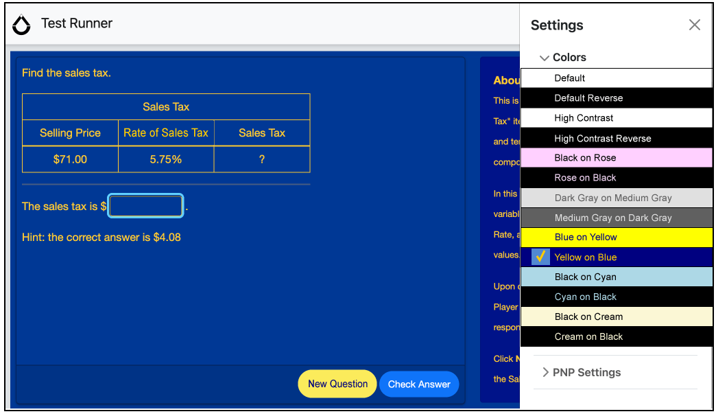
color-theme: yellow-blue
Yellow text on a dark-blue (navy) background. This color-theme is intended to give the candidate a high-contrast of foreground and background in both hue and value.
Sample text colors: yellow
- #FFCC00
- #FBEB5B


Sample background colors: blue
- #003398
- #000080 (navy)


Contrast Guidelines:
- The contrast MUST be at least 7:1 between the text and background colors (meets WCAG acceptance criteria 1.4.6 for Contrast Minimum).
- It is recommended to also follow the WCAG acceptance criteria 1.4.11 for Non-Text Contrast (contrast ratio of 3:1) for the remaining color choices.
color-theme: blue-yellow
Dark blue (navy) text on a yellow background. The blue-yellow theme reverses the foreground and background colors of the yellow-blue theme where the text is darker than the background.
See the above yellow-blue color-theme for sample colors and contrast requirements.
color-theme: black-rose
Black text on pinkish colored background. The black-rose theme imitates the use of a colored acetate sheet placed over white paper with black ink text.
Sample text color: black
- #000000
Sample background colors: rose
- #FFD0FF
- #F3D9F7


Contrast Guidelines:
- The contrast MUST be at least 7:1 between the text and background colors (meets WCAG acceptance criteria 1.4.6 for Contrast Enhanced).
- It is recommended to also follow the WCAG acceptance criteria 1.4.11 for Non-Text Contrast (contrast ratio of 3:1) for the remaining color choices.
color-theme: rose-black
Pink text on a black background. The rose-black theme reverses the foreground and background colors of the black-rose theme.
See the above black-rose color-theme for sample colors and contrast requirements.
color-theme: black-cyan
Black text on a light blue colored background. The black-cyan theme imitates the use of a colored acetate sheet placed over white paper with black ink text.
Sample text color: black
- #000000
Sample background colors: cyan
- #ADD8E6
- #DEECF2


Contrast Guidelines:
- The contrast MUST be at least 7:1 between the text and background colors (meets WCAG acceptance criteria 1.4.6 for Contrast Enhanced).
- It is recommended to also follow the WCAG acceptance criteria 1.4.11 for Non-Text Contrast (contrast ratio of 3:1) for the remaining color choices.
color-theme: cyan-black
Light blue text on a black background. The cyan-black theme reverses the foreground and background colors of the black-cyan theme.
See the above black-cyan color-theme for sample colors and contrast requirements.
color-theme: black-cream
Black text on a warm white colored background. The black-cream theme is intended to reduce fatigue when reading text on a computer for long periods of time.
Sample text color: black
- #000000
Sample background colors: cream
- #FFFACD (LemonChiffon)
- #FBF7D5


Contrast Guidelines:
- The contrast MUST be at least 7:1 between the text and background colors (meets WCAG acceptance criteria 1.4.6 for Contrast Enhanced).
- It is recommended to also follow the WCAG acceptance criteria 1.4.11 for Non-Text Contrast (contrast ratio of 3:1) for the remaining color choices.
color-theme: cream-black
Warm white text on a black background. The cream-black theme is intended to reduce fatigue when reading text on a computer for long periods of time.
See the above black-cream color-theme for sample colors and contrast requirements.
color-theme: medgray-darkgray
Medium gray text on a dark gray background. The medgray-darkgray theme is intended to help candidates who prefer/require content to be presented at a lower than default contrast.
Sample text colors: Medium Gray
- #E0E0E0
- #B1B8AD
- #ACB3A7


Sample background colors: Dark Gray
- #606060
- #616161

Contrast Guidelines:
- The contrast is intentionally below the contrast requirements provided by WCAG, though a general guideline of a contrast ratio between 3:1 to 4:1 is suggested.
color-theme: darkgray-medgray
Dark gray text on a medium gray background. The medgray-darkgray theme is intended to help candidates who prefer/require content to be presented in a low contrast setting where the text is lighter than the background.
5.2.9.7.2 font-color
Font-color (along with background-color) is no longer recommended to address a candidate's preferences for assessment content presentation. If candidates provide their preferred specific font and background color, it may conflict with other colors used in the delivery system's user interface, which may make the interface more difficult or impossible to use in an assessment context. Best practice is to use the text-appearance:color-theme support.
Font-color allows candidates to choose alternatives for the font color (corresponds with the CSS color property). The PNP may optionally include a hexadecimal color for the candidate's preferred font color, which should be used in the assessment interface for the candidate after they log into the test session.
The candidate MUST be able to change the color of the font at any time after logging into the test session. Additionally, the candidate MUST be able to return the original text color at any time during the testing session.
Within a PNP, a candidate can request the ability to choose text color alternative by stating:
<text-appearance>
  <font-color />
</text-appearance>
To add a specific color preference, add the color attribute to the font-color:
<font-color>#FFFF00</font-color>
5.2.9.7.3 background-color
Background-color (along with font-color) is no longer recommended to address a candidate's preferences for assessment content presentation. If candidates provide their preferred specific font and background color, it may conflict with other colors used in the delivery system's user interface, which may make the interface more difficult or impossible to use in an assessment context. Best practice is to use the text-appearance:color-theme support.
Background-color allows candidates to choose alternatives for the background color (behind the text — it often corresponds with the CSS background-color property). The PNP may optionally include a hexadecimal color for the candidate's preferred background color, which should be used in the assessment interface for the candidate after they log into the test session.
The candidate MUST be able to change the color of the background at any time after logging into the test session. Additionally, the candidate MUST be able to return the original background color at any time during the testing session.
Within a PNP, a candidate can request the ability to choose background color alternative by stating:
<text-appearance>
  <background-color />
</text-appearance>
To add a specific color preference, add the hexadecimal color in the node:
<background-color>#00008B</background-color>
5.1.5.7.4 font-size
Allows the candidate to choose different sizes for the text (corresponds with CSS font-size property with an assumption of an em value of 1). The PNP may optionally include a specific setting for the candidate's preferred font size, which should be used in the assessment interface for the candidate after they log into the test session.
The candidate MUST be able to change the font size at any time after logging into the test session.
Within a PNP, a candidate can request the ability to choose a font size alternative by stating:
<text-appearance>
  <font-size />
</text-appearance>
To add a specific size preference, add the font size as a number, relative to the base font size,
<font-size>1.6</font-size>
5.2.9.7.5 font-face
Allows the candidate to choose different font faces (corresponds to the CSS font-family property). The PNP may optionally include a specific setting for the candidate's preferred font face (if available), which should be used in the assessment interface for the candidate after they log into the test session. If the specific font face is not available, the delivery system should use any font face that is within the category specified in the generic font face preference (if available).
Within a PNP, a candidate can request the ability to choose font-face alternative by stating:
<text-appearance>
  <font-face />
</text-appearance>
To add a specific font face and a generic fallback, add the font name and generic category to the PNP within the font-face node.
<font-face>
  <font-name>Times New Roman</font-name>
  <generic-font-face>serif</generic-font-face>
</font-face>
5.2.9.7.6 line-spacing
Allows the candidate to choose different spacing between lines of text. The PNP may optionally include a specific setting for the candidate's preferred line spacing (in ems), which should be used in the assessment interface for the candidate after they log into the test session.
Within a PNP, a candidate can request the ability to choose line spacing options by stating:
<text-appearance>
  <line-spacing/>
</text-appearance>
To add a specific spacing preference, add the size in ems, relative to the base line spacing.
<line-spacing>1.5</line-spacing>
5.2.9.7.7 line-height
Another way to designate the spacing between lines of text is line-height, which corresponds to the CSS line-height property. A specific number can be assigned to a candidate's PNP that will multiply that number by the line-height specified in the default style of the text. If a specific number is supplied in a candidate's PNP, that preference should be rendered in the assessment content text. Delivery systems are not required to use this line-spacing in non-assessment content like buttons and other interface objects.
Within a PNP, a candidate can request the ability to choose line-height preferences:
<text-appearance>
  <line-height/>
</text-appearance>
To add a specific spacing preference, add the size in a number that will be multiplied with the base line spacing.
<line-height>1.5</line-height>
5.2.9.7.8 letter-spacing
Allows the candidate to choose different spacing between the characters of text. The PNP may optionally include a specific setting for the candidate's preferred character spacing (in proportion to the current spacing), which should be used in the assessment interface for the candidate after they log into the test session. This setting corresponds to the CSS "letter-spacing" property. Delivery systems are not required to use this letter spacing in non-assessment content like buttons and other interface objects.
Within a PNP, a candidate can request the ability to choose letter spacing options by stating:
<text-appearance>
  <letter-spacing/>
</text-appearance>
To add a specific spacing preference, add the size in pixels, which will be added to the space between the characters in the text.
<letter-spacing>2</letter-spacing>
5.2.9.7.9 uniform-font-sizing
Allows the candidate to indicate that all text presented will be the same size. This can help users who view their text at very large sizes, where headings typically have font sizes much larger than the body text. Text can become so large that it does not fit within the viewable area of the device. The text should be presented at the size of candidates preferred body text size.
Within a PNP, a candidate can request the ability to choose text display option of uniform font spacing by stating:
<text-appearance>
  <uniform-font-sizing/>
</text-appearance>
5.2.9.7.10 word-spacing
Allows the candidate to choose different spacing between the words of text. This feature corresponds with the CSS "word-spacing" property where the assumption is em spacing and the default is 1 em. The PNP may optionally include a specific setting for the candidate's preferred word spacing (in proportion to the current spacing), which should be used in the assessment interface for the candidate after they log into the test session.
Within a PNP, a candidate can request the ability to choose word-spacing options by stating:
<text-appearance>
  <word-spacing/>
</text-appearance>
To add a specific spacing preference, add the size in proportion to 1 em, the "normal" word spacing of the font face.
<word-spacing>1.4</word-spacing>
5.2.9.7.11 Word-wrapping
Allows the candidate to indicate that any text-appearance changes MUST allow text to wrap to the next line (i.e. text reflow). This will help prevent the need for horizontal scrolling. This is NOT the same as CSS word-wrap which allows long words to be hyphenated.
Within a PNP, a candidate can request the ability to wrap text by stating:
<text-appearance>
  <word-wrapping/>
</text-appearance>
5.2.10 On-screen Tools
Assessment Delivery user interfaces usually include a number of on-screen tools that aid the candidate in tracking and organizing their assessment session experience. While some tools are automatically included for all candidates, others are only allowed to be used by permission.
For delivery, the expectation for the on-screen tools is that the candidate would be able to access the named tool within the assessment user interface, not as a separate application, or as a separate physical tool (like a hand-held calculator). These tools should be made accessible, and not interfere with the candidate's ability to access and respond to assessment content.
On-screen tools in Personal Needs and Preferences 3.0:
- answer-masking
- calculator-on-screen
- dictionary-on-screen
- glossary-on-screen
- line-reader
- note-taking-on-screen
- outliner-on-screen
- peer-interaction-on-screen
- spell-checker-on-screen
- thesaurus-on-screen
- visual-organizer-on-screen
Refer to the QTI Terms & Definitions [QTI-TERM-30] for descriptions of the above tools.
Below is an example of assigning a candidate access to some on-screen tools that may help them during an assessment. By including the tools in a candidate's PNP, it is intended to indicate that the candidate should have access to these tools during their assessment session.
On-screen Tool Assignment in a Candidate PNP
|
In some cases, candidates can become distracted or confused when given access to on-screen tools. For this reason, many of the on-screen tools have been included in the QTI 3 profile of Personal Needs and Preferences 3.0 so that the tools can be included in the set of prohibited supports (see Section 5.2.8.3 Prohibit Set).
Below are notes related to specific on-screen tools as they relate to the QTI 3 specification.
Calculator-on-screen: QTI 3 allows item content to list the type of calculator that is allowed/recommended for use with any particular item by using the companion materials feature, and specifying the calculator type (see Section 3.7.7.1). By referencing a calculator in the companion materials, the intention is to convey that the assessment item SHOULD have a calculator available when answering the item. Some assessment programs may prefer to reference a specific calculator interface for an item by referencing a "widget" using the information control feature (see Section 3.7.8) instead of the companion materials reference.
By using the calculator-on-screen in a candidate's PNP, you could indicate that the candidate should ALWAYS have access to an on-screen calculator, regardless of whether the item is expected to be answered with a calculator or not. In other words, it is a method for assigning the candidate to an accommodation for unrestricted access to a calculator.
Glossary-on-screen: Glossary content can be included in QTI 3 content using the catalog feature (see Section 5.2.3.4). Alternatively, an assessment delivery engine could make a glossary look-up tool that allows candidates to access definitions for any words in the assessment content. Access to that glossary terms (or tool) may be available to all candidates or restricted to specific candidates depending on the administrative policies of the assessment program.
5.2.11 Physical Environment Supports
The environment support includes a group of parameters that convey information about the physical environment of the assessment session for the candidate. There are 5 possible areas where environmental information can be included in the candidate's PNP. They are:
- description
- medical
- software
- hardware
- breaks
For all but "breaks", the information is likely to be used in advance of the assessment session. Other than breaks, the environment data is not used to allow a computer device to adjust session requirements based on user needs. However, it may also be useful for test administrators to know that the candidate might be taking breaks during the assessment session.
For description, a string of human-readable text should be supplied, which can describe any environmental issue which cannot be expressed in any of the other parameters. It might be something like "Candidate needs to take the assessment in a room by themselves," or "The candidate needs a wheelchair accessible room and computer station."
The medical parameter should store any information (as human readable text) that is relevant to the assessment session, without revealing unnecessary medical information about the candidate. Information may include the need to use an Epinephrine auto-injector, insulin, regular medications, or even temporary conditions like a broken arm, and an explanation that the candidate might need additional assistance during testing. Diagnosis should generally be avoided, but rather the text should explain the needs of the candidate. Exceptions might include things like a nut allergy, to ensure the candidate is not seated in a place where food is regularly consumed.
The software parameter can supply any special software requirements of the candidate, in human-readable text. The string could express a general requirement, or very specific information, including the software version number. For practical purposes, this information should be conveyed to the assessment administrator well in advance of the testing session to be able to accommodate the candidate's needs.
The hardware parameter can supply any special computer hardware requirements of the candidate, in human-readable text. The string could express a general requirement, a very specific requirement, whether the candidate will be bringing the hardware themselves, or any other information relating to the computer hardware requirements. For practical purposes, this information should be conveyed to the assessment administrator well in advance of the testing session to be able to accommodate the candidate's needs.
The breaks parameter is a boolean value, where the assignment to breaks is a value of "true". While any particular assessment may have regular breaks included as part of the administration of the assessment, the specific assignment to breaks means that the candidate has the ability to choose when they feel they need a break. Assigning a value of "false" would indicate that the candidate is specifically not allowed to choose their own break times. The assignment may allow the delivery software to allow the candidate the ability to sign out of the assessment session without terminating the session, and allowing them to continue at a later time. The assignment can also be useful to test administrators to allow them to accommodate the candidate's need for taking regular breaks during testing.
Below is an example of the environment support in a PNP, where the candidate is allowed to take breaks, and has some additional environmental needs.
Environment Supports in a Candidate PNP
|
5.3 PNP Sets
Personal Needs and Preferences 3.0 has 3 "sets" that are containers that list which supports are part of the set. The specific expectations of each of the sets are described in the sections below.
When you assign a support to a set, you only list the top-level support name. No other parameters for the support are made within the set assignment. To make parameter assignments, use the regular assignment methods of Personal Needs and Preferences (see Section 5.2).
5.3.1 Activate-as-option-set
The term "activate-as-option-set" is a set of user preferences in a candidate PNP. Assigning a feature or support to this set indicates that each feature should be made available to the candidate as an option to use, but the feature is not activated (the feature isn't actively in use) until requested by the candidate. A method for making the feature available to the candidate should be obvious, like (but not limited to) a button on a toolbar, an item in a drop down menu, or an option in an Options window. A candidate's PNP might look like something in the example below.
Support Inclusion in the Activate as Option Set in a Candidate PNP
|
If a support is included in the activate-as-option-set, no other parameter information is provided as a part of the inclusion in the set. Any candidate preferences for a particular support should be supplied in the assignment portion of the PNP (line 0007 in the above example).
5.3.2 Activate-at-initialization-set
The term "activate-at-initialization-set" is a set of user preferences in a candidate PNP. Assigning a feature or support to this set indicates that each listed feature should be made available to the candidate as soon as the candidate initiates their working session (generally after logging into a content presentation system).
Support Inclusion in the Activate at Initialization Set in a Candidate PNP
|
If a support is included in the activate-as-option-set, no other parameter information is provided as a part of the inclusion in the set. Any candidate preferences for a particular support should be supplied in the assignment portion of the PNP (lines 0007–0009 in the above example).
5.3.3 Prohibit-set
Within a candidate PNP, a set of supports that are specifically NOT available to the candidate. The prohibition of supports should be made carefully to avoid denying a user a necessary support.
For the prohibit-set, the support SHOULD NOT be included in the PNP as assigned to the candidate. The only listing of the support MUST be in the prohibit-set. In the example below, the example is assigned to additional testing time (line 0007), but should not have access to the magnification capabilities of the interface (line 0010), the answer-masking feature (line 0011), or to be able to adjust the appearance of the text in any way (line 0012).
Support Listing in the Prohibit Set in a Candidate PNP
|
5.4 Custom Supports: Extending PNP
There are circumstances where a particular assessment program has specific support requirements that did not exist in the predefined vocabulary of AfA. In these circumstances, an assessment program can extend Personal Needs and Preferences supports for PNP records using the namespace extension methods, as shown in the example below.
Custom PNP
|
5.5 Bulk PNP Files
QTI 3 PNP profiles can also be provided in a bulk records file, where more than one test taker's profile, or more than one assessment assignment, can be supplied. Use of the bulk records file may be more efficient and accurate than individual PNP files where there is no candidate identifier supplied within the XML of the file.
Below is an example of how to provide multiple user profiles within a single file for the convenience of transferring multiple profiles in bulk.
Example of a Bulk PNP File
|
In the above example, the bulk records file has two student profiles in the same file. There is no actual limit on the number of records that can be supplied within a bulk records file. Individual PNP profiles are separated by including each profile within its own access-for-all-pnp-record node.
Within each access-for-all-pnp-record node, you MUST include a person-sourced-id node. The source-system attribute within the person-sourced-id element is required, and it represents the system that generated the id value.
For the purposes of preventing duplication or overwriting data, if a record does not contain an assignment-id, the profile is considered a universalprofile, and there can only be a single universal profile for an individual test taker within the bulk records file. In the example code above, both profiles are assigned to a universal assignment.
Also included in each access-for-all-pnp-record node is the access-for-all-pnp node, which contains the profile data, and has characteristics common to all PNP profiles. In the above example, candidate 111 is assigned to keyword translation and line-reader tool (lines 0011–0012). The test taker 888 is assigned to additional testing time, spoken, and answer masking (lines 0019–0026).
An optional appointment-id can be included to specify an assessment assignment for candidates. An appointment-id is an assessment context, where the data can represent a very specific assessment (e.g. a seat ticket for a particular test), or a more general subject area (e.g. mathematics). The example below includes specific appointment-ids for profiles.
A bulk records file should never contain multiple profiles for a specific candidate (same person-sourced-id) for the sameappointment-id. It is permissible to provide a universal profile as well as other profiles for specific appointment-ids, provided the PNP system handling the bulk records file has a place to store universal and specific appointment-ids. For candidates with universal and specific test assignments, the profile associated with the specific test assignment is intended to override the universal profile only in the context of that specific test assignment context.
Below is an example of how to provide information about test taker profiles assigned to specific assessment assignments.
Example of a Bulk PNP File with appointment-id
|
In example above, there are three test takers referenced in the code: test taker 100001, 200002, and 123456.
Test Taker 100001 has two different profiles, where the profile associated with appointment-id "g8ela5678" has removed the keyword-translation support and added an additional-testing-time to the profile. Because there is a different set of needs for a different assessment context, the test taker has two different profiles. There could be any number of reasons for the differences, including assessment subject matter, assessment program policy, or local assessment conditions, to name a few.
Test taker 200002 has a single profile, but is assigned to multiple assessment-ids. In this case, the test taker's profile should apply to both assessment assignments.
Test taker 123456 has a single profile associated with a single assessment.
Systems that import and export QTI 3 PNP bulk records files may electively support the appointment-id node, and can also electively support assignments to different assessments for individual test takers. However, if a system does not support the assignment of different assessments for individual test takers, the system should make decisions about how to handle the multiplicity of profiles for individuals during the import process.
6. Packaging and Metadata
6.1 Introduction
QTI Content Packages are instances of a QTI 3 profile of the IMS Content Packaging (CP) Specification.
This profile is constructed using the CPv1.2 schema, but currently only uses a subset of the features of content packaging. The following provides an overview of the basic usage of IMS Content Packaging for QTI Content Packages:
- A content package is a ZIP file containing all of the resources needed to ingest or access the assessment content
- Manifest – a single manifest called imsmanifest.xml MUST be present at the root of the content package and child manifests MUST NOT be used.
- Resources - the individual files, which MUST all be referenced in the Manifest which provide or support the use of the assessment content
6.1.1 Manifest
The manifest object may not contain child Manifest objects. In the CP metadata the schema would normally be set to "QTI Package" and the schema version MUST be set to "3.0.0". Other values for schema are allowed (e.g. you could use a value of "QTI Item" if you were packaging a single item) but are seldom seen in practice as a value of "QTI Package" can generally cover all of the use cases.
LOM Metadata can be used to describe the QTI Content Package itself when used at the level of the manifest and also to describe resource level metadata.
QTI also supports specific QTI metadata and can use the same Curriculum Standards Metadata as IMS Common Cartridge to describe the learning standards and any related IMS CASE identifiers.
Resources – each resource is declared using a resource element which references a single separate XML instance file. All files in the Content Package other than the manifest must be referenced in a resource declaration. Files may be placed in folders, which may be nested.
6.2 Content
The packages listed below are included with the specification as sample resources available for download from the IMS QTI 3 github repository.
The QTI Content Packaging Profile can be used to package a range of different types of resources. Each will be identified in a resource element in the manifest with one of the following resource types.
| Resource Type | Description | See also (section reference) |
|---|---|---|
| imsqti_test_xmlv3p0 | QTI 3 AssessmentTest | 6.2.6 |
| imsqti_section_xmlv3p0 | QTI 3 AssessmentSection | 6.2.8 |
| imsqti_item_xmlv3p0 | QTI 3 AssessmentItem | 6.2.6 |
| imsqti_outcomes_xmlv3p0 | QTI 3 OutcomeDeclaration | 6.4 |
| imsqti_responseprocessing_xmlv3p0 | QTI 3 ResponseProcessing | 6.2.4 |
| imsqti_stimulus_xmlv3p0 | QTI 3 AssessmentStimulus | 6.2.7 |
| imsqti_fragment_xmlv3p0 | QTI 3 inclusion (XInclude) | Example tests/rtest01-set01 |
| imsqti_rptemplate_xmlv3p0 | QTI 3 Response Processing Template | 6.2.4 |
| associatedcontent/learning-application-resource | A collection of files used exclusively by an individual Learning Application Object. A Learning Application Object is a directory structure used to group together all the files (or file references) that are used to deliver a single instance of one of the following resource types: web content, web link, discussion topic, assessment or intra-package reference. | — |
| webcontent | Web Content files include any files that are widely supported for delivery over the web. These could include HTML files, images, audio, video, MS Office, PDF, Flash etc. | 6.2.2 |
| imslti_xmlv1p1 | 1EdTech LTI 1.1 resource | 6.2.9 |
| imsltia_xmlv1p0 | 1EdTech LTI 1.3 resource | 6.2.9 |
| controlfile | Schema (XSD). Allows for packaging the XSD files needed to validate the files in the package as part of the package. | |
| resourcemetadata/xml | External IMS metadata | 6.3 |
| resourceextmetadata/xml | External non-IMS metadata | 6.3 |
| qtiusagedata/xml | QTI 3 Usage Data (may need to pass to a CAT engine) | 6.2.14 & 6.5 |
| pls | W3C Pronunciation Lexicon Specification files (for content accessibility) | 5.2.1.6 |
| css2 | CSS Stylesheet 2.0 | – |
| css3 | CSS Stylesheet 3.0 | – |
| extension | Proprietary file (enables extension) | – |
6.2.1 Simple Packaging Example
This example demonstrates how a single item is packaged.
The manifest file (which must be called imsmanifest.xml and be present at the root of the content package) demonstrates the use of a resource element to associate metadata (both Learning Object Metadata (LOM) and QTI) with an item and the file element to reference the assessmentItem XML file and the associated image file.
See below for the imsmanifest.xml file for this package.
|
The manifest element defines all of the required XML namespaces and defines the identifier of the QTI content package.
The manifest level metadata (lines 14-54) defines the metadata which applies to the entire content package. It would have been allowed to have used a value of "QTI Item" as the value of the schema element, but as previously mentioned the usual practice is to use a value of "QTI Package".
The organizations element is always empty (line 55).
The resources element is a container for all of the resource elements.
This package defines a single resource, which is an AssessmentItem (lines 57-102).
The resource is of type imsqti_item_xmlv3p0, which identifies an AssessmentItem and has a href attribute which provides a URL relative to the root of the content package to the file containing the XML markup of the AssessmentItem.
The resource provides two types of metadata on the item.
Firstly there is QTI metadata, which provides QTI specific metadata (lines 60-65) and then IMS LOM Metadata (lines 66-98).
Finally there are a set of file elements referencing all of the files related to this item, firstly the item itself and secondly an image file referenced by the item.
6.2.3 CC QTI package
packaging/ccPackage/ccPackage.zip
This fully zipped up package contains a linear test and a collection of the most widely used interaction types: multiple choice (single and multiple), fill-in-the-blank and essay submission. The package is a transcoding from a Common Cartridge QTI 1.2 example. It therefore demonstrates IMS_CC 1.1 metadata usage in the manifest file, including the use of curriculum standards.
The original QTI 1.2 profile for IMS_CC that provided the basis for this CC QTI package was determined by defining an intersection of the assessment capabilities of the most widely used LMSs at the time. This CC QTI package was successfully imported by a number of QTI 2.x implementations in interoperability tests. As such, it probably represents the most widely supported minimal subset of the QTI 2.x specification. Use of the Common Cartridge profile of QTI 1.2 is still very widespread and support of the equivalent QTI 3 features by a delivery engine can ease migration of Common Cartridge assessment to a QTI 3 delivery engine via a process of content conversion.
The package includes examples of the Choice (Single and Multiple), Text Entry, and Extended Text Interaction, and both Modal and Inline Feedback.
The CC2_match.xml response template provides inline feedback and is the preferred response template. It processes outcomes by doing two things. One is to set the FEEDBACK variable with the RESPONSE variable, so that the qti-feedback-inline element with an identifier that matches the FEEDBACK value can be shown to the candidate. When the CC2_match.xml template is used, the FEEDBACKBASIC variable that is declared in all choice items is not used and won't be set, which means the 'correct' and 'incorrect' modal feedback elements won't ever be shown to the learner.
The CC2_match_basic.xmltemplate is designed for those systems that do not support inline feedback but which do support modal feedback. Instead of inlinefeedback elements, the match basic template triggers the 'correct' and 'incorrect' qti-modal-feedback elements via the FEEDBACKBASIC variable. It does this by comparing the candidate's RESPONSE value with the correct RESPONSE value from the item. If they match, the SCORE variable is set to the MAXSCORE value from the item and the FEEDBACKBASIC variable is set to 'correct'. If the candidate's RESPONSE value and the correct RESPONSE value from the item do not match, the match basic template will set the FEEDBACKBASIC variable to 'incorrect'. When the CC2_match_basic.xml template is used, the FEEDBACK variable will never be set to the 'true' or 'false' value, which means that the inline feedback won't ever be shown to the learner.
The match_basic template should only be used by systems that cannot support inline feedback instead of the CC2_match.xml template that is referenced in the items.
6.2.4 Package with Response Processing Templates
packaging/maxfiles/maxfiles.zip
The response processing templates feature of QTI allows common sets of response processing rules to be documented in separate XML documents and simply referred to by the items that make use of them. The mechanism for identifying the template to use is the template attribute on the qti-response-processing element. This attribute is a URI, but it is not required to be a URL that resolves directly to the appropriate XML document. To help systems that support general response processing find the rule definitions required to support new templates an additional template-location attribute is provided which may be used to provide a URL that resolves to the template's XML document. If this URL is given relative to the location of the item then the template should be included in the same content package and listed as a dependency for each of the items that refer to it.
This example package demonstrates the use of a relative URL to refer to response processing templates listed as separate resources within the package as described above. Note that the technique used is similar to that for locating XML schemas from the URIs used to refer to their namespaces, however, XML schemas included in content packages to assist with validation should not be described as separate resources (or file dependencies) in the manifest file.
See below for the resources section of the imsmanifest.xml file for this package.
|
In line 20 you can see that there is a resource which is an item (type = "imsqti_item_xmlv3p0") which is in the file example/choice.xml and which uses the shared dependency with an identifier of "rp02".
If you look at line 87 you can see that resource is of type "imsqti_rptemplate_xmlv3p0" which indicates that it is a response processing template and you can see from the href attribute that it can be found in the file "rptemplates/match_correct.xml"
In the item this will be referenced in the qti-response-processing element:
|
Note, implementers should take care in handling relative paths to ensure that a malicious content package can not execute a Path Traversal attack. See Section 6.7 for details.
6.2.5 Package with Externally Defined Response Processing Templates
packaging/test_package_minfiles/test_package_minfiles.zip
This example is the same as the one above (Package with Response Processing Templates) except that response processing templates are not included. The template-location attribute is used with absolute URLs of the templates. While this is a supported capability, the best practice recommendation is to always include custom response processing templates in the content package.
6.2.6 Package with Test and Items
packaging/test_package_minfiles//test_package_minfiles.zip
This example demonstrates how to package a qti-assessment-test together with the qti-assessment-item s referenced by the test. Both the qti-assesment-test and qti-assessment-items are represented by resource elements within the manifest. A dependency is used to represent the relationship between the qti-assessment-test and the individual qti-assessment-items.
See below for the the section of the manifest which defines the qti-assessment-test:
|
Here, the resource for the qti-assessment-test is of type "imsqti_test_xmlv3p0" and the 4 items it references are included as dependencies.
6.2.7 Package with Test, Stimuli and Items
packaging/sharedStimulus/sharedStimulus.zip
This example demonstrates how to package an qti-assessment-test together with the qti-assessment-stimulus and qti-assessment-item s referenced by the test. The qti-assesment-test, qti-assessment-stimulus and qti-assessment-items are represented by resource elements within the manifest. A dependency is used to represent the relationship between the qti-assessment-test and the individual qt-assessment-items, dependencies are also used to represent the relationship between an item and any stimulus it references.
See below for the the section of the manifest which defines the qti-assessment-stimulus:
|
Here the resource for the stimulus has a type of "imsqti_stimulus_xmlv3p0" and each of the items which references the stimulus includes the stimulus resource as a dependency.
6.2.8 Package with Test, Sections and Items
packaging/BBQsTest/BBQsTest.zip
This examples demonstrates how to package a qti-assessment-test which uses multiple qti-assessment-sections together with the qti-assessment-items referenced by the test. Both the qti-assesment-test and qti-assessment-items are represented by resource elements within the manifest. A dependency is used to represent the relationship between the qti-assessment-test and the individual qti-assessment-items.
6.2.9 Package with a Test and Items with LTI resources
packaging/testWithLti/testWithLti.zip
6.2.9.1 IMS Learning Tool Interoperability (LTI)
A Basic LTI link is a simplified and self-contained LTI link. The approach for defining an LTI link in QTI, using a resource type, is identical to that recommended for Common Cartridge (see Section 4.10 in [CC-13]). The LTI specification [LTI-13] is used to allow remote tools and content to be integrated into the launching system e.g. an LMS, Assessment Delivery System, etc. In the case of QTI, LTI can be used to:
- Launch digital companion materials e.g. a rule, protractor, etc.
- Launch a custom interaction - this is the recommended way to start a qti-custom-interaction thereby realizing some form of interoperability;
- Access content that is available as a form of 'app' or which requires a proprietary player.The advantage of using this approach lies in the fact that any tool supporting LTI can be launched by any system supporting LTI. Furthermore, LTIv1.1 and higher versions allows the tool to report a score back to the system that launched the tool.
This example demonstrates how to package a qti-assessment-test together with LTI resources for the items referenced by the test. Both the qti-assesment-test and LTI launched items are represented by resource elements in the manifest.
As in IMS Common Cartridge these resources may be dynamically launched via LTI rather than directly loaded from the QTI Content package, and a grade can be returned to the delivery engine using LTI Basic Outcomes or the LTI Advantage Assignment and Grade Services. A dependency is used to represent the relationship between the qti-assessment-test and the individual items.
6.2.9.2 Identifying LTI resources in a manifest
See below for the imsmanifest.xml file for this package.
|
This package defines an AssessmentTest which includes three Assessment Items, however rather than directly including all of the items in the package, the item author has included two LTI resources which the delivery engine can use to LTI Launch the items. It also includes an item which includes companion materials which uses an LTI resource.
The item author has chosen to add manifest level metadata to indicate that the content package requires the use of LTI. This is not a requirement, but it can help the delivery engine know that LTI is required and what version of LTI is expected. This is done in the LOM technical metadata under otherPlatformRequirements.
The Assessment Test is unremarkable, it simply refers to three items by identifier.The difference is that when these identifiers are resolved through the manifest instead of all of these resources having a type of imsqti_item_xmlv3p0 two have a type of imsbasiclti_xmlv1p3, which identifies that they are LTI resource links.
The href of the resource here provides a relative path to an XML file which describes the LTI resource, and provides the resource specific information required to launch it.
The item author has also chosen to provide QTI metadata to describe to the delivery engine what type of interaction the LTI resource represents. This is again not a requirement, but it can be very helpful information to the delivery engine.
The LTI resources are described in the same way that they would be for an LTI resource in an IMS Common Cartridge [CC-13].
See below for one of the LTI resources in this package.
|
The first 14 lines are concerned with providing the expected namespace definitions. These namespaces and associated schemas are defined by other IMS specifications such as IMS Learning Tool Interoperability and IMS Common Cartridge and are more fully described in those specifications.
The secure_launch_url and launch_url elements provide the URL of the endpoint of the Tool Provider which will be responsible for delivering the LTI resource. Note, the presence of two urls is due to backwards compatibility requirements and the best practice is for both elements to contain https urls for security reasons, and the normal practice is for both to contain the same value.
An LTI launch has a series of standard parameters (which are defined in the LTI specification) but may also include a series of custom parameters which may be unique to the resource (in this case an item) being launched. These are provided as name/value pairs in property elements which are children of the element custom. In this way the item author can provide any parameters the LTI Tool Provider needs to know about the item (or other content) being launched. In this case only an item identifier (item_id) is required.
An LTI resource also allows for vendor specific extensions to be used, and any parameters required to support those extensions can be provided via the vendor element. It is generally recommended that such parameters be regarded as optional by the Tool as otherwise the presence of vendor specific extensions is likely to limit the interoperability of the QTI content package. In this example the delivery engine is using the extensions element to record along with the rest of the LTI configuration that the DataValue extension to Outcomes has been enabled for this item.
6.2.9.3 LTI Launching an item
At runtime a delivery engine would know from the manifest that as these items are resources of type imsbasiclti_xmlv1p3 that it should LTI launch the item via an LTI launch of the LTI Tool Provider identified in the launch_url, which will cause the Tool Provider to render the item, instead of the delivery engine attempting to render the item itself. Note that while a Tool Provider should honour reasonable expectations of the contents of what they render (e.g. if the LTI resource is referenced by an qti-assessment-item-ref then it should act as an Assessment Item) it is not required to import QTI markup to define that item.
Following the LTI specification, the delivery engine would take the information provided on the LTI resource in the cartridge_basiclti_link markup provided by the item author and combine it with dynamic generated information at run time (e.g. it may provide an identifier for the candidate, details on the delivery engine, on the expected presentation, a result id, details on the security contract between the delivery engine and the Tool Provider), and provides a cryptographically signed collection of these details to the Tool Provider. The Tool Provider validates the LTI launch parameters and if valid would render the resource requested, in this particular example it's an item.
LTI includes some launch parameters which can inform the tool of it's expectations for the presentation of the launched resource. An option which may work well in an assessment context is for the delivery engine to request that the resource be rendered in an iframe so that the item can be presented in the context of the delivery engine UI.
The above is a brief introduction to LTI in the context of an assessment delivery engine. It is not normative, and when implementing LTI implementers MUST follow the LTI and related specifications when implementing LTI support for an assessment delivery engine.
Assuming that the LTI resource link above is being launched in the context of a candidate with the following details:
- local id of 320171 and a SIS identifier of e6a3441a-ee74-4bbc-81f9-f6825a147bd6
- class with a local id of 7291790 & a SIS id of febdfccc-31ac-40a6-bfc8-d3de79557e02
- SIS course id of 8c4a0faf-5f41-4ce9-9ff3-0bfcc0f22099
- taking a formative assessment with a test session of TestSession108181909
- in delivery engine tenant Riverrun School District
- in a cloud hosted delivery engine from a company called 'Quizco'
6.2.9.3.1 Sample LTI 1.3 Launch Body
The LTI 1.3 launch body could be:
|
6.2.9.3.2 Sample LTI 1.1 Launch Parameters
The following set of LTI 1.1 launch parameters could be sent:
|
6.2.9.4 Returning a Score
For LTI 1.3 the Assignment and Grades service (AGS) can be used to return a score to the launch platform (via a pair of fields scoreGiven
and scoreMaximum).
If the response has a QTI response variable named "SCORE" then its value MUST be used as the value of scoreGiven in the AGS score payload.
If the response has a QTI response variable named "MAXSCORE" then its value MUST be used as the value of scoreMaximum in the AGS score payload.
QTI would typically return more information as the outcome of an item than that where this fuller exchange of the QTI outcomes is desired see the enhanced process defined in the next sub section.
In the launch the platform will provide a lineitem endpoint which is associated with the item in the launching assessment delivery engine. When the Tool has an outcome available for that item it will post a score to the scores endpoint for the provided lineitem endpoint (which is constructed by appending "/scores" to the lineitem endpoint).
An example of the lineitem endpointExample of the lineitem endpoint:
|
An example of POSTing item results with score information:
|
If it wishes the Tool MAY return interim results using an activityProgress other than "Completed" and/or gradingProgress other than FullyGraded.
LTI 1.1 supports a Basic Outcome service which can be used by a Tool to return a score earned by a candidate by interacting with a launched item. Later versions of LTI support more capable outcomes/grade services, but all versions of LTI for which IMS provide conformance testing support the return of a single numeric outcome value.
LTI models outcomes in the context of a line item in a gradebook, where a result is added for every user who takes the assignment or assessment. These lineitems may represent different levels of granularity, in an assessment context they may represent item level outcomes or test level outcomes. While later versions of LTI outcomes or grades services allow a lot of control in terms of being able to create new lineitems, the Basic Outcomes service defined by LTI 1.1 allows only for a single numeric outcome to be returned by the Tool Provider in response to an LTI launch.
To enable this capability in the Tool the delivery engine creates a new Result for the candidate in the lineitem representing this item and passes the identifier of that result in the standard lis_result_sourcedidparameter. The Tool may then use this result id to return a numeric result to the delivery engine by using the Basic Outcomes service (which is a server to server call). Implementers should again follow that specification when implementing outcomes support for an assessment delivery engine.
It is not required that the delivery engine record that score directly in a gradebook, it may record that score in the results of a test, i.e. the value of the lis_result_sourceid is treated as an opaque value by the Tool Provider and only used to pass back to the delivery engine when recording a score for the item, so the delivery engine may choose to use a value which uniquely identifies to it an individual item session with which it will later associate the returned score.
In the example LTI launch parameters above we can see that the delivery engine has passed an Outcomes service endpoint of http://items.example.com/test/scores.php via the lis_outcome_service_urlparameter and created a result with an id of 37472bad-7de7-426f-a6d5-3469dce3b107 which it passed in the lis_result_sourcedidparameter.
Assuming that the Tool has immediately auto-scored the item and the candidate earned a score of 1 then it would POST a Basic Outcomes request to update the result to the endpoint.
|
The delivery engine can then use the value returned for that result for the candidate to derive a value for the SCORE outcome variable. Basic Outcomes returns a float value which aligns well with the base-type required for the built in SCORE outcome variable.
Tools should be cognizant of the needs of delivery engines to receive the score in a timely manner. For example a test part may be configured with a submission mode of 'individual' where item outcomes must be submitted on an item by item basis.
6.2.9.5 Results Reporting
For LTI 1.3 the Assignment and Grades service (AGS) can be used to return a score to the launch platform (via a pair of fields scoreGiven and scoreMaximum). QTI
would typically return more information as the outcome of an item than that, however the Assignment and Grades services payloads are extensible. Additional properties
can be added to the assignment and grades responses which can be used to return this additional information using a JSON binding of the QTI Results Reporting information
model.
If the response has a QTI response variable named "SCORE" then its value MUST be used as the value of 'scoreGiven' in the AGS score payload.
If the response has a QTI response variable named "MAXSCORE" then its value MUST be used as the value of 'scoreMaximum' in the AGS score payload.
If the results reporting data includes a candidateComment property that is a comment provided by the test candidate, not the scorer and so would not typically be
sent as the comment property of the AGS payload.
In the launch the platform will provide a lineitem endpoint which is associated with the item in the launching assessment delivery engine. When the Tool has an outcome available for that item it will post a score to the scores endpoint for the provided lineitem endpoint ( which is constructed by appending "/scores" to the lineitem endpoint).
An example of the lineitem endpoint:
|
An example of POSTing item results with additional QTI results reporting data:
|
If it wishes the Tool MAY return interim results using an activityProgress other than "Completed" and/or gradingProgress other than FullyGraded.
There are widely supported extensions to the Basic Outcomes service which Tools and delivery engines may find useful in an assessment context. Delivery engines should not expect these extensions to be present in order to maximize interoperability, but may use them to provide additional capabilities. For example there is a defined extension which allows for a text and/or a URL to be returned with the outcome, which may be used if desired where supported by both delivery engine and Tool to return additional information along with the numeric outcome to the delivery engine. An extension element in the cartridge_basiclti_link with a platform attribute matching the delivery engine can be used to indicate that this extension should be enabled for this item.
In turn, the delivery engine would indicate support for this extension to the Assessment Tool Provider by adding the following LTI launch parameter: ext_outcome_data_values_accepted=url,text
An Assessment Tool Provider which supports that extension can then return an extra node (a resultDataelement) which can contain free text (in a textelement), it is RECOMMENDED that this text be a serialization of a response variable in the JSON format used by the CAT API for item variables.
|
Alternatively it can instead return a url (in a urlelement) and it is recommended that the url be a resolvable URL which can be used to get a QTI results reporting report for this item using the same JSON representation as used by the CAT standard. If the delivery engine wishes to use this URL it should do so immediately the URL is made available as the Learning Tool may only make it available for a short time (e.g. potentially for the lifetime of a test session). The URL MUST be a https url and may need to be self-authenticating as the delivery engine won't have an access token to provide for that endpoint unless this is established by an out of band mechanism.
|
The URL would then return a response similar to the following:
|
So if the Assessment Tool supports only returning a single variable it returns that in a text field, but if it supports returning a full QTI Results Reporting records it does so via a URL which can include the state of multiple outcome and response variables.
For more information see https://www.imsglobal.org/sites/default/files/spec/qti/v3/rr-bind/index.html
6.2.9.6 Discovery by the Tool of the Candidates to which the item has been Administered
To support this the Assessment Delivery Engine Platform MAY implement the IMS LTI Names and Roles Provisioning Resource Link Membership Service (NRPS) which allows the Tool to
discover the users who may access the resourceLink, which is a superset of the users who have had the item assigned to them. This service supports an optional 'role' query
parameter which can be used to limit the results to the test candidates only by filtering by the role 'Learner'. If the Platform supports the NRPS
specification then it would add a namesroleservice claim to the LTI launch.
An example namesroleservice claim:
|
The Tool after launch can then follow the NRPS specification to make a NRPS Resource Link Membership request by appending a rlid query string parameter to
the context_memberships_url and optionally a role query parameter. The rlid query parameter would be given the value of the id property
of the resource_link claim.
An example resource_link claim:
|
An example NRPS Resource Link Memberships Request:
|
An example response:
|
6.2.9.7 Returning to the Delivery Engine
If the candidate has indicated to the LTI launched item that they have finished interacting with the item the Tool Provider MAY return the candidate to the delivery engine by redirecting the user's browser to the URL provided in the return_urllaunch parameter. As defined in the LTI specification, two standard query string parameters are supported for this url in a non-error flow, these are:
| Param | Purpose |
| lti_msg | A human readable message to display to the end user |
| lti_log | The audience for this parameter is the delivery engine itself |
The format of the return_url is determined by the delivery engine. The Tool should allow for each launch of an item to provide a different value for the return_url.
The delivery engine MUST allow for the Tool adding query string parameters to the URL. The presence of an lti_log or an lti_msg query string parameter should signal to the delivery engine that the candidate has finished interacting with the item and it may e.g. navigate to the next item in a test with linear navigation.
For LTI 1.3 the return_url is the value of the "return_url" property of the "https://purl.imsglobal.org/spec/lti/claim/launch_presentation" claim, e.g.
|
For LTI 1.1 the return_url is the value of the launch_presentation_return_url launch parameter
6.2.9.8 Use of Custom Parameters
In QTI while most of the information related to an item is provided in the qti-assessment-item element some information about the item can be provided by a test which incorporates this item in a qti-item-session-control element for example. The item may wish to be aware of this information and so it would be good practice for the delivery engine to pass this information to the Tool as custom parameters. Where a delivery engine does this it is recommended that the following custom parameters be used.
| QTI Concept | Attribute/name | Custom param |
| Item Session Control | max-attempts | max_attempts |
| show-feedback | show_feedback | |
| allow-review | allow_review | |
| show-solution | show_solution | |
| allow-comment | allow_comment | |
| allow-skipping | allow_skipping | |
| validate-responses | validate_responses | |
| Item State | item_state | |
| Context Variable | variable1 | context_variable1 |
| Context Variable (record) | variable1/field1 | context_variable1_field1 |
When these custom params are used in an LTI 1.3 launch they would be properties of the "https://purl.imsglobal.org/spec/lti/claim/custom" claim, e.g.
|
When these custom params are used in an LTI 1.1 launch they would be prefixed with custom_
The values for Item State which would be expected to be passed would be the same as for PCI, namely:
- interacting
- suspended
- closed
- solution
- review
When sending the values of context variables they should be serialized to the JSON format used for QTI variables in the CAT standard and then serialized to a string in the format used by JSON.stringify().
6.2.9.9 Launching Companion Materials
Launching Companion Materials is handled in the same way, i.e. an LTI resource (i.e. a resource of type imsbasiclti_xmlv1p3) is defined in the manifest with a href attribute. When that URL is used in a qti-file-href in a qti-digital-material element that indicates that as the type resource is imsbasiclti_xmlv1p3 the companion digital materials should be LTI launched.
The delivery engine may use the same process as used to launch an item, however as companion materials are not scored and don't need to know the values set in item session control etc. it has the option to simplify the launch and omit launch parameters supporting those capabilities.
Example manifest:
|
Above you can see an item being packaged with a dependant LTI resource for the LTI launched companion digital materials.
In the item the companion materials are defined as normal:
|
The only difference is that the href points to links/periodicTable.xml which resolves in the manifest to an LTI resource rather than a Web Content resource.
The delivery engine may then provide a smaller set of launch parameters when launching this display only content.
6.2.9.9.1 Sample LTI 1.3 JWT Body
|
6.2.9.9.2 Sample LTI 1.1 Launch Parameters
|
6.2.9.10 Launching Custom Interactions
Launching a custom interaction is similar in many respects to launching an item from a test in that a response is expected. The major difference is that the response is to the item rather than to a test and consists of the value of a response variable.
For LTI Advantage the Assignment and Grades Service (AGS) can be used to return the required data from the custom interaction to the delivery platform. Where the response variable is not a numeric type then an extension to the Assignment And Grades Service needs to be added to pass these values back to the delivery platform. The delivery engine MAY pass an AGS claim ( "https://purl.imsglobal.org/spec/lti-ags/claim/endpoint" ) with a lineitem endpoint which is prepared to accept the outcome of the custom interaction, e.g.
|
When the Tool updates the assessment delivery platform with the current state of the interaction it posts a Score to that lineitem endpoint following the AGS specification, using an AGS extension to provide additional details for the response, e.g.
|
When Using LTI 1.1 this fits the standard Basic Outcome service contract only if the response variable is an integer or a float. For any other base-type an extension such as the ResultData extension discussed above in the section on launching items would be required.
When launching a custom interaction the delivery engine can provide a value for lis_result_sourcedid which uniquely identifies an item session and response variable for a candidate so that when the Tool later makes a Basic Outcomes call the result can be assigned to the correct response variable in the candidate's correct item session.
As mapping all response values to a numeric value between 0 and 1 would be very limiting is it recommended that the ResultData extension is always used with a <text> element. The one exception to this is where the base type is file where a <url> element with a self-authenticating url value may be appropriate.
Example manifest:
|
Here the LTI resource is added as a dependency of the item (line 59) and QTI metadata has been added to identify that the item uses a custom interaction (lines 43-48).
The LTI resource is defined in lines 61-64.
Example LTI resource
|
The LTI resource defines a series of custom parameters to be sent on launch (lines 18-23).
It identifies that an extension can be used to report additional resultData in a BasicOutcome response (line 26).
Example QTI item
|
A custom interaction is used with a class attribute using the recommended value of qti-lti-custom-interaction to indicate that it is an LTI Custom Interaction. A recommended data- parameter of data-lti-resource is used to identify the LTI resource to be launched.
This particular custom interaction chooses to add additional data- attributes and also chooses to have element content.
The delivery engine having seen that the item has a dependency which is an LTI resource and also seen that there is a qti-custom-interaction element in the item which has a class with the value qti-lti-custom-interaction (which indicates an LTI launched interaction) when rendering the custom interaction will LTI launch the interaction (typically in an iframe) using the details in the LTI resource XML file referenced in the manifest resource with an identifier of cloud_cover_981234.
It is recommended that when launching the interaction that the delivery engine also add custom parameters for each of the data- attributes of the qti-custom-interaction element and if the qti-custom-interaction has any contained content add a custom parameter called qti_interaction_body containing the Base64 encoded value of a serialization of the XML DOM of the body of the qti-custom-interaction element.When adding custom parameters for data- attributes any - in the data attribute name should be replaced by a _ and the parameter should be prefixed with qti_data_attribute.
The response variable that the custom interaction is bound to should be passed in a custom variable called qti_response_identifier.
Remember that at runtime all custom parameters will be prefixed by the value custom_ on launch.
Example LTI 1.3 launch parameters:
|
Example LTI 1.1 launch parameters:
|
Example Outcomes call
|
The LTI launched custom interaction can indicate to the delivery engine that the candidate has finished interacting with the item by redirecting to the URL passed as the launch_presentation_return_url launch parameter with either or both of the query params lti_msg or lti_log appended.
6.2.10 Package with a Portable Custom Interaction in an item
packaging/pci_simple_example.zip
This example takes the portable custom interaction (PCI) example from section 3.8.3 and shows how it can be packaged.
The main difference from a typical QTI content package is the addition of the Javascript AMD modules which implement the functionality of the PCI and any module resolution configuration files.
By default an assessment engine will look for module resolution configuration files in a directory called modules, and this is also where the AMD modules implementing the PCI would be placed. 3rd party modules required by these PCI modules might be placed in the modules directory or in a sub-directory e.g. modules/lib.
For this particular example there is a single small Javascript AMD module which doesn't depend on any other AMD modules. As a result, this module is included solely in the package and is not also CDN hosted. So only a primary configuration is required, which will be provided in modules/module_resolution.js.
The PCI module is provided in modules/tap.js
One item is included (measuring_ph.xml) which uses three images (ammonia.svg, baking_soda.svg, vinegar.svg).
See below for the imsmanifest.xml file for this package.
|
For a more complex example which includes multiple items, multiple PCIs, module resolution configuration files etc. see packaging/pci_item_examples.zip
6.2.11 BBQs test package
packaging/BBQsTest/BBQsTest.zip
A package with a wide, but representative, set of items from UK Higher Education. The set exemplifies the union of most commonly used interaction types in that sector, regardless of tool or format. There are some items that make use of math extensions.
6.2.12 English exercises
packaging/englishBasicLevelV2/englishBasicLevelV2.zip
A representative set of commonly used question types, geared for language learning. Partially in German.
6.2.13 English exercises II
packaging/englishHighLevelV2/englishHighLevelV2.zip
A more advanced language learning test that demonstrates the use of qti-rubric-block to provide a stimulus and qti-extended-text-interaction for reading comprehension. Note that as of QTI 2.2, qti-assessment-stimulus is the preferred method to provide stimulus material especially when the stimulus is to be shared by multiple items.
6.2.14 Example packaging for a CAT engine
samples/CAT_Test01_Adaptive_EchoAdapt/CAT_Test01_Adaptive_EchoAdapt.zip
Computer Adaptive Testing (CAT) allows for an assessment delivery engine to interoperate with an Adaptive Test Engine to allow for Adaptive Item Selection, where an external adaptive algorithm is used to select items from the section. This extension is detailed in the IMS CAT Standard [CAT-10].
6.3 External QTI Metadata
packaging/externalMetadata/externalMetadata.zip
In QTI v2.2 and prior, resource metadata was only embedded within the package manifest itself, i.e. part of the manifest XML. APIP and QTI v3.0 allows for resource-specific metadata to also be contained within its own XML instance file as an alternative to the current manifest embedded approach. Both methods are now allowed; however, it is recommended that only one of the approaches be used for any one resource. In the example below, a dependency on the new Item metadata instance has been added to the Item resource (line 0006);
For example in this content package each item has associated IMS LOM, QTI Metadata and Curriculum Standards Metadata/CASE metadata. In total that is about 3Kb of metadata per item, but the metadata only differs by the learning standards the items are aligned to. Multiple items align to the same learning standard and externalizing the metadata makes it possible to share that metadata rather than repeating it for each item.
Some implementers also find that generating pairs of files (e.g. XML of item, XML of item metadata) which are transported together is an easier way to manage item content than having the metadata for several items in the same manifest.
This is achieved by packaging the metadata in a separate file and creating a resource of type resourcemetadata/xmlwhich is added as a dependency on the items that metadata is being associated with.
|
The external metadata file consists on the LOM metadata. One difference from how the metadata would normally be packaged is that the QTI and CASE/Curriculum Standards Metadata is added to an extension point in the LOM lom element.
E.g.
|
As well as packaging IMS LOM metadata a similar process is allowed where non-IMS metadata can be provided in external files as above, with the one difference that the resource type used should be resourceextmetadata/xml.
6.4 CASE Metadata
Example of packaging assessment resources with CASE identifiers
packaging/CASEWithOutcome/CASEWithOutcome.zip
IMS CASE (Competencies and Academic Standards Exchange) [CASE-10] is used to exchange information about learning standards and education competencies. CASE identifiers can be applied to resources in an IMS Content Package to provide an interoperable way to exchange information on an education competency associated with an outcome variable such as a score.
It does this by extending the IMS Curriculum Standards Metadata as used by QTI since version 2.2, and by IMS Common Cartridge.
See below for an example of packaging an outcome declaration as a separate resource so that it can have curriculum standards metadata, which include CASE identifiers, attached.
|
Here an outcome declaration (indicated by the resource having a type of imsqti_outcomes_xmlv3p0) with an identifier of Outcome_01 has curriculum standards metadata added (as defined by the namespace http://www.imsglobal.org/xsd/qti/qtiv3p0/imscsmd_v1p1 , here bound to the prefix csmd).
That curriculumStandardsMetadataSet has a single curriculumStandardsMetadata child as it provides entries from a single CASE Registry which has a CASE Registry ProviderId of IMS_CASE_REGISTER.
This registry provides mappings for two regions, Texas and Florida and so provides two setOfGUIDs elements, one for each. The outcome variable happens to align to two learning standards, and so each setOfGUIDs element has two labelledGUID children.
CASE items typically have both a resolvable URI and a UUID as identifiers, these are provided via the caseItemURI and GUID elements, and a human readable label, provided by the label element.
This example package also demonstrates how to associate CASE identifiers to an item used in a test, see below for one such resource in the manifest.
|
This follows the same pattern as in the outcome declaration, except that the resourcePartId attribute on the curriculumStandardsMetadataSet element is given the same value as the identifier attribute on the resource element.
6.5 Usage Data (Item Statistics)
QTI has a standardized format for exchanging the item statistics generated from collecting results from an assessment (or assessments), with a specific reference to the context of the data.
Example Item Statistics
The following example demonstrates the construction of a usage-data file. When distributing usage data within a content package the usage-data should be stored in a separate file within the package and referred to in the manifest file by an appropriate cp:resource element. Note that references to the assessment items and other objects within the usage-data file itself are not considered to be dependencies of the resource. The resource type for usage-data files is imsqti_usagedata_xmlv3p0.
|
For more information on QTI Usage Data, see the QTI Usage Data & Item Statistics Specification Version 3.0
6.6 Packaging Variants
There are occasions when tests or item banks need to include variants of the assessment content in a content package. In QTI, a variant is a different version of what is essentially equivalent content (the same item) but in a different representation. The most common use of a variant is a language variant, where there are one or more language variants of the original item. The advantage to using a variant is that the content can have its own complete set of accessibility, accommodation supports, images (with labels), and media in the language of the variant.
For alternate language variants, there are two major implementations of delivery when using the variants. In the first use case, delivery systems determine the preferred language (variant) of the candidate, then present only the requested variant content during the assessment session. In the second use case, the delivery system presents the variant requested, as well as the original language variant of the item, and allows the candidate to switch back and forth between the two language variants during the assessment session. In the second use case, there is considerably more difficulty in maintaining the response data between the variants, as well as additional difficulty scoring the responses.
In the QTI 3 package, specify the variants by declaring the relationships in the manifest XML file. In the 'resource' element for a given item, add a 'variant' element with an 'identifierref' attribute value set to the identifier of a variant item resource. For example, if an item resource with an identifier of 'item-es' is the Spanish-language variant of item resource 'item-en', the manifest resources XML should contain the following:
Example of manifest fragment demonstrating variants.
|
The variant item will have a different identifier, so if that item is referenced by a test then that test can in turn define a Spanish language variant which references the Spanish version of the item.
In the above example for candidates who's PNP indicates that they should be presented the Spanish version of the test and item.The item's results will be reported using the identifier "item-es".
In the event that the content has two simultaneous written languages of the same content (sometimes referred to as "stacked" translations), both languages should be listed as the languageOfAdaption. This is the recommended approach for the exchange of this type of content.
|
There is also a use case for the state of California in the United States for "stacked Spanish" content. The exchanged content lists the content as using Spanish (es) as the languageOfAdaption and they use prefixes in the identifier and corresponding identifier ref where the prefix "os" identifies the Spanish only variant, and the prefix "es" represents the "Stacked Spanish" variant. Note this approach should only be used in the specific context of exchanging content for the state of California or SmarterBalanced QTI 3 Profiled content. All other stacked content should use the above "recommended" approach.
The California Stacked Spanish approach (partial manifest shown below)
|
6.7 Security Considerations
The processes described in this section generally describe the exchange of XML files between parties. There are some security considerations in doing so that implementers should consider:
- XML External Entity (XXE) Attacks.A specially constructed XML file containing an XML External Entity may result in injection of XML, resulting in disclosure of confidential data, denial of service, Server Side Request Forgery, port scanning from the perspective of the XML-parsing system, and other system impacts. Systems which import QTI and related XML documents should validate XML document instances against the QTI and other applicable XML schemas to ensure the validity of those document instances. However care should be taken to follow the guidance given in https://www.owasp.org/index.php/XML_External_Entity_(XXE)_Processing to ensure that the system is protected from attacks in specially crafted XML document instances against XML parsers.
- Server Side Request Forgery (SSRF) Attacks.QTI allows for content to be included via an external location, which might be used to trigger a Server Side Request Forgery attack if the location of the include is not validated.There is an introduction to security considerations in processing XML documents available from OWASP at https://www.owasp.org/index.php/XML_Security_Cheat_Sheet
There are more detailed discussions of many of these issues at https://www.mitre.org/sites/default/files/pdf/13_2445.pdf
- Path TraversalContent packages may contain many files which include relative paths to other resources in the package, including but not limited to the manifest file, AssessmentTest, AssessmentStimulus, AssessmentItem files. Implementers should take care in handling relative paths to ensure that a malicious content package can not execute a Path Traversal attack and manage to reference files outside of the package content. See OWASP Path Traversal for more details.
A. The QTI 3 Profile of Personal Needs and Preferences 3.0 Features
The table below details all the supports/features used in the QTI 3 profile of Personal Needs and Preferences 3.0, and any of the listed supports can be included in a candidate PNP. The list of predefined supports that are permitted in AssessmentItem content follows the table below.
| Support/Feature | Modifier Statements |
|---|---|
| activate-as-option-set | [0..*] #name-of-support#* |
| activate-at-initiation-set | [0..*] #name-of-support#* |
| additional-directions | |
| additional-testing-time |
|
| alternative-text | |
| answer-masking | |
| audio-description | |
| braille |
|
| calculator-on-screen | Optional attribute of calculator-type (basic, standard, scientific, graphing) |
| captions | |
| dictionary-on-screen | |
| encouragement | |
| environment |
|
| glossary-on-screen | |
| hazard-avoidance |
|
| high-contrast | |
| homophone-checker | |
| input-requirements |
|
| item-translation | lang attribute*: BCP 47 |
| keyboard-directions | |
| keyword-emphasis | |
| keyword-translation | lang attribute* BCP 47 |
| language-of-interface | |
| layout-single-column | |
| line-reader | highlight-color: (hex) |
| linguistic-guidance | |
| long-description | Optional attribute of hide-visually [1]: true (default), false |
| magnification |
|
| note-taking-on-screen | |
| outliner-on-screen | |
| peer-interaction-on-screen | |
| prohibit-set | [0..*] #name-of-support#* |
| sign-language | lang attribute* :BCP 47 |
| simplified-language-portions | |
| simplified-graphics | |
| spell-checker | |
| spoken |
|
| tactile | assume braille preferences from the braille support |
|
|
| thesaurus-on-screen | |
| transcript | |
| visual-organizer-on-screen |
The list of predefined supports for use in the QTI 3 AssessmentItem <card> "support" attribute:
- additional-directions
- audio-description
- braille
- glossary-on-screen
- high-contrast
- keyboard-directions
- keyword-translation
- linguistic-guidance
- long-description
- sign-language
- simplified-language-portions
- simplified-graphics
- spoken
- tactile
- transcript
C. JSON Binding for QTI variables in PCI
The following shows a list of examples of the JSON binding used to exchange QTI variables between a delivery engine and a Portable Custom Interaction (PCI). A JSON schema which fully describes this binding can be obtained from the IMS website.
C.1 QTI Base Types to JSON Representation
| QTI Base Type | JSON Representation |
| NULL | { "base" : null } |
| Boolean | { "base" : {"boolean" : true } } |
| Integer | { "base" : {"integer" : 123 } } |
| Float | { "base" : {"float" : 23.23 } } |
| String | { "base" : {"string" : "string" } } |
| Point | { "base" : {"point" : [10, 20] } } |
| Pair | { "base" : {"pair" : ["A", "B"] } } |
| Directed Pair | { "base" : {"directedPair" : ["a", "b"] } } |
| Duration | { "base" : {"duration" : "P10Y3M20DT4H30M25S" } } |
| File | { "base" : {"file" : {"data":"cGxlYXN1cmUu", "mime":"text/plain", "name": "helloworld.txt" } } } |
| URI | { "base" : {"uri" : "file:///somewhere.txt" } } |
| IntOrIdentifier | { "base" : {"intOrIdentifier" : 123456 } } |
| Identifier | { "base" : {"identifier" : "_identifier" } } |
Duration expresses the value using ISO 8601 durations to comply with JSON schema
C.2 QTI Multiple and Ordered Cardinality to JSON Representation
| QTI Multiple / Ordered Cardinality | JSON Representation |
| NULL | { "list" : null } |
| Boolean | { "list": { "boolean" : [true, false, true, true] } } |
| Integer | { "list" : {"integer" : [2, 3, 5, 7, 11, 13] } } |
| Float | { "list" : {"float" : [3.1415926, 12.34, 98.76] } } |
| String | { "list" : {"string" : ["Another", "And Another"] } } |
| Point | { "list" : {"point" : [ [123, 456], [640, 480] ] } } |
| Pair | { "list" : {"pair" : [ ["A", "B"], ["D", "C"] ] } } |
| Directed Pair | { "list" : {"directedPair": [ ["A", "B"], ["C", "D"] ] } } |
| Duration | { "list" : {"duration" : ["P10Y3M20DT4H30M25S"] } } |
| File | { "list" : {"file":[{"data":"cGxlYXN1cmUu","mime":"text/plain"}]}} |
| URI | { "list" : {"uri" : ["file:///aFile.txt", "file:///abc.txt"] } } |
| IntOrIdentifier | { "list" : {"intOrIdentifier" : [2, "_id"] } } |
| Identifier | { "list" : {"identifier" : ["_id1", "id2", "ID3"] } } |
C.3 QTI Record Cardinality to JSON Representation
| QTI Record Cardinality | JSON Representation |
| NULL | { "record" : null } |
| Record | {"record": [ |
D. PCI Module Resolution Configuration Format
This config file is a JSON document like the following example
{ "waitSeconds": 15,
"paths": {
"graph": "https://example.com/js/modules/graph1.01/graph",
"foo": "https://foobar.com/foo/bar1.2/foo"
}
}
The waitSeconds property determines how long the delivery engine should wait for a response from any of the URLs in the file before falling back to the fallback configuration, or reporting an error for a failure on a fallback url. A setting of 0 indicates that no timeout should be used (however this may prevent a fallback configuration from being used). If "waitSeconds" is not specified then a default of 7 seconds should be assumed.
The paths collection provides a simple mapping between module ids (e.g. "graph" and "foo") and the URL to use to download the module. The URL should not include the file extension, '.js' will be assumed.
E. Format Attribute of Printed Variable
The format attribute of qti-printed-variable profiles the formatting rules described by the C standard. The following table illustrates the main features. Spaces are shown as the '_' (underscore) character to improve readability.
| Format specification | Input | Formatted output | Notes |
|---|---|---|---|
| %i | -987 | -987 | Simple signed decimal format. |
| %.4i | -987 | -0987 | Precision specifies the minimum number of digits in i, o, x and X formats and defaults to no minimum. |
| %.0i | 0 | When formatting zero with a precision of 0 no digits are output (i, o, x and X formats only). | |
| %8i | 987 | _____987 | Field-width set manually to 8 results in five leading spaces. |
| %2i | 987 | 987 | Field-width set manually to 2 is insufficient so ignored. |
| %-8i | 987 | 987_____ | Hyphen flag forces left field alignment resulting in five trailing spaces. |
| %08i | 987 | 00000987 | Zero flag forces zero-padding resulting in five leading zeros. |
| %+i | 987 | +987 | Plus flag leads positive numbers with plus sign (excluding o, x and X formats). |
| %_i | 987 | _987 | Space flag leads positive numbers with space (excluding o, x and X formats). |
| %o | 987 | 1733 | Octal format, number must be positive |
| %#o | 987 | 01733 | # flag ensures at least one leading 0 for o format. |
| %x | 987 | 3db | Hex format (lower case), number must be positive |
| %#x | 987 | 0x3db | # flag always displays leading 0x for x format. |
| %X | 987 | 3DB | Hex format (upper case), number must be positive |
| %#X | 987 | 0X3DB | # flag always displays leading 0X for X format. |
| %f | 987.654 | 987.654000 | The precision specifies number of decimal places to display for f format and defaults to 6. |
| %.2f | 987.654 | 987.65 | Precision set manually to 2. |
| %#.0f | 987 | 987. | # flag forces trailing point for f, e, E, g, G, r and R formats. |
| %e | 987.654 | 9.876540e+02 | Forces use of scientific notation. The precision specifies number of figures to the right of the point for e and E formats and defaults to 6. |
| %.2e | 987.654 | 9.88e+02 | Precision set manually to 2. |
| %E | 987.654 | 9.876540E+02 | Forces use of scientific notation (upper case form). |
| %g | 987654.321 | 987654 | Rounded to precision significant figures (default 6) and displayed in normal form when precision is greater than or equal to the number of digits to the left of the point. |
| %g | 987 | 987 | Trailing zeros to the right of the point are removed. |
| %g | 987654321 | 9.87654e+08 | Scientific form used when required. |
| %g | 0.0000987654321 | 9.87654e-05 | Scientific form also used when 4 or more leading zeros are required to the right of the point. |
| %#g | 987 | 987.000 | # flag also forces display of trailing zeros (up to precision significant figures) in g and G formats. |
| %G | 0.0000987654321 | 9.87654E-05 | As for g but uses upper case form. |
| %r | 0.0000987654321 | 0.0000987654 | The same as g except that leading zeros to the right of the point are not limited. |
| %R | 0.0000987654321 | 0.0000987654 | The same as G except that leading zeros to the right of the point are not limited. |
F. Revision History
This section is non-normative.
F.1 Version History
| Version No. | Release Date | Comments |
|---|---|---|
| Final Release 2.0 | 1 October 2024 | The first final release of this document as part of the QTI version 3.0.1. This is the second version of this document. |
| Final Release 1.0 | 1 May 2022 | The first final release of this document as part of the QTI 3.0 specification set. |
Changes in this Document Version
Changes in this version of the Final Release documentation for the QTI 3 Specification are detailed below.
- Examples for items and interactions reviewed and updated as full, valid instances. Formatting was updated for consistent presentation.
- The standardized shared vocabulary was moved from within this document to the 1EdTech QTI 3 Standardized Shared Vocabulary and CSS Classes document available at https://www.imsglobal.org/spec/qti/v3p0/vocab
- Updated internal references to account for changes within the Sections of the document.
- The packaging resource types were updated in the first table of Section 6.2.
- Added additional guidance on packaging language variants in Section 6.6.
- Updated references to the Results Reporting documentation.
- Updated information related to the Choice Interaction's "orientation" attribute as deprecated.
- Changed wording for use of PCI interaction to SHOULD use in favor of the Custom interaction (which is deprecated in this version of QTI).
- Section 2.3.3 added for clarification on the difference between "id" and "identifier" in QTI items.
- Section 3.1 added clarification on the use of the optional "title" attribute for the qti-assessment-item element.
- A reference to the new Data-SSML standard was added to Section 5.
- Section 4.7 added additional information and clarification about outcome processing.
G. References
G.1 Normative references
- [AFA-30]
- AccessForAll v3.0. IMS Global Learning Consortium. September 2012. IMS Public Draft. URL: https://www.imsglobal.org/activity/accessibility/
- [APIP-IMPL-10]
- APIP Best Practice and Implementation Guide v1.0. IMS Global Learning Consortium. March 2014. IMS Final Release. URL: https://www.imsglobal.org/APIP/apipv1p0/APIP_BPI_v1p0.html
- [BCP 47]
- Matching of Language Tags. Phillips & Davis, Ed., The Internet Society, September 2006. URL: https://www.rfc-editor.org/info/rfc4647
- [CALIPER-11]
- Caliper® Analytics Specification 1.1. Whyte, Anthony; Haag, Viktor; Feng, Linda; Gylling, Markus; Ashbourne, Matt; LaMarche, Wes; Pelaprat, Etienne. IMS Global Learning Consortium. URL: https://www.imsglobal.org/sites/default/files/caliper/v1p1/caliper-spec-v1p1/caliper-spec-v1p1.html
- [CASE-10]
- IMS Competencies and Academic Standards Exchange (CASE) Service Version 1.0. IMS Global Learning Consortium. July 7, 2017. IMS Final Release. URL: https://www.imsglobal.org/sites/default/files/CASE/casev1p0/information_model/caseservicev1p0_infomodelv1p0.html
- [CAT-10]
- IMS Global Computer Adaptive Testing v1. IMS Global Learning Consortium. August 2019. IMS Candidate Final Public. URL: https://www.imsglobal.org/spec/cat/v1p0/
- [CC-13]
- IMS Global Common Cartridge v1.3. IMS Global Learning Consortium. July 2013. IMS Final Release. URL: http://www.imsglobal.org/cc/index.html
- [CP-12]
- Content Packaging v1.2. IMS Global Learning Consortium. March 2007. IMS Public Draft v2.0. URL: https://www.imsglobal.org/content/packaging/index.html
- [html40]
- HTML 4.0 Recommendation. Dave Raggett; Arnaud Le Hors; Ian Jacobs. W3C. 27 March 2018. W3C Recommendation. URL: https://www.w3.org/TR/html40/
- [html5]
- HTML5. Ian Hickson; Robin Berjon; Steve Faulkner; Travis Leithead; Erika Doyle Navara; Theresa O'Connor; Silvia Pfeiffer. W3C. 27 March 2018. W3C Recommendation. URL: https://www.w3.org/TR/html5/
- [iso-639-1]
- Codes for the representation of names of languages -- Part 1: Alpha-2 code. ISO/TC 37/SC 2. ISO. 2002. International Standard. URL: https://www.iso.org/standard/22109.html
- [iso-639-3]
- Codes for the representation of names of languages -- Part 3: Alpha-3 code for comprehensive coverage of languages. ISO/TC 37/SC 2. ISO. 2007. International Standard. URL: https://www.iso.org/standard/39534.html
- [LTI-13]
- IMS Global Learning Tools Interoperability® Core Specification v1.3. C. Vervoort; N. Mills. IMS Global Learning Consortium. April 2019. IMS Final Release. URL: https://www.imsglobal.org/spec/lti/v1p3/
- [pronunciation-lexicon]
- Pronunciation Lexicon Specification (PLS) Version 1.0. Paolo Baggia. W3C. 14 October 2008. W3C Recommendation. URL: https://www.w3.org/TR/pronunciation-lexicon/
- [QTI-BIND-30]
- Question & Test Interoperability (QTI) 3.0: Assessment Test, Section and Item (ASI): XML Binding. Mark Hakkinen; Padraig O'hiceadha; Mike Powell; Tom Hoffmann; Colin Smythe. IMS Global Learning Consortium. May 2022. IMS Final Release. URL: https://www.imsglobal.org/spec/qti/v3p0/bind/
- [QTI-CERT-30]
- Question & Test Interoperability (QTI) 3.0: Conformance and Certification. Mark Hakkinen; Padraig O'hiceadha; Mike Powell; Tom Hoffmann; Colin Smythe. IMS Global Learning Consortium. May 2022. IMS Final Release. URL: https://www.imsglobal.org/spec/qti/v3p0/cert/
- [QTI-INFO-30]
- Question & Test Interoperability (QTI) 3.0: Assessment Test, Section and Item (ASI) Information Model. Mark Hakkinen; Padraig O'hiceadha; Mike Powell; Tom Hoffmann; Colin Smythe. IMS Global Learning Consortium. May 2022. IMS Final Release. URL: https://www.imsglobal.org/spec/qti/v3p0/info/
- [QTI-RR-30]
- Question & Test Interoperability (QTI) 3.0: Results Reporting Information Model and Binding. Mark Hakkinen; Padraig O'hiceadha; Mike Powell; Tom Hoffmann; Colin Smythe. IMS Global Learning Consortium. May 2022. IMS Final Release. URL: https://www.imsglobal.org/sites/default/files/spec/qti/v3/rr-bind/index.html
- [QTI-UD-30]
- Question & Test Interoperability (QTI) 3.0: Usage Data Information Model and Binding. Mark Hakkinen; Padraig O'hiceadha; Mike Powell; Tom Hoffmann; Colin Smythe. 1EdTech Consortium. May 2022. 1EdTech Final Release. URL: https://www.imsglobal.org/sites/default/files/spec/qti/v3/ud-bind/index.html
- [QTI-TERM-30]
- Question and Test Interoperability (QTI) 3.0: Terms and Definitions. Mark Hakkinen; Padraig O'hiceadha; Mike Powell; Tom Hoffmann; Colin Smythe. IMS Global Learning Consortium. May 2022. IMS Final Release. URL: https://www.imsglobal.org/spec/qti/v3p0/term/
- [RFC2119]
- Key words for use in RFCs to Indicate Requirement Levels. S. Bradner. IETF. March 1997. Best Current Practice. URL: https://www.rfc-editor.org/rfc/rfc2119
- [rfc4198]
- A Uniform Resource Name (URN) Namespace for Federated Content. D. Tessman. IETF. November 2005. Informational. URL: https://www.rfc-editor.org/rfc/rfc4198
- [speech-synthesis11]
- Speech Synthesis Markup Language (SSML) Version 1.1. Daniel Burnett; Zhi Wei Shuang. W3C. 7 September 2010. W3C Recommendation. URL: https://www.w3.org/TR/speech-synthesis11/
- [SVG]
- Scalable Vector Graphics (SVG) 1.0 Specification. Jon Ferraiolo. W3C. 4 September 2001. W3C Recommendation. URL: https://www.w3.org/TR/SVG/
- [UNICODE]
- The Unicode Standard. Unicode Consortium. URL: https://www.unicode.org/versions/latest/
- [wai-aria]
- Accessible Rich Internet Applications (WAI-ARIA) 1.0. James Craig; Michael Cooper et al. W3C. 20 March 2014. W3C Recommendation. URL: https://www.w3.org/TR/wai-aria/
- [wai-aria-primer]
- WAI-ARIA 1.0 Primer. Lisa Pappas; Richard Schwerdtfeger; Michael Cooper. W3C. 14 July 2016. W3C Working Draft. URL: https://www.w3.org/TR/wai-aria-primer/
- [WCAG20]
- Web Content Accessibility Guidelines (WCAG) 2.0. Ben Caldwell; Michael Cooper; Loretta Guarino Reid; Gregg Vanderheiden et al. W3C. 11 December 2008. W3C Recommendation. URL: https://www.w3.org/TR/WCAG20/
G.2 Informative references
- [QTI-OVIEW-30]
- Question & Test Interoperability (QTI) 3.0: Overview. Mark Hakkinen; Padraig O'hiceadha; Mike Powell; Tom Hoffmann; Colin Smythe. IMS Global Learning Consortium. May 2022. IMS Final Release. URL: https://www.imsglobal.org/spec/qti/v3p0/oview/
H. List of Contributors
The following individuals contributed to the development of this document:
| Name | Organization | Role |
|---|---|---|
| Arjan Aarnink | Cito | |
| Vijay Ambati | ACT, Inc. | |
| Jérôme Bogaerts | Open Assessment Technologies | |
| Shiva Bojjawar | McGraw-Hill Education | |
| Catriona Buhayar | NWEA | |
| Jason Carlson | ACT, Inc. | |
| Michael Finger | Cognia | |
| Paul Grudnitski | amp-up.io | Editor |
| Mark Hakkinen | ETS | Co-Chair |
| Thomas Hoffmann | IMS Global | Editor |
| Rob Howard | NWEA | |
| Stephen Kacsmark | Instructure | |
| Justin Marks | NWEA | Editor |
| Mark McKell | pearson | |
| Mark Molenaar | Apenutmize | Editor |
| Padraig O'hiceadha | Houghton Mifflin Harcourt | Editor, Co-Chair |
| Mike Powell | Pearson | Co-chair |
| Julien Sebire | Open Assessment Technologies | |
| Colin Smythe | IMS Global | |
| Tjeerd Hans Terpstra | Cito | |
| Travis Thompson | Data Recognition Corporation | |
| Wyatt Vanderstucken | ETS | |
| Jason White | ETS |